

Visual Hierarchy: Size, Weight, Color, Position and Gestalt Principles

Visual hierarchy means making the order in which the eye reads a screen match the order of the user's task; the most effective way is usually to calm the rest down rather than enlarge one thing. We measure that 19 of 20 texts on Bookstore's book detail page are bold, build a three-level hierarchy with size, weight, colour, position and the Gestalt principles, and show primary/secondary/tertiary buttons and the squint test with before and after screens.
Version note: The example screens in this post were rendered and measured in Chromium 158 with Playwright 1.65; the scripts were run with Node.js 24.
Predict First
The book detail page of bookstore-web, the client of Bookstore, the online bookstore used as the shared example across this site's series, grew as the team added something with every request. Marketing asked for "free shipping to be visible" and an orange banner arrived; someone wanted a link to the author, so it turned blue; ratings were made purple. A few lines from the page's styles:
.info p { margin: 6px 0; font-weight: 600; }
.banner { background: #f97316; color: #fff; padding: 6px 10px; }
.title { font-size: 22px; margin: 8px 0; color: #b91c1c; }
.author { color: #1d4ed8; font-size: 18px; }
.rating { color: #7c3aed; }
.price { font-weight: 400 !important; }
.btn { padding: 8px 12px; border: 0; background: #1d4ed8; color: #fff; font: inherit; font-weight: 600; }
The page has four buttons (Add to cart, Add to wishlist, Read a sample, Share) and all four carry the .btn class. Where does the eye of a customer opening the page for the first time go first, and how long does it take them to find the price? Would you be surprised if I said the price is one of the weakest items on this page? We'll measure it in a moment.
In the previous post we evaluated the checkout screen with heuristics and fixed the problems in the flow. This post is not about the flow but the screen itself: what the user should see first and what later, and how to say that with size, weight, colour and position.
Visual Hierarchy: the Order in Which the Eye Reads
Visual hierarchy is the visual expression of how important each item on a screen is. When users look at a page they don't read everything at once; the eye goes to the most prominent thing first, then the second, then the rest. In a well-built hierarchy, that order matches the order of the user's task on the page. On a book detail page the task is simple: "Which book is this? How much is it? Is it in stock? Let me add it to the cart." The description and metadata such as the ISBN are information people look up if they need it.
Thinking in three levels is enough. Level one says what the page is (the book's title). Level two is where the user decides and acts (price, stock, Add to cart). Level three is supporting information (description, publisher, page count). The problem with the before page is that these three levels are not visually separated. Let's measure:
node scripts/02-hierarchy.mjs--- before: 3 font sizes, 6 text colors, 19 of 20 text elements bold, 4 solid buttons
title 22px 700 contrast 6.47 top 70px
price 16px 400 contrast 15.90 top 157px
add to cart 16px 600 contrast 6.70 top 187px
stock 16px 600 contrast 3.29 top 233px
isbn 16px 600 contrast 15.90 top 257px
--- after: 4 font sizes, 5 text colors, 6 of 21 text elements bold, 1 solid buttons
title 32px 700 contrast 17.73 top 24px
price 28px 700 contrast 16.11 top 134px
add to cart 16px 600 contrast 6.70 top 221px
stock 16px 600 contrast 6.47 top 168px
isbn 14px 400 contrast 17.73 top 423pxThe script reads the computed font size, weight, colour and background of every visible text element (with getComputedStyle) and calculates the contrast with the WCAG formula. On the before page, 19 of 20 text elements are bold. The price is 16 pixels and regular weight; it is the only text on the page that isn't bold. The ISBN is the same size as the price and heavier. All four buttons are solid blue. Here is the answer to the prediction: the eye goes first to the orange banner, then to the four blue buttons; finding the price means reading the lines one by one.
If Everything Is Important, Nothing Is
Bold text, bright colour and solid buttons are tools of emphasis. Emphasis only works when its surroundings are calm; a twentieth bold line among nineteen others goes unnoticed. With every new request it is easy to say "make this stand out too", but each added emphasis lowers the value of the ones before it. That is exactly how the before page came about.
So when building a hierarchy, the first move is often not to enlarge something but to calm everything else down. Turning the metadata labels from bold black to regular grey makes more of a difference than enlarging the price. NN/g's article on visual hierarchy says something similar: instead of many sizes, working with three, small, medium and large, is enough for most interfaces.
Four Tools: Size, Weight, Colour, Position
Size
The bluntest tool. Bigger things are seen first, but size also costs space. We took the title from 22 to 32 pixels and the price from 16 to 28 pixels; these became the two largest texts on the page. Everything else is 16 or 14 pixels. Size differences should be few and clear: a difference between 16 and 17 pixels reads as inconsistency, not hierarchy. How to build a size scale is the subject of the next post, on typography.
Weight
Of two texts of the same size, the bold one stands out. Weight costs less space than size; the stock information stays at 16 pixels and rises to level two with only weight 600 and its green colour. The rule is simple: use weight sparingly. On the after page only 6 of 21 text elements are bold: the title, the price, the stock line together with its check mark, and the two buttons. Nothing in the metadata list is bold.
Colour and contrast
Colour does two jobs: drawing attention and carrying meaning. On the before page colours were used only to draw attention: a red title, a blue author, a purple rating, an orange banner. None of them means anything, and they all compete with each other. On the after page colour roles are fixed: dark grey for main text, mid grey for supporting text, blue for clickable things, green for stock status. Contrast is a hierarchy tool too: on the after page the main text #111827 on white is 17.73:1, and secondary text like the author and rating is 7.55:1 with #4b5563. Secondary text steps back but stays comfortably above the readable threshold. The details of colour and contrast thresholds are in the fourth post.
Position
Items at the top left and at the start of the page are seen first. On the before page the topmost item is the campaign banner; on the after page it is the book's title. The price and Add to cart stay right next to the cover, in the first visible part of the screen. The metadata moved below the description; a user looking for the ISBN scrolls there, and for everyone else it stays out of the way.
Gestalt Principles: What Groups with What
The Gestalt principles are observations that people perceive visual items as groups rather than one by one. The Laws of UX site collects them under separate headings. The most useful ones for interfaces, and what they mean on the book detail page:
- Proximity: items close to each other are perceived as related. On the after page the author and rating sit 4 pixels below the title while the price block is 20 pixels away; the eye sees the title group and the buying group as separate.
- Similarity: items that look the same are assumed to be the same kind and equally important. The four equal buttons on the before page said that Share mattered as much as Add to cart.
- Common region: items inside the same frame or background read as one group. The price, stock, shipping note and buttons sit inside a light grey box: "the buying decision is made here".
- Continuity: the eye follows items lined up along a line. On the after page the title, price, description and metadata share the same left edge; the eye travels down a single vertical line.
- Figure/ground: the eye separates the foreground from the background. The grey box gives the foreground a ground; the same principle is what shadows do for modals and dropdowns.
On the before page even proximity works against us: the stock information sits in the same list, with the same spacing, as the ISBN, publisher and page count. So a piece of information that directly affects the buying decision gets lost in the metadata group that nobody looks at.
Scanning Patterns: F and Others
Users usually don't read web pages, they scan them. The best-known pattern from NN/g's eye-tracking studies is the F pattern: the eye first reads a horizontal line at the top, then a shorter line a bit lower, then moves down the left edge. NN/g stresses an important point: the F pattern is not a goal but a symptom. When a page doesn't say where to look, users fall back on this lowest-effort path and miss what is on the right. On a page with headings, short paragraphs and a clear hierarchy, users instead jump from heading to heading; NN/g calls this the layer-cake pattern.
For pages with little text and large images there is also the often-cited Z pattern: top left to top right, diagonally down to the bottom left, then to the bottom right. Its research support is not as strong as the F pattern's; use it as a reminder when arranging a simple landing page, not as a rule. Both lead to the same practical conclusion: put important information at the start of lines and along the left edge, not at the far right or in the middle of long paragraphs.
Rearranging the Book Detail Page
The content stayed the same; only the order, grouping and style changed. In the HTML, the buying information moved into its own region:
<section class="buy" aria-label="Buy">
  <p class="price">₺420.00</p>
  <p class="stock"><span aria-hidden="true">✓</span> In stock, ships tomorrow</p>
  <p class="shipping">Free shipping on orders over ₺500</p>
  <div class="actions">
    <button class="btn btn-primary" id="add">Add to cart</button>
    <button class="btn btn-secondary">Add to wishlist</button>
  </div>
  <div class="links">
    <a href="#">Read a sample</a>
    <a href="#">Share</a>
  </div>
</section>
The stylesheet is split into three sections by level. The values are plain numbers for now; turning them into typography, colour and spacing tokens is the job of the next three posts:
body { background: #fff; color: #111827; }
.book { display: flex; gap: 32px; max-width: 760px; margin: 0 auto; padding: 24px 20px; }
.cover { flex: none; width: 200px; height: auto; }
.info { flex: 1; }
.info p { margin: 0; }

/* level 1: the title */
.title { font-size: 32px; font-weight: 700; line-height: 1.15; margin: 0; }
.author { margin-top: 4px; color: #4b5563; }
.author a { color: inherit; }
.rating { margin-top: 4px; font-size: 14px; color: #4b5563; }

/* level 2: price and the action, grouped in one region */
.buy { margin-top: 20px; padding: 16px; background: #f3f4f6; border-radius: 8px; }
.price { font-size: 28px; font-weight: 700; }
.stock { margin-top: 4px; color: #166534; font-weight: 600; }
.shipping { margin-top: 2px; font-size: 14px; color: #4b5563; }
.actions { display: flex; gap: 8px; margin-top: 16px; }
.btn { padding: 10px 18px; border-radius: 6px; font: inherit; font-weight: 600; }
.btn-primary { border: 2px solid #1d4ed8; background: #1d4ed8; color: #fff; }
.btn-secondary { border: 2px solid #1d4ed8; background: #fff; color: #1d4ed8; }
.links { display: flex; gap: 16px; margin-top: 12px; font-size: 14px; }
.links a { color: #1d4ed8; }

/* level 3: description and metadata */
.desc { margin-top: 20px; line-height: 1.55; }
.meta { display: grid; grid-template-columns: repeat(4, auto); justify-content: start; gap: 24px; margin: 20px 0 0; }
.meta dt { font-size: 14px; color: #4b5563; }
.meta dd { margin: 2px 0 0; font-size: 14px; }
The campaign banner wasn't removed; it moved to where it belongs: "Free shipping on orders over ₺500" is information about the buying decision, so it sits below the price, small and grey. Context gives it value instead of an orange background. The result side by side:
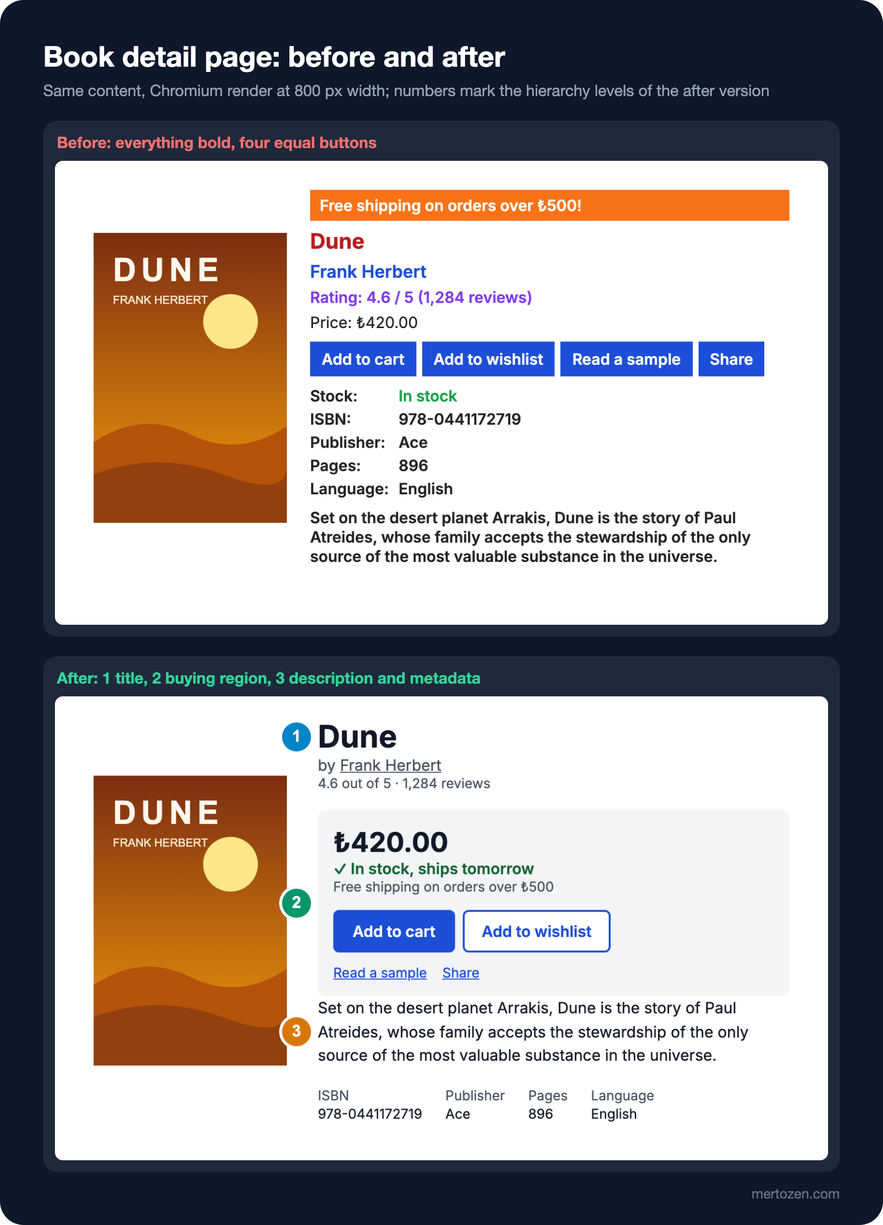
The after lines in the measurement output say the same thing in numbers: the title is 32 and the price 28 pixels, both at weight 700; stock is 16 pixels but bold and green, right below the price (top 168px); the ISBN is 14 pixels, regular weight, at the bottom of the page (top 423px). Bold texts went from 19 to 6, solid buttons from 4 to 1.
Primary, Secondary and Tertiary Buttons
Buttons have a hierarchy too. The primary button is the main action on the screen: solid background, highest contrast. There is one per view; on the book detail page it is Add to cart. A secondary button is a reasonable but secondary alternative: same size, outlined and hollow (Add to wishlist). Tertiary actions are smaller texts that look like links (Read a sample, Share). Three levels tell users which action is expected without them having to read.
An old and still useful way to check this is the squint test: look at the screen with your eyes narrowed, or blur it. Once legibility is gone, only masses, colours and contrast differences remain; if the hierarchy is right, the important items can still be picked out. I rendered the same two pages with filter: blur(6px) added to html:
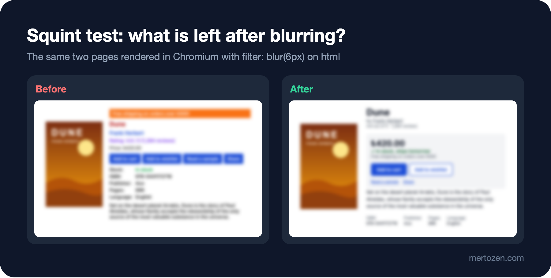
In the blurred before page, what stays in mind is an orange strip and four blue rectangles; which one is the buy button is unclear. On the after page you pick out, in order, the book's title, the dark price, the single blue button and the grey box. This test is not a measurement, but it is an honest check that takes two minutes in a design review.
In Production
Hierarchy breaks down mostly over time. Every new campaign, warning or "let's show this too" request adds emphasis. The practical way to prevent that is to write the rule down: "one primary button per view", "bold text only for the title, price and status information". A script like the one in this post can check the number of solid buttons and the share of bold text in CI and warn when a threshold is exceeded. That turns a design decision into something you can discuss in code review.
Check the hierarchy at different widths too. At 800 pixels the price and Add to cart are on the first screen; on a 360-pixel-wide phone, if the cover stays on top, the buying region can drop below the fold. On mobile you may need to shrink the cover or move the buying region right below it; the breakpoint decisions for that are in this series' post on responsive design.
Also keep an eye on the balance between marketing and design. "Make the banner more visible" is a legitimate request; the answer is not to make it the brightest item on the page but to put it in the most relevant place. If you'd rather measure its effect than argue about it, the A/B testing post of the Introduction to Product Management series explains how to compare two versions.
Common Pitfalls
First, trying to build hierarchy with size alone. Enlarging everything eventually leaves no room and makes the page look crowded; calming the rest down with weight and colour is often more effective.
Second, using colour as decoration. Giving every kind of information its own colour destroys colour's power to carry meaning; choose fixed roles, such as blue for clickable and green for status.
Third, buttons that look equal. Things that look the same are assumed to be equally important (similarity); without a primary, secondary and tertiary distinction, users have to read every button.
Fourth, treating the F pattern as a goal. Instead of designing the page because "users read in an F shape", use good headings and grouping so users have no reason to fall into that shape.
A Small Experiment
★☆☆ On the after page, change .btn-secondary to .btn-primary. Repeat the squint test in your own browser (by adding filter: blur(6px) to html in the developer tools) and check whether you can still tell which button is the main action.
★★☆ Add a check to 02-hierarchy.mjs that sets process.exitCode = 1 if the share of bold text exceeds 40 percent or there is more than one solid button. See it fail for before and pass for after.
★★★ Render the book detail page at 360 pixels wide (node scripts/shoot.mjs web/02-book-detail/after.html 360). Measure with a script whether the price and the Add to cart button stay within the first 640 pixels; if not, propose a layout that changes the order of the cover and the buying region, and measure again.
In the next post we tie this page's fixed font sizes to a system: a modular type scale, line length and line-height, the choice between system fonts and web fonts, tabular figures in price tables, and the traps Turkish characters fall into in font subsets and in text-transform.