

Navigation and Information Architecture: Menus, Breadcrumbs, Search, Filters and Pagination Decisions

Good catalogue navigation keeps the list's state in the URL, separates category as hierarchy from format as facet, makes active filters visible, and uses pagination rather than infinite scroll for lists people search and compare. In Bookstore's catalogue we measure filters lost on reload, a Back button that leaves the catalogue, a footer hidden until all 70 books load and a list with zero links, and fix them with pushState/replaceState, facet counts, chips, breadcrumbs and no-results recovery.
Version note: The example screens in this post were rendered and measured in Chromium 158 with Playwright 1.65; the scripts were run with Node.js 24.
Guess First
In bookstore-web for Bookstore, the online bookstore used as the shared example across this site's series, the catalogue page holds 70 editions of 30 books. On the left are category and format checkboxes and a sort select, on the right the cards; the list grows by 12 books as you scroll down. Where the filters are kept and how loading works:
const state = { categories: new Set(), formats: new Set(), sort: 'relevance', q: '' };

// filter state lives only in this variable: the URL never changes
function render() {
  shown = 0;
  grid.innerHTML = '';
  more();
}

// infinite scroll: 12 more books whenever the bottom of the list comes into view
new IntersectionObserver((entries) => {
  if (entries[0].isIntersecting && shown < results().length) more();
}, { rootMargin: '200px' }).observe(document.querySelector('#sentinel'));
The cards are divs that go to the book page with onclick. If Ada selects "Classics" and "Paperback" and reloads the page, what does she see? If she presses the browser's Back button to undo a filter, where does she end up? If she opens the 40th book in the list and comes back, where is that book? How many books does she have to wait for before she can reach the "Returns policy" link at the very bottom? What does someone see who searches for "Austen" in the Gothic category with the Hardcover format?
This post moves from a single screen to the structure of the site: how content is grouped, how users know where they are, and which decisions narrowing, sorting and splitting a list into pages require.
Measure first
The script follows the same path on both pages: it arrives at the catalogue from another page, selects two filters, prints the URL and the result count shown, reloads, presses Back; then it scrolls down until the footer is in view and counts the cards on the page at that moment, counts the links in the list a crawler can follow, opens the 40th book and comes back, and checks what the screen offers for a filter combination with no results:
node scripts/08-navigation.mjs--- before
filtered to Classics + Paperback: url 08-catalog/before.html, (no count shown)
after reload: active filters (none)
Back: url 05-spacing/after.html, active filters (left the catalog)
footer: in view once 70 of 70 cards are on the page
links in the list a crawler can follow: 0
open the 40th book, Back: "Emma" not on the page, url 08-catalog/before.html
"Austen" in Gothic + Hardcover: "No results", 0 way(s) forward
--- after
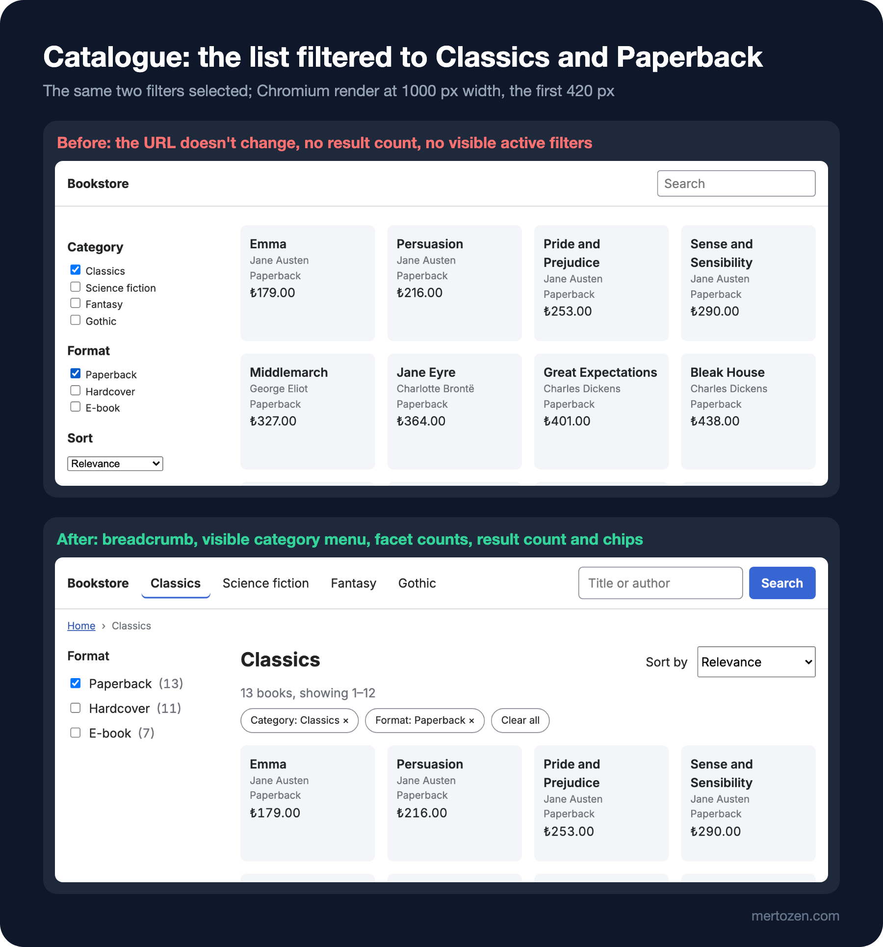
filtered to Classics + Paperback: url 08-catalog/after.html?category=classics&format=paperback, 13 books, showing 1–12
after reload: active filters paperback, Classics
Back: url 08-catalog/after.html?category=classics, active filters Classics
footer: in view once 12 of 70 cards are on the page
links in the list a crawler can follow: 17
open the 40th book, Back: "Emma" in view, url 08-catalog/after.html?page=4
"Austen" in Gothic + Hardcover: "No books match these filters", 2 way(s) forward: Search all categories (3 books) | Clear all filters (70 books)In the before page the filters aren't reflected in the URL, so a reload deletes them all, and Back takes the user out of the catalogue instead of undoing the filter. The footer only comes into view after all 70 books have loaded, 12 at a time; every scroll brings new books and pushes the footer down again. There isn't a single real link in the list. Coming back from the 40th book, the list starts again with 12 books and Emma isn't on the page. The filter combination with no results says "No results" and leaves it there.
Information Architecture: Group the Content First
Information architecture, IA for short, is how content is grouped, named and connected, and it is decided before anyone draws a menu. Bookstore has two different kinds of grouping, and mixing them is the before page's first mistake. Category is a hierarchy: a book sits in one of Classics, Science fiction, Fantasy or Gothic, and users "navigate" between these categories. Format is a facet, an independent property that narrows the list: Paperback, Hardcover and E-book can be selected together, and users "filter" with them. The before page makes both checkboxes; in the after page, categories are visible links in the top menu and formats are checkboxes on the left.
It is healthier to decide the names and groups of categories with users rather than in a team meeting. Card sorting is the best-known method: participants sort cards, each representing a page or concept, into groups that make sense to them. According to the definition from Nielsen Norman Group, NN/g, the usability research firm Jakob Nielsen and Don Norman founded in 1998, in an open card sort participants create and name the groups themselves, in a closed card sort they place cards into predefined groups; at least 15 participants are recommended for a qualitative study. User interviews and discovery work themselves are covered in the discovery post of the Introduction to Product Management series; here we look at how the result shows up on the screen.
The URL Is an Interface Too
Users rely on the URL even if they never read it: reload, Back and Forward, bookmarks, sharing a link and opening in a new tab all work through the URL. If what a list shows isn't in the URL, all of these break. In the after page the list's state lives in one place, the URL, and the page reads it on every render:
// the URL is the single source of truth for what the list shows
function readState() {
  const p = new URLSearchParams(location.search);
  return {
    category: p.get('category') ?? '',
    formats: p.getAll('format'),
    sort: p.get('sort') ?? 'relevance',
    q: p.get('q') ?? '',
    page: Math.max(1, Number(p.get('page')) || 1),
  };
}
There are two ways to change the URL, and choosing between them is a UX decision. history.pushState adds a new history entry, and Back undoes that step. history.replaceState changes the current entry, and Back skips that step. According to MDN, neither call fires popstate; the event only arrives when the user moves back or forward through history, so rendering has to be tied to that event as well:
// a filter change is a step the user may want to undo with Back: pushState
$('#filters').addEventListener('change', () => {
  const s = readState();
  const formats = [...document.querySelectorAll('[name=format]:checked')].map((i) => i.value);
  history.pushState(null, '', toUrl({ ...s, formats, page: 1 }));
  render();
});
// a different sort order of the same list is not: replaceState
$('#sort').addEventListener('change', (event) => {
  history.replaceState(null, '', toUrl({ ...readState(), sort: event.target.value, page: 1 }));
  render();
});
window.addEventListener('popstate', render);
The "Back: url …?category=classics, active filters Classics" line of the measurement is the result of this decision: Back removes the last filter and doesn't take the user out of the catalogue. The same reasoning is why sorting uses replaceState: someone who changes the order five times shouldn't have to press Back five times to leave the catalogue. Resetting the page number to 1 when a filter changes matters too; if the list shrinks to 13 books while the user is on page three, they look at an empty page. In Angular the same idea is built with the router's query parameters.
Facet Filters, Counts and Active Filter Chips
A good facet filter answers two questions up front: how many results remain if I check this option, and which filters are on right now? Next to each format option the after page writes how many books would remain with the other filters kept: within Classics, "Paperback (13)", "Hardcover (11)", "E-book (7)". Users see an option that ends in zero results before they click it. The "13 books, showing 1–12" line under the list heading also says how big the list is and where the user is in it; thanks to role="status", screen readers announce the new number when a filter changes.
Active filters sit in the left panel at the edge of the screen and disappear when you scroll a long panel. That's why the after page shows them again as chips right above the list. Every chip is a link whose href is the URL without that filter, so clicking the "Format: Paperback ×" chip, or opening it in a new tab, gives the same list without Paperback. "Clear all" removes them all at once.
Breadcrumbs: Where Is the User?
A breadcrumb is the row of links that shows a page's place in the site's hierarchy. NN/g's 2018 breadcrumb guidelines set a few clear rules: a breadcrumb shows the page's position in the hierarchy, not the path the user took; it supplements the main navigation rather than replacing it; the last item is the current page and is not a link; and it adds little on flat or single-level sites. On mobile it recommends showing only the last one or two levels to avoid wrapping onto several lines and tiny, hard-to-tap links.
// breadcrumb: where this list sits in the hierarchy, not the path the user took
const crumbs = [`<li><a href="after.html">Home</a></li>`];
if (category && s.q) crumbs.push(`<li><a href="${toUrl({ ...s, q: '', formats: [], page: 1 })}">${category.name}</a></li>`);
crumbs.push(`<li aria-current="page">${title}</li>`);
$('#crumbs').innerHTML = crumbs.join('');
The list is an ol inside nav aria-label="Breadcrumb"; the last item carries aria-current="page" and is not a link. The "›" separator comes from CSS with ::before, so screen readers don't read a separator character at every step. The active category in the top menu is marked with the same attribute: on the Classics page there is a line under the "Classics" link. Telling search engines about the breadcrumb as a BreadcrumbList is the subject of the Structured Data and Schema.org series.
Search: Suggestions and Recovering from "No Results"
A search box is navigation in the user's own words. On top of the spelling suggestion from the previous post, the after page does two things. The search box is linked to a datalist; as the user types, the browser suggests matching book titles and author names. Because a native datalist can't be styled and behaves differently from browser to browser, a large catalogue replaces it with server-side suggestions and an accessible combobox, but on a small list it works without any extra code.
Second, when a search combined with filters returns nothing, the after page works out which filter caused it and says how many results removing each one would bring:
// "no results" with filters: show what each filter costs
function noResults(s) {
  const options = [
    ...(s.category ? [[`Search all categories`, { ...s, category: '' }]] : []),
    ...s.formats.map((f) => [`Remove "${formatNames[f]}"`, { ...s, formats: s.formats.filter((x) => x !== f) }]),
  ].map(([label, next]) => [label, next, filter(next).length]).filter(([, , n]) => n > 0);
In the measurement "Austen" returns nothing in Gothic + Hardcover; the after page suggests "Search all categories (3 books)" and "Clear all filters (70 books)". Removing the Hardcover filter still gives zero results in Gothic, so that option isn't shown at all: every link in the suggestion list leads to at least one book. Logging which searches return nothing is the cheapest way to add a missing book or a synonym to the catalogue; measuring that belongs to the "Analytics and Measurement" series.
Pagination, "Load More" and Infinite Scroll
Each of the three approaches has a cost:
| Concern | Pagination | Load more | Infinite scroll |
|---|---|---|---|
| Reaching the footer | On every page | Below the button | Hard until the list ends |
| Returning to your place | Through the page number in the URL | Lost unless state is saved | Lost unless state is saved |
| Search engines | Every page is an a href | Needs extra links | Needs extra links |
| Knowing the list's size | "Page 4 of 6" | Partly | No |
| Best fit | Lists people search and compare | Medium lists people skim | Feeds browsed without a goal |
NN/g's 2022 article on infinite scrolling finds infinite scroll suitable for content browsed without a specific goal, such as news or social media feeds; it finds it problematic for lists where people look for something specific or compare items, when information in the footer matters, and for users on slow connections or with accessibility needs. One problem the article points out is coming back: sending users who opened a product back to the top of the list. That is exactly what happened in the measurement; Chromium reloaded the page on the way back, the before page started over with 12 books and Emma wasn't there. In the after page Emma is on page 4, the URL is ?page=4, and since the page rebuilds the same list on the way back, the browser restoring the scroll position was enough.
Google's e-commerce pagination guide covers the search engine side: Googlebot doesn't click buttons or run JavaScript triggered by user actions, so products that come in through "load more" or infinite scroll may not be found. The guide recommends giving every page its own URL such as ?page=n, linking each page to the next with standard a href links, not using the URL fragment (after #) for page numbers, and giving each page a canonical that points to itself rather than the first page; it also says it no longer uses rel="next" and rel="prev". The difference between "links … a crawler can follow: 0" and "17" in the measurement comes from this: the before page's cards are divs with onclick, the after page's are real links. For Bookstore's catalogue the choice is pagination; "load more" would also be a reasonable choice, as long as the page number in the URL is updated after every load.
Mobile Navigation: Bottom Bar, Hamburger and Jakob's Law
On a narrow screen the four categories and the search box in the top menu don't fit, and there are two common answers. A hamburger menu hides everything behind one button. In NN/g's 2016 study with 179 participants, hidden navigation on desktop was used in only 27 percent of cases, against 48 percent for visible navigation, and content discoverability dropped by more than 20 percent with hidden navigation. On mobile, hidden navigation was used in 57 percent of cases and navigation combining visible and hidden links in 86 percent. Their recommendations follow from that: don't hide navigation on desktop, and on mobile keep at most four top-level links visible.
A bottom bar keeps the main sections visible where the thumb can reach them. Material 3's navigation bar guidance recommends it for three to five main destinations and says not to use it with more than five items; Apple's Human Interface Guidelines also ask that a tab bar is used for navigation, not for actions. The candidate four sections for Bookstore's mobile app are clear: Home, Categories, Search, Cart. Thumb reach and touch targets are the subject of the next post.
Whichever you choose, Jakob's law draws a line: according to this rule, named after Jakob Nielsen, users spend most of their time on other sites, so they expect yours to work like those. The cart icon at the top right, the logo going to the home page, active filters shown as chips are such expectations. The before page's logo isn't a link and reloads the page when clicked; even that small deviation forces the user to learn something. Deviating from a familiar pattern is only worth it when there is a measured and clear gain.
In Production
Filter URLs are a risk for search engines. Combinations of format, sort and page produce thousands of variations of the same list. The same Google guide recommends putting noindex on filtered and differently sorted URLs, or blocking those URL patterns from crawling in robots.txt, to keep them out of the index. Which combinations should be indexed is a product decision; if "hardcover classics" is a page people really search for, it may deserve its own clean URL. The mechanics of canonical and noindex are in the Technical SEO series.
URL parameters should be consistent in order and format. toUrl always writes parameters in the same order and leaves default values (sort "relevance", page 1) out of the URL; that way the same list always has the same URL and shows up as one entry in caches and analytics.
Facet counts are expensive on a large catalogue. Here 70 books are counted in the browser; in the real Bookstore these counts come from the search infrastructure's aggregations and are cached on the server.
Common Pitfalls
First, keeping filters only in JavaScript state. Reload, Back, sharing and new tabs all break; the list's state belongs in the URL.
Second, writing every change to history with pushState. Steps the user would want to undo (filters) go into history, setting-like changes (sort order) don't.
Third, turning cards into links with div and onclick. A real a href opens in a new tab, is followed by search engines and can be reached with the keyboard.
Fourth, infinite scroll in a catalogue people search and compare. The footer disappears, the place is lost on return, and the list is invisible to search engines.
Fifth, mixing up category and facet. A hierarchy becomes navigation, independent properties become filters.
A Small Experiment
★☆☆ Add a second facet called "Language" (English, Turkish) to the after page and verify that facet counts are calculated with the other filters kept: with Classics + Paperback selected, guess the numbers next to the Language options first, then read them off the screen.
★★☆ Try a "Load more" button instead of pagination: each click should add 12 books and update the URL to ?page=n with replaceState. Run the script's 40th-book test against this version and see whether Emma is visible on the way back.
★★★ At mobile width (390 px), move the category menu into a bottom bar and keep the four main sections visible. Add a step to the script that checks the bottom bar doesn't cover the links in the footer and that keyboard focus doesn't end up hidden under the bottom bar.
In the next post we take this catalogue and the cart to the phone: prioritising content on mobile, placing breakpoints where the content breaks rather than at device sizes, the difference between WCAG 2.2's 24-pixel target size and the larger recommendations of the platform guidelines, thumb reach, and designing dark mode as a theme.