

UI vs UX and Design for Developers: Evaluating a Screen with Usability Heuristics
UI is the visible surface of a screen, UX the whole flow of using it; design decisions are made for measurable reasons, not taste. We group Nielsen's ten heuristics into four questions, review Bookstore's checkout, rank the findings by 0–4 severity, and measure and fix with Playwright a screen that creates two orders on a double-click and wipes the form on an error.
Version note: The example screens in this post were rendered and measured in Chromium 158 with Playwright 1.65; the scripts were run with Node.js 24. The heuristics follow the list Nielsen Norman Group updated in 2020.
Predict First
A developer wrote the checkout screen of bookstore-web, the Angular client of Bookstore, the online bookstore used as the shared example across this site's series, in two days. The screen works: the fields are there, the pay button is there, orders get created. But sales say too many orders are left in the cart, and customer service keeps hearing "I was charged twice". This is the form's submit code:
const form = document.querySelector('#checkout');
const message = document.querySelector('#message');

form.addEventListener('submit', async (event) => {
  event.preventDefault();
  const data = Object.fromEntries(new FormData(form));
  if (!/^\d{5}$/.test(data.postcode)) {
    message.textContent = 'Invalid input.';
    message.hidden = false;
    form.reset();
    return;
  }
  const order = await window.placeOrder(data);
  message.textContent = `Purchase complete: ${order.id}`;
  message.hidden = false;
});
placeOrder is a fake API; each call creates an order after 1.2 seconds. Two questions: if the user types the postcode as "347" and presses Pay now, what do they see, and what happens to the email address they just typed? With a valid postcode, how many orders does a double-click create? Don't look for the answer in the code; in a moment we'll have a script perform the same task and measure it.
This series is for developers who are not designers. The goal is to be able to fix, with reasons, the kind of screen people describe as "not ugly, but something is missing". In every post we build one Bookstore screen as a small HTML page, render and measure it with Playwright, then improve it. The CSS mechanics themselves were covered in the "CSS3: Flexbox, Grid and Modern CSS" series and the Sass side in the "Sass/SCSS" series; here we won't repeat those mechanics and will focus on which design decision we make and why.
UI and UX Are Not the Same Thing
UI is the surface the user sees and touches: buttons, inputs, colours, font sizes, spacing. UX is the whole experience of using that surface: what the user wanted to do, how many steps it took, where they got stuck, how they felt at the end. Shipping cost appearing only after the pay button is a UX problem; grey help text nobody can read is a UI problem. The two are linked, but they don't answer the same question.
Knowing the difference matters in practice: when you open a screen to "make it nicer", you usually touch only the UI. You change colours, round the corners, the screen looks more modern, and the number of abandoned carts stays the same. The real problems in Bookstore's checkout are in the flow: the user can't see the total, starts over after a mistake, and doesn't know whether anything is happening while the payment runs. Changing colours doesn't fix those.
Design Is Not a Matter of Taste: Decisions with Reasons
One reason developers stay away from design is that they think it is a matter of taste. You can't settle "I think this button should be bigger" against "I don't". But most interface decisions rest on observations about how people perceive things, what they remember and where they make mistakes, not on taste. Those observations have been tested for decades and turned into rules.
The most widely used set of such rules is the ten usability heuristics published by NN/g, the usability research firm founded by Jakob Nielsen and Don Norman. According to NN/g, Jakob Nielsen created the list in 1990 and finalised it in 1994; in 2020 the definitions were refreshed with examples. The word "heuristic" is deliberate: these are not strict rules but headings for the questions you ask while evaluating a screen. Violating a heuristic is not always a problem; context and alternatives matter.
A decision with a reason looks like this: "The Pay button should look inactive while the request runs, because if the system doesn't show what it is doing, the user presses again, and we measured it: two orders get created." You can argue with that sentence; you can't argue with "it would look nicer".
Ten Heuristics in Four Questions
Instead of memorising the list item by item, I split it into the four questions I ask when I look at a screen. The English names of the heuristics appear under each heading, since that is how literature and tools refer to them.
Does the user know what is happening?
Visibility of system status sits at the centre of this group: whatever the system is doing, it should show the user within a reasonable time. If nothing changes after a button press, the user can't tell whether the request went out and presses again. A total that stays hidden until payment belongs here too: the user doesn't know what they are agreeing to. The language the system speaks is part of this question as well; match between the system and the real world asks the screen to use words the user knows instead of internal codes. STD is the warehouse system's code, not the customer's.
Is making a mistake hard and fixing it easy?
Three heuristics meet here. Error prevention says to stop the error before it happens: don't put a destructive button next to the main action with the same look, don't allow a request to be sent twice. Help users recognize, diagnose, and recover from errors asks that, when an error happens, the message says plainly what happened and how to fix it. User control and freedom is about getting back from a wrong step easily: undo, cancel, going back to the previous step. Writing "Invalid input." and wiping the form breaks all three at once.
Is the screen consistent with itself and with the outside world?
Consistency and standards works in two directions: give the same thing the same name inside the product, and follow the conventions users know from other sites. If the header says "Basket", the summary box says "Your cart" and the result message says "Purchase complete", the user pauses for a moment to wonder whether these are the same thing. Each one is small; together they make the screen feel less trustworthy.
Does the user have to remember?
Recognition rather than recall says to show information on screen instead of expecting the user to keep it in their head. In an input that uses a placeholder instead of a label, the field's name disappears the moment the user starts typing; remembering which field wants what is left to them. Aesthetic and minimalist design, flexibility and efficiency of use, and help and documentation complete the question: no unnecessary information on screen, shortcuts for experienced users, and help, when needed, right where the work is done.
Evaluating Bookstore's Checkout
For a heuristic review, NN/g recommends this process: three to five people review the same interface independently, first doing the task once to learn the screen, then noting every violation on a second pass, after which the findings are merged and discussed. Nobody is expected to find everything alone; different people catch different problems. The practical version for a small team: a developer, the product owner and a tester take half an hour each, then collect the findings in one table.
Run the review through a task: "Ada buys two books with express delivery." Instead of looking at the screen in general, check what she sees at each step of that task. Part of the task can be automated too; a Playwright script can confirm the findings that can be counted. In the lab folder:
npm install
npx playwright install chromium
node scripts/01-review.mjs web/01-checkout/before.html
web/01-checkout/before.html
wrong postcode -> message: "Invalid input.", email kept: false
total before paying: (not shown)
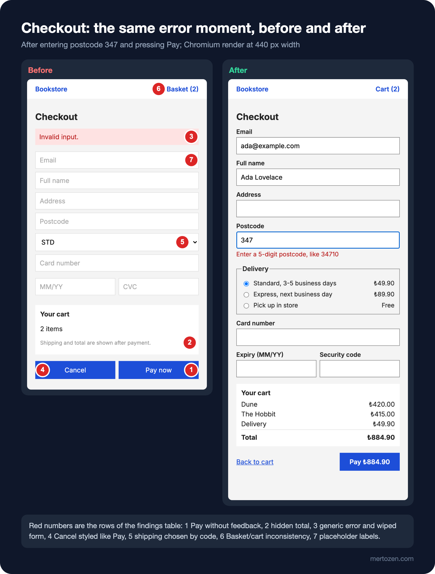
double-click Pay -> feedback within 100 ms: false, orders created: 2The answer to the prediction: the message for the short postcode is just "Invalid input.", which doesn't say which field is wrong or why, and because of form.reset() everything, including the email, is wiped. The total appears nowhere before payment. On a double-click the button shows no change within 100 milliseconds and two orders are created. The script hides nothing: it fills the fields, presses the button, then reads the visible message, the input value and the window.ordersCreated counter from the DOM. The visual findings need a look at the screen:
Ranking the Findings by Severity
If a list of findings isn't prioritised, the team starts with the easiest one and the most important one waits. In Nielsen's 1994 proposal, severity is given on a scale from 0 to 4: 0 is not a problem, 1 cosmetic, 2 minor, 3 major, 4 must be fixed before release. Three things decide the score: how often the problem occurs, how hard it is to get past when it does, and whether the user runs into it again every time. The table for Bookstore's checkout:
| # | Finding | Heuristic | Severity |
|---|---|---|---|
| 1 | No feedback when Pay is pressed; a double-click creates two orders | Visibility of system status, Error prevention | 4 |
| 2 | Shipping cost and total are not visible before paying | Visibility of system status | 4 |
| 3 | The error message is "Invalid input." and the whole form is wiped | Recognize, diagnose, recover from errors | 3 |
| 4 | Cancel looks exactly like Pay and wipes the form with no way back | Error prevention, User control and freedom | 3 |
| 5 | Shipping options are the codes STD, EXP, PUP with no price or duration | Match with the real world | 2 |
| 6 | Placeholders instead of labels; the field name disappears on typing | Recognition rather than recall | 2 |
| 7 | Basket, Your cart and Purchase complete mixed in one flow | Consistency and standards | 1 |
The first two rows scoring 4 is no accident. Duplicate orders touch money and can happen on every payment. A hidden total is one of the known reasons for cart abandonment: in Baymard Institute's list, updated in October 2026, 40 percent of shoppers who abandoned give unexpected extra costs as a reason and 12 percent the fact that they couldn't see the total up front. Row six belongs to form design; we'll cover it in detail in this series' post on forms. The low contrast of the hint text (grey #999999 on white, a ratio of 2.84:1 measured by script) belongs to the colour post, so it didn't get its own row.
The Fixes: Highest Severity First
The first four findings are solved in code. The new submit handler blocks a second submission while the request runs, reports the error under the field it concerns and leaves what the user typed alone:
form.addEventListener('submit', async (event) => {
  event.preventDefault();
  if (submitting) return; // the second click while the request runs does nothing
  if (!/^\d{5}$/.test(postcode.value.trim())) {
    postcodeError.textContent = 'Enter a 5-digit postcode, like 34710';
    postcodeError.hidden = false;
    postcode.setAttribute('aria-invalid', 'true');
    postcode.focus();
    return;
  }
  postcodeError.hidden = true;
  postcode.removeAttribute('aria-invalid');
  submitting = true;
  pay.setAttribute('aria-disabled', 'true');
  pay.textContent = 'Processing payment...';
  const order = await window.placeOrder(Object.fromEntries(new FormData(form)));
  status.textContent = `Order ${order.id} placed. A confirmation email is on its way.`;
  pay.textContent = 'Paid';
});
The button gets aria-disabled instead of disabled, so it keeps focus and screen reader users hear the state too. The accessibility side of this detail belongs to the "Accessibility (a11y)" series. The real guard is the submitting flag; the visual change tells the user, and the flag tells the system, not to send a second request. In a real application the server must not accept the same order twice either; server-side idempotency is covered in the "External Service Integration and Resilience" series.
Shipping turns from codes into words, and each option carries its price next to it. When the choice changes, the total in the summary box and the amount on the button update together:
<fieldset>
  <legend>Delivery</legend>
  <label class="option"><input type="radio" name="shipping" value="49.90" checked> Standard, 3-5 business days <span>₺49.90</span></label>
  <label class="option"><input type="radio" name="shipping" value="89.90"> Express, next business day <span>₺89.90</span></label>
  <label class="option"><input type="radio" name="shipping" value="0"> Pick up in store <span>Free</span></label>
</fieldset>
The Cancel button is gone; in its place, away from the main action and styled as a link, is "Back to cart". The user can still go back but can't wipe the form by accident. The header's "Basket" became "Cart" as well. Running the script for both pages:
node scripts/01-review.mjsweb/01-checkout/before.html
wrong postcode -> message: "Invalid input.", email kept: false
total before paying: (not shown)
double-click Pay -> feedback within 100 ms: false, orders created: 2
web/01-checkout/after.html
wrong postcode -> message: "Enter a 5-digit postcode, like 34710", email kept: true
total before paying: ₺924.90
double-click Pay -> feedback within 100 ms: true, orders created: 1With express selected, the total of 835 + 89.90 = ₺924.90 is visible before paying, the message says what to fix and how, the email is kept and a double-click creates one order. This screen is still not pretty; hierarchy, typography and colour are the work of the next posts. But it no longer leaves the user stranded halfway.
Checking with Users: Are Five People Enough?
A heuristic review is an expert's estimate; it doesn't show what real users do. In Bookstore's checkout, maybe nobody notices the "Back to cart" link, or customers mix up the delivery options for a reason we never expected. You only see that by sitting someone in front of the screen and giving them a task.
By the calculation in Nielsen's 2000 article, a single test user uncovers on average 31 percent of the problems, and with five users that reaches about 85 percent. The article's real advice is about method more than the number five: instead of one test with fifteen people, run three small tests with five each, fixing and measuring again after every round. How to run user interviews and discovery is covered in the "Product Discovery: Continuous Discovery, User Interviews and the Opportunity Solution Tree" post of the Introduction to Product Management series; if you want to compare two designs with numbers, the same series has a post on A/B testing.
In Production
Don't treat a heuristic review as a one-off. Critical flows like checkout should be reviewed again after every major change, because a new field, a new payment method or a new campaign box can bring old findings back. Turning the countable findings (duplicate orders, inputs that aren't kept, a hidden total) into a script like the one in this post and running it in CI catches the regression before a customer complaint does.
Link the findings table to the team's backlog. A severity 4 finding shouldn't ship in the next release; 1s and 2s can be planned along with other work. Keeping the heuristic column in the table moves the discussion past "I think".
Also track what you measured as it shows up in the field: the share of carts left behind, the number of errors seen at the payment step, a second order from the same customer a few seconds after the first. How to set those measurements up is the subject of the upcoming "Analytics and Measurement" series.
Common Pitfalls
First, reviewing without a task. When you "look at the screen in general", your eye goes to aesthetic details; when you say "Ada buys two books", you see the gaps in the flow.
Second, treating a heuristic as a rule. Minimalist design doesn't mean hiding the information the user needs; removing the summary box from our checkout "to keep it clean" would bring the total problem back.
Third, fixing only the UI. Had you given the before screen new colours and rounded corners, the first two findings would still be there; the most severe problems are usually in the flow.
Fourth, solving double submit only by making the button inactive. The visual state is for the user; when the network is slow or the page retries, you also need a guard on the server that recognises the same request.
A Small Experiment
★☆☆ In after.html, select Pick up in store and predict the total. Then add a step to 01-review.mjs that makes this choice and prints the value of #total.
★★☆ Find at least two more findings on the before screen that didn't make the table (for example the format of the card expiry field, or where the success message appears). For each, write the heuristic and the severity, and give the reason in one sentence.
★★★ Add one more check to the script: after the wrong postcode, read which element has focus with document.activeElement. Compare the result for before and after and write what the difference means for a keyboard user.
In the next post we move to Bookstore's book detail page. We'll look, with before and after screens, at where the eye goes when the price, the "Add to cart" button, the stock information and the metadata all carry the same weight, how to build hierarchy with weight and colour instead of size, and how the Gestalt principles group related information.