

Form Design: Label Placement, Error Messages, Inline Validation and Splitting Long Forms

A good form asks for few fields, keeps the label visible above the field, shows no error before the user has finished typing, and on an error says what happened and how to fix it and moves focus to a summary. We cut Bookstore's delivery form from 16 fields to 6 and from 150 characters to type to 54, measure and fix floating labels, asterisks, per-keystroke validation, "Invalid" messages and blocked paste, and apply WCAG 2.2's Redundant Entry and Accessible Authentication criteria.
Version note: The example screens in this post were rendered and measured in Chromium 158 with Playwright 1.65; the scripts were run with Node.js 24. WCAG success criteria refer to version 2.2.
Predict First
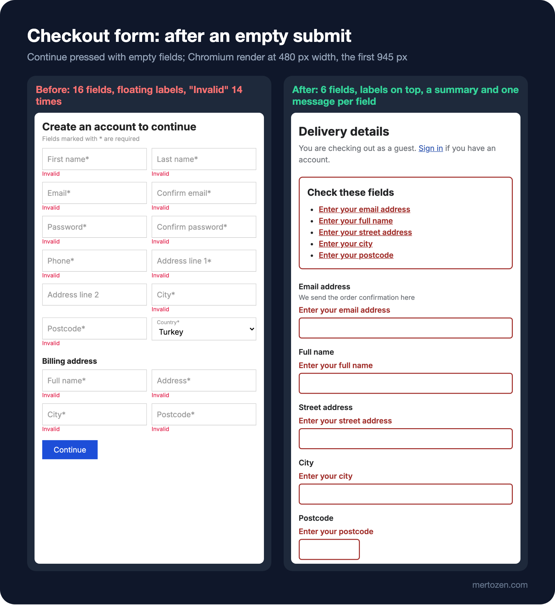
The checkout of bookstore-web, the client of Bookstore, the online bookstore used as the shared example across this site's series, has a delivery form before the payment step. The form has two columns, the labels sit inside the fields and slide up on focus (floating labels), and required fields carry an asterisk. This is the validation code:
const form = document.querySelector('#checkout');
const rules = {
  email: (v) => /^\S+@\S+\.\S+$/.test(v),
  postcode: (v) => /^\d{5}$/.test(v),
};

// validates on every keystroke
form.addEventListener('input', (event) => {
  const input = event.target;
  const rule = rules[input.name];
  if (!rule) return;
  showError(input, rule(input.value) ? '' : 'Invalid');
});

form.addEventListener('submit', (event) => {
  event.preventDefault();
  for (const input of form.querySelectorAll('input')) {
    const required = input.labels[0].textContent.endsWith('*');
    if (required && !input.value) showError(input, 'Invalid');
  }
});
The password fields also have onpaste="return false", and the form's heading is "Create an account to continue". What does Ada see when she starts typing her email and has typed "ada@"? How many error messages does a user who presses Continue without filling anything see, what do they say, and where does keyboard focus stay? What does someone who wants to paste their password from a password manager do?
Up to the previous post we built the visual side of screens: hierarchy, typography, colour, spacing. In this post we move to where users put in the most effort: the form. The HTML side (input types, label, autocomplete, native validation) was covered in the two form posts of the "HTML5 and Semantic HTML" series; here we look at which design decision we use those elements for.
Measure first
The script puts the same customer through both forms: it counts the visible and required fields, works out how many characters have to be typed to fill the required fields, types "ada@" into the email field and reads the visible message both while typing and after leaving the field, submits the empty form and records the messages and focus, and finally sends a paste event to the password field to see whether it is blocked:
node scripts/06-forms.mjs--- before: 16 visible fields, 15 required, 150 characters to type, 0 with autocomplete
typing "ada@": error while typing "Invalid", after leaving the field "Invalid"
empty submit: 14 messages ("Invalid"), focus on button, title "Checkout - Bookstore"
paste into password blocked: true
--- after: 6 visible fields, 5 required, 54 characters to type, 6 with autocomplete
typing "ada@": error while typing "(none)", after leaving the field "Email address must look like name@example.com"
empty submit: 5 messages ("Enter your email address", "Enter your full name", "Enter your street address", "Enter your city", "Enter your postcode"), focus on summary, title "Error: Checkout - Bookstore"
paste into password blocked: falseThe answers to the predictions are in the before lines: Ada sees "Invalid" while she is still typing "ada@", so she is blamed before she has finished. An empty submit shows the same word 14 times: "Invalid". It doesn't say which field is invalid, why, or how to fix it; focus stays on the button, and a screen reader user doesn't even hear that something happened. Pasting the password is blocked. Each of these has a design answer.
Where the Label Goes: on Top and Visible
The label is the only thing that says what a field wants; it must stay visible while the user types, while they review the form before sending it, and while they fix an error. NN/g's form recommendations say to put the label right above the field, especially on mobile and in short forms, and not to leave a label equally close to two fields. A label on top uses no horizontal space on narrow screens, the eye goes from label to field in one vertical move, and a long label causes no layout problem.
Using a placeholder instead of a label is the best-known mistake. According to the observations in NN/g's placeholder article, the hint disappears once the user starts typing, reviewing entries before submitting gets harder, filled and empty fields become hard to tell apart, and faint grey text falls below the contrast threshold.
Why floating labels aren't the answer
A floating label starts inside the field like a placeholder and moves up, shrinking, on focus or once the field has a value. It solves the placeholder's "label disappears" problem but brings others. In the before page's CSS the label shrinks to 11 pixels in a filled field; it becomes a hard-to-read, low-contrast tag. Because the label starts inside the field, there is no room for hint text. An empty field with a label sitting inside it can look as if it already has a value; that is why NN/g rates floating labels better than placeholders but worse than labels outside the field. The space saving is smaller than it seems as well: on the before page every field already reserves room for the label with 18 pixels of top padding.
One column
The before page's two columns make the eye zigzag: first name, last name, then email, then email again in the next column. Users work out the order again on every row, and skipping a field in the right column gets easy. In one column the order is single and clear. The exception is short fields read together: postcode and city, or the month and year of an expiry date, can share a row. On the after page the postcode field is narrow for that reason (max-width: 8rem): the width of a field is also a hint about the length of the expected answer.
Required and Optional Fields
On the before page 15 of 16 fields are required and all their labels have an asterisk. When nearly the whole form is required, the asterisk carries no information and only adds clutter. A better strategy has two steps: first reduce the optional fields, then clearly mark the few that remain. The GOV.UK Design System likewise recommends adding "(optional)" to the labels of optional fields and not marking required fields with asterisks. On the after page the only optional field is the phone number; its label is "Phone number (optional)".
Hint text sits right below the label and above the field: "We send the order confirmation here", "Only the courier uses it, on delivery day". Saying why something is asked reduces hesitation, especially for personal data like a phone number. The hint is linked to the field through aria-describedby; when a screen reader reaches the field, it reads the hint after the label.
Reducing the Number of Fields
The best field is the one never asked. According to Baymard Institute's 2024 checkout study, the sites it examined had 11.3 form fields on average, and most sites need 8 fields for the whole checkout. In the same institute's cart abandonment list, 18 percent of respondents name being forced to create an account and 17 percent a long or complicated checkout as a reason.
On the way from before to after, the fields went down like this:
- Account creation is no longer mandatory: the heading became "You are checking out as a guest", and the password field only opens if the user chooses "Save my details for next time". The account can also be offered after the order is complete.
- "Confirm email" and "Confirm password" are gone. Repeating the email doesn't catch typos, since users copy the first field into the second; the real remedy is the confirmation email and a way to correct the address later.
- First and last name became a single "Full name" field. Splitting names into two parts doesn't work in every culture, and one field is enough for a shipping label.
- "Address line 2" and the country selector were removed: in this example Bookstore ships only within Turkey, so asking for the country is a needless step.
- The billing address is the same as the delivery address by default; a user who needs a separate billing address unticks the box and the fields open.
The result in the measurement: 16 visible fields became 6, 15 required fields became 5, and the number of characters Ada has to type dropped from 150 to 54. Thanks to the autocomplete values (email, name, street-address, postal-code, tel), the browser can fill in most of those 54 characters itself; WCAG success criterion 1.3.5 Identify Input Purpose, at level AA, also asks that fields collecting information about the user state that purpose programmatically.
When to Validate?
The before page validates on every keystroke. Users see "Invalid" before they finish typing; that is both wrong (the address isn't complete yet) and tiring for slower typists. NN/g's article on form errors therefore recommends validating after the user leaves the field. The GOV.UK Design System goes further and prefers validating only when the user presses Continue, not on leaving a field. The two sources speak for different contexts; what they share is not blaming early.
The after page combines two rules. On leaving a field, a format check runs only if something was typed; the "required" error for empty fields comes only on submit, so a user tabbing through the form doesn't see a pile of errors before starting. Once a field shows an error, it is rechecked on every keystroke and the error disappears as soon as the value is fixed. Warn the user late, but reward the fix immediately:
// late: check a field when the user leaves it, and only if something was typed
form.addEventListener('focusout', (event) => {
  const input = event.target;
  if (rules[input.name] && input.value) setError(input, rules[input.name](input.value.trim()));
});

// early: once a field shows an error, clear it as soon as the value is fixed
form.addEventListener('input', (event) => {
  const input = event.target;
  if (input.getAttribute('aria-invalid') === 'true') setError(input, rules[input.name](input.value.trim()));
});
Validation doesn't all happen on the client. Whether a postcode really exists, or whether the last book in stock can still be sold, is something the server knows; the check in the browser is only there to guide the user quickly. Server-side validation and error responses are the subject of the ASP.NET Core Web API series.
Error Message, Summary and Focus
The message itself
A good error message says two things: what happened and how to fix it. It doesn't blame, avoids technical language and repeats the label's words so the user can match message and field. GOV.UK's guidance also recommends an instruction for an empty field ("Enter your…"), a description for a wrong format, and never clearing what the user typed. The after page's messages follow that pattern:
// what went wrong and how to fix it, in the words of the label
const rules = {
  email: (v) => (!v ? 'Enter your email address' : /^\S+@\S+\.\S+$/.test(v) ? '' : 'Email address must look like name@example.com'),
  fullName: (v) => (v ? '' : 'Enter your full name'),
  address: (v) => (v ? '' : 'Enter your street address'),
  city: (v) => (v ? '' : 'Enter your city'),
  postcode: (v) => (!v ? 'Enter your postcode' : /^\d{5}$/.test(v) ? '' : 'Postcode must be 5 digits, like 34710'),
};
The message sits right above the field, between label and input, in bold and in --color-danger-text; the input's border also thickens and turns the same colour. Because text and weight come with the colour, the error isn't conveyed by colour alone. The message is linked to the input with aria-describedby, and the input gets aria-invalid="true".
Summary and focus
Adding an error summary at the top of the form lets users see at a glance what needs fixing. But the summary must not be the only indicator; as NN/g points out, after reading the summary users would have to hunt for each field. On the after page the two come together: a summary on top, and each field's own message next to it. Every item in the summary is a link to its field.
summary.hidden = errors.length === 0;
document.title = `${errors.length ? 'Error: ' : ''}Checkout - Bookstore`;
if (errors.length) {
  summary.focus();
  return;
}
After submit, focus moves to the summary (that is what the summary's tabindex="-1" is for) and the page title starts with "Error:". These two steps, recommended by the GOV.UK Design System, let keyboard and screen reader users realise straight away that something went wrong. The "focus on summary" line in the measurement is the result; on the before page focus stays on the button. How dynamic error notifications are announced by screen readers is covered in detail in the live regions and form errors post of the "Accessibility (a11y)" series.
One Page or Several Steps? How WCAG 2.2 Affects Forms
There is no clear right answer between gathering the checkout on one page and splitting it into steps. One page lets users see the whole form and how much is left, with no waiting between pages; for short forms it is usually faster. A multi-step flow shows few fields per step, needs less scrolling on mobile and catches errors early through per-step validation; but the number of steps must be visible and users must be able to go back to a previous step without losing what they entered. GOV.UK's "one thing per page" approach is the extreme version of this; it was developed for public services, where many different users fill in long forms. Bookstore's choice: delivery details on one screen, payment on a separate screen, and a confirmation screen at the end that summarises everything. If you'd rather measure the two approaches than argue about them, how to set up an A/B test is in the experiments post of the Introduction to Product Management series.
WCAG 2.2 affects this decision through two success criteria. 3.3.7 Redundant Entry, at level A, asks that information already entered in the same process not be requested again, but be either filled in automatically or available to select; the W3C's own example is a checkbox confirming that the billing address is the same as the delivery address. It matters especially in a multi-step flow: asking for the email again in step three breaks this criterion. 3.3.8 Accessible Authentication (Minimum), at level AA, asks that a cognitive test such as remembering a password not be the only way to log in; a helping mechanism such as a password manager or copy and paste is enough. The before page's onpaste="return false" blocks exactly that help. On the after page pasting is allowed, the field carries autocomplete="new-password" and the hint text explicitly suggests a password manager.
In Production
Form analytics is the most honest feedback on a design: which field produces the most errors, at which field users abandon the form, how many people fix an error and carry on after seeing a message. GOV.UK also recommends tracking how often error messages are shown. Setting up these measurements is the subject of the upcoming "Analytics and Measurement" series.
Test with real data: long names, surnames with apostrophes, addresses with Turkish characters ("Çiçek Sokak No: 3/1"), postcodes with spaces, and leading and trailing spaces in pasted text. The trim() on the after page is for that last one. Writing restrictive regexes for names and addresses is the easiest way to block real customers' orders.
Keep the form's state. When the page reloads after an error, or the user comes back from the payment step, the values they entered must still be there; wiping the form is, as we measured in the first post's checkout, one of the most expensive mistakes.
Common Pitfalls
First, a placeholder or a floating label instead of a label. The label should always be visible and outside the field.
Second, validating on every keystroke. Showing an error before the user has finished typing is both wrong and tiring.
Third, generic messages like "Invalid". A message should say what is wrong and how to fix it, in the field's own words.
Fourth, leaving focus where it was after an error. Users, especially keyboard and screen reader users, only notice the error when focus moves to it.
Fifth, blocking paste and asking for the same information twice. Neither adds security or accuracy; they only tire the user, and both break WCAG 2.2.
A Small Experiment
★☆☆ Write the code that shows the billing fields when the "Billing address is the same as delivery address" box is unticked on the after form. Predict the number of fields and the number of characters to type first, then run 06-forms.mjs for that case.
★★☆ Add a step to the script: type "ada@example" into the email field, press Tab and read the error; then add ".com" and confirm that the error is rechecked on every keystroke and disappears.
★★★ Split the delivery form into two steps (contact, address) and confirm with a script that values are kept when going back between steps, that the email isn't asked again in the second step, and that focus moves to the error summary on each step.
In the next post we widen from forms to all interactive components: affordance and feedback, every component's default, hover, focus-visible, active, disabled, loading and error states, the choice between skeletons and spinners, optimistic UI and undo, and Bookstore's empty cart, no results and API error screens.