

What Is a Design System? Design Tokens (DTCG 2025.10), Component Libraries and Documentation

A design system is made of tokens, components, usage rules and governance, and tokens split into primitive, semantic and component layers. We move Bookstore's hand-written tokens.css into DTCG 2025.10 JSON files and a resolver for light/dark and reduced motion, generate CSS and Tailwind output with Terrazzo, and measure that 100 of 101 variables resolve exactly the same in Chromium.
Version note: The token files in this post use the DTCG 2025.10 format and were built with Terrazzo 2.10; the Tailwind output was tried with Tailwind CSS 4.3 and the example pages in Chromium 158 with Playwright 1.65; the scripts were run with Node.js 24.
Guess First
In bookstore-web for Bookstore, the online bookstore used as the shared example across this site's series, the tokens.css file grew over nine posts: the type scale in 03, the palette and semantic colours in 04, spacing in 05, the focus ring and motion in 07, elevation in 09. Blocks like these now sit side by side in the file:
/* 04: semantic colors, light theme */
:root {
  color-scheme: light;
  --color-bg: #ffffff;
  --color-surface: var(--gray-50);
  --color-action: var(--blue-600);
  /* ... */
}

/* 07: focus ring and motion */
@media (prefers-color-scheme: dark) {
  :root:not([data-theme="light"]) {
    --color-focus: var(--blue-300);
  }
}
The colours for the dark theme were added in three separate blocks, in three separate posts. The designer keeps the same colours separately in Figma, and the admin panel, which uses Tailwind, keeps yet another copy in its own @theme. How many tokens are there, and how many are just another name for another token? How many places does someone who wants to add a new colour have to write it? Which screens does changing "the blue" affect, and which not? If we stop writing this file by hand and generate it from a source, how do we prove the generated CSS is the same as the old one?
Measure first
In this post we moved the file into JSON token files in the DTCG format and generated the CSS from them. The script first counts the token files layer by layer; then it loads both the hand-written and the generated CSS into Chromium and compares the value each custom property resolves to in the browser for the light theme, the dark theme and reduced motion; finally it measures the contrast of the semantic colour pairs and whether the same token gives the same colour through plain CSS and through Tailwind:
npm run tokens
node scripts/10-tokens.mjs
primitive 79 tokens, 0 aliases (color 55, dimension 14, fontFamily 1, fontWeight 3, number 3, duration 2, cubicBezier 1)
semantic 21 tokens, 15 aliases (color 18, shadow 1, border 1, dimension 1)
component 8 tokens, 6 aliases (color 4, dimension 3, shadow 1)
dark theme 19 tokens, 18 aliases (color 18, shadow 1)
reduced motion 2 tokens, 0 aliases (duration 2)
light: 100 of 101 identical; not in the generated file: --measure
dark: 100 of 101 identical; not in the generated file: --measure
reduced motion: 100 of 101 identical; not in the generated file: --measure
contrast light: 9 of 9 pairs at least 4.5:1, lowest text-muted/surface 4.63:1
contrast dark: 9 of 9 pairs at least 4.5:1, lowest text-muted/surface-raised 4.77:1
button background light: CSS oklch(0.54 0.178 264), Tailwind oklch(0.54 0.178 264), same: true
button background dark: CSS oklch(0.7899 0.1057 264), Tailwind oklch(0.7899 0.1057 264), same: trueThe answers to the guesses: there are 108 tokens, 79 of them raw values, and most of the rest are a name given to another token. The dark theme changes 19 tokens, and 18 of those only redirect an alias. Of the 101 hand-written custom properties, 100 give the browser exactly the same value from the generated file; one, --measure, was left out on purpose. The rest of this post is how these lines came about.
What Is a Design System, and When Do You Need One?
A design system is made of four parts: tokens (named versions of decisions such as colours, sizes and durations), components (the button, input and card built with those tokens), usage rules (which component to use when, and with which states) and governance (who proposes a change, who approves it, how it is versioned). Those parts are what set it apart from related ideas. A UI kit is a library of ready-made pieces in a design tool; it carries no code and no rules. A style guide is a document that explains the colours, fonts and how to use the logo; it often has no link to live code. A design system joins the two with code and a process.
Not every project needs a design system. With one team, one product and one designer, a well-organised token file and a few shared components are enough, and governance can be a meeting note. When a second product with the same brand (for Bookstore, the shop and the institutional portal), a second team or a second platform (web and a mobile app) arrives, the question "is this the same blue?" starts coming back every sprint; that is the point where a design system pays for itself.
There are two ways. Adopting a ready-made system, such as Material 3: tokens, components designed with their states and accessibility in mind, and documentation come ready, and with Angular Material there is code too; the price is that the brand's look is tied to that system's rules and customisation stays within the places the system allows. Building your own system gives full control, but the team writes and maintains every component's states, accessibility and documentation itself. Our choice for Bookstore sits between the two: the tokens are our own system, complex components (a date picker, a dialog) come from a ready-made library, and a theme connects that library to our tokens. Angular Material's theming allows this: according to the Angular Material documentation, components read system tokens such as --mat-sys-surface and --mat-sys-on-surface as CSS variables, and the mat.theme-overrides mixin redefines them. We didn't set up an Angular project in this post; the mapping is the same thing we do for Tailwind below.
Token Layers: Primitive, Semantic, Component
While building the palette in post 04 we separated two layers without naming them: --blue-600 is a colour, --color-action is "what" that colour is used for. In design systems this separation becomes three layers:
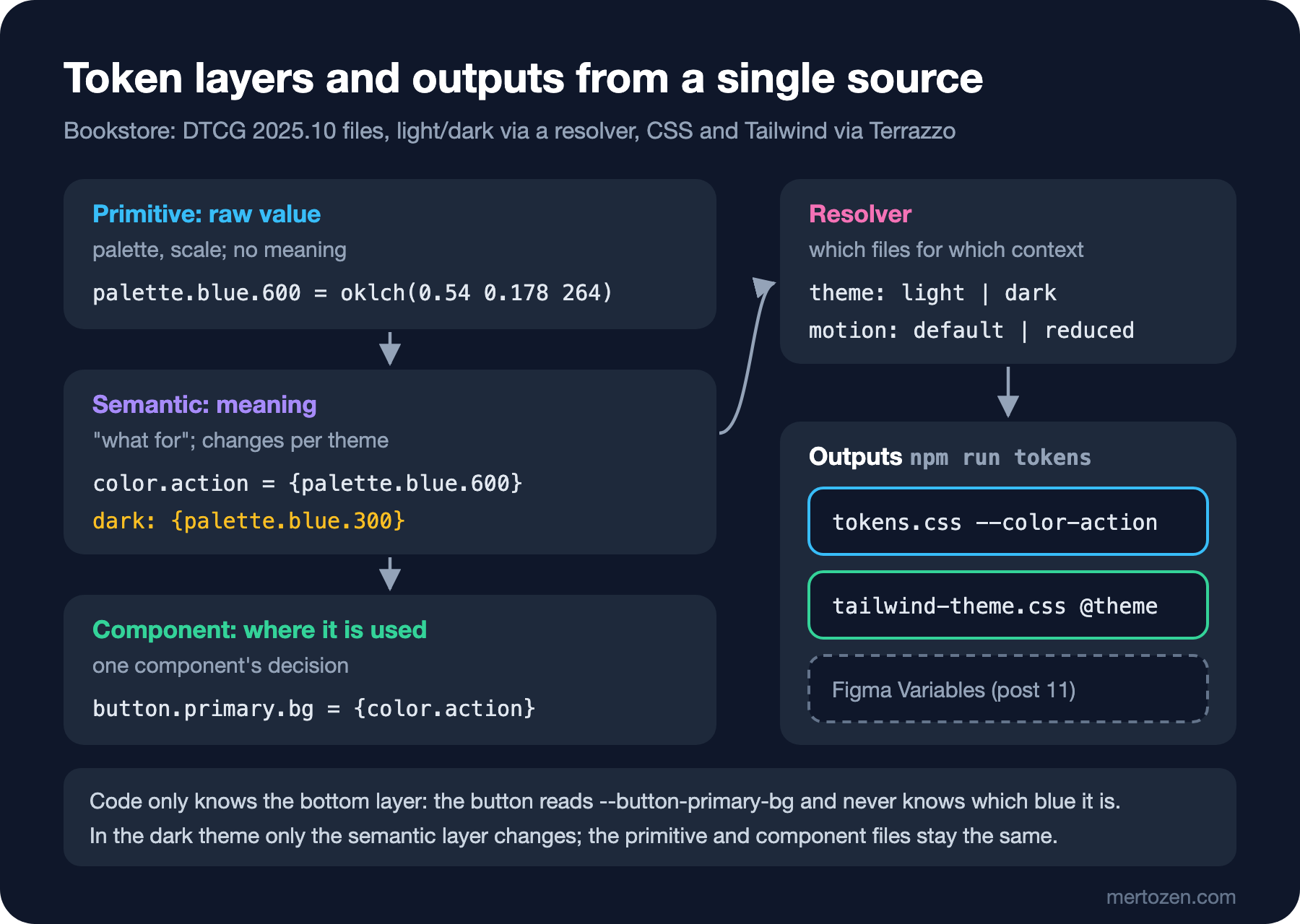
Primitive tokens are raw values: the palette's 55 colours, the spacing scale, the font family, the durations. They carry no meaning; palette.blue.600 says nothing except that it is a colour. Semantic tokens are decisions: color.action is "the colour of the primary action", color.text-muted is "secondary text". This is the layer that changes when the theme changes. Component tokens are the decision of a single component: button.primary.bg equals color.action today, but if the brand team ever wants buttons in a different shade, only this line changes and links are not affected.
The rule is that code only knows the bottom layer. The button on this post's token page reads only component tokens:
/* the button only knows its component tokens */
.btn { min-height: var(--button-min-height); padding: 0 var(--space-4); border: 0; border-radius: var(--button-radius); background: var(--button-primary-bg); color: var(--button-primary-text); font: inherit; font-weight: var(--weight-semibold); }
.btn:hover, .btn.is-hover { background: var(--button-primary-bg-hover); }
Three layers aren't needed everywhere. Component tokens add value only when a component's decision can really diverge from the semantic layer; opening a token for every property of every component turns 108 tokens into 1000 and produces a dictionary nobody can read. Bookstore has only 8 component tokens, for the button and the card.
The DTCG 2025.10 Format
The question of which format to keep tokens in now has a standard answer. The Design Tokens Community Group at the W3C published the first stable version of the format on 28 October 2025. The 2025.10 report consists of three modules: Format (tokens, groups, aliases and types), Color (colour spaces) and Resolver (contexts such as themes). It is a community group report, not a W3C standard; but token tools such as Terrazzo and Style Dictionary read the format.
A token is a JSON object that carries a $value; $type states the type of the value and, when given at group level, passes down to the tokens inside it. A piece of Bookstore's palette file:
{
  "palette": {
    "blue": {
      "$type": "color",
      "50": {
        "$value": {
          "colorSpace": "oklch",
          "components": [0.97, 0.014, 264],
          "hex": "#f0f5ff"
        }
      },
The Color module defines a colour not as a string but with its colour space and components; OKLCH is one of the supported spaces, and hex is an optional fallback for older tools. That is how the palette we built with OKLCH in post 04 moves over without loss. An alias is the path of another token in curly braces:
"action": {
  "$type": "color",
  "$value": "{palette.blue.600}"
},
During the move we ran into one of the format's limits. DTCG's dimension type accepts only the px and rem units; the line length token from post 03, --measure: 52ch, uses the ch unit because line length is about character counts. According to the spec, not every mobile platform has an equivalent of rem either, and tools may convert it to px when needed; ch isn't defined at all. The options: convert the value to rem (it loses its meaning when the font changes), or keep it out of the token system and leave it in CSS. We left --measure in CSS; the "not in the generated file: --measure" line in the measurement records that decision.
Light, Dark and Reduced Motion with a Resolver
The dark theme is the value of the same tokens in another context. The Resolver module in 2025.10 is the standard way to describe this: sets list the token files that apply in every context, modifiers list the files layered on top depending on the context, and resolutionOrder decides which overrides which:
{
  "$schema": "https://www.designtokens.org/schemas/2025.10/resolver.json",
  "name": "Bookstore",
  "version": "2025.10",
  "sets": {
    "base": {
      "sources": [
        { "$ref": "primitive.tokens.json" },
        { "$ref": "semantic.tokens.json" },
        { "$ref": "component.tokens.json" }
      ]
    }
  },
  "modifiers": {
    "theme": {
      "contexts": {
        "light": [],
        "dark": [{ "$ref": "theme-dark.tokens.json" }]
      },
      "default": "light"
    },
    "motion": {
      "contexts": {
        "default": [],
        "reduced": [{ "$ref": "motion-reduced.tokens.json" }]
      },
      "default": "default"
    }
  },
  "resolutionOrder": [
    { "$ref": "#/sets/base" },
    { "$ref": "#/modifiers/theme" },
    { "$ref": "#/modifiers/motion" }
  ]
}
theme-dark.tokens.json contains only the 19 semantic tokens that change, and 18 of them are aliases: in dark, color.action turns to {palette.blue.300}. The primitive and component files are untouched; the figure's "in the dark theme only the semantic layer changes" is measured by this file. The two modifiers are independent of each other (orthogonal, in the spec's word): one touches colours, the other durations, so we don't have to write four files for four combinations. If a high-contrast theme is needed next, adding a new context to theme will be enough.
Generating CSS and Tailwind from a Single Source
There are two common tools that generate CSS from JSON: Style Dictionary and Terrazzo. Both read DTCG's $value/$type syntax; Terrazzo's 2.0 release notes say it fully supports the 2025.10 spec including resolvers, which is why we used Terrazzo 2.10 here. The configuration defines which combination of the resolver is written to which CSS selector:
// token id -> CSS variable name: palette.blue.600 -> --blue-600, color.text-muted -> --color-text-muted
const variableName = (token) => `--${token.id.replace(/^palette\./, '').replaceAll('.', '-')}`;
// an empty shadow list means "no shadow"
const noShadow = (token) => (token.$type === 'shadow' && token.$value.length === 0 ? 'none' : undefined);

export default defineConfig({
  tokens: ['./tokens/bookstore.resolver.json'],
  outDir: './web/styles/generated/',
  plugins: [
    css({
      filename: 'tokens.css',
      variableName,
      permutations: [
        {
          input: { theme: 'light', motion: 'default' },
          prepare: (css) => `:root {\n  color-scheme: light;\n  ${css}\n}`,
        },
        {
          input: { theme: 'dark', motion: 'default' },
          include: ['color.*', 'shadow.*'],
          transform: noShadow,
          prepare: (css) => `@media (prefers-color-scheme: dark) {\n  :root:not([data-theme="light"]) {\n    color-scheme: dark;\n    ${css}\n  }\n}`,
        },
We kept the variable names the same as in the old file, so the pages from 03 to 09 work with the generated file without any change. The dark block takes only colour and shadow tokens: component tokens are references such as var(--color-action), so the browser already resolves them to the dark value.
Adding the Tailwind plugin to the same configuration gives one more output from the same source. The admin panel gets utilities such as bg-action, text-muted and p-4 from these tokens. npm run tokens runs both steps; its output:
plugin:@terrazzo/plugin-tailwind: space.1 matched 0 tokens
plugin:@terrazzo/plugin-tailwind: space.2 matched 0 tokens
plugin:@terrazzo/plugin-tailwind: space.3 matched 0 tokens
plugin:@terrazzo/plugin-tailwind: space.4 matched 0 tokens
plugin:@terrazzo/plugin-tailwind: space.6 matched 0 tokens
plugin:@terrazzo/plugin-tailwind: space.8 matched 0 tokens
plugin:@terrazzo/plugin-tailwind: space.12 matched 0 tokens
plugin:@terrazzo/plugin-tailwind: radius.md matched 0 tokens
plugin:@terrazzo/plugin-tailwind: font.sans matched 0 tokens
✔  108 tokens built 33ms
≈ tailwindcss v4.3.5

Done in 37ms
The warnings are about the dark block: looking at the generated tailwind-theme.css, the dark block contains only colours; there is no dark value to write for spacing, radius and font. The real surprise was elsewhere. With a top-level @variant dark { … }, as in the plugin's example template, the Tailwind CLI turned it into an @media (prefers-color-scheme: dark) { --color-bg: … } block without a selector; declarations without a selector are invalid CSS and the browser silently ignores them. Wrapping the block in @layer theme { :root { @variant dark { … } } } in the template produced the correct rule. The last two lines of the measurement check this: the plain CSS button on the token page and the button drawn with Tailwind utilities get the same background in the light and the dark theme.
One more thing stands out in the compiled Tailwind file: Tailwind's default theme also defines --text-sm, --leading-tight and --ease-out, with values different from ours (for example --text-sm: 0.875rem, ours is 0.8125rem). Because Tailwind puts its values inside @layer theme and our tokens.css is unlayered, ours win; but that is a fragile balance that depends on which file the page loads and in what order. Resetting the clashing namespaces inside @theme, or giving your own tokens a prefix, is safer; the Tailwind details are in the theme and design token post of the Tailwind CSS series.
Is the Generated CSS the Same as the Old One?
The riskiest moment of moving to a token system is when the generated file replaces the hand-written one. A text comparison doesn't work: Terrazzo writes oklch(54% 0.178 264) instead of oklch(0.54 0.178 264) and outputs white as rgb(100% 100% 100%). So the script compares results rather than text: it applies every custom property to a CSS property that fits its type (colours to color, sizes to width, durations to transition-duration), converts colours to sRGB bytes through a canvas, and checks whether the two files give the same result in the browser.
The result is 100 of 101 in all three contexts. An intermediate run showed one more difference: in the dark theme --focus-ring was oklch(0.79 0.106 264) in the old file and oklch(0.7899 0.1057 264) in the new one. The cause is that Terrazzo fits three colours that slightly exceed sRGB (amber-600, amber-950, blue-300) into sRGB in the base block and puts the original values in an @media (color-gamut: p3) block. Comparing the colour's bytes instead of the outline's text made the difference disappear: on an sRGB screen both values give the same pixel. On wide-gamut screens the new file shows the original colour, a small improvement.
The real gain of tokens is in the contrast lines of the measurement. In post 04 we measured contrast through the texts of one screen; now we can measure the system itself. Nine semantic pairs (text/background, secondary text/surface, link/background, button text/button, three status colours) are above 4.5:1 in both themes; the lowest pair is text-muted/surface in the light theme at 4.63:1. If this check runs in CI, a token change that breaks the contrast threshold is caught before it reaches any screen.
Component Library and Documentation
Tokens alone aren't a system; you also need the components that use them and the knowledge of "when to use this". In Storybook's own words, Storybook is a frontend workshop for building UI components and pages in isolation. Each story renders one state of a component: "Primary button, disabled", "Cart, empty". It is the mature form of the idea from post 07, "a test page that shows all states side by side"; Storybook supports Angular and can generate documentation from stories automatically. We didn't install Storybook in this series; component architecture itself is in the component architecture post of the UI Architecture Patterns series.
For a small start, a single page fed by the tokens does the job too. web/10-design-system/index.html reads every --color-* variable in the generated CSS and draws a swatch with its contrast ratio against the background for each, shows the spacing scale as bars, and puts the button's four states side by side:
const bg = rgb(root.getPropertyValue('--color-bg'));
document.querySelector('#colors').innerHTML = unique.filter((n) => n.startsWith('--color-')).map((n) => `
  <li class="swatch"><span class="chip" style="background: var(${n})"></span>
    <span><code>${n}</code><br><span class="ratio">${ratio(rgb(root.getPropertyValue(n)), bg)}:1</span></span></li>`).join('');
Because the page is generated from the tokens, it never goes out of date: a new semantic colour shows up on the page by itself after npm run tokens.
In Production
Tokens should be versioned like an API. Deleting or renaming a token breaks every screen that uses it. DTCG defines the $deprecated property for this: the token lives on under its old name with an explanation for a while, tools warn about it, and then it is removed. Publishing the token package with semantic versioning and keeping a change log are part of the same discipline.
Don't edit generated files by hand. The first line of Terrazzo's output says DO NOT EDIT; a hand-made fix is lost on the next npm run tokens. In this series we didn't put the generated files in the repository (they are in .gitignore) and generate them in the build step. If you prefer to commit them, a CI step that regenerates and checks for differences catches the source and the output drifting apart.
Keep governance small, but write it down. Who proposes a new token, where designers and developers agree, and which states, which contrast and keyboard tests a component needs before it counts as "ready" belong in a one-page document. Seeing the design system as a product rather than a project means planning its maintenance too.
Common Pitfalls
First, using primitive tokens directly in components. A button that says var(--blue-600) shows the same blue in the dark theme too; components should read semantic or component tokens.
Second, opening a token for everything. A token is the name of a recurring decision; a value used in a single place isn't a token and can stay in CSS.
Third, naming a token after its colour. color.blue-button starts lying when the brand colour changes; the name should describe the purpose, not the value.
Fourth, verifying the move with a text comparison. The same colour can be written in many forms; compare the value the browser resolves.
Fifth, trusting tool output blindly. Tailwind's selector-less dark block and the namespace clash with the default theme only showed up when we read the generated CSS.
A Small Experiment
★☆☆ In theme-dark.tokens.json, change color.text-muted to {palette.gray.400}, then run npm run tokens and the script. Guess which contrast pair drops first, then read it from the measurement.
★★☆ Add a context called darkHighContrast to the resolver's theme modifier: it should put a third file on top of the dark file that changes only color.text-muted and color.border. Add a permutation with an @media (prefers-contrast: more) selector for this context to the Terrazzo configuration and verify it with the measurement.
★★★ Apply a card component that uses the card.* component tokens to the page from post 09 and run 09's dark measurement again. Verify that the 1.73:1 difference between the card and the background doesn't change and that the card no longer looks at semantic tokens directly.
In the next and last post we move to the other end of the tokens, the design tool: reading Figma with a developer's eye, the Flexbox counterpart of Auto Layout, connecting Figma Variables to these DTCG tokens, Dev Mode and Code Connect, and what giving an AI assistant design context through the Figma MCP server makes easier and what it doesn't.