

Responsive and Platform-Appropriate Design: Touch Targets, Thumb Zones, Breakpoint Decisions and Dark Mode

Responsive design is not shrinking a screen but deciding what is needed on a narrow one, putting breakpoints where the content breaks, raising primary targets to 44–48 pixels and building dark mode as a separate theme with surfaces separated by tone. In Bookstore's catalogue we measure horizontal scrolling at 26 of 97 widths, a hover-only button invisible on phones, a 15-pixel Checkout and covers inverted by a filter, and fix them.
Version note: The example screens in this post were rendered and measured in Chromium 158 with Playwright 1.65; the scripts were run with Node.js 24. WCAG criteria refer to version 2.2.
Guess First
The Classics page of bookstore-web for Bookstore, the online bookstore used as the shared example across this site's series, was designed for desktop and then made "mobile friendly". At the end of its CSS are these lines:
/* "Add to cart" appears on hover */
.add { position: absolute; left: var(--space-3); right: var(--space-3); bottom: var(--space-3); padding: var(--space-2); border: 0; border-radius: 6px; background: var(--color-action); color: var(--color-on-action); font: inherit; opacity: 0; }
.card:hover .add { opacity: 1; }

/* device breakpoints: iPad, then iPhone */
@media (max-width: 768px) {
  .grid { grid-template-columns: repeat(2, 180px); gap: var(--space-4); }
}
@media (max-width: 375px) {
  .grid { grid-template-columns: 340px; }
  .author, .price { display: none; }
}

/* dark mode: invert the whole page */
@media (prefers-color-scheme: dark) {
  html { filter: invert(1) hue-rotate(180deg); }
}
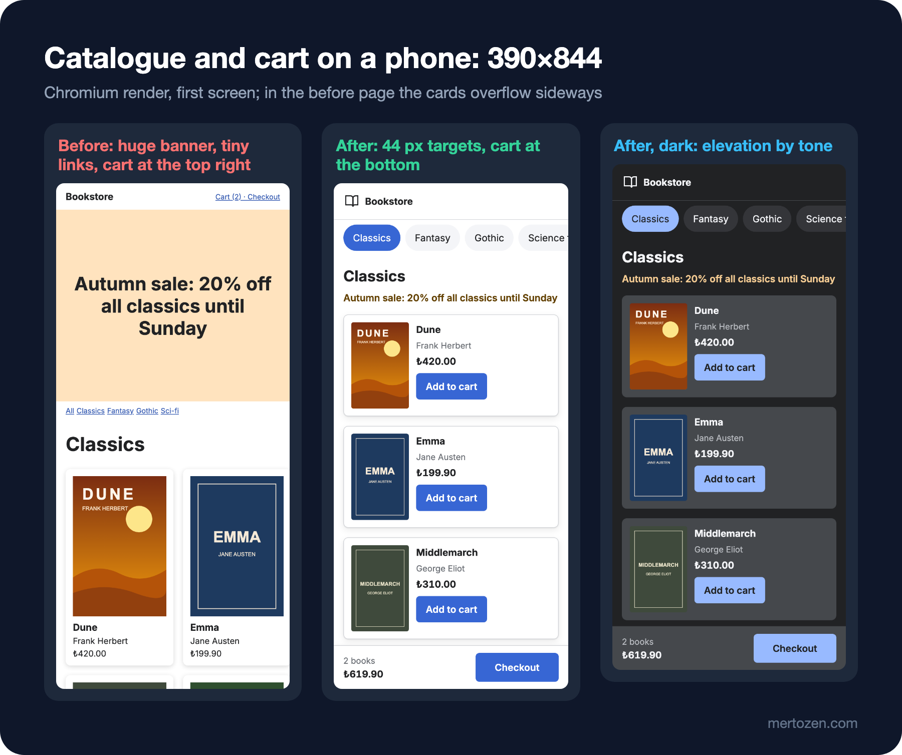
On desktop the grid has three 300-pixel columns. At the top of the page sits a 320-pixel-tall campaign banner, below it 12-pixel category links, and at the top right a small link that says "Cart (2) · Checkout". How does Ada, on a 390-pixel-wide phone, find the button to add a book to the cart? At which screen widths does the page scroll sideways? Is the price of the books visible on a 375-pixel phone? How does someone who uses their phone in dark mode see the covers?
Measure first
The script opens the page at 97 widths, from 320 to 1280 pixels in steps of 10, and checks for horizontal scrolling. Then it emulates a 390×844 phone with touch and no hover: it measures how many cards fit entirely in the first screen, whether "Add to cart" is visible without hover, the size of every touch target, and where Checkout sits on the screen. Finally it renders the same page in dark mode and reads the pixel colours of the card and the background and whether the cover changed:
node scripts/09-responsive.mjs--- before
horizontal scroll at 26 of 97 widths (320–350, 380–390, 770–960 px)
phone 390x844: hover available false; whole cards in the first screen 2; "Add to cart" visible without hover on 0 of 6
targets: 12, failing WCAG 2.5.8 (24 px) 1, under 44 px 12, under 48 px 12
checkout: 108x15 px, centre at 3% of the screen height
at 375 px: price visible on 0 of 6 cards
dark: page 1,1,1, card 0,0,0, card vs page 1.00:1; cover colours changed (inverted)
--- after
horizontal scroll at 0 of 97 widths
phone 390x844: hover available false; whole cards in the first screen 3; "Add to cart" visible without hover on 6 of 6
targets: 12, failing WCAG 2.5.8 (24 px) 0, under 44 px 0, under 48 px 11
checkout: 138x48 px, centre at 96% of the screen height
at 375 px: price visible on 6 of 6 cards
dark: page 33,34,36, card 69,72,76, card vs page 1.73:1; cover colours unchangedThe answers to the guesses are in the before lines: since a phone has no hover, "Add to cart" is visible on none of the six cards; Ada can't find a way to add to the cart. The page scrolls sideways at 26 of the 97 widths; those ranges are exactly the widths that fall between the breakpoints. On a 375-pixel phone none of the six cards shows a price. Checkout is 15 pixels tall and at the very top of the screen. In dark mode the card and the background are the same colour and the covers are reversed like a photo negative.
Mobile First: Decide What Fits First
The real meaning of mobile first is not the order in which you write CSS but a decision about priority: only what is truly needed fits on a 390-pixel screen, so you are forced to decide first what is needed. The before page made that decision backwards. To make room at 375 pixels it hid the price and the author, yet the price is the information users look at most when choosing a book. Meanwhile it kept the 320-pixel decorative banner; more than a third of the first screen goes to a campaign sentence.
In the after page the campaign is a single line of text, right above the book list and in the warning colour; the price, the author and "Add to cart" are visible at every width. The number of cards that fit entirely in the first screen went from 2 to 3, and every card shows its add-to-cart button. Instead of hiding content you change the layout: on a narrow screen the card turns into a horizontal row with the cover on the left and the information on the right.
Content Sets the Breakpoint, Not the Device
The before page's breakpoints were picked by device name: 768 for "iPad", 375 for "iPhone". The measurement shows the cost: between 380 and 390 pixels two 180-pixel columns with their gaps don't fit, between 770 and 960 pixels three 300-pixel columns don't fit, between 320 and 350 the single 340-pixel column doesn't fit. Every new phone size means a new exception. web.dev's Learn Design course also recommends placing breakpoints where the content needs them rather than at device widths, because device sizes change every year.
The after page defines the grid not by a fixed number of columns but by the smallest width a card needs; the browser decides how many columns there are:
/* the grid breaks where the content breaks: a new column whenever 220 px fits */
.grid { display: grid; grid-template-columns: repeat(auto-fill, minmax(min(100%, 220px), 1fr)); gap: var(--space-4); margin: 0; padding: 0; list-style: none; }
A single media query is left on the page, and it is tied to a content decision rather than a device: when the screen reaches 64rem, the cart summary leaves the fixed bar at the bottom and joins the page flow. None of the 97 widths scrolls horizontally. Including 320 pixels in the measurement is no accident: WCAG's AA criterion 1.4.10 Reflow asks that content can be used at a width of 320 CSS pixels without scrolling in two directions; that width corresponds to 400 percent zoom on a 1280-pixel screen. The details of minmax, clamp and the media query range syntax are in the responsive design post of the "CSS3: Flexbox, Grid and Modern CSS" series.
A Component Looks at Its Own Width
The same book card is wide in a single column on a phone, narrow in two columns on a tablet, narrow again in four columns on desktop. Tying the card's layout to the screen width gives the wrong result when you place the card somewhere else, for example in a "You might also like" strip on the cart page. A container query ties a component's layout to the width of its own box:
.card { container-type: inline-size; background: var(--color-surface-raised); border: 1px solid var(--color-border); border-radius: var(--radius-md); box-shadow: var(--shadow-raised); }
.book { display: grid; grid-template-columns: 96px 1fr; gap: var(--space-3); padding: var(--space-3); }

/* the card decides by its own width, not the screen's: narrow card, cover on top */
@container (max-width: 300px) {
  .book { grid-template-columns: 1fr; }
  .book img { max-width: 160px; }
  .add { width: 100%; }
}
On a 390-pixel phone the card is 358 pixels wide, on a 700-pixel screen 326 pixels in two columns, and the cover sits on the left; on a 768-pixel tablet the cards split into three columns and drop to 235 pixels, so the cover moves to the top. That is also how to think about the design decision: not "what does it look like on a phone" but "what happens when this component drops to 280 pixels". Size and style queries are covered in detail in the container query post of the CSS3 series.
Touch Targets: 24, 44 and 48
A finger is a much coarser pointer than a mouse, and more than one number circulates for target size. All of them are right, but they answer different questions:
| Source | Value | Nature |
|---|---|---|
| WCAG 2.2, 2.5.8 Target Size (Minimum) | 24×24 CSS px | AA, lower bound; has a spacing exception |
| WCAG 2.2, 2.5.5 Target Size (Enhanced) | 44×44 CSS px | AAA |
| Apple Human Interface Guidelines | 44×44 pt default, 28×28 pt minimum | iOS and iPadOS controls |
| Material 3 | 48×48 dp | about 9 mm physical size |
2.5.8's spacing exception matters: according to the W3C's explanation, a target smaller than 24 pixels still passes if a 24-pixel-diameter circle placed on its centre doesn't touch another target or the circle of another small target. Links inside a sentence, controls drawn by the browser itself and cases where a larger control does the same job are exceptions too. The script applies this rule exactly, and the result is instructive: all 12 of the before page's targets are under 44 pixels, but only 1, the 14-pixel-wide "All" link, fails 2.5.8. 2.5.8 is a lower bound, not the size of a usable target. The criterion itself recommends aiming for 44 pixels for important links and controls.
The after page raised every target to at least 44 pixels in height, and Checkout to 48. The 11 targets under Material's 48 dp are a deliberate choice: 44 pixels is Apple's default and WCAG's AAA threshold, which is enough for this screen's density. Remember that the visible part of a target can be small while its touchable area is large: in Material's own example a 24 dp icon has a 48 dp touch area thanks to the padding around it. The compact density option from post 05 must stay within these limits as well.
None of the numbers in the table catches the before page's real problem: "Add to cart" appears on hover, and a phone has no hover. The hover available false line in the measurement is the result of matchMedia('(hover: hover)'). Hover can be extra feedback, never the only way to information or an action.
Thumb Reach
The most quoted study of phone use is the observation Steven Hoober published in UXmatters in 2013: of 780 people touching their screens in public places, 49 percent held the phone in one hand, 36 percent cradled it in one hand and used a finger of the other, and 15 percent used two hands. The "thumb zone" drawings in the article spread widely too. But in a note he added under the article in 2017, Hoober said those reach drawings were not accurate and asked readers to ignore them; he said his later work found that people touch the centre of the screen more often, more quickly and more accurately than the edges and corners.
The practical rule that follows is not "put everything at the bottom" but something simpler: put the frequent primary action where it can be reached without changing grip, and put destructive or rare actions in the corners. In the before page Checkout sits at 3 percent of the screen height, in the top right corner, and is 15 pixels tall; the hardest place for someone holding the phone in one hand. In the after page the cart summary and Checkout are in a fixed bar at the bottom, centred at 96 percent of the screen height and 48 pixels tall. The bar's bottom padding uses env(safe-area-inset-bottom), so on phones with a notch and a home indicator it doesn't end up under the system area. The bottom bar suggestion in the previous post rests on the same reasoning; the target itself satisfies both halves of Fitts's law: large and close.
/* the cart sits where the thumb is: a bar at the bottom */
.cart-bar { position: fixed; left: 0; right: 0; bottom: 0; display: flex; justify-content: space-between; align-items: center; gap: var(--space-4); padding: var(--space-3) var(--space-4) calc(var(--space-3) + env(safe-area-inset-bottom));
  background: var(--color-surface-raised); border-top: 1px solid var(--color-border); box-shadow: var(--shadow-raised); }
A fixed bar can cover the last content on the page; that's why the after page gives body a bottom padding equal to the bar's height. Keeping keyboard focus from ending up under this bar is the subject of the 2.4.11 Focus Not Obscured criterion we mentioned in post 07.
Designing Dark Mode as a Theme
filter: invert(1) hue-rotate(180deg) looks like dark mode in one line, but the measurement shows two problems. The first is images: the filter inverts photos and covers too, and Dune's orange cover looks like a photo negative. The second is depth: the white card was separated from the white background only by a shadow; once inverted both are black, the shadow is invisible, and the contrast between card and background is 1.00:1. In post 04 we re-tuned the palette instead of inverting it; here we apply the same idea to elevation:
/* 09: elevation: shadow in the light theme, a lighter tone in the dark theme */
:root {
  --color-surface-raised: #ffffff;
  --shadow-raised: 0 1px 2px rgb(0 0 0 / 0.08), 0 4px 12px rgb(0 0 0 / 0.08);
}
@media (prefers-color-scheme: dark) {
  :root:not([data-theme="light"]) {
    --color-surface-raised: var(--gray-800);
    --shadow-raised: none;
  }
}
In the light theme a raised surface is white with a shadow; in the dark theme there is no shadow, but the surface is a lighter tone than the background. The difference between card and background is 1.73:1; not text contrast, but enough to separate surfaces from each other. The platform guidelines take the same path: Material 3 separates surfaces in the dark theme with the surface role and five levels of surface container roles, and Apple's Human Interface Guidelines define two sets of background colours in Dark Mode: dimmer "base" colours for the interface that recedes, brighter "elevated" colours for popovers and modals that come forward.
Images and the logo are theme decisions too. The covers are photos and illustrations, so they stay the same in both themes; the logo in the after page is an inline SVG that uses stroke="currentColor", so it follows the text colour and is dark in the light theme and light in the dark theme by itself. A coloured logo or a product photo on a transparent background may need a second file in a picture element with media="(prefers-color-scheme: dark)".
The last decision is respecting the user's preference. The default is the operating system setting (prefers-color-scheme); if the site also offers a theme option, it usually has three choices: System, Light, Dark. The :root:not([data-theme="light"]) selector in the tokens keeps the light theme when the user explicitly chooses "Light", even if the system is dark. Storing the preference and applying it with light-dark() is in the custom properties and theming post of the CSS3 series, and its Tailwind counterpart in the theme post of the Tailwind CSS series.
In Production
Emulation doesn't replace a real device. Playwright's mobile emulation imitates the viewport, touch and the absence of hover correctly, but not the physical screen size, the thickness of a finger, readability in sunlight or how the user holds the phone. The measurements are for catching mistakes early; the final check belongs on a real phone.
Take the user's text size setting into account. For someone who increases the browser's default font size, the 64rem breakpoint written in rem moves with the text; values written in pixels don't. The after page's 220-pixel card minimum is still a weak point in this respect: with a large font setting the text inside the card can get cramped, and converting the value to rem is the fix.
Check dark mode separately on every screen. Third-party content such as charts, code blocks, embedded maps and video players doesn't know your tokens; the most common dark mode bug is a chart drawn for the light theme disappearing on a dark background.
Common Pitfalls
First, tying information or an action only to hover. Touch screens have no hover; hover can only be extra feedback.
Second, picking breakpoints by device name. Every width between two breakpoints is a candidate bug; define the grid by the content's minimum width.
Third, hiding important information to make room on a narrow screen. First shrink what is decorative, then change the layout, and only then shorten the content.
Fourth, taking WCAG 2.5.8's 24 pixels as the target. It is a lower bound; aim for 44–48 pixels for primary actions.
Fifth, inverting dark mode with a filter. Images break and depth given by shadows disappears; you need a separate set of tokens that separates surfaces by tone.
A Small Experiment
★☆☆ Run the script's width scan for the after page again in 2-pixel steps and print the widths where the number of columns changes. Calculate the change points from the 220-pixel minimum, the 16-pixel gap and the page padding first, then compare with the measurement.
★★☆ Reduce the links in the category strip to 32 pixels and set the gap between them to 4 pixels. Guess the script's numbers for 2.5.8, 44 and 48 pixels first, then measure; interpret how 2.5.8's spacing exception changes the result.
★★★ Add a theme picker to the page that offers System, Light and Dark; the choice should be applied through the data-theme attribute and kept when the page is opened again. Add to the tokens the rule needed for a user who picks Dark while the system is in light mode, and run the script's dark measurement for that case too.
In the next post we connect the tokens and components we added one by one in these nine posts into a system: we will see that a design system consists of tokens, components, usage rules and governance, look at the primitive, semantic and component token layers and the DTCG 2025.10 format, and generate CSS and Tailwind output from a single source.