

Typography: Type Scale, Line Height, Line Length, Font Choice and Turkish Characters

Good typography rests on a few rules: a single-ratio type scale, 45–75 characters per line, 1.5–1.6 line-height for body text and tabular figures in tables. On Bookstore's book page we measure and fix 146-character lines and drifting decimal points, and show in Chromium the ch unit's trap in Inter, the ğ, ş, İ and ₺ missing from the latin subset, and the i that uppercases wrongly without lang.
Version note: The example screens in this post were rendered and measured in Chromium 158 with Playwright 1.65; the scripts were run with Node.js 24. Font: Inter, from the @fontsource-variable/inter 5.3 package.
Predict First
The book page of bookstore-web, the client of Bookstore, the online bookstore used as the shared example across this site's series, has an "About this book" section and a price table of editions. The page's styles look like this:
body { color: #222; font-size: 15px; }
.page { max-width: 1100px; margin: 0 auto; padding: 24px; }
.title { font-size: 23px; text-transform: uppercase; margin: 0; }
.author { font-size: 17px; margin: 4px 0 24px; }
.section { font-size: 19px; margin: 24px 0 8px; }
.desc { font-size: 15px; }
.editions { border-collapse: collapse; font-size: 14px; }
.editions td { padding: 4px 24px 4px 0; }
.price { text-align: right; }
Three questions. On a 1280-pixel-wide screen, how many characters fit on one line of the description paragraph? The price column is right-aligned; do the decimal points of ₺189.90, ₺418.00, ₺1,111.00 and ₺111.10 line up? The last question is about Turkish catalogue data: how does the same text-transform: uppercase write the category name "bilim kurgu" on an English page?
In the previous post we built the hierarchy of the book detail page with size, weight and colour, but left the values as plain numbers. In this post we tie typography to a system: type scale, line length, line-height, font choice, figures and Turkish characters.
Type Scale: Few Sizes, One Ratio
The before page uses five different font sizes: 14, 15, 17, 19 and 23 pixels. None follows a rule; each was picked on the day it was written, with "a bit bigger". The problem isn't only aesthetic: the difference between 15 and 17 pixels reads as inconsistency rather than hierarchy, and the next developer adds 16 or 18 as well.
A modular type scale solves this with a base size and a ratio: each step is the previous one times the ratio. Common ratios are 1.2 (minor third), 1.25 (major third) and 1.333 (perfect fourth); the names come from musical intervals. Let's calculate with a 16-pixel base:
// Modular type scale: base * ratio^step, for steps -1..4
const base = 16;
for (const [name, ratio] of [['minor third', 1.2], ['major third', 1.25], ['perfect fourth', 1.333]]) {
  const steps = [-1, 0, 1, 2, 3, 4].map((s) => base * ratio ** s);
  console.log(`${name.padEnd(15)} ${ratio}: ${steps.map((v) => v.toFixed(1)).join(' / ')}  ->  ${steps.map((v) => Math.round(v)).join(' / ')}`);
}
minor third 1.2: 13.3 / 16.0 / 19.2 / 23.0 / 27.6 / 33.2 -> 13 / 16 / 19 / 23 / 28 / 33
major third 1.25: 12.8 / 16.0 / 20.0 / 25.0 / 31.3 / 39.1 -> 13 / 16 / 20 / 25 / 31 / 39
perfect fourth 1.333: 12.0 / 16.0 / 21.3 / 28.4 / 37.9 / 50.5 -> 12 / 16 / 21 / 28 / 38 / 51The larger the ratio, the faster headings grow. At 1.333 the fourth step is 51 pixels, too much for an e-commerce page. At 1.2 the steps are very close to each other, and the difference between 16 and 19 is weak. For Bookstore I chose 1.25: 13, 16, 20, 25, 31, 39. These six values are enough to place every text on the book page. The ratio is a starting point; rounding the calculated value to a whole pixel, and adjusting a step by hand if needed, is normal.
The values live as tokens in a single file. This file will grow with colour and spacing tokens in the following posts of the series:
/* Bookstore design tokens. 03: typography */
:root {
  --font-sans: "Inter", system-ui, -apple-system, "Segoe UI", Roboto, sans-serif;

  /* type scale: 16px base, ratio 1.25, rounded to whole pixels */
  --text-sm: 0.8125rem;  /* 13px */
  --text-base: 1rem;     /* 16px */
  --text-lg: 1.25rem;    /* 20px */
  --text-xl: 1.5625rem;  /* 25px */
  --text-2xl: 1.9375rem; /* 31px */
  --text-3xl: 2.4375rem; /* 39px */

  --weight-regular: 400;
  --weight-semibold: 600;
  --weight-bold: 700;

  --leading-tight: 1.2;  /* headings */
  --leading-normal: 1.5; /* UI text */
  --leading-prose: 1.6;  /* long reading text */

  --measure: 52ch;       /* about 66 characters of Inter body text */
}
The values are in rem; when users increase the default font size in their browser, the whole scale grows with it. Weights are limited to three as well. Using clamp() for headings that grow fluidly with the screen width can be layered on top of this scale; the mechanics were covered in the responsive design and fluid typography post of the "CSS3: Flexbox, Grid and Modern CSS" series.
Line Length and Line-height
The most overlooked setting for readability is line length. If a line is too long, the eye loses its place on the way back from the end of one line to the start of the next; if it's too short, constant line breaks get tiring. web.dev's Learn Design course, drawing on research, gives 45 to 75 characters per line as comfortable and around 66 as ideal. WCAG success criterion 1.4.8, at level AAA, also asks that lines in blocks of text not exceed 80 characters.
The measurement script creates a Range for every character of the description paragraph, finds the line it sits on and counts characters per line:
node scripts/03-typography.mjs--- before @1280px: font sizes 14/15/17/19/23
description: 15px, line-height normal, 4 lines, avg 146 chars/line, max 148
price decimal points x: 291.8, 291.9, 291.9, 295.9 (spread 4.1px)
--- after @1280px: font sizes 13/16/20/39
description: 16px, line-height 25.6px, 8 lines, avg 66 chars/line, max 68
price decimal points x: 330.4, 330.4, 330.4, 330.4 (spread 0.0px)
--- "Inter Latin Only": web font 70 glyphs, system fallback 5 glyphs
--- Inter: web font 75 glyphs, system fallback 0 glyphs
--- not in the latin subset: ş İ ğ ₺
--- uppercase lang="en": BILIM KURGU · ŞIIR · ÇIZGI ROMAN
--- uppercase lang="tr": BİLİM KURGU · ŞİİR · ÇİZGİ ROMANThe answer to the first question: on the before page there are on average 146 characters per line, twice the ideal range. On the after page, 66.
There's a trap here. For line length, max-inline-size: 66ch is the usual advice. But the ch unit is the width of the font's "0" character. In Inter at 16 pixels, "0" is 10.1 pixels wide, while the average character in English text is narrower. My first try with 66ch measured 85 characters per line on average; with 52ch it came down to 66. So don't treat ch as a font-independent "character count"; measure with your own font. The 52ch in the token is the result of that measurement.
Line-height gives long text room to breathe. The before page's normal is about 1.2 for Inter; with 15-pixel text and 146-character lines, the lines stick together. For body text, 1.5 to 1.6 is a good start; longer lines need more spacing. Headings are the opposite: at large sizes a 1.5 line spacing makes the two lines of a heading look disconnected, so headings sit around 1.2. Writing the values unitless matters; 1.6 scales with the font size, 24px doesn't.
WCAG 2.2 success criterion 1.4.12 Text Spacing, at level AA, also affects design: when users raise line-height to 1.5 times the font size, paragraph spacing to 2 times, letter spacing to 0.12 and word spacing to 0.16 times, content must not be cut off or overlap. Fixed-height cards and headings clipped with overflow: hidden are where this test fails most often.
Font Choice: System Font or Web Font?
There are two options, and each has a different cost.
A system font stack (system-ui, Segoe UI on Windows, Roboto on Android) needs no download, the page opens with the right font at once and looks like the rest of the user's operating system. The cost is a different font on every platform: metrics, line breaks and character widths change; the ch calculation above gives a different result on each system.
A web font gives the brand a voice and the same metrics on every platform. The cost is download time and deciding what to show until the font arrives. For Bookstore I chose Inter: openly licensed (OFL), with good support for figures and Turkish characters, and as a variable font it carries every weight from 100 to 900 in one file. In the @fontsource-variable/inter package, the latin subset file is 48,256 bytes and the latin-ext file 85,068 bytes. A variable font is usually cheaper than downloading three files for three separate weights.
The performance side of font loading (font-display, preload, layout shift) is not this post's subject; it will be covered, together with Turkish subsets, in the image and font optimisation post of the upcoming "Web Performance" series. From a design point of view, the rule is: decide up front how many font families you will use. One family is enough for most products; two, for headings and body, is the upper limit.
Figures: Tabular Numbers
The answer to the second question is in the measurement: on the before page, although the price column is right-aligned, the x positions of the decimal points range from 291.8 to 295.9 pixels, a 4.1-pixel drift. The reason is proportional figures: in Inter, "1" is narrower than "0" by default. Because the "10" in ₺111.10 and the "00" in ₺418.00 have different widths, the point shifts and the eye can't compare digits while scanning the column.
The fix is one line: font-variant-numeric: tabular-nums draws all figures at the same width. On the after page all four points sit at 330.4 pixels. Use tabular figures for every number that changes or is compared in a column: price lists, cart totals, order tables and counters. A single number inside a paragraph doesn't need it; there, proportional figures flow better with the text. If the font doesn't support the feature, CSS can't help, so look at the figures when choosing a font.
Turkish Character Traps
Missing letters in a font subset
Web fonts are usually split into subsets by language group; the browser downloads only the files that the page's characters fall into. Imagine a project that kept only the latin subset "to keep the file small". According to the ranges in the package's unicode.json, the latin subset contains Ç, Ö, Ü and dotless ı, but ğ, ş, İ and ₺ are in latin-ext. I tried this in a lab page with an @font-face that loads only the latin file:
<style>
  /* only the latin subset, no latin-ext */
  @font-face {
    font-family: "Inter Latin Only";
    font-weight: 100 900;
    src: url("/node_modules/@fontsource-variable/inter/files/inter-latin-wght-normal.woff2") format("woff2");
  }
  .latin-only { font-family: "Inter Latin Only", serif; }
  .full { font-family: "Inter", serif; }
  .label { text-transform: uppercase; letter-spacing: 0.06em; font-weight: 600; }
</style>
<p class="latin-only" id="a1" lang="tr">Çalıkuşu · İnce Memed · Ağrı Dağı Efsanesi · Kürk Mantolu Madonna · ₺420.00</p>
<p class="full" id="a2" lang="tr">Çalıkuşu · İnce Memed · Ağrı Dağı Efsanesi · Kürk Mantolu Madonna · ₺420.00</p>
<p class="full label" id="b1" lang="en">bilim kurgu · şiir · çizgi roman</p>
<p class="full label" id="b2" lang="tr">bilim kurgu · şiir · çizgi roman</p>
The script asks, through the Chrome DevTools Protocol command CSS.getPlatformFontsForNode, which font drew which glyph in each paragraph. According to the output, with only the latin subset five glyphs (ş, İ, two ğ and ₺) fall back to the system's fallback font; with both subsets loaded the fallback count is zero. On screen this shows up as a letter from another font in the middle of a word:
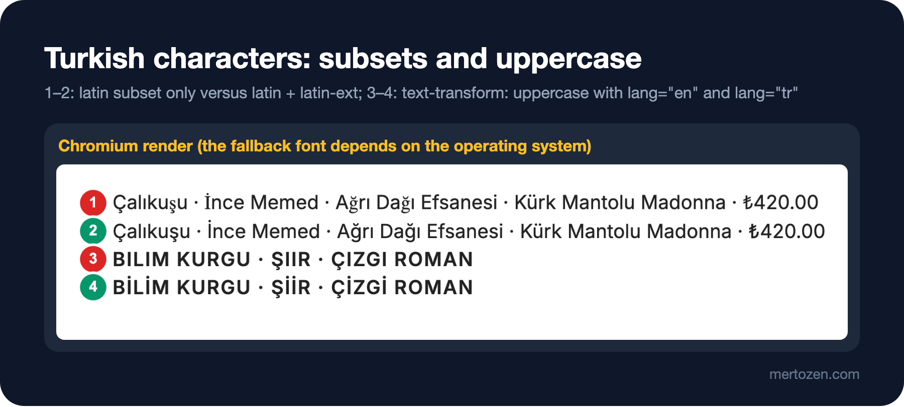
In the first line İ, ğ, ş and ₺ come from a serif font; on Windows the fallback font is different, but the problem is the same. Even a page with an English interface needs latin-ext if it shows Turkish catalogue data and the ₺ sign. When choosing a font and setting up subsets, check with a Turkish test sentence; a font checked only with "Lorem ipsum" won't show this problem.
text-transform and lang
The answer to the third question is in the output too. text-transform: uppercase maps case according to the page's language. In an element with lang="en", "bilim kurgu" becomes BILIM KURGU: in English the uppercase of i is I. In Turkish, the uppercase of i is İ and of ı is I; with lang="tr" the result is BİLİM KURGU. MDN also notes that the transformation follows language-specific rules and that the language is taken from the lang attribute.
The practical consequence: a Turkish interface needs <html lang="tr">. If the interface is English but the content is Turkish (like the book and category names in Bookstore), give lang="tr" to the element that carries the Turkish data. The same rule applies in JavaScript: use toLocaleUpperCase('tr-TR') instead of toUpperCase().
Letter spacing in uppercase headings
The ascenders and descenders of lowercase letters give a word its shape; in uppercase text that shape is lost and letters sit close together. That is why opening up the letter spacing a little on short uppercase labels (letter-spacing: 0.06em on the after page) makes reading easier. Never set long text in uppercase; sentence case also reads more easily in headings. The before page's "MIDDLEMARCH" heading became "Middlemarch" on the after page; uppercase remained only in the small section labels.
The Book Page: Before and After
The after styles take every value from the tokens:
body { color: #222; font-family: var(--font-sans); font-size: var(--text-base); line-height: var(--leading-normal); }
.page { max-width: 1100px; margin: 0 auto; padding: 24px; }
.title { font-size: var(--text-3xl); line-height: var(--leading-tight); margin: 0; }
.author { font-size: var(--text-lg); margin: 4px 0 24px; }
.section {
  font-size: var(--text-sm);
  font-weight: var(--weight-semibold);
  text-transform: uppercase;
  letter-spacing: 0.06em;
  margin: 32px 0 8px;
}
.desc { max-inline-size: var(--measure); line-height: var(--leading-prose); margin: 0; }
.editions { border-collapse: collapse; }
.editions td { padding: 4px 24px 4px 0; }
.price { text-align: right; font-variant-numeric: tabular-nums; }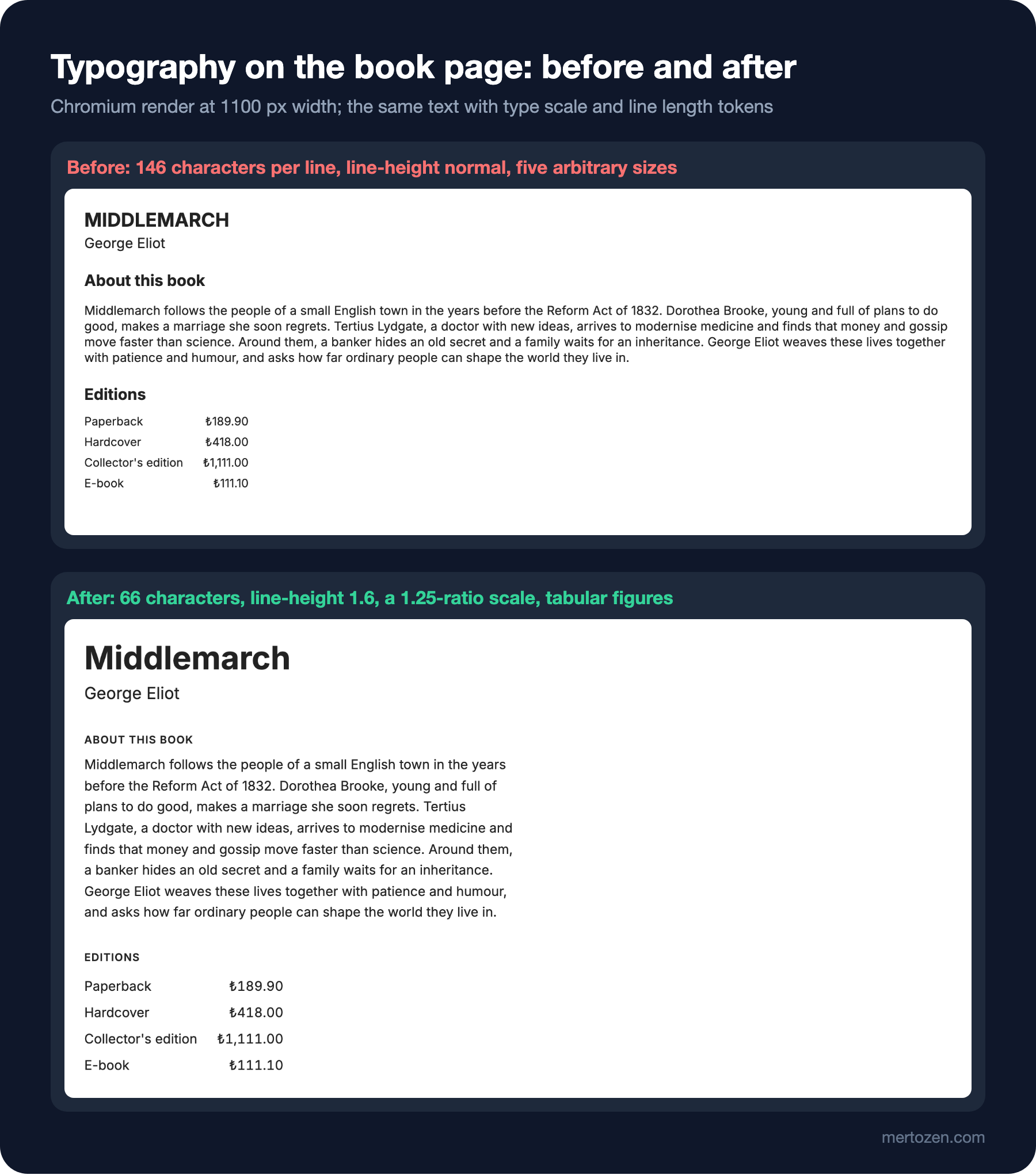
The number of font sizes dropped from five to four (13, 16, 20, 39), and all four come from the scale. The description grew to 8 lines, but each line is a length you can read at a glance. Section headings got smaller and turned uppercase: on this page the book's title is the only big heading, and "About this book" is a label that groups content. That is the typographic counterpart of the hierarchy rule from the previous post.
In Production
Keep the type scale in one place in code and catch hard-coded pixel values in components during code review. The style audit script from this post can be extended to warn in CI when it finds a font size on the page that isn't on the scale. In projects using Tailwind, the same scale is defined inside @theme; the details are in the themes and design tokens post of the upcoming "Tailwind CSS" series.
Test with real content. Book titles can be short ("Emma") or long ("Saatleri Ayarlama Enstitüsü"); a 39-pixel heading can wrap to three lines on a narrow screen. Render the design with the longest real data and with Turkish data, then decide.
Respect the user's font size preference. For a user who sets the browser default to 20 pixels, a rem-based scale grows proportionally; don't break that preference with tricks like font-size: 62.5% on the root or with pixel values.
Common Pitfalls
First, adding a new font size for every need. A 15 or 17 pixels that isn't on the scale is the first sign the system is starting to fall apart.
Second, not limiting line length. A paragraph that flows full-width on a wide screen produces, as we measured, 146-character lines.
Third, treating ch as font-independent. 66ch is about 85 characters in Inter; measure the value with your own font.
Fourth, leaving proportional figures in prices and tables. Even a right-aligned column doesn't line up without tabular figures.
Fifth, not testing Turkish: ğ, ş, İ and ₺ falling back in a missing subset, and i turning into I in an uppercase transformation without lang.
A Small Experiment
★☆☆ Set --measure to 66ch in tokens.css and run 03-typography.mjs. Predict the average number of characters per line first, then measure.
★★☆ Add the text KIRMIZI KEDİ to turkish.html with lang="en" and text-transform: lowercase. Predict the result, then compare it with the same text under lang="tr", and add a line to the script that prints the innerText values.
★★★ Rebuild the type scale with a ratio of 1.2 and render both the book page and the previous post's book detail page with it. Compared with 1.25, judge with the squint test and the style audit output whether the difference between the title and the price is still enough.
The next post is about colour: building a palette from a brand colour, a neutral scale and semantic colours, producing perceptually even shades with OKLCH, calculating WCAG 2.2 contrast ratios with our own script, the current state of APCA, and re-tuning the dark mode palette instead of inverting it.