

Color and Contrast: Building a Palette, Semantic Colors, OKLCH and WCAG Contrast Ratios

An interface palette is made of a brand colour, a neutral scale and semantic colours; with OKLCH and the same lightness steps, the same-numbered shade of every colour gives almost the same contrast against white. In Bookstore's catalogue we measure WCAG 2.2 ratios with our own script and axe-core, fix 8 failing texts and a stock status shown by colour alone, re-tune dark mode instead of inverting it, and explain where APCA stands today.
Version note: The example screens in this post were rendered and measured in Chromium 158 with Playwright 1.65; contrast ratios were computed with our own script implementing the WCAG 2.2 formula and cross-checked with axe-core 4.14. The scripts were run with Node.js 24.
Predict First
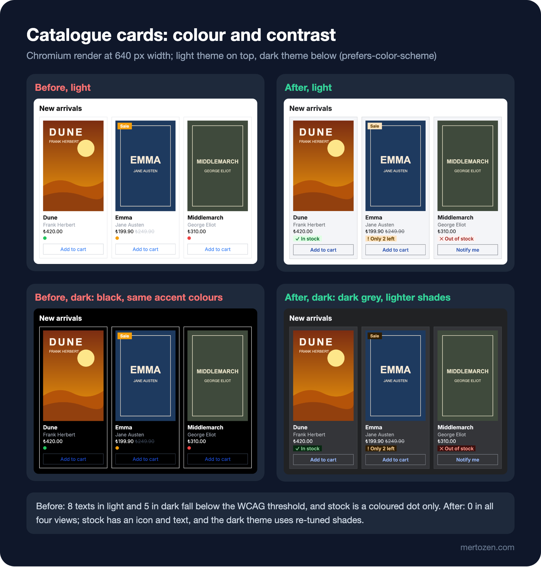
The "New arrivals" section of bookstore-web, the client of Bookstore, the online bookstore used as the shared example across this site's series, shows three book cards. Each card has the author's name, the price, a sale badge, the stock status and a button. The colours were picked like this:
.author { color: #9ca3af; }
.price s { color: #d1d5db; }
.badge { position: absolute; top: 16px; left: 16px; padding: 2px 8px; background: #f59e0b; color: #fff; font-size: 12px; font-weight: 700; }
.dot { display: inline-block; width: 10px; height: 10px; border-radius: 50%; }
.dot.in { background: #22c55e; }
.dot.low { background: #f59e0b; }
.dot.out { background: #ef4444; }
.btn { margin-top: 6px; width: 100%; padding: 6px; border: 1px solid #d1d5db; background: transparent; color: #3b82f6; font: inherit; font-size: 14px; }

/* dark mode: swap black and white, keep the accent colors */
@media (prefers-color-scheme: dark) {
  body { background: #000; color: #fff; }
  .card { border-color: #fff; }
  .btn { border-color: #374151; color: #1d4ed8; }
  .price s { color: #374151; }
}
How many texts on these cards fall below the WCAG contrast threshold? How does a user who can't see colour find out the stock status, that is, whether the book can be added to the cart at all? And since the accent colours are kept in dark mode, do the problems shrink there, or grow?
In the previous post we tied typography to tokens. In this post we build the colour palette, measure contrast ratios with our own script, and design dark mode as a separately tuned theme rather than an inverted copy of the light one.
The Layers of a Palette: Brand, Neutral and Semantic
The colours on the before page were picked one by one: one from Tailwind's grey, one from a campaign image, one because "green looks nice". A palette, by contrast, has three groups, and every colour has a job.
The brand colour identifies the product and marks actions; in Bookstore it is blue. The neutral scale carries most of the interface: text, secondary text, background, surface, borders. Eighty percent of a screen is neutral, which is why the number of shades in the neutral scale matters at least as much as the brand colour's. Semantic colours carry meaning: success (green), warning (amber), danger (red) and info (often the brand blue). "In stock" is green, "only 2 left" amber, "out of stock" red.
Each colour has not one value but an eleven-step scale from 50 to 950. The reason is simple: the same blue is a button background in one place, link text in another, the light background of a selected row elsewhere, and a light accent in dark mode. Each of those jobs wants a different lightness. The separation between a shade's name (blue-600) and where it is used (color-action) is the subject of design token layers; we'll cover it in detail in this series' post on design systems.
Producing Even Shades with OKLCH
The easiest way to build a scale is to use the same lightness steps for every hue. That needs a colour space that measures lightness the way the human eye perceives it. HSL's lightness doesn't do that; in the modern colour post of the "CSS3: Flexbox, Grid and Modern CSS" series we measured that the contrast of white text on a yellow and a blue with the same HSL lightness ranges from 1.07 to 8.59. OKLCH was designed for exactly this. The palette script uses the same eleven lightness values for five colours and keeps chroma highest in the middle shades:
// 11-step scales: same lightness steps for every hue, chroma highest in the middle.
const steps = { 50: 0.97, 100: 0.93, 200: 0.87, 300: 0.79, 400: 0.7, 500: 0.62, 600: 0.54, 700: 0.47, 800: 0.4, 900: 0.33, 950: 0.25 };
const hues = { blue: [264, 0.2], gray: [264, 0.012], green: [150, 0.16], amber: [75, 0.17], red: [27, 0.2] };
const white = [255, 255, 255];

const css = [];
const ours = [];
for (const [name, [h, peak]] of Object.entries(hues)) {
  const row = [];
  for (const [step, l] of Object.entries(steps)) {
    const c = peak * Math.max(0.15, 1 - Math.abs(l - 0.6) * 1.8);
    const { rgb, chroma } = toSrgb(l, c, h);
    css.push(`  --${name}-${step}: oklch(${l} ${chroma} ${h}); /* ${hex(rgb)} */`);
    ours.push([`oklch(${l} ${chroma} ${h})`, rgb]);
    row.push(`${step}:${ratio(rgb, white).toFixed(2)}`);
  }
  console.log(`${name.padEnd(5)} vs white  ${row.join(' ')}`);
}
node scripts/04-palette.mjs --checkblue vs white 50:1.09 100:1.23 200:1.48 300:1.94 400:2.72 500:3.77 600:5.21 700:7.00 800:9.41 900:12.46 950:16.12
gray vs white 50:1.09 100:1.22 200:1.48 300:1.92 400:2.68 500:3.64 600:5.05 700:6.81 800:9.16 900:12.24 950:15.96
green vs white 50:1.07 100:1.20 200:1.43 300:1.85 400:2.53 500:3.40 600:4.71 700:6.44 800:8.82 900:11.74 950:15.73
amber vs white 50:1.09 100:1.23 200:1.49 300:1.95 400:2.73 500:3.71 600:5.16 700:6.95 800:9.32 900:12.36 950:16.13
red vs white 50:1.09 100:1.23 200:1.51 300:2.03 400:2.87 500:3.98 600:5.52 700:7.37 800:9.76 900:12.74 950:16.41
Chromium check: 55 colors, largest channel difference 1/255How to read the table: the shade with the same number gives almost the same contrast against white, whatever the colour. Shade 600 is between 4.71 and 5.52 for all five colours, so it is enough for normal text on a white background. Shade 500 is between 3.40 and 3.98; enough for large text and UI components, not for normal text. That makes the design decision easier: the rule "text colour on white is at least 600" holds for every colour. You couldn't write that rule in HSL, because yellow's 600 and blue's 600 would look nothing alike.
The script's toSrgb function converts OKLCH to sRGB with the OKLab matrices that CSS Color 4 uses. If a colour falls outside the sRGB range a screen can show, it keeps lightness and hue and lowers chroma; that is why green 50 ends up with less chroma than targeted. The --check flag has Chromium convert the same 55 values (by painting them on a canvas and reading the pixel), and the largest difference is 1 out of 255. Don't trust contrast calculations from your own formula without comparing it against a browser.
WCAG 2.2 Thresholds and Measuring the Catalogue
WCAG 2.2 has two thresholds for text: at least 4.5:1 for normal text and at least 3:1 for large text. Large text is 18 points, or 14 points bold; according to the W3C's explanation that is about 24 pixels, or 18.66 pixels bold. For non-text items, success criterion 1.4.11 Non-text Contrast asks that the visual information needed to identify a UI component and its state (for example the border of an input or of a button without a background) reach at least 3:1 against its surroundings. Inactive components and logos are exempt from these rules.
The ratio is calculated from the relative luminance of the two colours. The formula in our script is a direct translation of the W3C definition:
// WCAG 2.2 relative luminance and contrast ratio (sRGB, threshold 0.04045).
export function channel(c8) {
  const c = c8 / 255;
  return c <= 0.04045 ? c / 12.92 : ((c + 0.055) / 1.055) ** 2.4;
}

export function luminance([r, g, b]) {
  return 0.2126 * channel(r) + 0.7152 * channel(g) + 0.0722 * channel(b);
}

export function contrast(a, b) {
  const [hi, lo] = [luminance(a), luminance(b)].sort((x, y) => y - x);
  return (hi + 0.05) / (lo + 0.05);
}

// Floors to two decimals so that 4.499 is reported as 4.49, never 4.50.
export const ratio = (a, b) => Math.floor(contrast(a, b) * 100) / 100;
Rounding down on the last line is deliberate. The W3C's explanation says the computed value must not be rounded: 4.499:1 does not meet the 4.5:1 threshold. Many tools round the result up to two decimals and can make a borderline colour look like a pass. The threshold constant is 0.04045; the W3C notes that the 0.03928 found in older texts was corrected in 2021 and makes no practical difference to results.
The measurement script reads the colour and background of every visible text, compares them with the threshold, measures button borders against the card's background and cross-checks the result with axe-core's color-contrast rule. To turn colours written with oklch() into bytes it again uses a canvas:
node scripts/04-contrast.mjs--- before / light: 8 of 15 texts below WCAG, axe color-contrast nodes: 8
text Frank Herbert #9ca3af on #ffffff 2.53 < 4.5
text Add to cart #3b82f6 on #ffffff 3.67 < 4.5
text Sale #ffffff on #f59e0b 2.14 < 4.5
text Jane Austen #9ca3af on #ffffff 2.53 < 4.5
text ₺249.90 #d1d5db on #ffffff 1.47 < 4.5
text Add to cart #3b82f6 on #ffffff 3.67 < 4.5
text George Eliot #9ca3af on #ffffff 2.53 < 4.5
text Add to cart #3b82f6 on #ffffff 3.67 < 4.5
button border vs card, lowest 1.47 (needs 3)
stock 3 statuses shown only as a colored dot
--- after / light: 0 of 21 texts below WCAG, axe color-contrast nodes: 0
button border vs card, lowest 3.35 (needs 3)
--- before / dark: 5 of 15 texts below WCAG, axe color-contrast nodes: 5
text Add to cart #1d4ed8 on #000000 3.13 < 4.5
text Sale #ffffff on #f59e0b 2.14 < 4.5
text ₺249.90 #374151 on #000000 2.03 < 4.5
text Add to cart #1d4ed8 on #000000 3.13 < 4.5
text Add to cart #1d4ed8 on #000000 3.13 < 4.5
button border vs card, lowest 2.03 (needs 3)
stock 3 statuses shown only as a colored dot
--- after / dark: 0 of 21 texts below WCAG, axe color-contrast nodes: 0
button border vs card, lowest 3.35 (needs 3)The first answer to the prediction: in the light theme, 8 of 15 texts fall below the threshold, and axe finds exactly 8 nodes too. The worst is the struck-through old price at 1.47:1; the decision "the old price doesn't matter, make it faint" produced a price nobody can read. The white "Sale" text on amber is 2.14:1. The button border against the card background is 1.47:1; the button turns into blue text with no visible boundary.
Don't Convey Information by Colour Alone
The answer to the second question: they can't. On the before page the stock status is only a green, amber or red dot; the only text is a title that appears on mouse hover. WCAG success criterion 1.4.1 Use of Color, at level A, requires that colour not be the only visual means of conveying information. This isn't only a problem for colour-blind users: anyone looking at a phone in sunlight, using a greyscale e-ink screen, or not knowing what red and green mean here gets stuck at the same point.
The fix comes in three parts: icon, text and colour together. On the after page each stock status comes with a symbol (✓, !, ✕), a short text ("In stock", "Only 2 left", "Out of stock") and a semantic colour pair. Colour is still the fastest cue, but not the only one. The out-of-stock book's button also changed from "Add to cart" to "Notify me"; a restriction expressed by colour was replaced by a useful action.
Semantic Colours and the After Page
Components don't use a shade like --blue-600 directly; they use a semantic token that gives it a job name. That way only this mapping changes in dark mode, and the component styles stay the same:
/* 04: semantic colors, light theme */
:root {
  color-scheme: light;
  --color-bg: #ffffff;
  --color-surface: var(--gray-50);
  --color-text: var(--gray-950);
  --color-text-muted: var(--gray-600);
  --color-border: var(--gray-200);        /* decorative dividers */
  --color-border-strong: var(--gray-500); /* borders that identify a control */
  --color-action: var(--blue-600);
  --color-action-hover: var(--blue-700);
  --color-on-action: #ffffff;
  --color-link: var(--blue-700);
  --color-success-text: var(--green-700);
  --color-success-bg: var(--green-50);
  --color-warning-text: var(--amber-800);
  --color-warning-bg: var(--amber-100);
  --color-danger-text: var(--red-700);
  --color-danger-bg: var(--red-50);
}
The difference between the two border tokens comes from 1.4.11. The thin line between cards is decorative; it isn't needed for identification, so it can be gray-200. The border of a button without a background, however, is the only visual information that makes it a button; it must exceed 3:1, and gray-500 gives 3.35:1 against the card's gray-50 background. The card styles now know only token names:
.author { color: var(--color-text-muted); }
.price s { color: var(--color-text-muted); }
.badge { position: absolute; top: 16px; left: 16px; padding: 2px 8px; background: var(--color-warning-bg); color: var(--color-warning-text); font-size: 12px; font-weight: 700; }
.stock { display: inline-flex; gap: 4px; padding: 0 6px; font-weight: 600; }
.stock.in { background: var(--color-success-bg); color: var(--color-success-text); }
.stock.low { background: var(--color-warning-bg); color: var(--color-warning-text); }
.stock.out { background: var(--color-danger-bg); color: var(--color-danger-text); }
.btn { margin-top: 6px; width: 100%; padding: 6px; border: 1px solid var(--color-border-strong); background: transparent; color: var(--color-link); font: inherit; font-size: 14px; font-weight: 600; }
The "Sale" badge went from white text on bright amber to dark amber text on light amber (amber-800 text on an amber-100 background, 7.53:1). The badge draws attention through its position over the cover and its weight, not through the brightness of its colour.
Dark Mode: Re-tune, Don't Invert
The answer to the third question is in the measurement: in the before page's dark mode the problems don't shrink, they move. The grey author names became readable on black, but the dark blue button text (#1d4ed8) dropped to 3.13:1 on black and the old price to 2.03:1. Dark shades chosen for a light theme disappear on a dark background. Pure black with pure white text gives the highest contrast, 21:1, but since there is no darker shade below black, there is also no way to separate cards and dropdowns from the background: shadows don't show on black.
That is why the dark theme guidance of Material Design's second version, M2, recommends a dark grey surface (#121212) instead of pure black, uses lighter, less saturated shades of the accent colours (the 200 tone) and shows raised surfaces with a lighter shade in addition to a shadow. Material 3 builds the same idea from a tonal palette rather than a fixed hex value: surfaces step up through the surface role and five surface container roles. Bookstore's dark theme follows the same logic:
/* 04: dark theme, re-tuned rather than inverted */
@media (prefers-color-scheme: dark) {
  :root:not([data-theme="light"]) {
    color-scheme: dark;
    --color-bg: var(--gray-950);
    --color-surface: var(--gray-900);
    --color-text: var(--gray-50);
    --color-text-muted: var(--gray-300);
    --color-border: var(--gray-800);
    --color-border-strong: var(--gray-500);
    --color-action: var(--blue-300);
    --color-action-hover: var(--blue-200);
    --color-on-action: var(--gray-950);
    --color-link: var(--blue-300);
    --color-success-text: var(--green-300);
    --color-success-bg: var(--green-950);
    --color-warning-text: var(--amber-200);
    --color-warning-bg: var(--amber-950);
    --color-danger-text: var(--red-300);
    --color-danger-bg: var(--red-950);
  }
}
The background is gray-950 and cards one step lighter at gray-900: surface difference through shade instead of shadow. Main text is not pure white but gray-50 (14.64:1). Link and button text moved from blue-700 to blue-300 and gives 6.30:1 on the card background. In the semantic colours, the light theme's "dark text, light background" pair became "light text, dark background". None of this is an automatic inversion; every mapping was chosen separately for the dark background and measured with the same script. The :root:not([data-theme="light"]) selector lets users explicitly pick the light theme on the site; the mechanics of a theme switcher and the light-dark() function were covered in the custom properties and theming post of the "CSS3: Flexbox, Grid and Modern CSS" series.
APCA and WCAG 3: What to Use Today?
The WCAG 2 contrast formula has known limits: for light text on dark backgrounds it can pass some pairs that are actually hard to read, and it accounts for font size and weight only through the "large text" threshold. That is why APCA, the Accessible Perceptual Contrast Algorithm, was discussed for a while as a candidate for the WCAG 3 draft.
The current state: according to the W3C's publication history, the latest WCAG 3.0 draft is a Working Draft dated 10 September 2026; it is not a standard. In that draft the text contrast requirements have "developing" status and the contrast measure is left undefined; an editor's note says the algorithm has not been decided yet. APCA isn't in the draft either; according to Adrian Roselli's April 2026 review, the working group removed it from the July 2023 draft. The practical consequence: legal obligations and audits look at WCAG 2.2 today. If you want to use APCA as an additional view, make sure the colours you pick also pass the WCAG 2.2 thresholds.
In Production
Measure contrast on the rendered page, not at the design stage. A colour pair in the design file may be right, but a semi-transparent overlay, a hover state or text over an image gives a different contrast on the real page. Running a script like the one in this post, or axe-core, in CI catches the regression before release. The limits of automation and the CI setup are covered in the test automation post of the "Accessibility (a11y)" series.
Measure each theme separately. The problems of the before page's light theme moved to other places in dark mode; a check that measures only the light theme won't see that. Add hover, focus and disabled states to the list too; designing those states is the subject of this series' post on interaction design.
Fit the brand colour to the palette, not the palette to the brand colour. If the brand blue doesn't reach 4.5:1 on white, instead of using it as a text colour, use a darker step of the same hue for text and the brand colour itself for large surfaces and logos.
Common Pitfalls
First, making secondary information unreadable "to keep it faint". Secondary text should step back, not disappear; gray-400 on white is 2.68:1, gray-600 is 5.05:1.
Second, putting white text on every coloured background. White text on amber, yellow and light green almost always falls below the threshold.
Third, showing status by colour alone. Stock, error, success and selected states should each also be expressed with text or an icon.
Fourth, inverting for dark mode. Dark accent shades chosen for the light theme fail on a dark background; every semantic mapping should be chosen again for the dark theme.
Fifth, trusting ratios rounded by tools. 4.499:1 doesn't pass; check borderline colours with the raw value.
A Small Experiment
★☆☆ Set --color-text-muted to gray-500 in tokens.css. Predict how many texts in the light theme will fall below the threshold, then measure with 04-contrast.mjs.
★★☆ Add a purple info colour to the palette (a row in hues with a hue angle around 300). Predict which shade will be the first to pass for text on white and compare with the script's output.
★★★ Add a step to 04-contrast.mjs that also measures the hover state of the buttons and stock labels: hover over each button with page.hover(), read the computed colours, and write a hover style using --color-action-hover that passes 4.5:1 in both themes.
In the next post we move from colour to space: a spacing system built from multiples of 4 and 8, the rule "related items close, groups apart", the choice between a 12-column grid and content-out layout, and separating items in the Bookstore catalogue with spacing and background shade instead of borders.