

Interaction Design: Affordance, Feedback, Component States and Empty/Loading/Error Screens
A good interactive component designs each of its states (hover, focus-visible, active, disabled, loading, error), gives feedback within 400 ms, and shows the user a way forward on empty, no-results and error screens. In Bookstore's cart we measure an 803 ms silent wait, invisible focus, a disabled button with no reason and an "Are you sure?" dialog, and fix them with optimistic UI, undo, a skeleton and a tokenised focus ring.
Version note: The example screens in this post were rendered and measured in Chromium 158 with Playwright 1.65; the scripts were run with Node.js 24. WCAG criteria refer to version 2.2.
Guess First
In bookstore-web for Bookstore, the online bookstore used as the shared example across this site's series, the cart page works like this: when the page opens, the cart comes from the API, each row has small "−" and "+" buttons for the quantity and a "Remove" link, and below them sit the delivery choice and the Checkout button. Because the designer said "the outline looks ugly", the CSS starts with :focus { outline: none; }. The heart of the behaviour is this code:
cartBox.addEventListener('click', async (event) => {
  const row = event.target.closest('tr');
  if (event.target.dataset.step) {
    const quantity = Number(row.querySelector('.count').textContent) + Number(event.target.dataset.step);
    render(await api.setQuantity(row.dataset.id, quantity)); // the screen changes when the server answers
  }
  if (event.target.classList.contains('remove') && confirm('Are you sure?')) {
    render(await api.removeItem(row.dataset.id));
  }
});
cartBox.addEventListener('change', (event) => {
  if (event.target.id === 'delivery') cartBox.querySelector('.checkout').disabled = !event.target.value;
});
The fake API answers every call after 800 milliseconds; the cart itself arrives after 1.2 seconds. When Ada presses "+", when does anything change on screen? Can someone navigating with the keyboard see which button they are on? How does a user who wants to press Checkout without choosing a delivery option find out why the button doesn't work? What is left on screen when the cart is empty, when the API is down, or after a search for "dnue"?
Measure first
The script runs the same steps on both pages: it looks at the screen at 600 milliseconds and at how much the layout moves when the data arrives (Cumulative Layout Shift, or CLS), tabs through every stop comparing the pixels around each element with and without focus, checks whether the style changes on hover, measures how many milliseconds pass after "+" before the quantity changes, removes a book, and tries the empty cart, an API error, a search with no results and a quantity increase rejected because stock has run out:
node scripts/07-states.mjs--- before
loading: at 600 ms spinner over the whole page; layout shift (CLS) 0.048
focus: 9 tab stops, visible indicator on 0, a 3:1 change covering a 2 px perimeter on 0
hover: style changes on 0 of 8 buttons and links
"+" button 20x20 px; checkout disabled, no reason shown
"+" clicked: quantity on screen changes after 803 ms
remove: dialogs "Are you sure?"; no undo
empty cart: "Total: ₺0.00", 2 way(s) forward: delivery select | Checkout
API error: alert "Error: 503 Service Unavailable", "(empty)", 0 way(s) forward
search "dnue": "0 results", 0 way(s) forward
"+" when stock runs out: quantity 1, message (nothing), uncaught: 409 Conflict: not enough stock
--- after
loading: at 600 ms 2 skeleton rows in the cart's place; layout shift (CLS) 0.000
focus: 10 tab stops, visible indicator on 10, a 3:1 change covering a 2 px perimeter on 10
hover: style changes on 7 of 8 buttons and links
"+" button 32x32 px; checkout enabled
"+" clicked: quantity on screen changes after 1 ms
remove: dialogs (none); toast "Emma removed from your cart.", Undo brings back 1 row
empty cart: "Your cart is empty", 2 way(s) forward: Browse the classics | Search for a book
API error: "We couldn't load your cart", 2 way(s) forward: Try again | Keep browsing
search "dnue": "No books match "dnue"", 2 way(s) forward: Search for "Dune" | Browse the classics
"+" when stock runs out: quantity 1, message Only 1 in stock right now. We kept your quantity at 1.The answers to the guesses are in the before lines. After "+" is pressed, the screen shows nothing for 803 milliseconds. Focus is visible on none of the nine tab stops, and none of the eight buttons changes on hover. Checkout is locked, but no text says why. The empty cart is an empty table that says "Total: ₺0.00"; the API error is an alert with a blank page behind it; the search says "0 results" and leaves it there. When stock runs out, the server's answer only lands in the console; the user is told nothing.
Affordance and Feedback
An affordance is an object telling you through its appearance how it can be used. Don Norman brought the idea into design as perceived affordance in 1988; in a 2008 column he proposed the word signifier for the visible cue that shows users what they can do. On a screen those cues are familiar shapes: a box with a fill and a border says "press me", blue underlined text says "I take you somewhere else", an empty bordered rectangle says "type here". The "Remove" in the before page is small blue text that looks like a link but doesn't go to a page; it deletes the row. Its appearance and its behaviour don't match.
Feedback is the component saying "I heard you". When the user does something, the screen should change immediately, close to where the action happened, and in a way that is easy to understand. The question from the first post, "what state is the system in, and does the user know?", comes down to the component level here.
Every Component Has a Set of States
Designing a button means designing all of its states, not one look. In practice an interactive component has the following states, and each needs its own appearance:
| State | When | How it looks in Bookstore's cart |
|---|---|---|
| default | untouched | fill colour or border, readable label |
| hover | pointer over it | background one shade darker |
| focus-visible | reached with the keyboard | 2 px blue outline with a 2 px gap |
| active | being pressed | moves down 1 px |
| disabled | not usable right now | muted text, light border, not-allowed cursor |
| loading | work in progress | skeleton or a "Searching…" text |
| error | the action failed | text under the row saying what happened |
| selected | chosen option | checked radio |
The CSS for the buttons in the after page puts the first five of these in one place. The colour and thickness of the focus ring are now a token too:
/* 07: focus ring and motion */
:root {
  --color-focus: var(--blue-600);
  --focus-ring: 2px solid var(--color-focus);
  --focus-offset: 2px;
  --duration-fast: 120ms;  /* hover, press */
  --duration-base: 200ms;  /* toast, panel */
  --ease-out: cubic-bezier(0.2, 0, 0, 1);
}
.btn:hover { background: var(--color-action-hover); }
.btn:active { transform: translateY(1px); }
/* not opacity: it would dim the focus ring too */
.btn[aria-disabled="true"], .btn[aria-disabled="true"]:hover { background: transparent; color: var(--color-text-muted); border-color: var(--color-border); cursor: not-allowed; }
:is(.btn, input, a):focus-visible { outline: var(--focus-ring); outline-offset: var(--focus-offset); }Using :focus-visible instead of :focus for the focus ring is the real answer to the designer's "the outline looks ugly". According to MDN, the browser decides with its own heuristics when focus should be visible: the ring appears when you arrive with the keyboard, not on a button clicked with the mouse, and always in a text field, because that element keeps needing the user's attention. Baseline lists it as available in all major browsers since 2022. So instead of removing the ring, you can show it only when it is needed.
The "a 3:1 change covering a 2 px perimeter" column of the measurement uses the yardstick of WCAG 2.2's AAA criterion 2.4.13 Focus Appearance: the focus indicator should cover at least the area of a 2 CSS pixel thick perimeter around the component, and on those pixels the focused and unfocused states should differ by at least 3:1. What is required at level AA is simpler: 2.4.7 Focus Visible asks for the indicator to be visible, and 2.4.11 Focus Not Obscured (Minimum) asks that the focused component is not completely hidden under something like a sticky header or a cookie banner. Aiming for the AAA yardstick is the easiest way to pass AA comfortably. The full, testable treatment of these criteria is in the "Accessibility (a11y)" series.
On the first try the script showed a surprise: in the after page one of the 10 stops, the "−" button in the row whose quantity is 1, failed the 3:1 yardstick. The cause was giving the disabled look with opacity: 0.6; opacity also dims the element's outline, so the contrast of the ring dropped. With the disabled state expressed through colours, 10 of 10 stops passed. The "7 of 8" in the hover line is deliberate too: nothing changes when you hover the disabled button, and nothing should.
What to Do Instead of a Disabled Button
The Checkout button in the before page is disabled until a delivery option is chosen. That has three problems. The user doesn't know why they can't press it. A native disabled button leaves the tab order, which is why Checkout is not among the nine stops in the measurement; keyboard and screen reader users may not even notice the button exists.
The best fix is to remove the condition that locks the button. With a radio group of two options instead of a five-option select, and "Standard, free, 2–3 working days" preselected, we don't ask the user for a decision at all; most users choose free delivery anyway. This is the practical side of Hick's law: according to this rule, based on the 1952 work of William Edmund Hick and Ray Hyman, decision time grows with the number and complexity of choices. Fewer options and a highlighted recommended option make the decision faster.
If the condition can't be removed, there are two ways. Keep the button active and say what is missing when it is pressed; the error summary in the previous post is an example. Or mark the button with aria-disabled="true" so it can still take focus, and show a text next to it that says why. The "−" in the row whose quantity is 1 takes the second way in the after page: the screen reader announces the button as unavailable, the button stays in the tab order, and the click handler checks aria-disabled and does nothing.
Feedback Timing: 100 ms, 400 ms, 1 Second
How fast does the answer have to be? The three limits Jakob Nielsen described in his 1993 book Usability Engineering are still in use: an answer under 0.1 seconds feels instantaneous and the result itself is enough feedback; up to 1 second the user's flow of thought is not interrupted, though they notice the delay; beyond 10 seconds attention drifts elsewhere and they need progress information that shows when it will finish. The Doherty threshold, as collected by Laws of UX, looks at the same subject from the productivity side: according to the work Walter Doherty and Ahrvind Thadani published in the IBM Systems Journal in 1982, when the system answers in under 400 milliseconds, user and computer stop waiting for each other and the work speeds up.
The "+" button in the before page shows nothing for 803 milliseconds: twice the Doherty threshold. In the after page the quantity changes in 1 millisecond, because we update the screen without waiting for the server's answer. That is called optimistic UI, and it is the subject of the next section.
Skeleton or spinner?
For the first load of a page, the skeleton screen article from Nielsen Norman Group, NN/g for short, the usability research firm Jakob Nielsen and Don Norman founded in 1998, draws a practical line: waits under 1 second need no indicator, which would only flicker; full-page loads under 10 seconds suit a skeleton that shows the structure of the page, a single module's 2–10 second wait suits a spinner, and work longer than 10 seconds suits a progress bar. It does not recommend the "frame only" kind of skeleton that shows just the header and footer; grey boxes that carry the shape of the content are preferred.
The before page covers the whole page with a semi-transparent layer and spins a spinner in the middle. For 1.2 seconds the user doesn't know what is coming, then the table is inserted when the data arrives and the "Free delivery" box below it is pushed down: CLS 0.048. The after page has grey boxes in the HTML shaped like two rows, the delivery section and the summary; their heights match the real rows, so nothing moves when the data arrives, CLS 0.000:
/* skeleton: the same box sizes as the real rows, so nothing jumps when data arrives */
.skeleton-row { display: grid; grid-template-columns: 1fr 9rem; gap: var(--space-3); padding: var(--space-3) 0; border-bottom: 1px solid var(--color-border); }
.bone { height: 43.5px; border-radius: 4px; background: var(--color-surface); animation: pulse 1.2s ease-in-out infinite; }
.bone.short { height: 32px; align-self: center; }
.delivery-bone { height: 88px; margin-top: var(--space-4); }
.summary-bone { height: 42px; margin-top: var(--space-4); }
@keyframes pulse { 50% { opacity: 0.5; } }
@media (prefers-reduced-motion: reduce) { .bone { animation: none; } }
We set the skeleton heights by measuring, not guessing: on the first try a row was 69 pixels while the real row was 68.5, and there was no box for the delivery section at all; CLS came out as 0.020. Where CLS sits in the Core Web Vitals and how it is measured is in the Web Performance series.
Optimistic UI and Undo
Optimistic UI means updating the screen immediately for an action the server will very likely accept, and rolling back in the rare case it says no:
// optimistic: change the screen now, roll back if the server says no
async function changeQuantity(id, step) {
  const item = items.find((i) => i.id === id);
  const previous = item.quantity;
  if (previous + step < 1) return;
  item.quantity = previous + step;
  item.error = '';
  render();
  try {
    await api.setQuantity(id, item.quantity);
  } catch {
    item.quantity = previous;
    item.error = `Only ${previous} in stock right now. We kept your quantity at ${previous}.`;
    render();
  }
}
The rollback is the real work of optimistic UI. The last line of the measurement shows it: when stock runs out, the after page puts the quantity back to 1 and writes a sentence under the row saying what happened and what it kept; in the before page the same error stays in the console as an uncaught exception. Where not to use optimistic UI matters as well: for actions whose outcome the server decides and which are expensive to undo, like payment, creating an order or reserving stock, you have to wait for the answer before telling the user "done". There the right feedback is what the first post did: the button switches to "Processing payment..." right away and refuses a second click.
Undo instead of "Are you sure?"
The before page asks confirm('Are you sure?') before removing a book. According to NN/g's 2018 article on confirmation dialogs, frequent and generic confirmation questions teach users to press "OK" without thinking; after a while the dialog stops protecting them and only keeps interrupting the flow. The same article sees undo as a better safeguard wherever it is possible, and recommends keeping confirmations for actions with serious consequences that can't be reversed; even then the question should be specific and the buttons should name the outcome rather than "Yes/No". Removing a book from the cart is neither serious nor irreversible, so the after page removes it and offers undo in a toast:
// undo instead of "Are you sure?"
let toastTimer;
async function removeItem(id) {
  const index = items.findIndex((i) => i.id === id);
  const [removed] = items.splice(index, 1);
  render();
  showToast(`${removed.title} removed from your cart.`, async () => {
    items.splice(index, 0, removed);
    render();
    await api.restoreItem(removed, index);
  });
  await api.removeItem(id);
}
Toasts have limits too. A message that disappears by itself may be a missed message for a user who reads slowly or is trying to reach it with the keyboard. In the after page the toast stays for 8 seconds, the timer stops while the pointer is over it or focus is inside it, and the toast container is already in the DOM with role="status" when the page opens, so the message written into it is announced by screen readers (WCAG 4.1.3 Status Messages). A toast should never hold information found nowhere else or the only way to do something: the cart row can be added back from the site itself even if Undo is never pressed.
Fitts's Law, Target Size and Micro-interactions
Fitts's law, set out by Paul Fitts in 1954, says that the time to reach a target grows with its distance and shrinks with its size. The quantity buttons in the before page are 20×20 pixels and almost touching; a quick click can land on the wrong one. In the after page they are 32×32 pixels with space between them. WCAG 2.2's 2.5.8 Target Size (Minimum) asks for 24×24 pixels, and the platform guidelines recommend larger values; we cover that difference and thumb reach on mobile in detail in post 09. The second half of Fitts matters as well: the Checkout button sits right next to the total, where the user's eye and pointer already are.
Micro-interactions, such as the background darkening on hover, the button moving down 1 pixel when pressed and the toast sliding in, are the smallest units of feedback. They should be short and come from tokens; two durations, 120 and 200 milliseconds, are enough for all the motion on this screen. Motion can cause dizziness and nausea for some users; the preference of a user who turned on "reduce motion" in the operating system can be read with prefers-reduced-motion, and tokens make the job easy here too:
@media (prefers-reduced-motion: reduce) {
  :root {
    --duration-fast: 0ms;
    --duration-base: 0ms;
  }
}
Since every transition takes its duration from a token, a single media query turns them all off; the skeleton's pulse animation stops with the same media query. WCAG's AAA criterion 2.3.3 Animation from Interactions likewise asks that motion triggered by interaction can be turned off.
Empty, No-Results and Error Screens
These three screens are the last thing most projects think about, yet they are where the user needs help most. The design rule is the same for all three: say what happened in the user's words, and show at least one way forward. The "way(s) forward" column of the measurement counts exactly that: the before page's empty cart has two "ways", but both are meaningless (choosing delivery for an empty cart and a locked Checkout), and the API error and the empty search have zero.
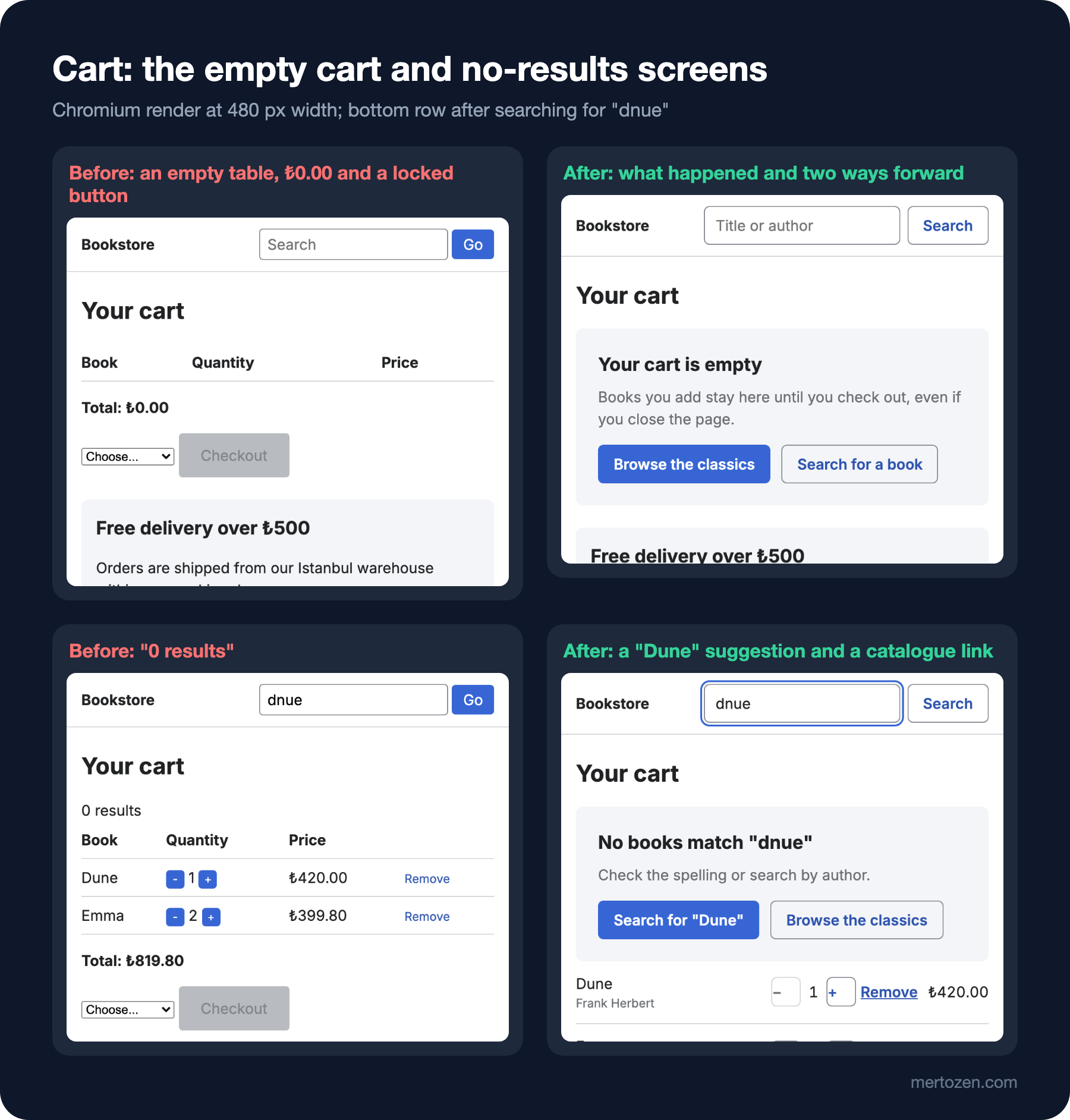
The empty cart is really a starting screen: it tells the user in one sentence what the cart is for and takes them to the catalogue and to search. The no-results screen is not where the search ends but where it changes direction. The after page finds a book title at most two letters away from the search term and offers a "Search for "Dune"" button; when there is no spelling suggestion, it points to the catalogue.
results.innerHTML = `
  <div class="state">
    <h2>No books match "${query}"</h2>
    <p>Check the spelling or search by author.</p>
    <div class="actions">
      ${close ? `<button class="btn suggestion" data-q="${close.title}">Search for "${close.title}"</button>` : ''}
      <a class="btn btn-secondary" href="/web/05-spacing/after.html">Browse the classics</a>
    </div>
  </div>`;
The error screen is the visible side of what the backend calls graceful degradation: serving a reduced experience instead of taking down the whole page when one part fails. Not throwing an exception when the API is down is not enough; you have to tell the user what happened, whether their data is safe, and what they can do. The before page's alert("Error: 503 Service Unavailable") does none of these: an HTTP status code means nothing to the user, and once the alert closes nothing is left on screen. The message in the after page says "We couldn't load your cart", says the books are saved, and offers "Try again" and "Keep browsing"; thanks to role="alert", screen readers announce it right away. The "what happened + how to fix it" rule for error messages from the previous post applies here too.
In Production
Look at states in the real component, not in the design file. A single test page that shows the hover, focus-visible, disabled and error states side by side like a table reveals a missing state at first glance; that is the idea behind "stories" in component libraries. We will come back to it with the design system in post 10.
Try delays under real network conditions, not locally: on a local machine every API answers in 10 milliseconds, so skeletons and optimistic UI look unnecessary. Network throttling in Playwright and DevTools is enough for this.
Test the rollback path of optimistic UI as well. A scenario that checks the screen goes back to the right value when the server returns 409 or 503 catches the before page's "error that lands in the console" before it reaches production. Measuring how often errors and empty screens are seen is the subject of the upcoming "Analytics and Measurement" series.
Common Pitfalls
First, deleting focus with outline: none. The right way is to show the ring only when needed with :focus-visible and tie its colour to a token.
Second, giving the disabled look with opacity. Opacity dims the focus ring too; that is exactly why one button failed the 3:1 threshold in the measurement.
Third, a disabled button that doesn't say why. First try to remove the condition; if you can't, keep the button active and say what is missing, or keep it focusable with aria-disabled and write the reason next to it.
Fourth, asking "Are you sure?" for every removal. Undo for reversible actions, a specific confirmation for serious, irreversible ones.
Fifth, forgetting the empty, no-results and error screens. Each needs one sentence that says what happened and at least one way forward.
A Small Experiment
★☆☆ Cut the after page's toast duration from 8 seconds to 3 and add a step to the script that measures "once the toast is visible, how many seconds does it take to reach the Undo button with Tab?". Interpret from the result what a short toast means for a keyboard user.
★★☆ Add a loading state to the Checkout link: when clicked it should say "Saving your cart…", get aria-disabled="true", and go to the after page of form 06 after 1.2 seconds. Verify with the script that a second click does not send a second request.
★★★ Open the page with colorScheme: 'dark' and run the focus measurement again. Does the ring of the Undo button inside the toast still pass the 3:1 threshold on the inverted background? If it doesn't, find out why and fix it.
In the next post we move from a single screen to the structure of the whole site: information architecture, the category tree, breadcrumbs, facet filters in Bookstore's catalogue that are reflected in the URL and active filter chips, search suggestions, and the choice between pagination, "load more" and infinite scroll.