

Spacing, Layout Grids and Alignment: a 4/8 Spacing System, Whitespace and Responsive Grids

A consistent interface takes its spacing from a limited scale of multiples of 4 and 8, and keeps the space inside a group smaller than the space between groups. In Bookstore's catalogue we measure 12 arbitrary spacing values, card padding wider than the gap between cards and 19 borders, fix them with spacing tokens, a single left edge, background tone and a content-out auto-fill grid, compare it with a 12-column grid and add a compact density.
Version note: The example screens in this post were rendered and measured in Chromium 158 with Playwright 1.65; the scripts were run with Node.js 24.
Predict First
The "Classics" catalogue page of bookstore-web, the client of Bookstore, the online bookstore used as the shared example across this site's series, shows six book cards. The stylesheet grew over the years by adding or removing a pixel whenever a problem came up:
.catalog { max-width: 1100px; margin: 0 auto; padding: 18px 13px; }
.catalog-header { display: flex; justify-content: space-between; align-items: baseline; border-bottom: 1px solid #ccc; margin-bottom: 7px; }
.grid { display: grid; grid-template-columns: repeat(6, 1fr); gap: 6px; }
.card { padding: 22px 15px 18px; border: 1px solid #ccc; }
.card img { width: 100%; height: auto; border: 1px solid #ccc; margin-bottom: 11px; }
.title { font-size: 16px; text-align: center; margin: 0 0 9px; }
.author { color: #555; font-size: 14px; margin: 0 0 3px; }
.price { font-weight: 700; margin: 0; padding-top: 5px; border-top: 1px solid #ccc; text-align: right; }
.btn { display: block; margin: 14px 0 0 auto; padding: 5px 10px; border: 1px solid #1d4ed8; background: #fff; color: #1d4ed8; font: inherit; font-size: 14px; }
Three questions. How many different spacing values are on the page? Which is bigger, the card's inner spacing or the space between two cards, and how does that affect the way the eye groups the cards? What does this page look like on a phone 390 pixels wide?
In the previous post we tied the colour palette and semantic colours to tokens. In this post we add spacing to the token file, build the relationship between cards with space, and make the layout grid decision.
Space Is a Design Tool
Spacing is often adjusted at the last minute with "open things up a bit". Yet space is the cheapest tool for the hierarchy and grouping we saw in the earlier posts. The distance between two items tells users how related they are; that is the Gestalt principle of proximity. Without adding borders, backgrounds or headings, you can rebuild the groups on a page by changing space alone.
Let's start by measuring. The script collects the computed margin, padding and gap values of every element in the catalogue, measures the card's inner spacing and the distance between cards, and counts bordered elements and the left edges of the texts inside a card:
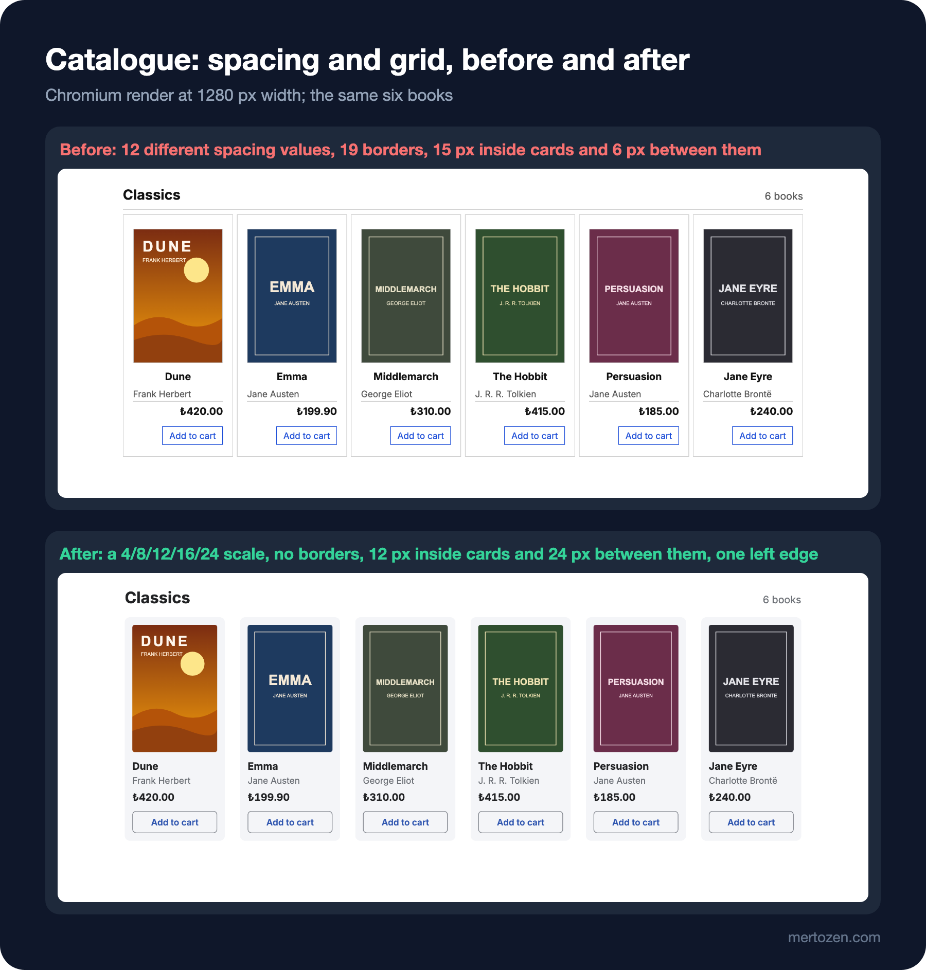
node scripts/05-spacing.mjs--- before: spacing values 3/5/6/7/9/10/11/13/14/15/18/22 (12 not on the 4px grid)
card padding 15px, gap between cards 6px, bordered elements 19, text edges in a card 16/62/66/90
@1280: 6 columns, card 383px tall, page 1280px wide
@390: 6 columns, card 336px tall, page 688px wide (horizontal scroll)
--- after: spacing values 4/8/12/16/24 (0 not on the 4px grid)
card padding 12px, gap between cards 24px, bordered elements 0, text edges in a card 12
@1280: 6 columns, card 353px tall, page 1280px wide
@390: 2 columns, card 367px tall, page 390px wide
--- after compact: spacing values 4/8/12/16/24 (0 not on the 4px grid)
card padding 8px, gap between cards 16px, bordered elements 0, text edges in a card 8
@1280: 7 columns, card 324px tall, page 1280px wide
@390: 2 columns, card 373px tall, page 390px wideThe answer to the first question: the before page has twelve different spacing values (3, 5, 6, 7, 9, 10, 11, 13, 14, 15, 18, 22), and none of the twelve is a multiple of 4. None was chosen deliberately; each was written by looking at a screenshot and saying "a bit more". The result is spacing that is close but not equal: the eye reads the difference between 9 and 11 pixels as disorder, not hierarchy.
A Limited Spacing Scale: Multiples of 4 and 8
As with typography, the solution is a scale with few values. The most common approach is to work in multiples of 8 and add 4 for small details. The layout guidance of Material Design's second version, M2, likewise aligned components to an 8dp grid and icons, type and some small elements inside components to a 4dp grid; Material 3's spacing system also uses a scale built on an 8dp base unit. 4 and 8 divide well: they fit screen widths, icon sizes and common font sizes, and deciding between two values is easy.
The scale added to Bookstore's token file has seven steps:
/* 05: spacing scale, 4px base */
:root {
  --space-1: 0.25rem; /* 4px */
  --space-2: 0.5rem;  /* 8px */
  --space-3: 0.75rem; /* 12px */
  --space-4: 1rem;    /* 16px */
  --space-6: 1.5rem;  /* 24px */
  --space-8: 2rem;    /* 32px */
  --space-12: 3rem;   /* 48px */
  --radius-md: 8px;
}
The names are not step numbers but multiples of 4 pixels: --space-6 is 6 × 4 = 24 pixels. There is no 5, 7, 9, 10 or 11 in between; the steps get sparser as they grow, because a 4-pixel difference isn't visible in large gaps. This naming follows the same logic as Tailwind's spacing scale; how tokens are defined in Tailwind is in the themes and design tokens post of the upcoming "Tailwind CSS" series. When you need a value that isn't on the scale, question the design first: usually the problem isn't the space but the grouping.
Related Items Close, Groups Apart
The answer to the second question is the most important finding: on the before page the card's inner spacing is 15 pixels (22 at the top) while the distance between two cards is 6 pixels. A card's edge is closer to the neighbouring card's edge than to its own content. The eye doesn't see the cards as separate groups but as a single strip divided by borders, and that is why there are 19 borders: the lines try to carry the "these are separate things" message that space should be saying.
The rule is simple: the space inside a group should be smaller than the space between groups. On the after page the inside of a card is 12 pixels and the space between cards 24. The same rule continues inside the card: 4 pixels between title and author (information read together), 8 between author and price, 12 between price and button. As the space grows, it says "the next thing is a bit more separate".
/* inside a card: small steps; between cards: a bigger one */
.card { display: flex; flex-direction: column; padding: var(--card-pad, var(--space-3)); background: var(--color-surface); border-radius: var(--radius-md); }
.card img { width: 100%; height: auto; border-radius: 4px; }
.title { font-size: var(--text-base); margin: var(--space-3) 0 0; }
.author { color: var(--color-text-muted); font-size: 14px; margin: var(--space-1) 0 0; }
.price { font-weight: var(--weight-bold); margin: var(--space-2) 0 0; font-variant-numeric: tabular-nums; }
.btn { margin-top: var(--space-3); padding: var(--space-2) var(--space-3); border: 1px solid var(--color-border-strong); border-radius: 6px; background: transparent; color: var(--color-link); font: inherit; font-size: 14px; font-weight: var(--weight-semibold); }
All margins are on top only (margin: X 0 0). Each item sets the distance to the item before it; there is no need to give an item margins both above and below and work out which one wins. The mechanics of margin collapse and gap were covered in the box model post of the "CSS3: Flexbox, Grid and Modern CSS" series.
Space and Background Tone Instead of Borders
On the after page the number of bordered elements dropped from 19 to 0. What separates a card from the page is no longer a line but a light grey background from --color-surface and the 24 pixels between cards. The frame around the cover, the line above the price and the line under the header were removed; each of them added nothing to the screen but one more obstacle for the eye.
Borders still have a place, but where they carry meaning: the boundary of an input or of a button without a background stays, because it is the information that identifies the control, and as we saw in the previous post it needs 3:1 contrast. A decorative divider, on the other hand, can usually be replaced with space. For a grouping, try in this order: space first, then background tone, borders last.
Alignment: a Single Left Edge
The script's "text edges in a card" line counts the left edges of the visible items inside a card. On the before page there are four different edges: the cover at 16 pixels, the centred title at 62, the right-aligned button at 66 and the right-aligned price at 90. Reading the card, the eye has to start from four different places. On the after page there is one edge: everything starts at 12 pixels. This is the practical form of the Gestalt principle of continuity; items lined up along the same line read as a single flow.
Centring is fine for short, single-line content (a button label, an empty cart message); for multi-line text of different lengths it makes reading harder, because the start of every line moves. In a card or a form, make left alignment the default and centring a deliberate exception.
There is also optical alignment: what is mathematically aligned doesn't always look aligned. A round icon looks smaller than a square one in the same box; the side bearing of a large heading's first letter can make the heading appear a pixel or two inside the text below it. These corrections are small and done by hand; they are part of the final check, not a rule of the system.
Layout Grid: 12 Columns or Content-Out?
The answer to the third question is in the @390 line of the output: the before page's repeat(6, 1fr) grid tries to open six columns on a phone too. Because the columns can't shrink below their content's minimum width, the page overflows to 688 pixels and horizontal scrolling appears.
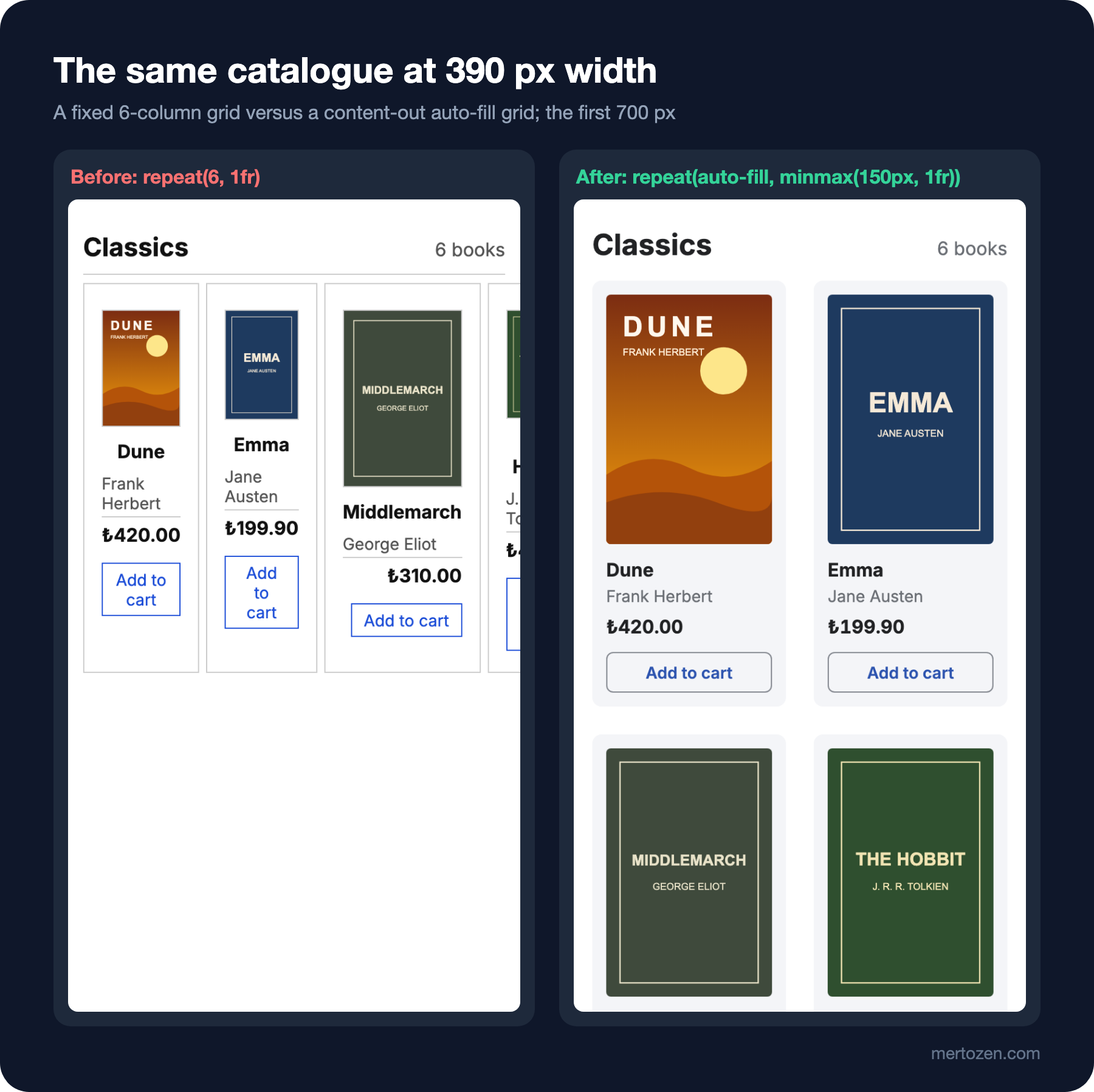
There are two approaches. The first is the classic 12-column grid: the page width is divided into twelve equal columns, each component says how many of them it spans, and that number changes at breakpoints. Its advantage is a shared language across pages and teams: "sidebar 3 columns, content 9 columns" is a sentence everyone understands. Because 12 divides by 2, 3, 4 and 6, it fits most layouts. Its disadvantage is that it needs a separate decision for every width; the before page above is exactly that decision not having been made for mobile.
The second is content-out layout: you first decide the smallest reasonable width of the content, and the browser calculates the number of columns. Bookstore's book card isn't readable below 150 pixels, so the grid says "as many 150-pixel columns as fit in this width":
/* content-out grid: as many 150px+ columns as fit */
.grid { display: grid; grid-template-columns: repeat(auto-fill, minmax(150px, 1fr)); gap: var(--space-6); }
In the measurement this single line gives 6 columns at 1280 pixels and 2 at 390, with no breakpoint written. The macro layout example in web.dev's Learn Design course uses the same pattern and points out that many breakpoints become hard to maintain. The mechanics of auto-fill and minmax() are in the CSS Grid post of the "CSS3: Flexbox, Grid and Modern CSS" series.
The two are not alternatives to each other. A 12-column grid, or one with a few fixed regions, for the page's main skeleton (header, sidebar, content area), and a content-out grid for the repeating cards inside those regions, make a good pair. Putting breakpoints where the content breaks rather than at device widths is the subject of this series' post on responsive design.
Density: Card and Table Density
The same layout may need different densities for different users. A Bookstore customer wants to see covers large; a school purchasing officer listing hundreds of books in the institutional portal wants more rows on screen. You can provide that without a separate design, by stepping the spacing tokens down one notch:
/* compact density: same layout, smaller steps */
[data-density="compact"] .grid { grid-template-columns: repeat(auto-fill, minmax(128px, 1fr)); gap: var(--space-4); }
[data-density="compact"] .card { --card-pad: var(--space-2); }
[data-density="compact"] .title { margin-top: var(--space-2); }
The after compact lines in the output: at 1280 pixels, 7 columns instead of 6 and a 324-pixel card instead of 353. At 390 pixels there are still 2 columns and the card is 373 pixels, 6 pixels taller than comfortable: with a smaller gap the column gets wider and the cover grows with it. On a narrow screen the cover decides the card's height, so the density setting saves no space there. A density option pays off most in tables and lists: when row height and cell padding drop one step, noticeably more rows fit on the same screen. Even in compact mode, clickable targets must not go below a minimum size; that measure is covered under touch targets in this series' post on responsive design.
In Production
A spacing token only helps when it is used. A check like this post's script can warn in CI when it finds a spacing value on the page that isn't a multiple of 4; as the component library grows, it catches the margin: 7pxs that slip through code review.
Test with real content and real counts. A six-book catalogue looks good; a results page can show 1 book or 400. Check whether a row with a single card, a card left alone on the last row and a very long book title break the layout.
Shrink space on narrow screens, but don't zero it. Reducing page edge padding from 24 to 16 pixels on a phone makes sense; reducing it to 0 glues the text to the edge of the screen.
Common Pitfalls
First, setting space by eye. Saying "a bit more" every time produces the twelve different values of the before page.
Second, making the space inside a group bigger than the space between groups. If the inside of a card is wider than the gap between cards, the cards don't look separate and you need borders to separate them.
Third, separating everything with borders. Lines pile up quickly; try space and background tone first.
Fourth, different alignments inside the same card. A centred title, a left-aligned author and a right-aligned price send the eye to three different places.
Fifth, not checking a fixed column count on mobile. repeat(6, 1fr) means horizontal scrolling on a phone.
A Small Experiment
★☆☆ Set the grid's gap to var(--space-2) in after.css. Predict how the grouping of the cards changes when the card's inner spacing is 12 and the gap between cards 8 pixels, then take a screenshot with node scripts/shoot.mjs web/05-spacing/after.html and look.
★★☆ Add a step to 05-spacing.mjs that prints the vertical distances between consecutive items in a card (cover-title, title-author, author-price, price-button). Show with numbers that on the after page, the distances grow as the relationship weakens.
★★★ Write an order table for the institutional portal (book, ISBN, quantity, unit price, total). Define two densities, comfortable and compact, with spacing tokens only, and measure with a script how many rows fit on a 1280×800 screen in each mode.
In the next post we move from screens to forms: where labels go, the problems with floating labels, marking required and optional fields, when and how to show error messages, and reducing the number of fields in Bookstore's checkout form.