

Getting Started with Angular Material and the CDK: ng add, the Component Catalog, the M3 Theme and Material vs CDK vs Angular Aria
Import Material components as standalone classes, not from one shared module: in Bookstore's admin panel a shared file exporting 35 modules grew the lazy chunk from 173 kB to 682 kB without a compiler warning. We measure what ng add changes, an M3 theme and density from the brand color, a responsive shell with toolbar and sidenav, why internal class overrides are fragile, and cutting the icon font from 325 KB to 1.4 KB.
Version note: The examples in this post were tried with Angular 22.2 (TypeScript 6.0), Angular Material and the CDK 22.2.7 and Node.js 24; browser behavior was observed in headless Chromium with Playwright 1.65. For the measurements Bookstore.Api ran on SQLite instead of SQL Server.
Predict First
We are adding an admin panel to Bookstore, the online bookstore used as the shared example across this site's series, and we will build its screens with Angular Material. The panel lives in its own lazy-loaded chunk. Three questions: which files does ng add @angular/material touch? How much does the old habit of "export every Material module from one shared file" add to the bundle in Angular 22, with standalone components and tree-shaking: a few kilobytes or a few hundred? And third: how many kilobytes is the Material Symbols font file downloaded for two menu icons?
What ng add Changes
Bookstore's Angular client, bookstore-web, is a small app with catalog, book details and cart pages and no Material. We started with a single command. The ng add schematic in 22.2.7 asks only one thing: the starter pair of color palettes (azure-blue, rose-red, magenta-violet, cyan-orange). The typography and animation questions of older versions are gone:
ng add @angular/material
✔ Packages installed successfully.
CREATE src/material-theme.scss (1179 bytes)
UPDATE angular.json (2046 bytes)
UPDATE src/index.html (639 bytes)
The changes are small. package.json got @angular/material and @angular/cdk; it did not get @angular/animations, because Material has not depended on the animations module since 19.2 (the "drop dependency on animations module" line in the components CHANGELOG). Since the project uses styles.css, the schematic could not add to a Sass file; it created a separate src/material-theme.scss and put it at the front of the style list in angular.json. index.html got Google Fonts links for Roboto and Material Symbols Outlined:
"styles": ["src/material-theme.scss", "src/styles.css"]Material's package.json declares the peer dependency "@angular/cdk": "22.2.7": an exact version, not a range. The two packages must always move together; ng update @angular/material upgrades the CDK as well. Nothing was added on the provider side: app.config.ts was not touched.
The Catalog: Material, the CDK and Angular Aria
Inside the package there are 35 component entry points (@angular/material/button, /table, /dialog…) plus core. The documentation lists the components in one list; in daily work we find them faster in these groups: form controls (form-field, input, select, autocomplete, datepicker, timepicker, checkbox, radio, slide-toggle, slider, chips), navigation (toolbar, sidenav, menu, tabs, stepper), layout (list, card, divider, expansion, grid-list, tree), buttons and indicators (button, button-toggle, icon, badge, progress-bar, progress-spinner, ripple), popups and modals (dialog, bottom-sheet, snack-bar, tooltip) and the data table (table, sort, paginator). Posts 02–04 of this series build the ones an admin panel uses most.
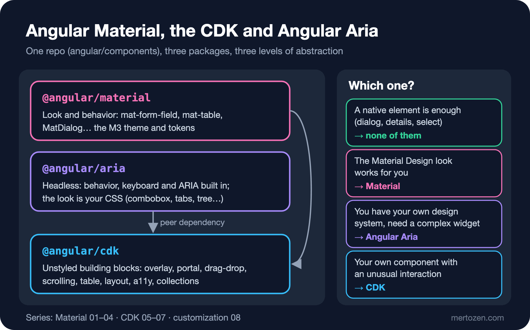
The CDK is the layer under Material: overlay, portal, drag-drop, virtual scroll, layout, table and a11y provide unstyled behavior, and Material's dialog and select are both built on them. Angular Aria (@angular/aria) is the third option: it gives you the keyboard behavior and the ARIA attributes of widgets such as combobox, tabs, listbox, menu and tree, and leaves the look entirely to your CSS. It also depends on the CDK: its peer dependency is @angular/cdk 22.2.7. The decision order in short: if a native element is enough, none of them; if the Material Design look works for you, Material; if you have your own design system and need a complex widget, Angular Aria; if you are writing your own component, the CDK. We measured the accessibility side of that order, and the fact that Angular Aria became stable in 22.0.0, in the Accessibility (a11y) series post "Accessible Components in Angular: Angular Aria, CDK a11y, Material and Not Writing Your Own Combobox"; we do not repeat it here.
The M3 Theme: Brand Color, Typography and Density
The theme ng add generated uses a prebuilt palette. Bookstore's existing CSS uses the brand color #1d4ed8; Material's palette schematic generates M3 tonal palettes from a single color:
ng generate @angular/material:theme-color --primary-color="#1d4ed8" --directory=src/
CREATE src/_theme-colors.scss (2516 bytes)
// Note: Color palettes are generated from primary: #1d4ed8
$_palettes: (
primary: (
0: #000000,
10: #001551,
20: #002682,
// ...
40: #2151da,
// ...
100: #ffffff,
),The theme file now uses these palettes instead of a prebuilt one. The important change is at the end of the file: ng add wrote Material's background color, text color and Roboto onto body. Because that rule applies to the whole app, the font of the catalog page our customers see turned into Roboto too. Material is only used in the admin panel, so we moved those three lines to the panel's root class:
@use '@angular/material' as mat;
// Generated from the Bookstore brand color #1d4ed8 with: ng generate @angular/material:theme-color
@use './theme-colors' as brand;

html {
  height: 100%;
  @include mat.theme(
    (
      color: (
        primary: brand.$primary-palette,
        tertiary: brand.$tertiary-palette,
      ),
      typography: Roboto,
      density: 0,
    )
  );
}

body {
  color-scheme: light;
  margin: 0;
  height: 100%;
}

// Only the back office looks like Material; the storefront keeps its own font and background
.admin-shell {
  background-color: var(--mat-sys-surface);
  color: var(--mat-sys-on-surface);
  font: var(--mat-sys-body-medium);
  // Admin screens are dense lists and tables: one density step = 4px less
  @include mat.theme((density: -1));
}
The values we measured in the browser:
# density: 0 inside .admin-shell
--mat-sys-primary: light-dark(#2151da, #b7c4ff)  toolbar: 64px  nav item: 48px
# density: -1 inside .admin-shell
--mat-sys-primary: light-dark(#2151da, #b7c4ff)  toolbar: 60px  nav item: 44px
Two details. First, the primary color of the light theme is #2151da, not #1d4ed8: the M3 palette splits the color into tones and the light theme uses tone 40 for primary. If you need exactly the tone of the logo, you have to adjust the palette by hand; the Sass side of that, dark mode with light-dark() and turning tokens into custom properties are covered in the Sass/SCSS series post "Theming with Sass: Maps, Generating CSS Custom Properties, Dark Mode and an Angular Material M3 Theme". Second, calling mat.theme inside a selector with only density makes the components in that area denser; according to the theming guide each step reduces sizes by 4px, and popups such as the datepicker are not affected by density. The guide also warns that density below 0 can reduce accessibility; we stopped at -1.
The Admin Shell: Toolbar, Sidenav and Nav List
The catalog, book and cart pages moved under a StoreLayout with their own header; the admin panel loads lazily under /admin. That way Material code is only downloaded when someone enters the panel:
export const routes: Routes = [
  {
    path: '',
    component: StoreLayout,
    children: [
      { path: '', component: CatalogPage, title: 'Bookstore' },
      { path: 'books/:isbn', component: BookDetailPage, title: 'Book · Bookstore' },
      { path: 'cart', component: CartPage, title: 'Cart · Bookstore' },
    ],
  },
  // Back office: its own chunk, the only part of the app that uses Angular Material
  { path: 'admin', loadChildren: () => import('./admin/admin.routes').then(m => m.adminRoutes) },
  { path: '**', redirectTo: '' },
];
The shell is three components: a mat-toolbar on top, a mat-nav-list inside a mat-sidenav on the left and the route content on the right. We import Material components as standalone classes, not as modules:
@Component({
  selector: 'app-admin-shell',
  imports: [
    MatToolbar, MatSidenavContainer, MatSidenav, MatSidenavContent, MatNavList, MatListItem, MatListItemIcon,
    MatListItemTitle, MatIcon, MatButton, MatIconButton, RouterOutlet, RouterLink, RouterLinkActive,
  ],
  templateUrl: './admin-shell.html',
  styleUrl: './admin-shell.scss',
})
export class AdminShell {
  // CDK Breakpoints.Handset: narrower than 600px in portrait or 960px in landscape
  protected readonly handset = toSignal(
    inject(BreakpointObserver).observe(Breakpoints.Handset).pipe(map(state => state.matches)),
    { initialValue: false },
  );
  protected readonly mode = computed(() => (this.handset() ? 'over' : 'side'));

  protected readonly links = [
    { path: 'dashboard', icon: 'dashboard', label: 'Dashboard' },
  ];
}
<div class="admin-shell">
<mat-toolbar>
@if (handset()) {
<button matIconButton type="button" aria-label="Open navigation" (click)="drawer.toggle()">
<mat-icon>menu</mat-icon>
</button>
}
<span class="title">Bookstore Admin</span>
<span class="spacer"></span>
<a matButton routerLink="/">Storefront</a>
</mat-toolbar>
<mat-sidenav-container class="container">
<mat-sidenav #drawer [mode]="mode()" [opened]="!handset()">
<mat-nav-list>
@for (link of links; track link.path) {
<a mat-list-item [routerLink]="link.path" routerLinkActive #active="routerLinkActive"
[activated]="active.isActive" (click)="handset() && drawer.close()">
<mat-icon matListItemIcon>{{ link.icon }}</mat-icon>
<span matListItemTitle>{{ link.label }}</span>
</a>
}
</mat-nav-list>
</mat-sidenav>
<mat-sidenav-content>
<main class="content">
<router-outlet />
</main>
</mat-sidenav-content>
</mat-sidenav-container>
</div>For buttons we used the matButton and matIconButton selectors that 22.2 prefers; the old mat-button and mat-icon-button attributes are still in the selector list. The dashboard page shows a catalog summary in a mat-card: it reads the total from /api/books?pageSize=1 and the number of categories from /api/categories with httpResource, and draws a mat-progress-bar while loading.
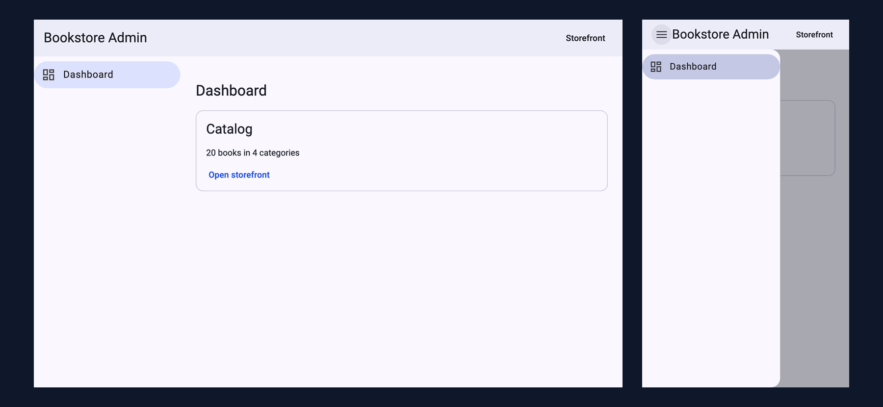
On a wide screen the sidenav stays open next to the content in side mode; at 360px it switches to over mode, closes, and a menu button appears in the toolbar. What we measured with Playwright:
desktop sidenav mode mat-drawer mat-sidenav mat-drawer-opened mat-drawer-side
mobile sidenav mode mat-drawer mat-sidenav mat-drawer-over
# after clicking the menu button
mobile open mat-drawer mat-sidenav mat-drawer-over mat-drawer-opened content inert: true
The last line is a change from 22.0.0: while the sidenav is open in over mode, the content becomes inert, so keyboard and screen reader users cannot reach the page behind it. We used BreakpointObserver here only to pick the mode; post 07 of the series covers such cases that CSS cannot solve, and when it is unnecessary, in detail.
How Much Does It Add to the Bundle?
Production builds before and after Material:
# before: no Material
main-BDBHRKZT.js    | main          | 264.83 kB |                73.11 kB
                    | Initial total | 265.76 kB |                74.05 kB

# after: the admin panel with Material
chunk-VK7IGDT4.js   | -             | 291.01 kB |                80.66 kB
styles-XPDJZGP6.css | styles        |  11.63 kB |                 2.00 kB
main-ZXWJ4VXZ.js    | main          |  10.29 kB |                 3.33 kB
                    | Initial total | 312.94 kB |                85.98 kB

Lazy chunk files    | Names         |  Raw size | Estimated transfer size
chunk-BPOV3ZKE.js   | admin-routes  | 173.01 kB |                29.47 kB
All Material and CDK code sits in the admin-routes chunk (137.1 kB of Material and 27.0 kB of CDK according to the build stats). Still, the initial bundle the catalog page downloads grew by 47 kB raw, about 12 kB transferred. The stylesheet went from 0.9 kB to 11.6 kB because all --mat-sys-* custom properties of the M3 theme are defined on html; compressed, that is only 1 kB. The rest of the transfer growth is JavaScript: the parts of @angular/core and the router that Material uses moved into the chunk shared by main and the lazy chunk. When we removed the admin route temporarily, main went back to 265.11 kB. Lazy loading keeps Material away from the catalog, but not at zero cost.
Now the second question. We built the SharedMaterialModule common in older projects, exported all 35 modules from it and gave only that to the admin components. We repeated the measurement with different import styles:
// The "one shared file for all of Material" habit from NgModule-era projects
@NgModule({ imports: modules, exports: modules })
export class SharedMaterialModule {}| How the admin components import Material | admin-routes (raw) | Estimated transfer |
|---|---|---|
The standalone classes in use (MatToolbar, MatSidenav…) | 172.90 kB | 29.43 kB |
Only the 7 modules in use (MatToolbarModule…) | 174.84 kB | 29.56 kB |
A SharedMaterialModule exporting 35 modules | 681.79 kB | 108.31 kB |
The same 35 modules as an array passed to imports | 681.65 kB | 108.45 kB |
The answer is a few hundred kilobytes: the chunk quadrupled. In the build stats Material code went from 137.1 kB to 511.0 kB, CDK code from 27.0 kB to 116.3 kB, and 33.0 kB of @angular/forms, which the panel does not use at all, came along. Wrapping the modules in an NgModule or putting them in an array makes no difference; what matters is unused modules ending up in imports. The compiler also treats the two cases differently. It warns about an unused standalone class and leaves it out of the bundle; it says nothing about an unused module:
# an unused MatSelect added to imports
▲ [WARNING] NG8113: MatSelect is not used within the template of DashboardPage [plugin angular-compiler]
chunk-BPOV3ZKE.js   | admin-routes  | 173.01 kB |                29.47 kB

# an unused MatSelectModule added to imports: no warning
chunk-RO5TITOV.js   | admin-routes  | 291.18 kB |                48.32 kB
One forgotten MatSelectModule silently added 118 kB. Importing standalone classes is both smaller and the only way the compiler can warn you.
Changing Styles: Internal Classes or the Override API?
We wanted bolder labels in the nav list. When you select the element in DevTools you see the .mdc-list-item__primary-text class, and overriding it is tempting. We tried three ways and measured the computed font-weight:
// 1) An internal class in the component styles
.mdc-list-item__primary-text {
  font-weight: 700;
}

// 2) The same with ::ng-deep
::ng-deep .mdc-list-item__primary-text {
  font-weight: 700;
}

// 3) Material's override API
mat-nav-list {
  @include mat.list-overrides((
    list-item-label-text-weight: 700,
  ));
}
base font-weight: 400
internal-class font-weight: 700
ng-deep font-weight: 400
list-overrides font-weight: 700The result is confusing, and that is the actual lesson. The first way worked because matListItemTitle adds the class to the span in our own template; the attribute selector added by encapsulation made our rule more specific than Material's. The second way did not work: ::ng-deep removed the attribute, our rule and Material's ended up with the same specificity, and Material's styles, added to the page later, won. So an internal class override depends on the DOM structure, on encapsulation and on the order in which styles reach the page, and any of these can change in the next Material release. The theming guide also treats the components' DOM structure and classes as private and does not support CSS changes outside the override API. The third way changes a token (--mat-list-list-item-label-text-weight) that Material's own rule reads. We changed the toolbar background the same way:
// Public theming API instead of overriding .mat-toolbar / .mat-mdc-* classes
mat-toolbar {
  @include mat.toolbar-overrides((
    container-background-color: var(--mat-sys-surface-container),
  ));
}
Token overrides, system tokens and why .mat-* overrides left over from old projects silently stop working are the topic of the last post in this series.
Testing the Sidenav Mode with a Harness
The Bookstore client has Vitest unit tests, so we covered both behaviors of the panel. We replace BreakpointObserver with a fake value and query the sidenav through Material's test harness, so the test does not depend on the sidenav's internal DOM:
async function render(handset: boolean) {
  const state: BreakpointState = { matches: handset, breakpoints: {} };
  TestBed.configureTestingModule({
    imports: [AdminShell],
    providers: [provideRouter([]), { provide: BreakpointObserver, useValue: { observe: () => of(state) } }],
  });
  const fixture = TestBed.createComponent(AdminShell);
  const sidenav = await TestbedHarnessEnvironment.loader(fixture).getHarness(MatSidenavHarness);
  return { element: fixture.nativeElement as HTMLElement, sidenav };
}

it('turns the navigation into a closed overlay with a menu button on handsets', async () => {
  const { element, sidenav } = await render(true);
  expect(await sidenav.getMode()).toBe('over');
  expect(await sidenav.isOpen()).toBe(false);
  expect(element.querySelector('button[aria-label="Open navigation"]')).not.toBeNull();
});
ng test --watch=false
✓ src/app/store-layout.spec.ts > StoreLayout > shows the brand and an empty cart
✓ src/app/admin/dashboard-page.spec.ts > DashboardPage > shows the catalog totals from the API
✓ src/app/admin/admin-shell.spec.ts > AdminShell > keeps the navigation open beside the content on wide screens
✓ src/app/admin/admin-shell.spec.ts > AdminShell > turns the navigation into a closed overlay with a menu button on handsets
Test Files 3 passed (3)
Tests 4 passed (4)The dashboard test had a small trap: because the httpResource request is a pending task, the first fixture.whenStable() waits for the request to finish, and the request does not finish until we flush it; the test timed out after 5 seconds. Calling fixture.detectChanges() first to start the request and then flushing it fixed it. Harnesses themselves and writing your own are covered in the Frontend Testing series post "Component Harnesses: Using CDK Harnesses, Writing Your Own and Decoupling Tests from Markup".
In Production
Shrink the icon font. The third question: the link ng add adds downloads the whole Material Symbols set. With two icons in the panel (menu and dashboard) the woff2 file we measured was 325,060 bytes. We asked for only the icons we use with the icon_names parameter of Google Fonts, and the file dropped to 1,392 bytes:
<link
href="https://fonts.googleapis.com/css2?family=Material+Symbols+Outlined&icon_names=dashboard,menu&display=block"
rel="stylesheet"
/># before: the whole Material Symbols set
fonts.gstatic.com/s/materialsymbolsoutlined font/woff2 325060
# after: icon_names=dashboard,menu
fonts.gstatic.com/l/font font/woff2 1392According to Google's documentation the list must be in alphabetical order. The price is updating the list for every new icon; if you forget, the ligature text (such as "delete") appears instead of the icon. If the app must not reach Google Fonts at all, serving the font yourself or using SVG icons with MatIconRegistry are the other options.
The production build goes to the internet. The Angular CLI's font optimization downloads the Google Fonts CSS during the build and inlines it into index.html; in our build two @font-face blocks and the theme variables were written into index.html (24,920 bytes). On a CI machine without internet access this step fails, or you have to turn the optimization off.
Choose the theme scope with overlays in mind. We left mat.theme on html and only moved the font and background to .admin-shell. Putting the whole theme inside .admin-shell is tempting, but overlays such as dialogs, menus and the select panel are rendered outside that element and would not see the tokens. We measure this in the dialog post.
Update Material and the CDK together. Because the peer dependency is an exact version, npm install @angular/material@latest on its own produces a conflict; ng update @angular/material upgrades both together, with their migrations.
Common Pitfalls
First, importing every Material module from one shared file. In the panel we measured, the chunk went from 173 kB to 682 kB and the compiler did not print a single warning. Import standalone classes.
Second, overriding Material's internal classes (.mdc-*, .mat-mdc-*) directly. The same rule worked with encapsulation and failed with ::ng-deep; both may change in the next release. Use the override mixins and tokens.
Third, leaving the global styles of ng add as they are. The font written onto body also changed pages that do not use Material.
Fourth, lowering density everywhere. Smaller targets make forms and touch screens harder to use; lower density only in the areas that really lack space.
A Small Experiment
★☆☆ Set the density inside .admin-shell in material-theme.scss to -3 and measure the toolbar and nav list heights in DevTools. Does the 4px-per-step rule hold, and where did it stop?
★★☆ Add an unused MatDatepickerModule to the imports of DashboardPage, run ng build and see how much the admin-routes chunk grew. Then repeat with the MatDatepicker class; in which case did the compiler warn you?
★★★ Add a second link to the panel (for example "Stock" with the inventory icon) and forget to update the icon_names list in the Material Symbols link. What appears on screen? Write a small script that generates the list from the mat-icon elements in the templates at build time.
The shell is ready. In the next post we put the first real screen into it: the institutional order form. The appearances of mat-form-field, when mat-error shows up, a mat-autocomplete that searches on the server, mat-select with compareWith, and mat-datepicker with Turkish dates, weeks starting on Monday and the time zone shift.