

Customizing Material and Its Versions: Token Overrides, Density, Your Own Component with the CDK, and Material from 12 to 22
Customize Material with tokens: to repaint one area, a mat.theme with only color inside a class added 4.2 kB, the old all-component-themes habit 53 kB; overlays stay outside the theme class, so give the class to the overlay container too. In Bookstore's institutional portal we measure the density scale, build a split button with CDK Menu and its harness, and look at Material from 12 to 22 and why old .mat-* overrides match zero elements.
Version note: The examples in this post were tried with Angular 22.2 (TypeScript 6.0), Angular Material and the CDK 22.2.7, .NET 10 and Node.js 24; browser behavior was observed in headless Chromium with Playwright 1.65. For the measurements Bookstore.Api ran on SQLite instead of SQL Server. The facts about Material 12–21 come from the angular/components CHANGELOG; the old versions were not run.
Predict First
The admin panel of Bookstore, the online bookstore used as the shared example across this site's series, has two screens for institutional orders: the new institutional order form and the shipment plan. Hakan's team (institutional sales) wants these screens to show the institutional portal's teal color, as a reminder that they deal with schools and libraries. In this last post of the series we repaint Material, make it denser, write a component Material does not have with the CDK, and look at how Material changed from 12 to 22. Three questions: if you give a page's host element a theme class, does a datepicker opened from that page get the new color? There are four ways to produce the portal theme; how many kB does the most expensive one add to the CSS? How many elements does a .mat-form-field-outline override written in the Material 12 days match in a form in Material 22?
System Tokens and a Scoped Theme
In post 01 we applied mat.theme to html: palettes generated from the Bookstore blue, Roboto and density. This mixin does not produce component styles; it produces system tokens such as --mat-sys-primary and --mat-sys-surface-container as CSS custom properties, and the components read these variables in their own styles. So to repaint an area it is enough to define the same variables again on that area's class. We generated the palette for the institutional portal color (#0f766e) with Material's schematic, as in 01:
$ ng generate @angular/material:theme-color --primary-color='#0f766e' --directory=src/tmp-inst/ --defaults --interactive=false
CREATE src/tmp-inst/_theme-colors.scss (2516 bytes)
// Generated from the institutional portal color #0f766e with: ng generate @angular/material:theme-color
@use './institutional-colors' as inst;
// Institutional portal: the same components in the institution color. Only the color system tokens are emitted
// again for this class, not the component styles
.institutional-portal {
@include mat.theme((color: (primary: inst.$primary-palette, tertiary: inst.$tertiary-palette)));
// Squarer buttons for the portal through the public token API instead of .mat-mdc-* classes
@include mat.button-overrides((filled-container-shape: 8px, outlined-container-shape: 8px, text-container-shape: 8px));
}We gave the class to the host element of the two pages (host: { class: 'institutional-portal' }). For the second question we did the same job in four ways and measured the global stylesheet of the production build:
a) no portal theme       | styles-BC4VCQTW.css | styles                   |  11.73 kB |                 2.02 kB
b) mat.theme color       | styles-VUMMKPZJ.css | styles                   |  15.93 kB |                 2.34 kB
c) theme-overrides 4     | styles-DTYTJQJ7.css | styles                   |  11.89 kB |                 2.05 kB
d) all-component-themes  | styles-MINI35OH.css | styles                   |  65.29 kB |                 6.82 kB
(b) is the way we chose: a mat.theme with only color inside the class produces all color tokens from the new palette and adds 4.2 kB. (c) changing only four tokens (primary, on-primary, primary-container, on-primary-container) by hand with mat.theme-overrides adds 0.16 kB; but the secondary, tertiary and surface tones stay from the blue palette, and you only see which token you forgot on the screen. Use (c) to change a single color and (b) to turn a whole area into another brand. (d) is the habit of Material 17 and earlier: building a theme object with mat.define-theme and calling mat.all-component-themes inside the class. This prints the tokens of every component again and took the stylesheet from 11.73 kB to 65.29 kB. Generating a separate theme for every sub-area or every component multiplies the CSS exactly like this. The Sass side of the M3 theme, the palettes and the parameters of mat.theme are covered in the Sass/SCSS series post "Theming with Sass: Maps, Generating CSS Custom Properties, Dark Mode and an Angular Material M3 Theme".
Overlays Are Outside the Theme Class
The first question. We pressed "Save plan" on the shipments page to get the snackbar, opened the datepicker on the order form, and looked at the value of --mat-sys-primary:
orders page          : --mat-sys-primary light-dark(#2151da, #b7c4ff)
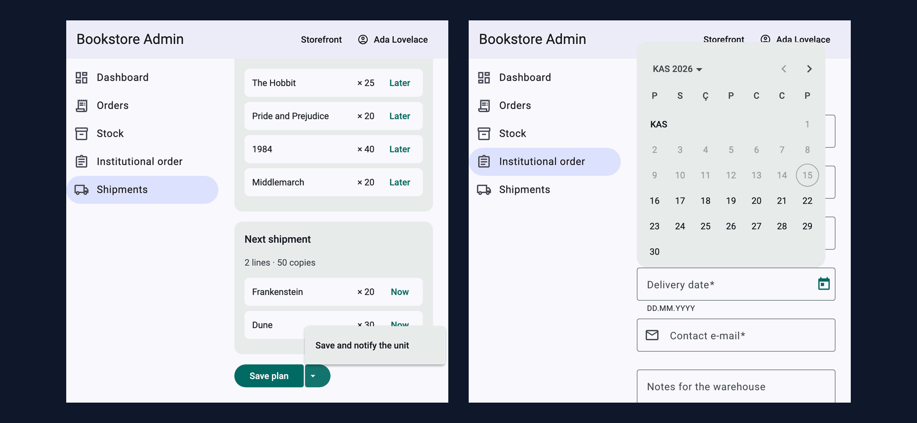
shipments page       : --mat-sys-primary light-dark(#006a63, #80d5cb) | Save plan background color(srgb 0.0941176 0.109804 0.109804 / 0.12) radius 8px
snackbar (overlay)   : --mat-sys-primary light-dark(#2151da, #b7c4ff) | action color rgb(183, 196, 255) | inside .institutional-portal false
datepicker (overlay) : --mat-sys-primary light-dark(#2151da, #b7c4ff) | today/selected cell color(srgb 0.101961 0.105882 0.137255 / 0.38) | inside .institutional-portal false
The page is teal, but the snackbar and the datepicker are still blue. We know it from post 05: overlays are rendered in the overlay container at the end of body, not inside the page's host element, and they do not inherit the variables defined there. (The button on the second line is faded because it is still disabled; the measurement below shows its real color.) The fix is to give the overlay container the same class while the page is on screen:
// Overlays (datepicker, autocomplete, snackbar) are rendered in the overlay container at the end of <body>, outside
// the page's theme class. Give the container the same class while the page is on screen. Call from an injection context.
export function useOverlayThemeClass(themeClass: string): void {
  const container = inject(OverlayContainer).getContainerElement();
  container.classList.add(themeClass);
  inject(DestroyRef).onDestroy(() => container.classList.remove(themeClass));
}
export class ShipmentPlanPage {
// ...
constructor() {
useOverlayThemeClass('institutional-portal');
// ...
}
}orders page : --mat-sys-primary light-dark(#2151da, #b7c4ff)
shipments page : --mat-sys-primary light-dark(#006a63, #80d5cb) | Save plan background rgb(0, 106, 99) radius 8px
snackbar (overlay) : --mat-sys-primary light-dark(#006a63, #80d5cb) | action color rgb(128, 213, 203) | inside .institutional-portal true
datepicker (overlay) : --mat-sys-primary light-dark(#006a63, #80d5cb) | today/selected cell color(srgb 0.0941176 0.109804 0.109804 / 0.38) | inside .institutional-portal trueThis approach is right for a single page; if two areas with different themes were on screen at the same time, one class on the container would not be enough. In that case you have to use each overlay-opening component's own option (panelClass, class on mat-autocomplete).
Component Tokens: the overrides Mixins
System tokens affect every component. To change one property of one component, every component has its own *-overrides mixin: above, mat.button-overrides set the corners of the portal's buttons to 8px. In post 01 we changed the toolbar's background with mat.toolbar-overrides. This API has two benefits. First, it does not touch Material's internal DOM and class names, so it does not break when versions change. Second, it checks the token name at build time. With one letter missing, the build said:
✘ [ERROR] Error: Invalid token name `filled-container-shap`. Valid tokens are: filled-container-shape, filled-horizontal-padding, filled-icon-offset, filled-icon-spacing, filled-label-text-transform, filled-touch-target-size, outlined-container-shape, ...
# (list shortened: every token button-overrides accepts is listed)
Had you made the same mistake with a class override like .mat-mdc-unelevated-button { border-radius: 8px; }, nothing would have been reported; nothing would simply have happened. The fastest way to learn which tokens a component has is this error message or the "Styling" tab of each component in the Material documentation.
The Density Scale
According to Material's theming guide, density is an integer between 0 and -5, and each step makes the affected sizes 4px smaller, but only down to the smallest size at which the component can still be drawn properly. In post 01 we gave the admin panel -1. We measured the whole scale by changing the value on .admin-shell (px):
| density | toolbar | nav item | select field | table header | table row | checkbox | button |
|---|---|---|---|---|---|---|---|
| 0 | 64 | 48 | 56 | 56 | 52 | 40 | 40 |
| -1 | 60 | 44 | 52 | 52 | 48 | 36 | 36 |
| -2 | 56 | 40 | 48 | 48 | 44 | 32 | 32 |
| -3 | 52 | 36 | 44 | 44 | 40 | 28 | 28 |
| -4 | 52 | 32 | 40 | 40 | 36 | 28 | 28 |
| -5 | 52 | 24 | 36 | 40 | 36 | 28 | 28 |
The guide's "smallest size" shows in the table: the toolbar, the button and the checkbox stop shrinking after -3 and the table after -4, while the nav item goes down to 24px at -5. For the button, 28px is the visible box; we did not measure whether Material adds a separate touch target around it. We stayed at -1 in the admin panel: tables are tight, but nav items and buttons are still comfortable to click. The accessibility side of target size, the 24px rule of WCAG 2.2, is covered by the Accessibility (a11y) series; read that before using -4 and -5 on a touch screen.
A Need Material Does Not Fit: a Split Button with CDK Menu
The shipment plan needed a second save option: "save and notify the institution unit". The usual pattern for this is a split button: a main action with a menu of related actions next to it. Material has no split button. Attaching a mat-menu to a button group is possible, but here we wrote a small component that takes its behavior from the CDK and its look from Material buttons and system tokens. The menu, arrow keys, Escape and focus returning come from @angular/cdk/menu:
// Material has no split button: a main action plus a menu of related actions.
// Behavior from the CDK (menu, keyboard, focus), look from Material buttons and system tokens.
@Component({
  selector: 'app-split-button',
  imports: [CdkMenuTrigger, CdkMenu, CdkMenuItem, MatButton, MatIcon],
  template: `
    <div class="split" role="group" [attr.aria-label]="label()">
      <button matButton="filled" type="button" class="main" [disabled]="disabled()" (click)="run.emit(primary().id)">
        {{ primary().label }}
      </button>
      <button matButton="filled" type="button" class="toggle" [disabled]="disabled()" [cdkMenuTriggerFor]="menu"
              [attr.aria-label]="'More ' + label() + ' actions'">
        <mat-icon>arrow_drop_down</mat-icon>
      </button>
    </div>
    <ng-template #menu>
      <div class="split-menu" cdkMenu>
        @for (action of more(); track action.id) {
          <button type="button" class="split-menu-item" cdkMenuItem (cdkMenuItemTriggered)="run.emit(action.id)">
            {{ action.label }}
          </button>
        }
      </div>
    </ng-template>
  `,
  styleUrl: './split-button.scss',
})
export class SplitButton {
  readonly label = input.required<string>();
  readonly primary = input.required<SplitAction>();
  readonly more = input<SplitAction[]>([]);
  readonly disabled = input(false);
  readonly run = output<string>();
}
// Two buttons that read as one: shapes through the button's public tokens, not through .mdc-button classes
.main {
@include mat.button-overrides((filled-container-shape: 20px 4px 4px 20px));
}
.toggle {
min-width: 40px;
padding: 0 8px;
@include mat.button-overrides((filled-container-shape: 4px 20px 20px 4px));
}
// The menu is rendered in an overlay at the end of <body>, but it comes from this component's template,
// so the emulated encapsulation attributes are there and these styles apply without ::ng-deep
.split-menu {
display: flex;
flex-direction: column;
min-width: 220px;
padding: 8px 0;
border-radius: 4px;
background: var(--mat-sys-surface-container);
box-shadow: var(--mat-sys-level2);
}Here we used the token override in the component's own SCSS, on our own class: filled-container-shape can take the four corners separately, and the two buttons form one joined shape. We tried it with the keyboard in Playwright; the menu opened in a popover, inside the institutional theme:
shape        : button.main radius 20px 4px 4px 20px | button.toggle radius 4px 20px 20px 4px
ArrowDown    : button "Save and notify the unit" role=menuitem | menu role=menu background rgb(235, 239, 237) in popover true
Escape       : button "More Save actions" role=button | menus 0
Enter, Enter : /api/admin/institutional-orders/1042/shipments?notifyUnit=true | Shipment plan saved, Main Campus Library notified
The "notify" option goes to the API as ?notifyUnit=true; for now Bookstore.Api only writes a log line (the real e-mail is the Notifications module's job):
info: Bookstore.Institutional[0]
      Shipment plan of order 1042 saved, notifying Main Campus Library
When you write your own component, writing its tests with a harness, like Material's components, keeps the tests independent of the markup. The harness is the only place that knows the menu is in an overlay:
// Tests talk to the split button through this API, not through its markup or CSS classes
export class SplitButtonHarness extends ComponentHarness {
  static hostSelector = 'app-split-button';

  private readonly main = this.locatorFor('button.main');
  private readonly toggle = this.locatorFor('button.toggle');
  // The menu is in an overlay, outside the host element
  private readonly menuItems = this.documentRootLocatorFactory().locatorForAll('.split-menu-item');

  async openMenu(): Promise<void> {
    const toggle = await this.toggle();
    if ((await toggle.getAttribute('aria-expanded')) !== 'true') {
      await toggle.click();
    }
  }

  async chooseFromMenu(text: string): Promise<void> {
    await this.openMenu();
    for (const item of await this.menuItems()) {
      if ((await item.text()) === text) {
        return item.click();
      }
    }
    throw new Error(`No menu item "${text}"`);
  }
  // getPrimaryText, isDisabled, clickPrimary, getMenuItems ...
}
In the harness's first version chooseFromMenu clicked the toggle every time; called after getMenuItems, it closed the open menu and the test failed with "No menu item". openMenu, which checks aria-expanded, fixed that. The details of writing harnesses are in the Frontend Testing series post "Component Harnesses: Using CDK Harnesses, Writing Your Own and Decoupling Tests from Markup". For a new component, consider Angular Aria next to the CDK; the Accessibility (a11y) series post "Accessible Components in Angular: Angular Aria, CDK a11y, Material and Not Writing Your Own Combobox" discusses the difference.
Material from 12 to 22
If you inherit an old project, knowing which era it comes from explains why its overrides do not work. A short map we put together from the CHANGELOG:
| Version | Date | What changed |
|---|---|---|
| 12.0.0 | 2021-05 | The Sass theming API was rewritten for @use; node-sass support ended |
| 15.0.0 | 2022-11 | Button, select, list, menu, dialog, table, tabs and others moved to the new MDC-based implementation; DOM and CSS classes changed, the old ones stayed in legacy-* entry points |
| 17.0.0 | 2023-11 | Legacy components removed; ng update stops a project that uses legacy components from moving to v17 |
| 18.0.0 | 2024-05 | M3 support became stable; the component token override API arrived; M2 functions got the m2- prefix |
| 19.0.0 | 2024-11 | mat.theme and mat.theme-overrides; ng add and the prebuilt themes moved to mat.theme |
| 20.0.0 | 2025-05 | Tonal button and dynamic appearance; tree-shakeable functions for overlays |
| 21.0.0 | 2025-11 | A DI token to turn off the overlays' use of popovers |
| 22.0.0 | 2026-06 | bindings for dialog and bottom sheet; combobox stable in Angular Aria |
The MDC migration is the real breaking point. The 15.0.0 notes say clearly that the TypeScript API stayed largely the same but the DOM and CSS classes changed. We looked for Material 12 era overrides in the current form:
.mat-form-field-outline     0   ->   .mdc-notched-outline         6
.mat-form-field-underline   0   ->   .mdc-line-ripple             0
.mat-form-field-wrapper     0   ->   .mat-mdc-text-field-wrapper  6
.mat-select-trigger         0   ->   .mat-mdc-select-trigger      1
.mat-flat-button            0   ->   .mat-mdc-unelevated-button   2
.mat-button                 0   ->   .mat-mdc-button              10
.mat-list-item-content      0   ->   .mdc-list-item__content      10
The answer to the third question is zero. None of the old selectors matches an element; the build reports no error, and the browser silently skips a rule that matches nothing. That is why after upgrading an old project you see not "the theme broke" but "some customizations disappeared". Moving to the new classes (the right column) is not the fix either: as we saw in post 01, they are internal details too, and the same thing happens at the next big change. The lasting fix is to turn every override into a token, and for the few with no counterpart, to use the classes Material documents.
The upgrade itself: ng update @angular/core @angular/cli and ng update @angular/material, one major version at a time. Material's update schematics do the renames themselves (the 18.0.0 notes list names like define-palette → m2-define-palette as "fixed automatically if you update using ng update"). When moving to 15 there was a separate ng generate @angular/material:mdc-migration schematic for MDC. None of these fixes the CSS overrides you wrote; you have to find them with a count like the one above.
In Production
Review theme changes together with the size of the stylesheet. One line of mat.all-component-themes added 53 kB; the styles line of the build output shows it right away.
Test every themed area that opens overlays together with its overlays. A datepicker in the wrong color while the page is right is the easiest thing to miss; screenshot tests should be taken with the overlay open.
Write token names in the mixin, not in code. Setting --mat-button-filled-container-shape by hand in CSS works today, but if the name changes it is silently lost; the mixin fails at build time.
Tests. The final state of the unit tests, which grew from 4 to 33 over the series:
 ✓ src/app/shared/split-button.spec.ts > SplitButton > runs the main action and the actions in its menu
 ✓ src/app/shared/split-button.spec.ts > SplitButton > disables both parts together
 ✓ src/app/admin/shipments/shipment-plan-page.spec.ts > ShipmentPlanPage > saves and notifies the unit from the split button menu
      Tests  33 passed (33)
Common Pitfalls
First, assuming that ::ng-deep .mat-* overrides left over from an old project still work after MDC. They stop working without any warning; run the count above on your own project.
Second, generating a separate full theme for every component or every area and multiplying the CSS. For an area-specific color, mat.theme with only color is enough, and for a single value theme-overrides or a component's overrides.
Third, giving the theme class to the page and forgetting the overlays. Snackbars, datepickers, autocompletes and menus are rendered outside the page.
Fourth, pushing density to -4 or -5 everywhere. It works for a dense table on a desktop, but shrinks the click targets on a touch screen.
Fifth, writing a copy that imitates Material's internal classes for a component Material does not have. Use the CDK or Angular Aria for the behavior and system tokens for the look; that way your own component changes along with the theme.
A Small Experiment
★☆☆ Add color-scheme: dark to the institutional portal theme and repeat the same measurement. Do the second colors inside light-dark() take effect, and do the snackbar and the datepicker get the dark theme too?
★★☆ Add an injection token like MAT_*_DEFAULT_OPTIONS to the split button, so that the default menu position and the button appearance (filled, tonal) can be set app-wide. Add getAppearance() to the harness.
★★★ Write a small script for your own project (or for this series' 01 snapshot) that finds every .mat-* and .mdc-* selector; count the matching elements on the running pages with Playwright and list the ones at zero. Which tokens can you turn the rest into?
The series ends here: we started with ng add and the M3 theme, built Bookstore's admin panel and institutional portal with form components, a server-side paginated table, dialogs, CDK Overlay, drag and drop and virtual scroll, and finally customized Material with tokens. Managing the state of these screens (filters, selections, pagination) with Signal Store is the topic of the "State Management in Angular" series, testing the components with harnesses is the topic of the Frontend Testing series, and going deeper into the keyboard and screen reader side is the topic of the Accessibility (a11y) series.