

Dialog, Snackbar and Bottom Sheet: Passing Data with MatDialog, afterClosed, CDK Dialog and the Native dialog
Give MatDialog only ids, take the decision from afterClosed() and use closeOnNavigation: 'url-change': the default only closes on back/forward, so the dialog stayed open on a navigation from code. We build an order cancel dialog, an Undo snackbar and a bulk action bottom sheet in Bookstore, and measure a bare mat-dialog-close returning '', lost focus after confirming, a snackbar adding 34 kB to the initial bundle, and how MatDialog, CDK Dialog and the native dialog differ.
Version note: The examples in this post were tried with Angular 22.2 (TypeScript 6.0), Angular Material and the CDK 22.2.7, .NET 10 and Node.js 24; browser behavior was observed in headless Chromium with Playwright 1.65. For the measurements Bookstore.Api ran on SQLite instead of SQL Server.
Predict First
We are adding a "Cancel order" confirmation dialog and a bulk action menu for mobile to the orders table in the admin panel of Bookstore, the online bookstore used as the shared example across this site's series, plus a snackbar that says "Undo" in the customer's cart. Three questions: if the app navigates to another route from code while the dialog is open (a guard, an expired session, a click on a notification), does MatDialog close by itself? If you put a mat-dialog-close without a value on the dialog's "Keep order" button, what does afterClosed() give you? Which of the native dialog, MatDialog and the CDK Dialog open in the top layer?
Passing Data to MatDialog and Getting a Result
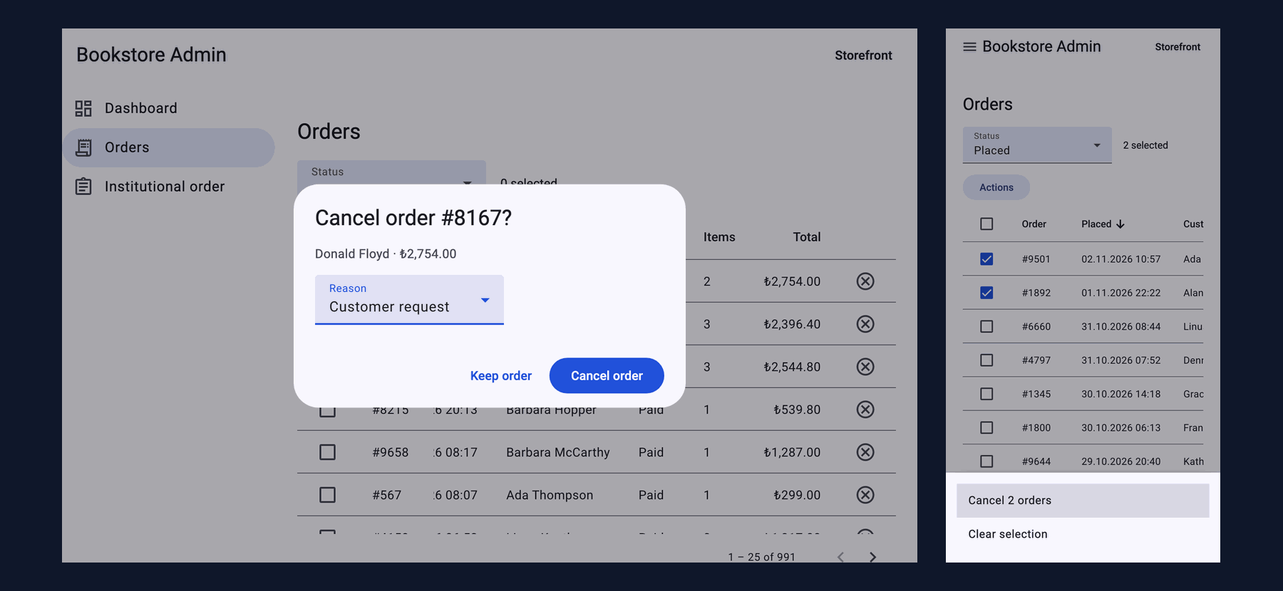
A dialog is a component. The opener gives it data through MAT_DIALOG_DATA, and the dialog returns a result with MatDialogRef.close(). We give the dialog only what it shows: order ids and a summary line. The table's row objects, services or "run this when confirmed" callbacks do not go into the data:
// Only what the dialog shows: ids and a summary line, not the table's rows, services or callbacks
export interface CancelOrderData {
  orderIds: number[];
  summary: string;
}

export interface CancelOrderResult {
  reason: string;
}

@Component({
  selector: 'app-cancel-order-dialog',
  imports: [
    MatDialogTitle, MatDialogContent, MatDialogActions, MatButton, MatFormField, MatLabel, MatSelect, MatOption,
  ],
  template: `
    <h2 mat-dialog-title>Cancel {{ title }}?</h2>
    <mat-dialog-content>
      <p>{{ data.summary }}</p>
      <mat-form-field>
        <mat-label>Reason</mat-label>
        <mat-select [value]="reason()" (valueChange)="reason.set($event)">
          @for (r of reasons; track r) {
            <mat-option [value]="r">{{ r }}</mat-option>
          }
        </mat-select>
      </mat-form-field>
    </mat-dialog-content>
    <mat-dialog-actions align="end">
      <!-- A bare mat-dialog-close closes with '' (the attribute's value), not undefined -->
      <button matButton (click)="dialogRef.close()">Keep order</button>
      <button matButton="filled" [disabled]="!reason()" (click)="confirm()">Cancel order</button>
    </mat-dialog-actions>
  `,
})
export class CancelOrderDialog {
  protected readonly data = inject<CancelOrderData>(MAT_DIALOG_DATA);
  protected readonly dialogRef = inject<MatDialogRef<CancelOrderDialog, CancelOrderResult>>(MatDialogRef);

  protected readonly title =
    this.data.orderIds.length === 1 ? `order #${this.data.orderIds[0]}` : `${this.data.orderIds.length} orders`;
  protected readonly reasons = ['Customer request', 'Out of stock', 'Payment failed', 'Duplicate order'];
  protected readonly reason = signal('');

  protected confirm(): void {
    this.dialogRef.close({ reason: this.reason() });
  }
}
The opener is the orders page. The dialog returns the decision; the page makes the API call, reloads the table and shows the notification, so the same dialog can be opened from another screen in the same way:
private cancelOrders(orderIds: number[], summary: string): void {
  const dialogRef = this.dialog.open<CancelOrderDialog, CancelOrderData, CancelOrderResult>(CancelOrderDialog, {
    data: { orderIds, summary },
    width: '440px',
    // The default only closes on browser back/forward; close on every route change
    closeOnNavigation: 'url-change',
  });
  // afterClosed() emits once (undefined when dismissed with Esc, the backdrop or "Keep order") and completes
  dialogRef.afterClosed().subscribe(result => {
    if (result) {
      void this.submitCancel(orderIds, result.reason);
    }
  });
}
The second question came up in a test. In the first version "Keep order" was <button matButton mat-dialog-close>, and the test said:
AssertionError: expected [ '' ] to deeply equal [ undefined ]mat-dialog-close is an input; an attribute without a value gives an empty string, and the dialog closes with ''. Our if (result) treated that as falsy and behaved correctly, but while the type said CancelOrderResult | undefined, the value was a string. We changed the button to call dialogRef.close() explicitly. We also watched afterClosed() itself in Playwright: after Escape it was next(undefined) complete, one value and then completion. No unsubscribe is needed; what needs attention is the component itself being destroyed while the dialog is open, covered below.
Since Angular Material 22.0.0 you can also pass bindings to open() (the CHANGELOG line "dialog: add the ability to pass bindings"); the dialog component can then use normal input()s instead of MAT_DIALOG_DATA. In this post we used the classic way; it is enough to know that MAT_DIALOG_DATA is a value captured at opening time, not a signal that changes later.
Focus, Escape and Screen Readers
We clicked the cancel button in a row and inspected the dialog with Playwright:
opened from      : Cancel order 8781
dialog           : role=dialog aria-modal=false labelledby="Cancel order #8781?" | host cdk-overlay-popover popover=manual :popover-open=true
page behind      : app-root aria-hidden=true inert=false
initial focus    : mat-select
Tab 1            : button Keep order
Tab 2            : mat-select
Tab 3            : button Keep order
Tab 4            : mat-select
after Escape     : dialogs 0 | afterClosed next(undefined) complete | focus button "Cancel order 8781" cancel
confirm          : POST /api/admin/orders/8781/cancel {"reason":"Customer request"}
snackbar         : Order #8781 cancelled OK | live: polite
focus after      : button "Cancel order 8781" cancel
The dialog is a role="dialog" named by the text in mat-dialog-title. Material leaves aria-modal at false and hides the app behind it from screen readers with aria-hidden="true"; focus cycles inside the dialog (Tab moves between two elements because "Cancel order" is disabled). The initial focus is on the reason select because of the default autoFocus: 'first-tabbable'. Escape closed the dialog and focus returned to the opening button. Why focus traps and returning focus matter is covered in the Accessibility (a11y) series post "Keyboard Navigation and Focus Management: Tab Order, :focus-visible, Skip Links, Focus Traps, inert and Roving Tabindex".
The last line was different in the first attempt. After the confirmation the table reloads, the cancelled order's button becomes disabled, and focus landed here:
focus after : body Bookstore AdminStorefrontdashbTwo causes worked together, and we tried them one at a time; with only one fixed, focus still fell to body. First: because rows are new objects in every response, mat-table recreated every row element, and the focused button left the DOM. Second: when a focused button becomes disabled, the browser drops focus. The fix is trackBy on the table and Material's disabledInteractive on the button:
<table mat-table [dataSource]="rows()" [trackBy]="trackById" matSort [matSortActive]="sort()" [matSortDirection]="dir()"
       (matSortChange)="sortChanged($event)">
<!-- disabledInteractive: a disabled button keeps focus (aria-disabled) instead of dropping it to <body> -->
<button matIconButton type="button" [disabled]="!canCancel(order)" disabledInteractive
[attr.aria-label]="'Cancel order ' + order.id"
(click)="cancelOne(order)">
<mat-icon>cancel</mat-icon>
</button>// Same order, same row element after a reload: focus and selection stay where they were
protected readonly trackById = (_: number, order: OrderRow) => order.id;disabledInteractive sets aria-disabled="true" and swallows clicks instead of really disabling the button; because the button can still take focus, keyboard users do not lose their place. In a filtered list (for example only "Paid") the cancelled order leaves the list, so this is not enough; there you have to move focus deliberately to the next row or the table heading.
A Dialog That Stays Open After a Route Change
The first question. With the dialog open we navigated to /admin/dashboard using the orders page's router, and in another attempt pressed the browser's back button. First without closeOnNavigation (the default), then with 'url-change':
default      router.navigateByUrl: url=/admin/dashboard dialogs=1
default      browser back:         url=/admin/orders dialogs=0
url-change   router.navigateByUrl: url=/admin/dashboard dialogs=0
url-change   browser back:         url=/admin/orders dialogs=0
According to the description in the CDK's type definition, the default closeOnNavigation: true only watches the browser's back and forward buttons. On a navigation from code the dialog stayed open above the dashboard, and if the user pressed "Cancel order" there, an order from a page no longer on screen would be cancelled. The type in 22.2.7 also accepts 'url-change': close on every URL change. The type description notes that this may immediately close overlays opened from a route resolver; if you do not open dialogs from resolvers, it is a safe default.
"Undo" with MatSnackBar
When a customer removes a book from the cart, a snackbar offers "Undo" for five seconds. The removal goes to the API right away; Undo puts the same quantity back:
// Remove at once, offer "Undo" for 5 seconds: Undo puts the same quantity back
protected async remove(line: CartLine): Promise<void> {
  await this.store.remove(line.isbn);
  const snackBarRef = this.snackBar.open(`Removed ${line.title}`, 'Undo', { duration: 5000 });
  snackBarRef.onAction().subscribe(() => void this.store.setQuantity(line.isbn, line.quantity));
}
cart : ["Dune ₺489.00 ₺978.00 Remove"]
snackbar : Removed Dune Undo | aria-live polite | cart lines 0
after Undo : ["Dune ₺489.00 ₺978.00 Remove"] | snackbars 0
no action : snackbar gone after 5.3 s | cart lines 0
API calls : PUT /api/carts/{cartId}/items/9780441172719 {"quantity":1} | PUT /api/carts/{cartId}/items/9780441172719 {"quantity":2} | DELETE /api/carts/{cartId}/items/9780441172719 | PUT /api/carts/{cartId}/items/9780441172719 {"quantity":2} | DELETE /api/carts/{cartId}/items/9780441172719Undo brought back the line with two copies (978 TL); the snackbar's content is in an aria-live="polite" region, so screen readers read the message. Toasts and live regions are covered in detail in the Accessibility (a11y) series post "Dynamic Content and Screen Reader Announcements: Live Regions, ariaNotify(), Form Errors, Toasts and Loading States". Keep one thing in mind: five seconds can be short for someone trying to reach the snackbar with the keyboard; for actions that cannot be undone, use a confirmation dialog instead of a snackbar.
An alternative to "remove, then add back" is to postpone the removal until the snackbar closes. Undo is then not an API call but simply doing nothing; but if the user closes the page within those five seconds, the removal never happens. For the cart we chose the first approach: the cart on the server always shows the real state.
The cart page became the first customer page using Material, and we measured the cost. While CartPage was an eager route, the snackbar went into the initial bundle; making the cart route lazy with loadComponent took it out again:
# CartPage with the snackbar, eager route
                    | Initial total            | 510.06 kB |               127.89 kB
# the same page with loadComponent
                    | Initial total            | 349.12 kB |                93.91 kB
chunk-BTPSdOPZ.js   | cart-page                |   3.57 kB |                 1.51 kB
A single snackbar added 34 kB of transfer to the JavaScript the catalog page downloads.
// Lazy: the snackbar brings Material code that the catalog does not need
{ path: 'cart', loadComponent: () => import('./cart/cart-page').then(m => m.CartPage), title: 'Cart · Bookstore' },
Bulk Actions with MatBottomSheet
The table from the previous post already knew the selected orders. While the selection is not empty, an "Actions" button appears in the toolbar and opens a bottom sheet from the bottom of the screen, where the thumb reaches on a phone:
// Bulk actions for the selected orders, as a sheet from the bottom edge (thumb reach on phones)
@Component({
  selector: 'app-order-actions-sheet',
  imports: [MatActionList, MatListItem, MatListItemTitle],
  template: `
    <mat-action-list>
      <button mat-list-item type="button" (click)="choose('cancel')">
        <span matListItemTitle>Cancel {{ data.count }} {{ data.count === 1 ? 'order' : 'orders' }}</span>
      </button>
      <button mat-list-item type="button" (click)="choose('clear')">
        <span matListItemTitle>Clear selection</span>
      </button>
    </mat-action-list>
  `,
})
export class OrderActionsSheet {
  protected readonly data = inject<{ count: number }>(MAT_BOTTOM_SHEET_DATA);
  private readonly sheetRef = inject<MatBottomSheetRef<OrderActionsSheet, OrderAction>>(MatBottomSheetRef);

  protected choose(action: OrderAction): void {
    this.sheetRef.dismiss(action);
  }
}
protected openActions(): void {
const ids = [...this.selection.selected];
this.bottomSheet
.open<OrderActionsSheet, { count: number }, OrderAction>(OrderActionsSheet, { data: { count: ids.length } })
.afterDismissed()
.subscribe(action => {
if (action === 'cancel') {
this.cancelOrders(ids, `${ids.length} selected orders`);
} else if (action === 'clear') {
this.selection.clear();
}
});
}We selected two orders at a width of 390px and ran the flow end to end:
sheet         : role=dialog aria-modal=false items=["Cancel 2 orders","Clear selection"] focus=Cancel 2 orders
dialog title  : Cancel 2 orders?
requests      : POST /api/admin/orders/9501/cancel | POST /api/admin/orders/1892/cancel
snackbar      : 2 orders cancelled OK | 0 selected
The bottom sheet is a role="dialog" too, and focus starts on the first action. The selection is copied into ids before the sheet opens; the dialog opened after the sheet and the two POSTs work with that copy, so even if the selection changes in the meantime, the orders the user confirmed are the ones cancelled. On desktop a mat-menu is more natural for the same menu; choosing the bottom sheet by screen width is a BreakpointObserver topic for post 07.
The CDK Dialog and the Native dialog
We built the same confirmation in two more ways and measured them without putting them into the snapshot. The CDK Dialog is the unstyled layer under MatDialog: the Dialog service, DIALOG_DATA and DialogRef; the title, padding and rounded corners are our CSS:
// CDK Dialog: the same behavior (overlay, focus trap, Esc, aria-hidden), no Material look; the styles are ours
@Component({
  selector: 'app-cancel-order-dialog',
  imports: [MatButton, MatFormField, MatLabel, MatSelect, MatOption],
  template: `
    <h2 [id]="titleId">Cancel {{ title }}?</h2>
    <p>{{ data.summary }}</p>
    <mat-form-field>
      <mat-label>Reason</mat-label>
      <mat-select [value]="reason()" (valueChange)="reason.set($event)">
        @for (r of reasons; track r) {
          <mat-option [value]="r">{{ r }}</mat-option>
        }
      </mat-select>
    </mat-form-field>
    <div class="actions">
      <button matButton (click)="dialogRef.close()">Keep order</button>
      <button matButton="filled" [disabled]="!reason()" (click)="confirm()">Cancel order</button>
    </div>
  `,
  styles: `
    :host { display: block; padding: 24px; border-radius: 16px; background: var(--mat-sys-surface-container-high); }
    .actions { display: flex; justify-content: flex-end; gap: 8px; }
  `,
})
export class CancelOrderDialog {
  protected readonly data = inject<CancelOrderData>(DIALOG_DATA);
  protected readonly dialogRef = inject<DialogRef<CancelOrderResult, CancelOrderDialog>>(DialogRef);
  // ...
}
In the native version there is no dialog component; the page's template has a <dialog> opened with showModal():
<dialog #confirmDialog aria-labelledby="native-title" (close)="pending.set(null)">
  @if (pending(); as p) {
    <h2 id="native-title">Cancel {{ p.orderIds.length === 1 ? 'order #' + p.orderIds[0] : p.orderIds.length + ' orders' }}?</h2>
    <p>{{ p.summary }}</p>
    <label>Reason <select #reason>@for (r of reasons; track r) {<option>{{ r }}</option>}</select></label>
    <button type="button" (click)="confirmDialog.close()">Keep order</button>
    <button type="button" (click)="confirmNative(reason.value)">Cancel order</button>
  }
</dialog>
We served the three versions as production builds, added up the JavaScript a user downloads when entering /admin/orders and opening the dialog, and compared the behavior:
native    JS for /admin/orders + dialog: 938051 bytes
native    role=dialog aria-modal=null top layer=true | app-root aria-hidden=null | focus dialog
native    Escape: open=0 focus button "Cancel order 5123"
cdk       JS for /admin/orders + dialog: 938410 bytes
cdk       role=dialog aria-modal=false top layer=true | app-root aria-hidden=true | focus mat-select
cdk       Escape: open=0 focus button "Cancel order 5123"
material  JS for /admin/orders + dialog: 957185 bytes
material  role=dialog aria-modal=false top layer=true | app-root aria-hidden=true | focus mat-select
material  Escape: open=0 focus button "Cancel order 5123"
In the native line role=dialog is not an attribute but the element's name: the role of <dialog> is dialog already. The answer to the third question: all three. CDK 22 opens overlays inside a popover="manual" host by default; that is why MatDialog and the CDK Dialog are in the top layer like the native dialog and do not compete with z-index. The top layer and stacking contexts themselves are covered in the CSS series post "Normal Flow, display and Positioning: sticky, z-index, Stacking Contexts and the Top Layer". The differences are elsewhere: according to the HTML spec, the native showModal() makes the rest of the page inert at the browser level and gives the initial focus to the dialog itself; the CDK and Material hide the background with aria-hidden, hold focus with JavaScript and give it to the first tabbable element.
The byte differences are specific to this page: the bottom sheet and the snackbar already bring the CDK overlay and the CDK Dialog, so the extra cost of the CDK Dialog was 359 bytes and that of MatDialog 19,134 bytes. On a page without any other overlay we would expect a much larger difference; we did not measure that separately. The native dialog and popover themselves are covered in the HTML5 and Semantic HTML series post "Native Interactive Elements 1: details/summary, dialog, popover and Invoker Commands". The decision: a single confirmation on a page without Material → the native dialog; on a screen that uses Material → MatDialog (look, density and theme tokens are ready); if you need your own design with the CDK's behavior → the CDK Dialog.
In Production
Give the dialog IDs, not objects. MAT_DIALOG_DATA is a value from opening time; when the table reloads, the row object in the dialog is stale. Everything you pass in also makes it harder to open the dialog from other screens.
Handle the kind of closing. afterClosed() gives undefined for Escape, the backdrop and "never mind" (or '' for a mat-dialog-close without a value); accept a confirmation only as a result of the shape you expect.
Close on navigation. A dialog without closeOnNavigation: 'url-change' stays open on route changes made from code.
Measure the bundle when bringing Material to a customer page. One snackbar grew the initial bundle by 34 kB of transfer; a lazy route brought that back to zero.
Turn animations off in tests. afterClosed() arrives after the closing animation; with { animationsDisabled: true } for MATERIAL_ANIMATIONS in the test, the result arrived right after close(). Dialogs are rendered in the overlay, outside the fixture, so we look for harnesses with TestbedHarnessEnvironment.documentRootLoader:
 ✓ src/app/cart/cart-page.spec.ts > CartPage > removes a book and puts the same quantity back on Undo
 ✓ src/app/admin/orders/cancel-order-dialog.spec.ts > CancelOrderDialog > asks for a reason before it can cancel and returns it
 ✓ src/app/admin/orders/cancel-order-dialog.spec.ts > CancelOrderDialog > returns undefined when the user keeps the order
      Tests  16 passed (16)
Common Pitfalls
First, carrying services, callbacks or the table's state into the dialog component as data. Let the dialog return the decision and let the opener do the work.
Second, assuming afterClosed() gives the same thing on every kind of close. A mat-dialog-close without a value returns an empty string.
Third, assuming an open dialog closes when the route changes. The default only listens to the back and forward buttons.
Fourth, forgetting focus after the confirmation. If rows are recreated or the button becomes disabled, focus falls to body.
Fifth, presenting an action that cannot be undone as "undoable" with only a snackbar. Use Undo where it can really undo.
A Small Experiment
★☆☆ Open CancelOrderDialog with autoFocus: 'dialog' and measure where the initial focus goes. Which is better for screen readers: hearing the title, or going straight to the select?
★★☆ Open the dialog with bindings: [inputBinding('orderIds', …)] and use input() instead of MAT_DIALOG_DATA. If the table reloads while the dialog is open, does the summary in the dialog update?
★★★ Turn the snackbar into the "postpone the removal" approach: send the DELETE only when the snackbar closes without Undo. What happens if the user closes the tab within those five seconds? Solve it with the dismissedByAction value of afterDismissed() and pagehide.
We used Material's ready-made overlays: dialog, bottom sheet, snackbar. In the next post we go below them: with the CDK Overlay and Portal we build a "quick preview" panel and a user menu in the catalog, and compare position strategies, scroll strategies and the JavaScript-free version of the same job with CSS anchor positioning.