

Material Form Components: mat-form-field, matInput, mat-select, mat-autocomplete and mat-datepicker

mat-error only appears once a field is touched or after submit because of the default ErrorStateMatcher; with Signal Forms the ShowOnDirty matcher never shows the error of an empty required field. On Bookstore's institutional order form we measure an empty-looking mat-select without compareWith, debounce cutting 8 requests to 1, the native date adapter reading 05.12.2026 as 12 May, Turkish dates with date-fns and 15 December shifting to the 14th in UTC.
Version note: The examples in this post were tried with Angular 22.2 (TypeScript 6.0, Signal Forms), Angular Material and the CDK 22.2.7, @angular/material-date-fns-adapter 22.2.7, date-fns 4.4 and Node.js 24; browser behavior was observed in headless Chromium with Playwright 1.65, with the time zone set to Europe/Istanbul. For the measurements Bookstore.Api ran on SQLite instead of SQL Server.
Predict First
We are adding an institutional order form to the admin panel of Bookstore, the online bookstore used as the shared example across this site's series: bulk orders from schools and libraries, at least 20 copies. The form has a choice of the institution's units, a book field that searches on the server, a quantity, a delivery date and a contact e-mail. Three questions: if you press "Create order" without touching any field, under which fields does a red error appear? With Material's default date adapter and the Turkish locale, which day ends up in the model when the user types "05.12.2026" into the date field? And if you pick 15 December in the calendar and send the model to the server with JSON.stringify, what does deliveryDate become?
The Form's Skeleton: mat-form-field, Label, Hint and Error
We added a small endpoint to the API for the institution's units. The Institutional module has no tables of its own yet; the endpoint returns the demo institution's units from a fixed list:
// Read-only for now: the units of the demo institution until the Institutional module gets its own tables.
public static class InstitutionalModule
{
    private static readonly InstitutionUnitView[] DemoUnits =
    [
        new(1, "Main Campus Library", "Campus"),
        new(2, "North Campus Library", "Campus"),
        new(3, "Science Department", "Department"),
        new(4, "Literature Department", "Department"),
        new(5, "Primary School Branch", "Branch")
    ];

    public static IEndpointRouteBuilder MapInstitutionalEndpoints(this IEndpointRouteBuilder app)
    {
        app.MapGet("/api/institutions/{institutionId:int}/units", GetUnits).WithTags("Institutional");
        return app;
    }

    private static Results<Ok<InstitutionUnitView[]>, NotFound> GetUnits(int institutionId) =>
        institutionId == 1 ? TypedResults.Ok(DemoUnits) : TypedResults.NotFound();
}
The form's model is a signal and its rules live in a Signal Forms schema. Signal Forms itself, stable since Angular 22, is covered in the Angular series post "Angular 22: OnPush by Default, Stable Signal Forms and a File-by-File Comparison with Angular 12"; here we look at how it behaves together with Material components. Material 22.2.0's CHANGELOG has the line "form-field: support signal forms in MatFormFieldControl": the [formField] directive binds directly to matInput, mat-select and the datepicker input.
protected readonly orderForm = form(this.model, path => {
  // required() treats an empty array as a value; ask for at least one unit explicitly
  minLength(path.units, 1, { message: 'Choose at least one unit.' });
  validate(path.book, ({ value }) =>
    typeof value() === 'string' ? { kind: 'bookNotChosen', message: 'Pick a book from the list.' } : undefined);
  min(path.quantity, 20, { message: 'Institutional orders start at 20 copies.' });
  required(path.deliveryDate, { message: 'Choose a delivery date.' });
  minDate(path.deliveryDate, this.tomorrow, { message: 'The earliest delivery date is tomorrow.' });
  required(path.contactEmail, { message: 'Enter a contact e-mail.' });
  email(path.contactEmail, { message: 'Enter an e-mail address like buyer@example.com.' });
});
<mat-form-field>
<mat-label>Contact e-mail</mat-label>
<mat-icon matPrefix>mail</mat-icon>
<input matInput type="email" autocomplete="email" [formField]="orderForm.contactEmail"
[errorStateMatcher]="whileTyping" />
<mat-error>{{ firstError(orderForm.contactEmail) }}</mat-error>
</mat-form-field>mat-form-field is a shell: depending on the state of the control inside, it floats the label, switches between mat-hint and mat-error, and places the matPrefix and matIconSuffix slots. mat-error always stays in the template; the control's error state decides whether it is shown. The default appearance is fill (DEFAULT_APPEARANCE = 'fill' in the source); instead of an attribute on every field we made all fields on the page outline with one provider:
providers: [
  provideDateFnsAdapter(),
  { provide: MAT_DATE_LOCALE, useValue: tr },
  // One place for the look of every field on the page instead of appearance="outline" on each
  { provide: MAT_FORM_FIELD_DEFAULT_OPTIONS, useValue: { appearance: 'outline' } },
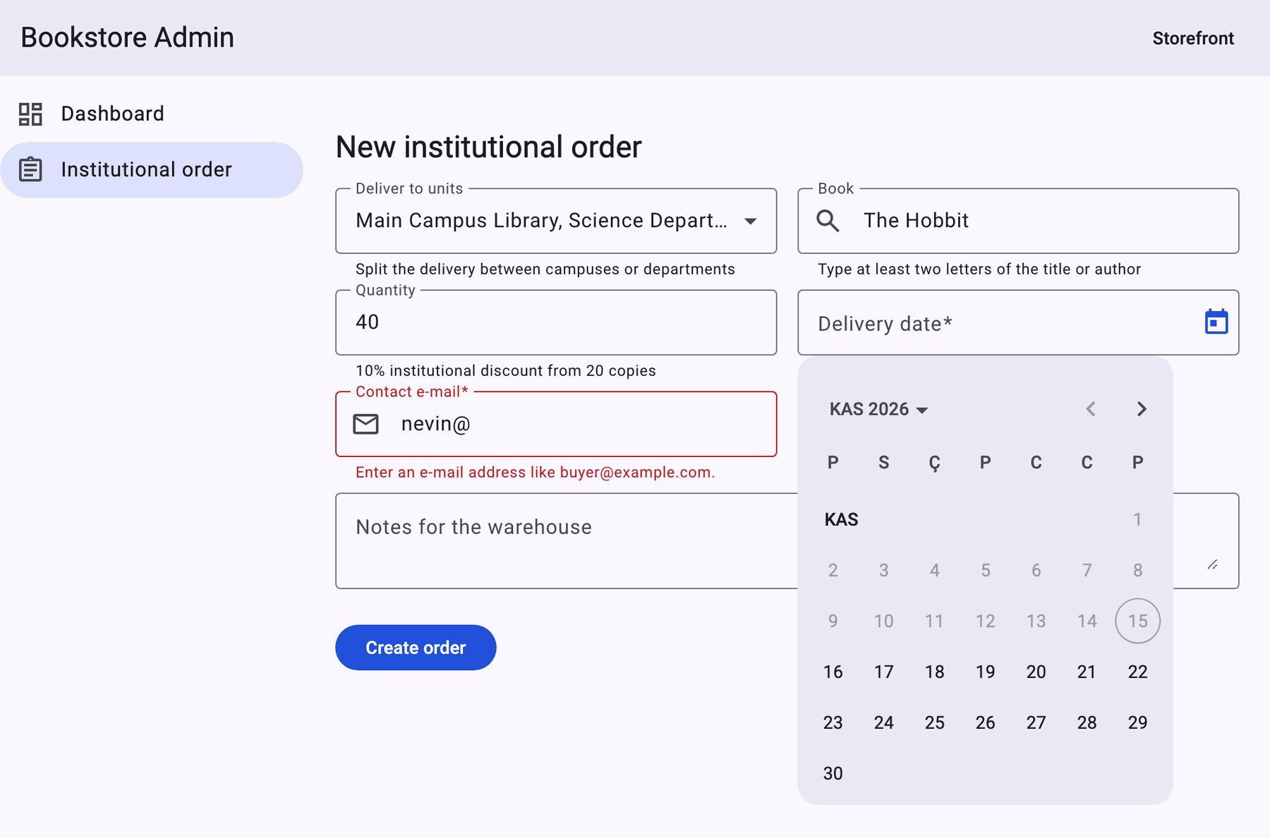
],
When Does mat-error Show Up?
The first question. With Playwright we first opened the page, then entered the e-mail field and left it with Tab, and finally submitted the empty form:
on load        : []
e-mail blurred : ["Enter a contact e-mail."]
after submit   : ["Choose at least one unit.","Pick a book from the list.","Choose a delivery date.","Enter a contact e-mail."]
When the page opens the form is invalid but no error is visible; that is not a bug but the rule of Material's default ErrorStateMatcher. The source has two methods: for Reactive Forms, isErrorState(control, form) says "invalid and (touched or the form was submitted)"; for Signal Forms, isSignalErrorState(field), added in 22.2, says only "invalid and touched", because Signal Forms has no submitted flag on a parent form. What makes the errors appear after submit is Signal Forms' submit() function: in our measurement every field was touched after submit. The quantity field is not in the list because its initial value is 20, which is valid.
In the first version of this measurement the units field was missing from the list too. The schema had required(path.units), and the fields' state after submit was this (T: touched, I: invalid):
submit units:T- book:TI quantity:T- deliveryDate:TI contactEmail:TI | mat-error: ["Pick a book from the list.","Choose a delivery date.","Enter a contact e-mail."]The units field is touched but not invalid: required treats an empty array as a value. In a multiple selection, "at least one" has to be written as minLength(path.units, 1).
For some fields you may want to show the error while the user types. For the e-mail we tried Material's ready-made ShowOnDirtyErrorStateMatcher and created a new bug:
on load        : []
e-mail blurred : []
after submit   : ["Choose at least one unit.","Pick a book from the list.","Choose a delivery date."]
The Signal Forms side of this matcher says "invalid and dirty". An e-mail left empty is never dirty, so "Enter a contact e-mail." did not show up even after submit. In Reactive Forms the same matcher shows the error once the form is submitted; Signal Forms has no such flag. The fix is a small matcher combining both conditions:
// ShowOnDirtyErrorStateMatcher alone would hide "required" on an empty field even after submit:
// submit() marks fields as touched, not dirty
class WhileTypingErrorStateMatcher extends ErrorStateMatcher {
  override isSignalErrorState(field: Field<unknown> | null): boolean {
    const state = field?.();
    return !!state && state.invalid() && (state.dirty() || state.touched());
  }
}
quantity "5", no blur []
e-mail "nevin@", no blur ["Institutional orders start at 20 copies.","Enter an e-mail address like buyer@example.com."]
after Tab ["Institutional orders start at 20 copies.","Enter an e-mail address like buyer@example.com."]Typing 5 into the quantity field did not show an error right away; it appeared when focus moved to the e-mail. The e-mail error appeared while typing. The two behaviors differ on purpose in the same form.
mat-select: Multiple Selection and compareWith
The units the order is delivered to are a multiple mat-select. As a convenience we keep the units chosen in the last order in localStorage and open the form with them:
<mat-select [formField]="orderForm.units" multiple [compareWith]="sameUnit">
  @for (unit of units.value(); track unit.id) {
    <mat-option [value]="unit">{{ unit.name }}</mat-option>
  }
</mat-select>
// Options come from the API as new objects on every load: compare units by id, not by reference
protected readonly sameUnit = (a: InstitutionUnit | null, b: InstitutionUnit | null) => a?.id === b?.id;We reloaded the page and read the text the select shows and the value in the model, first without compareWith and then with it:
# no compareWith
after reload  : "" | model units: Main Campus Library, Science Department
# compareWith="sameUnit"
after reload  : "Main Campus Library, Science Department" | model units: Main Campus Library, Science Department
The first line is a nasty bug: the model has two units and the form is valid, but the user sees an empty select and will probably choose the units again. mat-select compares with === by default; objects parsed from localStorage are not the same references as the objects from the API. Using the id as the value instead of the object is one fix; if you want to keep objects, compareWith is required.
Searching on the Server with mat-autocomplete
The book field searches the catalog on the server. The input's value is a string while typing and a BookSummary object once an option is chosen; the validate rule in the schema answers "was a book chosen from the list" by looking at that difference. The search turns a signal derived from the string in the model into RxJS:
// Server-side search: 300 ms after the last key stroke, at least 2 characters, the old request is cancelled
private readonly query = computed(() => {
  const value = this.model().book;
  return typeof value === 'string' ? value.trim() : '';
});
protected readonly matches = toSignal(
  toObservable(this.query).pipe(
    debounceTime(300),
    distinctUntilChanged(),
    switchMap(search => search.length < 2
      ? of([])
      : this.http.get<PagedResult<BookSummary>>('/api/books', { params: { search, pageSize: 8 } }).pipe(
          map(result => result.items),
          catchError(() => of([])))),
  ),
  { initialValue: [] },
);
<input matInput [formField]="orderForm.book" [matAutocomplete]="bookList" />
<mat-autocomplete #bookList [displayWith]="bookTitle">
@for (book of matches(); track book.isbn) {
<mat-option [value]="book">{{ book.title }} · {{ book.author }}</mat-option>
}
</mat-autocomplete>We typed "The Hobbit" key by key, 60 ms apart, and counted the requests to /api/books:
# no debounceTime(300)
book requests : 8 ?search=Th&pageSize=8 ?search=The&pageSize=8 ?search=The H&pageSize=8 ?search=The Ho&pageSize=8 ?search=The Hob&pageSize=8 ?search=The Hobb&pageSize=8 ?search=The Hobbi&pageSize=8 ?search=The Hobbit&pageSize=8
# debounceTime(300)
book requests : 1 ?search=The Hobbit&pageSize=8
Without debounce, every key from the second one on is a request; "The " and "The" became the same query, so distinctUntilChanged dropped one. Because switchMap cancels old requests, a response arriving out of order cannot break the list, but the server still runs eight queries. Time-based operators are covered in detail in the RxJS series post "Time-Based Operators and Schedulers: debounceTime, throttleTime, auditTime, timeout and Polling". displayWith decides how the chosen object is written into the input; without it the input shows "[object Object]".
mat-datepicker: Turkish Dates and Monday
In the first attempt we used Material's own provideNativeDateAdapter() with MAT_DATE_LOCALE: 'tr-TR'. The calendar is Turkish and starts on Monday: the native adapter takes the first day of the week from the browser's Intl.Locale week info. The problem showed up with typed dates:
# provideNativeDateAdapter() + 'tr-TR'
typed 05.12.2026 input="12.05.2026" model=Tue May 12 2026 touched=true errors=["matDatepickerMin","minDate"] | mat-error: []
typed 15.12.2026 input="15.12.2026" model=null touched=true errors=["matDatepickerParse","required"] | mat-error: []
typed 2026-12-15 input="15.12.2026" model=Tue Dec 15 2026 touched=true errors=[] | mat-error: []
calendar         ARA 2026 | P S Ç P C C P
The answer to the second question: 12 May. The native adapter formats dates for display with Intl.DateTimeFormat according to the locale, but parses with Date.parse (new Date(Date.parse(value)) in the source); Chromium read "05.12.2026" as month.day.year and could not read "15.12.2026" at all. If the day is below 13 you silently get the wrong date, otherwise a parse error. A second observation: the datepicker's own validators (matDatepickerParse, matDatepickerMin) end up in Signal Forms' error list, but without a message; our firstError returned an empty string, so mat-error stayed empty.
For Turkish dates we switched to Material's date-fns adapter. The adapter's default format is date-fns' P, the locale's short date format; in the tr locale that is day.month.year, and the week starts on Monday (weekStartsOn: 1):
npm install @angular/material-date-fns-adapter@22.2.7 date-fns@4.4.0const datepickerMessages: Record<string, string> = {
matDatepickerParse: 'Enter the date as DD.MM.YYYY.',
matDatepickerMin: 'The earliest delivery date is tomorrow.',
};
protected firstError(field: { (): { errors(): { kind: string; message?: string }[] } }): string {
const error = field().errors()[0];
// The datepicker's own validators (parse, min, max, filter) arrive without a message
return error?.message ?? datepickerMessages[error?.kind ?? ''] ?? '';
}# provideDateFnsAdapter() + date-fns tr locale
typed 05.12.2026 input="05.12.2026" model=Sat Dec 05 2026 touched=true errors=[] | mat-error: []
typed 15.12.2026 input="15.12.2026" model=Tue Dec 15 2026 touched=true errors=[] | mat-error: []
typed 31.02.2026 input="31.02.2026" model=null touched=true errors=["matDatepickerParse","required"] | mat-error: ["Enter the date as DD.MM.YYYY."]
typed 2026-12-15 input="15.12.2026" model=Tue Dec 15 2026 touched=true errors=[] | mat-error: []
calendar ARA 2026 | P S Ç P C C PCorrect parsing has a price. The page chunk was 340.55 kB (64.72 kB transferred) with the native adapter and 389.80 kB (75.39 kB transferred) with date-fns and the Turkish locale. About 11 kB of transfer is small next to an order shipped on the wrong delivery date.
The Time Zone Shift
The third question. The datepicker puts the chosen day into a Date at local midnight. Sending the model as is with JSON.stringify calls toISOString(), and in Istanbul (UTC+3) the chosen 15 December moves to the previous day:
JSON.stringify(model.deliveryDate): "2026-12-14T21:00:00.000Z"
timezone: Europe/Istanbul
If the server reads that value as a date in UTC, the order is booked for 14 December. A delivery date is not an instant but a day in the calendar; we put it into the request as a date without a time:
function toDateOnly(date: Date): string {
  const month = String(date.getMonth() + 1).padStart(2, '0');
  const day = String(date.getDate()).padStart(2, '0');
  return `${date.getFullYear()}-${month}-${day}`;
}
{
"unitIds": [
1,
3
],
"isbn": "9780261102217",
"quantity": 40,
"deliveryDate": "2026-12-15",
"contactEmail": "nevin@example.com",
"notes": ""
}On the server the counterpart of this is DateOnly. Time zones and formatting with Intl are covered in the JavaScript series post "Advanced Date Handling in JavaScript: Time Zones, UTC and Formatting with Intl".
A Growing Textarea: cdkTextareaAutosize or field-sizing?
We wanted the warehouse notes field to grow with its content. First we used the CDK's cdkTextareaAutosize directive with cdkAutosizeMinRows="2" and cdkAutosizeMaxRows="6", typed 1, 4 and 10 lines and measured the height:
cdkTextareaAutosize  1 lines: height 30px, scrollable false
cdkTextareaAutosize  4 lines: height 90px, scrollable true
cdkTextareaAutosize 10 lines: height 90px, scrollable true
Four lines already scrolled despite the six-row limit. The directive finds the height of one row by measuring a copy of the textarea; when we caught the moment of measurement, the copy still had the browser's default font:
clone: clientHeight=15 font="13.3333px monospace" parentFont="16px / 24px Roboto" sheets=21 fontsStatus=loadingIt counted a row as 15px instead of 24px and allowed at most 6 × 15 = 90px. When the window is resized the directive measures again and finds 24px, but the limit is wrong when the user opens the page. We did the same with CSS's field-sizing property:
// Grows with its content between 2 and 6 lines (Baseline 2026: Chrome 123, Firefox 152, Safari 26.2)
.notes {
  field-sizing: content;
  min-height: 2lh;
  max-height: 6lh;
}
field-sizing 1 lines: height 48px, scrollable false
field-sizing 4 lines: height 96px, scrollable false
field-sizing 10 lines: height 144px, scrollable trueAccording to MDN, field-sizing has been Baseline since June 2026. In an older browser without support the textarea keeps a fixed height and the user can still type; a more acceptable result than the JavaScript solution's wrong measurement. If older browsers are a requirement, cdkTextareaAutosize is still an option, but verify its first measurement on your own page.
Testing the Form with Harnesses
We covered the three decisions of this post with tests: units restored with compareWith, errors that appear after submit (including the e-mail's own matcher), and Turkish dates with a request without a time. The tests use Material's select, form-field, button and datepicker harnesses:
it('reads Turkish dates as day.month.year', async () => {
  const { fixture, loader } = await render();
  const year = new Date().getFullYear() + 1;
  const date = await loader.getHarness(MatDatepickerInputHarness);
  await date.setValue(`05.12.${year}`);
  await date.blur();

  const picked = fixture.componentInstance['model']().deliveryDate as Date;
  expect([picked.getDate(), picked.getMonth() + 1, picked.getFullYear()]).toEqual([5, 12, year]);
  expect(await date.getValue()).toBe(`05.12.${year}`);
});
✓ src/app/admin/institutional-order/institutional-order-page.spec.ts > InstitutionalOrderPage > selects the last used units again although the options are new objects
✓ src/app/admin/institutional-order/institutional-order-page.spec.ts > InstitutionalOrderPage > shows the errors of untouched fields only after submit
✓ src/app/admin/institutional-order/institutional-order-page.spec.ts > InstitutionalOrderPage > reads Turkish dates as day.month.year
✓ src/app/admin/institutional-order/institutional-order-page.spec.ts > InstitutionalOrderPage > sends the picked day as a date, not as UTC midnight
Test Files 4 passed (4)
Tests 8 passed (8)We did not hard-code the year in the date test; because of the "not before tomorrow" rule a fixed date would break the test a few months later.
In Production
Load the form page separately. Form-field, select, autocomplete, datepicker, Signal Forms and date-fns together make a 385.24 kB chunk (74.45 kB transferred); loading the page with loadComponent keeps this code away from people who only open the dashboard. We also provided the date adapter in this component's providers rather than at the application level. Still, part of the cost reached the panel's shared chunk: admin-routes grew from 173.01 kB to 232.44 kB. According to the build stats most of that is code shared with the form page, for example 38.9 kB from @angular/forms; the build put this shared code into the parent chunk that always loads first. Measure the bundle budget along the chain of chunks a user actually downloads, not page by page.
Keep error messages in one place. The schema rules carry a message, the datepicker's validators do not; sending all of them through one function prevents empty mat-errors. If a message is missing, mat-error is shown but empty and the field turns red for no visible reason.
Measure accessibility. On the empty, required e-mail field there was no aria-invalid attribute after submit, and aria-describedby pointed to the error message: Material deliberately does not write aria-invalid on empty required fields. We measured in the Accessibility (a11y) series post "Accessible Components in Angular: Angular Aria, CDK a11y, Material and Not Writing Your Own Combobox" that Signal Forms alone does not write aria-invalid; Material's form field makes that connection for you.
Let the server validate too. The rules here are early feedback for the user; the 20-copy minimum and the date rule must also be in the order API.
Common Pitfalls
First, taking it as a bug that mat-error only shows after touched or submit. That is the default matcher's rule; if you change it, think about dirty and touched together in Signal Forms, otherwise the error of an empty field never shows.
Second, forgetting compareWith on an object-valued mat-select. The model is full, the screen is empty.
Third, trusting the native adapter for Turkish dates. The display is right, the parsing is wrong: 05.12 turns into May.
Fourth, serializing the Date from the datepicker as is. A day picked in UTC+3 reaches the server as the day before.
Fifth, relying on required in a multiple selection. An empty array passes it; use minLength(…, 1).
A Small Experiment
★☆☆ Add subscriptSizing: 'dynamic' to MAT_FORM_FIELD_DEFAULT_OPTIONS and compare on screen how the space under fields without a hint changes.
★★☆ Add a [matDatepickerFilter] to the delivery date that blocks weekends. When you type a Saturday with the keyboard, which kind shows up in Signal Forms' error list? Add its message to datepickerMessages and verify it with a test.
★★★ Rewrite the e-mail and quantity fields of the same form with Reactive Forms (FormGroup, formControlName) and try ShowOnDirtyErrorStateMatcher there. Does the empty e-mail show its error after submit? Explain the difference by reading the source of isErrorState and isSignalErrorState.
The form is ready; next is the admin panel's most used screen: the orders table. In the next post we build mat-table's column structure, MatSort and MatPaginator, see why paging 10,000 orders in the browser is a bad idea, and set up server-side pagination that keeps sort, page and filter in the URL.