

CDK Overlay and Portal: Building Your Own Floating Panel, Position Strategies and a Comparison with CSS Anchor Positioning
In CDK Overlay, open the panel with createOverlayRef and a ComponentPortal, give FlexibleConnectedPositionStrategy fallback positions and the reposition scroll strategy, and dispose it with DestroyRef: without that, the panel and its backdrop stayed on screen after the page changed. We build a quick view and an account panel in Bookstore, and measure focus lost on Tab, the 14.5 kB cost of an eager import and the same panel with popover + CSS anchor positioning.
Version note: The examples in this post were tried with Angular 22.2 (TypeScript 6.0), Angular Material and the CDK 22.2.7, .NET 10 and Node.js 24; browser behavior was observed in headless Chromium with Playwright 1.65. For the measurements Bookstore.Api ran on SQLite instead of SQL Server.
Predict First
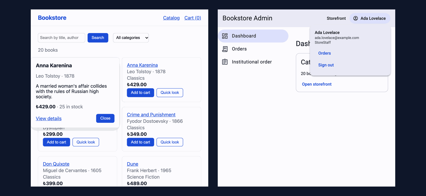
On the catalog page of Bookstore, the online bookstore used as the shared example across this site's series, we add a "Quick look" button to every book card: a click opens a small panel next to the card with the book's description, price and stock. We also put an account panel in the admin panel's toolbar. We build both without Material's ready-made components, directly with CDK Overlay and Portal. Three questions: if the user clicks the "View details" link inside the open panel and the page changes, does the panel close by itself? Where does the panel go when it opens on a card in the rightmost column? Where does focus go when a keyboard user presses Tab on the panel's last button?
Opening an Overlay from Code: createOverlayRef and ComponentPortal
The dialog, bottom sheet and snackbar of the previous post all sit on the same foundation: CDK Overlay. An overlay is a box rendered outside the page flow, in a container at the end of body, and placed by a position strategy. What goes inside is decided by a Portal: a ComponentPortal renders a component and a TemplatePortal renders an ng-template "somewhere else". The quick view's content is an ordinary component; it knows nothing about where the panel sits:
// The panel's content: a ComponentPortal renders it inside the overlay, far away from the card in the DOM
@Component({
  selector: 'app-book-quick-view',
  imports: [CurrencyPipe, RouterLink],
  host: {
    role: 'dialog',
    'aria-labelledby': 'quick-view-title',
    tabindex: '-1',
    class: 'quick-view',
  },
  template: `
    @if (book.value(); as b) {
      <h2 id="quick-view-title">{{ b.title }}</h2>
      <p class="muted">{{ b.author }} · {{ b.publishedYear }}</p>
      <p>{{ b.description }}</p>
      <p>
        <strong>{{ b.price | currency: 'TRY' : 'symbol-narrow' }}</strong>
        <span class="muted"> · {{ b.available > 0 ? b.available + ' in stock' : 'Out of stock' }}</span>
      </p>
      <div class="actions">
        <a [routerLink]="['/books', b.isbn]">View details</a>
        <button type="button" (click)="closed.emit()">Close</button>
      </div>
    } @else if (book.error()) {
      <h2 id="quick-view-title">Not available</h2>
      <button type="button" (click)="closed.emit()">Close</button>
    } @else {
      <p id="quick-view-title" class="muted">Loading…</p>
    }
  `,
})
export class BookQuickView {
  readonly isbn = input.required<string>();
  readonly closed = output<void>();

  protected readonly book = httpResource<BookDetails>(() => `/api/books/${this.isbn()}`);
}
The code that opens the overlay lives in a separate file. Since CDK 20.0.0 there are tree-shakeable functions next to the Overlay service (the CHANGELOG says "add tree-shakeable alternatives for overlay APIs"): createOverlayRef, createFlexibleConnectedPositionStrategy, createRepositionScrollStrategy. They all take an Injector:
// Right of the card; if it does not fit, left of it; if neither fits, below it
const positions: ConnectedPosition[] = [
  { originX: 'end', originY: 'top', overlayX: 'start', overlayY: 'top', offsetX: 8 },
  { originX: 'start', originY: 'top', overlayX: 'end', overlayY: 'top', offsetX: -8 },
  { originX: 'center', originY: 'bottom', overlayX: 'center', overlayY: 'top', offsetY: 8 },
];

// Loaded on the first "Quick look" click: the CDK overlay code is not part of the catalog's initial bundle
export function attachQuickView(injector: Injector, isbn: string, card: HTMLElement, close: () => void): OverlayRef {
  const overlayRef = createOverlayRef(injector, {
    positionStrategy: createFlexibleConnectedPositionStrategy(injector, card)
      .withPositions(positions)
      .withViewportMargin(8)
      .withPush(false),
    // The panel follows the card while the page scrolls
    scrollStrategy: createRepositionScrollStrategy(injector),
    hasBackdrop: true,
    backdropClass: 'cdk-overlay-transparent-backdrop',
  });
  const view = overlayRef.attach(new ComponentPortal(BookQuickView, null, injector));
  view.setInput('isbn', isbn);
  view.instance.closed.subscribe(close);
  overlayRef.backdropClick().subscribe(close);
  const panel: HTMLElement = view.location.nativeElement;
  // Escape, or Tab out of the panel: close and give focus back to the button
  overlayRef.keydownEvents().subscribe(event => {
    if (event.key === 'Escape' || tabLeavesPanel(event, panel)) {
      event.preventDefault();
      close();
    }
  });
  // Keyboard and screen reader users land in the panel, not behind it
  panel.focus();
  return overlayRef;
}
attach() returns a ComponentRef; we pass the input with setInput and connect to the output with a plain subscription. The component did not need a token like MAT_DIALOG_DATA. The injector we give the portal is the page's injector, so the panel sees HttpClient, the router and the page's services. The overlay's lifetime is held by a small service tied to the page:
// Provided by the page that uses it: one panel at a time, gone together with the page
@Injectable()
export class QuickView {
  private readonly injector = inject(Injector);
  private overlayRef: OverlayRef | null = null;
  private trigger: HTMLElement | null = null;
  private destroyed = false;
  readonly openIsbn = signal<string | null>(null);

  constructor() {
    // Without this the panel and its backdrop stay on screen after the page is gone
    inject(DestroyRef).onDestroy(() => {
      this.destroyed = true;
      this.overlayRef?.dispose();
    });
  }

  async open(isbn: string, card: HTMLElement, trigger: HTMLElement): Promise<void> {
    this.close();
    const { attachQuickView } = await import('./quick-view-overlay');
    // The page may be gone while the chunk was loading
    if (this.destroyed) {
      return;
    }
    this.trigger = trigger;
    this.overlayRef = attachQuickView(this.injector, isbn, card, () => this.close());
    this.openIsbn.set(isbn);
  }

  close(): void {
    if (!this.overlayRef) {
      return;
    }
    this.overlayRef.dispose();
    this.overlayRef = null;
    this.openIsbn.set(null);
    // Focus goes back to the button that opened the panel
    this.trigger?.focus();
    this.trigger = null;
  }
}
<li class="book-card" #card>
<!-- ... title, author, price ... -->
<div class="card-actions">
<button type="button" (click)="cartStore.add(book.isbn)">Add to cart</button>
<button #trigger type="button" class="secondary" aria-haspopup="dialog"
[attr.aria-expanded]="quickView.openIsbn() === book.isbn"
[attr.aria-label]="'Quick look: ' + book.title"
(click)="quickView.open(book.isbn, card, trigger)">Quick look</button>
</div>
</li>We put QuickView in CatalogPage's providers; the service is created with the page, destroyed with the page, and DestroyRef disposes the overlay at that moment.
Position Strategy: A Panel Tied to Its Trigger, with Fallback Positions
FlexibleConnectedPositionStrategy ties the panel to an origin; here the origin is the whole card, not the button. positions is a list tried in order: each one says "which corner of the origin touches which corner of the panel". The first puts the panel's top-left corner at the card's top-right corner; if the panel does not fit the viewport, the second (left of the card) is tried, and if that does not fit either, the third (below the card). withViewportMargin(8) keeps 8px from the viewport edge; withPush(false) makes a panel that does not fit move on to the next position instead of being pushed onto the screen. We measured in a four-column grid in a 1280x700 viewport:
columns          : 4
card 1 (col 1)   : right of card (card x=160-388, panel x=396-710)
focus            : app-book-quick-view role=dialog
overlay host     : popover=manual :popover-open=true
aria-expanded    : true
after Escape     : panes 0 | focus button "Quick look: 1984"
card 4 (col 4)   : left of card (card x=892-1120, panel x=570-884)
backdrop click   : panes 0 | focus button "Quick look: Crime and Punishment"
View details     : url /books/9780060934347 | panes 0 | backdrops 0
The answer to the second question is on the fourth line: there is no room for the 314px panel to the right of the card in the rightmost column, so the strategy moved on to the second position and put the panel to the left of the card. If your code needs to know which position was picked, positionStrategy.positionChanges emits the chosen connectionPair on every change; if the panel has an arrow, for example, you turn it accordingly.
The overlay host being popover="manual" is what we saw with the dialog in post 04: in CDK 22 overlays open inside a native popover by default, so they are in the top layer and do not compete with the page's z-index values. Version 21.0.0 added a DI token for those who want to turn this off.
Scroll Strategies and the Backdrop
The scroll strategy decides what happens when the page scrolls while the panel is open. We opened the same panel with four strategies on a card in the second row and scrolled 150px with the mouse wheel:
reposition : before card top 330 panel top 330 | after wheel 150px scrollY 150 card top 180 panel top 180
block      : before card top 330 panel top 330 | after wheel 150px scrollY 0 card top 330 panel top 330
close      : before card top 330 panel top 330 | after wheel 150px scrollY 150 card top 180 panel top closed
noop       : before card top 330 panel top 330 | after wheel 150px scrollY 150 card top 180 panel top 330
reposition moved the panel with the card; that is the right choice for a quick view. block stopped the page from scrolling (scrollY stayed 0); sensible for something modal, surprising for a small panel. close closed the panel, which suits short-lived things like a tooltip. noop did nothing: the card moved up to 180, the panel stayed at 330 and now sits on top of another card. When you give no strategy, the default is noop; on a connected panel that is the result you do not want unless you chose it on purpose.
We made the backdrop transparent (cdk-overlay-transparent-backdrop). Its job is to catch clicks outside the panel: backdropClick() closes it. The mouse wheel still scrolled the page over the backdrop, as the reposition measurement above shows. The cost is that nothing on the page can be clicked while the backdrop is there; the first click only closes the panel. If another card should be clickable without closing the panel first, listen to overlayRef.outsidePointerEvents() instead of using a backdrop.
The Declarative Way: an Account Panel with cdkConnectedOverlay
Not every overlay needs a service. We built the toolbar's account panel in the template with the cdkConnectedOverlay directive. The directive turns the ng-template into a TemplatePortal, attaches it when cdkConnectedOverlayOpen becomes true and detaches it when it becomes false:
<button matButton type="button" cdkOverlayOrigin #userOrigin="cdkOverlayOrigin" aria-haspopup="dialog"
        [attr.aria-expanded]="accountOpen()" (click)="accountOpen.set(!accountOpen())">
  <mat-icon>account_circle</mat-icon>
  {{ user.name }}
</button>

<!-- Declarative overlay: the directive turns this template into a TemplatePortal and attaches it -->
<ng-template cdkConnectedOverlay [cdkConnectedOverlayOrigin]="userOrigin" [cdkConnectedOverlayOpen]="accountOpen()"
             [cdkConnectedOverlayPositions]="accountPositions" (overlayOutsideClick)="closeAccount(userOrigin.elementRef.nativeElement, false)"
             (detach)="closeAccount(userOrigin.elementRef.nativeElement, true)" (attach)="focusFirst()"
             (overlayKeydown)="accountKeydown($event)">
  <section #accountPanel class="account-panel" role="dialog" aria-label="Account">
    <p class="name">{{ user.name }}</p>
    <p class="email">{{ user.email }}</p>
    <p class="role">{{ user.role }}</p>
    <a matButton routerLink="/admin/orders" (click)="accountOpen.set(false)">Orders</a>
    <a matButton routerLink="/" (click)="accountOpen.set(false)">Sign out</a>
  </section>
</ng-template>
// Below the button, right edges aligned; above it if there is no room below
protected readonly accountPositions: ConnectedPosition[] = [
{ originX: 'end', originY: 'bottom', overlayX: 'end', overlayY: 'top', offsetY: 4 },
{ originX: 'end', originY: 'top', overlayX: 'end', overlayY: 'bottom', offsetY: -4 },
];
protected focusFirst(): void {
// The panel's DOM exists only after the next render
afterNextRender(() => this.accountPanel()?.nativeElement.querySelector<HTMLElement>('a, button')?.focus(),
{ injector: this.injector });
}
// Escape is handled by the directive itself (it detaches); Tab out of the panel closes it as well
protected accountKeydown(event: KeyboardEvent): void {
const panel = this.accountPanel()?.nativeElement;
if (panel && tabLeavesPanel(event, panel)) {
event.preventDefault();
this.accountOpen.set(false);
}
}
// detach: the directive closed the panel (Escape); outside click: we close it, focus stays where the user clicked
protected closeAccount(button: HTMLElement, returnFocus: boolean): void {
const focusInside = this.accountPanel()?.nativeElement.contains(document.activeElement) ?? false;
this.accountOpen.set(false);
if (returnFocus && (focusInside || document.activeElement === document.body)) {
button.focus();
}
}The difference between the two ways is not in behavior but in who manages what. The directive catches Escape itself and detaches the panel, but on an outside click it only emits the overlayOutsideClick event; closing the panel is up to us. It neither moves focus into the panel nor brings it back on close. For Escape the directive checks event.keyCode; in the unit test it did not react until we gave the synthetic event keyCode: 27. For panels that live in a template and open from one place, the directive is enough. When the panel opens from several places, its content is a component, or a chunk has to load before it opens, the service way is more comfortable.
Keyboard and Focus: the Overlay Lives at the End of body
The third question. The panel is in the top layer, but in the DOM it sits at the very end of body. In the first version, pressing Tab did this:
# quick view, first version
Tab 1: a "View details" panes=1
Tab 2: button "Close" panes=1
Tab 3: body "BookstoreCatalogCart (0)Sear" panes=1
Shift+Tab: button "Quick look: Wuthering Height" panes=1
# account panel, first version
Tab x2 out    : panels 1 | focus body "Bookstore AdminStorefrontaccou"
Tab after the last element moved focus out of the page (to body, and from there to the browser's address bar). Shift+Tab is even more confusing: focus went not to the button of the card we opened, but to the element right before the panel in the DOM, the button of the last book on the page. The panel stays open all the while. A problem you never notice with a mouse. The fix is to close the panel when Tab would leave it and give focus to the button that opened it:
// An overlay is rendered at the end of <body>: Tab from its last element (or Shift+Tab from its first) would leave
// the page or jump to the last button of the page. True when this keydown would move focus out of the panel.
export function tabLeavesPanel(event: KeyboardEvent, panel: HTMLElement): boolean {
  if (event.key !== 'Tab') {
    return false;
  }
  const focusable = [...panel.querySelectorAll<HTMLElement>('a[href], button:not([disabled]), input, select, textarea')];
  const active = document.activeElement;
  return event.shiftKey
    ? active === panel || active === focusable[0]
    : focusable.length === 0 || active === focusable.at(-1);
}
Tab 1: a "View details" panes=1
Tab 2: button "Close" panes=1
Tab 3: button "Quick look: Anna Karenina" panes=0
Shift+Tab: button "Quick look: Anna Karenina" panes=0
Tab x2 out : panels 0 | focus button "account_circle Ada Lovelace"This is not a focus trap; we do not want to keep the user inside a non-modal panel, we only do not want them to get lost. If you need something modal, there is the CDK's cdkTrapFocus and the Material dialog; the details are in the Accessibility (a11y) series post "Accessible Components in Angular: Angular Aria, CDK a11y, Material and Not Writing Your Own Combobox". Naming the panel with role="dialog" and aria-labelledby, and the button's aria-expanded and aria-haspopup, are the ARIA side; choosing them correctly is the topic of the same series' post "Using WAI-ARIA Correctly: Roles, States, Properties, Accessible Names and "No ARIA Is Better than Bad ARIA"".
The Same Panel with CSS Anchor Positioning and popover
We also built the same quick view without writing JavaScript and measured it without putting it in the snapshot. The popover attribute takes care of opening, closing, Escape and outside clicks; CSS anchor positioning does the placement:
<li class="book-card" [style.anchor-name]="'--card-' + $index">
  <!-- ... -->
  <button type="button" class="secondary" [attr.popovertarget]="'peek-' + $index">Quick look</button>
  <!-- No JavaScript: popover opens and closes it, anchor positioning places it next to the card -->
  <div popover class="peek" [id]="'peek-' + $index" [style.position-anchor]="'--card-' + $index" role="dialog"
       [attr.aria-label]="book.title">
    <h2>{{ book.title }}</h2>
    <p class="muted">{{ book.author }} · {{ book.publishedYear }}</p>
    <p><strong>{{ book.price | currency: 'TRY' : 'symbol-narrow' }}</strong></p>
    <a [routerLink]="['/books', book.isbn]">View details</a>
  </div>
</li>
.peek {
/* The popover UA styles center it in the viewport (inset: 0; margin: auto) */
inset: auto;
margin: 0 8px;
width: 280px;
/* Right of the card, starting at its top; if it does not fit, left of it; then below it */
position-area: right span-bottom;
position-try-fallbacks: flip-inline, bottom;
}Each card gets its own anchor-name (--card-0, --card-1…), and the panel is tied to its card with position-anchor. position-try-fallbacks is the counterpart of the CDK's positions list. The result:
support       : anchor-name true position-area true popover true
card 1        : right of card (card x=160-388 top=162, panel x=396-710 top=162)
top layer     : popover= :popover-open=true aria-expanded on button=null
focus         : button "Quick look"
Tab           : a "View details"
after Escape  : open 0 | focus button "Quick look"
card 4        : left of card (card x=892-1120 top=162, panel x=570-884 top=162)
outside click : open 0 | focus body "BookstoreCatalogCart (0)Sear"
scroll 150px  : card top 330 -> 180, panel top 330 -> 180
700px wide    : below of card (card x=247-453 top=217, panel x=193-507 top=425)
AX closed     : expanded=false
AX open       : expanded=true
The placement came out exactly the same: right on the first card, left on the fourth, below on a narrow 700px screen. When the page scrolled, the panel moved with the card, so the counterpart of reposition is built into the browser. Escape and outside clicks are the popover's light dismiss. Focus works differently: the popover does not move focus, the button keeps it; but because the browser puts the popover right after the button in the Tab order, the next Tab went to "View details", and after Escape focus returned to the button. We did not write aria-expanded; it is not in the DOM, but in Chromium's own accessibility tree (read through CDP) the button is expanded=false when closed and expanded=true when open. In this panel the only job of JavaScript is Angular rendering the template.
So which one? According to MDN's browser compatibility data, anchor-name has been available since Chrome 125, Firefox 147 and Safari 26, position-try-fallbacks since Chrome 128 and position-area since Chrome 129; MDN shows the feature as "Baseline 2026", meaning it works everywhere in the latest versions but not in older browsers. Anchor positioning itself is covered in the CSS series post "Anchor Positioning: Tooltips, Dropdowns and Popovers Without JavaScript", and popover in the HTML series post "Native Interactive Elements 1: details/summary, dialog, popover and Invoker Commands". Our decision: if the content is static and your users' browsers are recent, use popover + anchor. CDK Overlay is still needed when you have to support older browsers; when the content is a component that loads only when opened (our preview fetches the description and stock with a separate request); when code has to run depending on the chosen position (positionChanges); or when the overlay has to be managed in the same stack as Material's own components (such as Escape closing the topmost overlay).
In Production
Measure the overlay's bundle cost. The catalog page is an eager route. In the first version QuickView imported the overlay functions directly, and the production build's initial bundle changed like this:
# before (end of post 04)
                    | Initial total            | 349.12 kB |                93.97 kB
# createOverlayRef + ComponentPortal, eager import
                    | Initial total            | 413.79 kB |               108.49 kB
# the same with the Overlay service (overlay.create, overlay.position(), overlay.scrollStrategies)
                    | Initial total            | 415.79 kB |               108.57 kB
# attachQuickView through a dynamic import
                    | Initial total            | 351.26 kB |                94.45 kB
chunk-DtuH_jRq.js   | quick-view-overlay       |   2.87 kB |                 1.32 kB
One quick view panel added 14.5 kB of transfer to the JavaScript every catalog visitor downloads. With import('./quick-view-overlay') that code moved to the first click. We served the production build and counted the files downloaded on the first click:
load : 1 JS files, 339523 bytes  main-JMV5IMZ4.js 339523
click: 3 JS files, 63630 bytes  chunk-DtuH_jRq.js 2869, chunk-C_jCNfGN.js 233, chunk-CBHxC1D_.js 60528
The first click downloads 63,630 bytes; on a slow connection the panel opens later, but a user who never opens the panel does not pay for it. The difference between the functions and the service is small on this page (2 kB raw); the real benefit of the functions is that you do not get every strategy the service brings along. The destroyed check in QuickView is a side effect of this lazy loading too: if the user leaves the page while the chunk is downloading, we never open the overlay.
Write tests against the overlay's DOM. The overlay is outside the fixture, in document; the unit tests look for .cdk-overlay-pane in document and call TestBed.tick() so that the httpResource request goes out:
 ✓ src/app/core/overlay-focus.spec.ts > tabLeavesPanel > is true for Tab on the last element and for Shift+Tab on the panel or its first element
 ✓ src/app/catalog/quick-view.spec.ts > QuickView > shows the book in an overlay and moves focus into it
 ✓ src/app/catalog/quick-view.spec.ts > QuickView > closes on Escape and gives focus back to the button
 ✓ src/app/catalog/quick-view.spec.ts > QuickView > removes the overlay when the page that opened it is destroyed
 ✓ src/app/admin/admin-shell.spec.ts > AdminShell > opens the account panel with focus inside and closes it on Escape with focus back on the button
      Tests  22 passed (22)
Common Pitfalls
First, destroying the component without disposing the overlay. We measured the first question by commenting out the DestroyRef line:
View details : url /books/9780060934347 | panes 1 | backdrops 1The page moved to the book details, the catalog component was destroyed, but the panel and its transparent backdrop stayed. The user cannot click anything on the details page; the first click goes to the backdrop and calls close() of a page that no longer exists. The component inside the panel keeps living too, with its httpResource. An overlay is not tied to the view of the component that opened it; disposing it is your job. The disposeOnNavigation: 'url-change' option exists in the 22.2.7 type and closes on a route change, but it does not cover a component destroyed by an @if; DestroyRef covers both. (We did not measure 'url-change' separately for overlays.)
Second, a panel that works only with a mouse. A preview that opens on mouseenter, does not take focus and does not listen to Escape does not exist for a keyboard user. The Tab measurement above showed a problem that is invisible with a mouse; open the panel with a button, move focus into it, and return to the opening button on Escape and on Tab out.
Third, not giving a scroll strategy. The default noop leaves a connected panel on top of another card while the page scrolls.
Fourth, forgetting the cost of the backdrop. A transparent backdrop is invisible, but while it is there it swallows the first click on the page.
Fifth, rewriting one of Material's components. If you need a list of actions, mat-menu, and if you need a selection list, mat-select or mat-autocomplete already come with keyboard navigation and ARIA; use CDK Overlay for panels that have no counterpart in Material.
A Small Experiment
★☆☆ Add disposeOnNavigation: 'url-change' to attachQuickView, comment out the DestroyRef line and repeat the "View details" measurement. Then search the catalog while the panel is open: does the panel close, and should it?
★★☆ Subscribe to positionStrategy.positionChanges and write data-side="left" or "right" on the panel depending on the chosen position; draw a small arrow pointing at the card with CSS. How would you make the same arrow in the anchor positioning version?
★★★ Remove the backdrop and use overlayRef.outsidePointerEvents(): clicking another card's "Quick look" while a panel is open should open that card's panel directly. Without breaking that, should a click on "Add to cart" close the panel?
With CDK Overlay we took something out of the page flow and put it where we wanted. In the next post we do the opposite: let the user move elements themselves. With CDK Drag and Drop we make "My reading list" sortable, move an institutional order's items between two shipments, and add a way to do the same without dragging.