

Scroll-Driven Animations and View Transitions
animation-timeline with scroll() and view() takes an animation's progress from the scroll position instead of time and has been Baseline since October 2026; view transitions animate a DOM change between two snapshots. The post adds a reading progress bar, cards that appear as they scroll in, a sorting animation, withViewTransitions() in Angular and cross-document transitions, which Firefox lacks, to Bookstore.
Version note: This post follows the CSS Scroll-driven Animations Level 1 and CSS View Transitions Level 1/2 specifications and the Baseline status of November 2026; the examples were run in Chrome 158 and WebKit 27.2 (Playwright 1.65), Angular 22.2 and TypeScript 6.0, and Firefox support is taken from the web-features 3.46 data and web.dev's monthly "New to the web platform" posts.
Guess First
In Bookstore, the online bookstore used as the shared example across this site's series, the editor's note on the catalog's "Book of the week" card linked to a reading guide, but the page did not exist. In this post we add that page and put a thin bar at its top that shows how much of the page has been read. The bar will fill up with a CSS animation tied to the scroll position, not with JavaScript. A teammate wrote the first attempt like this:
.reading-progress {
    animation-timeline: scroll(root block);
    animation: reading-progress linear both;
}
The reading-progress keyframes take the bar's scale from 0 to 1. With the page at the very top, before any scrolling, how full does the bar look?
In the previous post we looked at time-based animations. In this post we look at animation-timeline, which takes an animation's progress from the scroll position instead of time, and at view transitions, which animate a DOM change between two snapshots of the page: sorting a list on the same page, a page change in the Angular router, and moving from page to page in multi-page applications.
Scroll Timelines: scroll() and a Reading Progress Bar
A normal animation takes its progress from time: 0 at 0 seconds, 1 when the duration is over. animation-timeline changes that source. scroll() uses the position of a scroll container: 0 at the top, 1 at the bottom. view() uses an element's passage through the visible area of a scroll container. To see the difference, I built a small 200px tall scroller with 700px of content in the lab and placed a 100px "card" at 300px inside it. The animations take a registered custom property (--progress) from 0 to 1, so I can read the progress directly as a number:
@property --progress { syntax: "<number>"; inherits: false; initial-value: 0; }
@keyframes progress { to { --progress: 1; } }

/* a 200px scroller with 700px of content: it scrolls from 0 to 500px */
.scroller { block-size: 200px; overflow-y: scroll; }
.spacer { block-size: 300px; }

/* 1) scroll(): progress of the nearest scroll container, 0 at the top, 1 at the bottom */
.scroll-progress { animation: progress linear both; animation-timeline: scroll(nearest); }

/* 2) view(): progress of a 100px subject crossing the scroller, split into named ranges */
.subject { block-size: 100px; view-timeline: --book block; }
.range { animation: progress linear both; animation-timeline: --book; }
#cover { animation-range: cover; }
#entry { animation-range: entry; }
#contain { animation-range: contain; }
#exit { animation-range: exit; }

/* 3) the shorthand after the timeline: animation-timeline is reset to auto */
.wrong-order { animation-timeline: scroll(nearest); animation: progress linear both; }
node scripts/14-scroll.mjs--- chromium
scrollTop scroll() cover entry contain exit
0px 0.00 0.00 0.00 0.00 0.00
100px 0.20 0.00 0.00 0.00 0.00
150px 0.30 0.17 0.50 0.00 0.00
200px 0.40 0.33 1.00 0.00 0.00
250px 0.50 0.50 1.00 0.50 0.00
300px 0.60 0.67 1.00 1.00 0.00
350px 0.70 0.83 1.00 1.00 0.50
400px 0.80 1.00 1.00 1.00 1.00
500px 1.00 1.00 1.00 1.00 1.00
timeline before the shorthand: auto, --progress 1.00
guide.html, 888px to scroll: 0% 0 1 | 25% 0.25 1 | 50% 0.5 1 | 100% 1
"The Hobbit" 0% in: opacity 0.25, translate y 24.1px | 50% in: opacity 0.75, translate y 8.0px | 100% in: opacity 1.00, translate y NaNpx (no-preference)
"The Hobbit" 0% in: opacity 0.00, translate y none | 50% in: opacity 0.50, translate y none | 100% in: opacity 1.00, translate y none (reduce)
--- webkit:
scrollTop scroll() cover entry contain exit
0px 0.00 0.00 0.00 0.00 0.00
100px 0.20 0.00 0.00 0.00 0.00
150px 0.30 0.17 0.50 0.00 0.00
200px 0.40 0.33 1.00 0.00 0.00
250px 0.50 0.50 1.00 0.50 0.00
300px 0.60 0.67 1.00 1.00 0.00
350px 0.70 0.83 1.00 1.00 0.50
400px 0.80 1.00 1.00 1.00 1.00
500px 1.00 1.00 1.00 1.00 1.00
timeline before the shorthand: auto, --progress 1.00
guide.html, 888px to scroll: 0% 0 1 | 25% 0.25 1 | 50% 0.5 1 | 100% 1
"The Hobbit" 0% in: opacity 0.00, translate y 32.0px | 50% in: opacity 0.50, translate y 15.9px | 100% in: opacity 1.00, translate y 0.0px (no-preference)
"The Hobbit" 0% in: opacity 0.00, translate y none | 50% in: opacity 0.50, translate y none | 100% in: opacity 1.00, translate y none (reduce)The scroll() column of the table is simple: the scroller can scroll from 0 to 500px, and the progress is scrollTop / 500. At 250px it is 0.50, at the bottom 1.00. The animation has no duration; I gave none in the animation shorthand, because in a scroll-driven animation the duration loses its meaning. When the user scrolls back, the animation goes back too.
The line below the table answers the guessing question: for the element that writes animation-timeline before the shorthand, the timeline is auto, the document's normal timeline, and its progress is 1.00 from the very start. The animation shorthand does not include animation-timeline, but it does reset it: a shorthand sets every longhand you did not write to its initial value. With the timeline back at auto, the animation without a duration plays by time, finishes in zero time and, because of the both fill mode, stays on the last keyframe. The reading bar looks completely full as soon as the page opens. The rule: animation-timeline always comes after the animation shorthand.
I added a bar at the very start of Bookstore's reading guide page (<div class="reading-progress" aria-hidden="true">; it is hidden from screen readers because it is a visual indicator) and wrote its styles in a new component file:
.guide-page {
    max-inline-size: 40rem;
    margin-inline: auto;
    padding-inline: var(--space);
}

/* a reading progress bar: hidden by default, driven by the page's scroll position where supported */
.reading-progress {
    position: fixed;
    inset-block-start: 0;
    inset-inline: 0;
    z-index: 10;
    block-size: 0.25rem;
    background-color: var(--color-accent);
    transform-origin: left;
    scale: 0 1;
}

@supports (animation-timeline: scroll()) {
    .reading-progress {
        /* the shorthand resets animation-timeline, so the timeline comes after it */
        animation: reading-progress linear both;
        animation-timeline: scroll(root block);
    }
}

@keyframes reading-progress {
    to {
        scale: 1 1;
    }
}
The guide.html line in the output was measured on a 360px wide phone screen: the page scrolls 888px, and the bar's horizontal scale is 0.25 at 25% of the way, 0.5 half way and 1 at the end. scroll(root block) uses the document's own scrolling, on the vertical axis. I put the animation inside @supports and gave the bar a default scale of 0: in a browser without scroll-driven animations the bar does not appear at all. Showing no bar is better than showing one that is stuck half full or always full.
The classic way to do this in JavaScript is a scroll event listener: read the position on every scroll event and change the bar's style. The Chrome team's guide to scroll-driven animations describes two problems with that: the browser scrolls in a separate process, so the events arrive asynchronously, and an animation running on the main thread stutters while the thread is busy. A scroll timeline uses the same machinery as Web Animations and CSS animations; for properties such as transform and opacity it can run without touching the main thread, as we measured in the previous post. In the script I waited two frames after scrolling before reading, because the timeline value is updated on the next frame.
View Timelines: view() and animation-range
view() turns an element's own visibility into a timeline. The card in the lab is 100px tall and passes through a 200px window; view-timeline: --book block gives that passage a name, and the indicators inside are tied to different parts of the passage with animation-range:
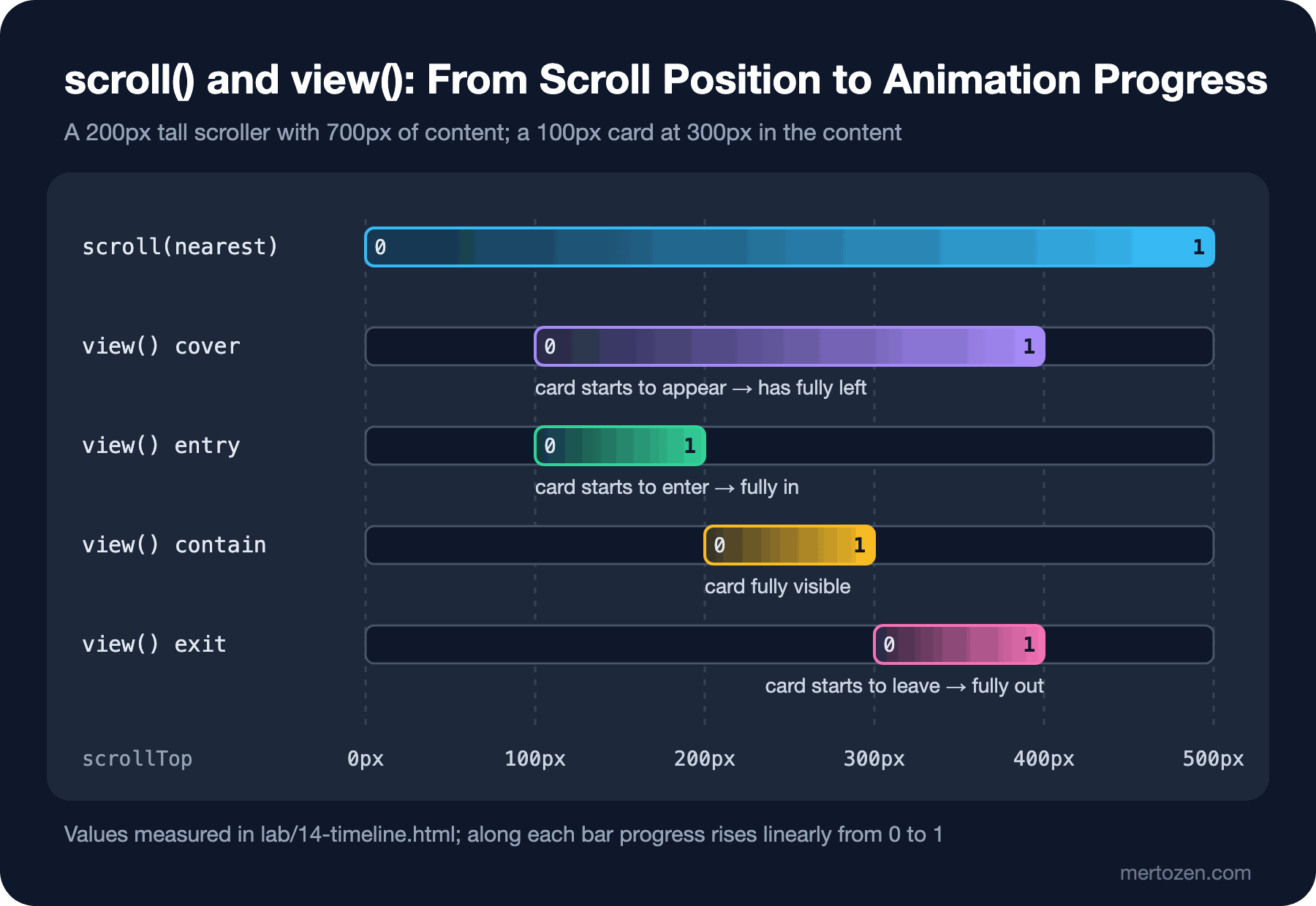
The values in the table match the bars in the figure exactly: cover runs from the moment the card starts to appear (scrollTop 100px, the card's top edge at the bottom of the window) until it has fully left (400px). entry is the entering itself (100–200px), contain the span in which the card is fully visible (200–300px), exit the leaving (300–400px). The default range for view() is cover. Ranges can also be combined: animation-range: entry 0% entry 100% is the whole entry, entry 50% cover 50% runs from half way through the entry until the card reaches the middle of the window.
Book Cards That Appear as They Come into View
In Bookstore's catalog list we want cards to appear as they enter the screen. This effect used to be built by adding a class with IntersectionObserver; now a single CSS block is enough. I added the rule at the end of book-card.css:
/* cards fade in as they scroll into view; the slide is only for users who did not ask for less motion */
@supports (animation-timeline: view()) {
    .book-list > .book-card {
        animation: card-fade linear both;
        animation-timeline: view();
        animation-range: entry 0% entry 100%;

        @media (prefers-reduced-motion: no-preference) {
            animation-name: card-slide;
        }
    }
}

@keyframes card-fade {
    from {
        opacity: 0;
    }
}

@keyframes card-slide {
    from {
        opacity: 0;
        translate: 0 2rem;
    }
}
The animation spans the whole entry (entry 0% entry 100%): opacity 0 when the card starts to appear at the bottom of the window, 1 when it is fully in. The last two lines of the output are the last card in the list, The Hobbit, on a 360x640 screen: half way in, opacity 0.50 and half of the 2rem slide (15.9px); fully in, opacity 1 and the slide is over. The animation has no to keyframe; a missing keyframe uses the element's own value, so when the animation ends the card simply looks as it always does.
I applied the decision from the previous post here too: the slide (card-slide) is only for users whose motion preference is known; for users with prefers-reduced-motion: reduce the card appears in place (card-fade). Nesting the @media inside the rule keeps both animation names in one place. In the "reduce" line of the output, translate is none and the opacity still goes from 0 to 1.
One point to watch: this animation is only on the cards in .book-list. When the page opens, cards that are fully on screen have already completed their entry on the view timeline and are fully visible at once; a card half visible at the bottom edge of the screen starts half transparent and becomes solid as you scroll. But tying an element's visibility to scrolling carries the risk that some content is never shown if the user never scrolls. In every scroll animation that starts opacity at 0, make sure there is a default that leaves content visible in browsers without support and on the first screen; here @supports and the missing to keyframe take care of that.
Same-Document View Transitions: Sorting the Catalog
A view transition is an API that captures two states of the page as snapshots and animates between them. document.startViewTransition(callback) first takes a snapshot of the old state, runs the callback to update the DOM, then takes a snapshot of the new state and, by default, cross-fades between them. Every element with a view-transition-name is captured as a separate group and moved from its old position to its new one. I connected the sort select in Bookstore's catalog toolbar to this:
// Sorts the book list in place; where view transitions exist, every card moves from its old place to its new one.
const list = document.querySelector('.book-list');
const select = document.querySelector('.catalog-toolbar select');

const title = card => card.querySelector('.book-title').textContent;
const price = card => parseFloat(card.querySelector('.price').textContent);

function sortBooks() {
    const cards = [...list.children].sort((a, b) =>
        select.value === 'Price' ? price(a) - price(b) : title(a).localeCompare(title(b), 'en'));
    list.append(...cards);
}

select.addEventListener('change', () => {
    // older browsers: sort without an animation
    if (!document.startViewTransition) {
        sortBooks();
        return;
    }
    document.startViewTransition(sortBooks);
});
/* cross-document view transitions: a same-origin navigation between two pages that both opt in cross-fades */
@view-transition {
navigation: auto;
}
/* every card in the list is its own view transition group, so sorting moves the cards to their new places */
.book-list > .book-card {
view-transition-name: match-element;
view-transition-class: book-card;
}
::view-transition-group(*.book-card) {
animation-duration: 300ms;
}
/* less motion: the cards do not travel, they cross-fade in their new places */
@media (prefers-reduced-motion: reduce) {
::view-transition-group(*.book-card) {
animation-duration: 0s;
}
}Instead of naming every card individually I used view-transition-name: match-element: the browser generates a name from the element's identity, and when the same element changes place in the DOM its old and new snapshots are matched. view-transition-class: book-card gives all the cards a common class, so I set the animation of all of them in one rule with ::view-transition-group(*.book-card). Both have been Baseline since October 2025.
node scripts/14-view-transitions.mjs--- chromium
sort no-preference: Dune, Middlemarch, Emma, The Hobbit -> Emma, The Hobbit, Middlemarch, Dune
groups: 300ms (-520, 0) 300ms (-520, 0) 300ms (260, 0) 300ms (780, 0) 250ms (0, 0)
sort reduce: Dune, Middlemarch, Emma, The Hobbit -> Emma, The Hobbit, Middlemarch, Dune
groups: 250ms (0, 0) 0ms (-520, 0) 0ms (-520, 0) 0ms (260, 0) 0ms (780, 0)
duplicate name: InvalidStateError: Transition was aborted because of invalid state. Snapshot capture failed | update ran: yes
book.html revealed with a view transition
--- webkit
sort no-preference: Dune, Middlemarch, Emma, The Hobbit -> Emma, The Hobbit, Middlemarch, Dune
groups: 300ms (-520, 0) 300ms (-520, 0) 300ms (260, 0) 300ms (780, 0) 250ms (0, 0)
sort reduce: Dune, Middlemarch, Emma, The Hobbit -> Emma, The Hobbit, Middlemarch, Dune
groups: 250ms (0, 0) 0ms (-520, 0) 0ms (-520, 0) 0ms (260, 0) 0ms (780, 0)
duplicate name: InvalidStateError: Multiple elements found with view-transition-name: book-cover | update ran: yes
book.html revealed with a view transitionOn a 1280px screen the four cards are in one row. Sorting by price moves Emma and The Hobbit 520 pixels to the left, Middlemarch 260 pixels to the right and Dune 780 pixels to the right; each card's group takes 300ms. The 250ms group in the list is the page's root snapshot (root), the default cross-fade. In the "reduce" line the cards' groups take 0ms: the cards jump to their new places, and the old and new snapshots cross-fade there. There is no movement, and the change is still visible.
For browsers without startViewTransition, sort.js sorts the list directly. View transitions became Baseline in October 2025 with Firefox 144; in older browsers these lines change only how the change looks, not whether the page works.
withViewTransitions() in the Angular Router
In single page applications a page change is also a DOM update, so the same API works. The Angular router offers it as a provider. I added two routes to the bookstore-web project we set up in the container query post of this series: the catalog and a book detail page:
import { ApplicationConfig, provideBrowserGlobalErrorListeners } from '@angular/core';
import { provideRouter, withComponentInputBinding, withViewTransitions } from '@angular/router';
import { routes } from './app.routes';

export const appConfig: ApplicationConfig = {
  providers: [
    provideBrowserGlobalErrorListeners(),
    // every router navigation runs inside document.startViewTransition(); without browser support it navigates as usual
    provideRouter(routes, withComponentInputBinding(), withViewTransitions()),
  ],
};
withViewTransitions() runs every router navigation inside document.startViewTransition(); if the browser does not support it, navigation continues as usual. The Angular documentation still marks it as developer preview. I gave the cover image in the card component and the large cover on the detail page the same name:
<article class="card">
  <img [src]="cover()" [alt]="'Cover of ' + bookTitle()" width="120" height="180"
       [style.view-transition-name]="'cover-' + slug()">
  <h3><a [routerLink]="['/books', slug()]">{{ bookTitle() }}</a></h3>
import { Component, input } from '@angular/core';
@Component({
selector: 'app-book-page',
template: `
<!-- the same view-transition-name as the cover in the card: the browser moves one image to the other's place -->
<img [src]="slug() + '.svg'" [alt]="'Cover of ' + slug()" width="240" height="360"
[style.view-transition-name]="'cover-' + slug()">
<h1>{{ slug() }}</h1>
`,
styles: `
:host {
display: block;
padding: 1rem;
}
`,
})
export class BookPage {
// filled from the :slug route parameter by withComponentInputBinding()
readonly slug = input.required<string>();
}cd angular
npm install
npx ng build
cd ..
node scripts/14-angular.mjs--- chromium no-preference, /books/dune
::view-transition-group(cover-dune) 250ms 120px x 180px -> 240px x 360px
::view-transition-group(root) 250ms 1024px x 600px -> 1024px x 600px
--- chromium reduce, /books/dune
::view-transition-group(cover-dune) 0ms 120px x 180px -> 240px x 360px
::view-transition-group(root) 0ms 1024px x 600px -> 1024px x 600px
--- webkit no-preference, /books/dune
::view-transition-group(cover-dune) 250ms 120px x 180px -> 240px x 360px
::view-transition-group(root) 250ms 1024px x 600px -> 1024px x 600px
--- webkit reduce, /books/dune
::view-transition-group(cover-dune) 0ms 120px x 180px -> 240px x 360px
::view-transition-group(root) 0ms 1024px x 600px -> 1024px x 600pxClicking Dune's title navigates to /books/dune and creates two groups: the page root and cover-dune. The cover's group grows from 120x180 to 240x360: the user sees the small cover grow and move to its place on the detail page. The name has to be different for every book; if the covers of Emma and Dune were on the same page with the same name, the transition would not run at all (the reason is under Common Pitfalls).
In the reduce lines both groups take 0ms. I wrote this rule in the global styles.css, not in a component's styles:
/* The ::view-transition-* pseudo-elements hang off the document root, outside every component:
   rules for them belong in this global file, not in a component's styles */

/* less motion: the cover does not travel to its new place, the two pages only cross-fade */
@media (prefers-reduced-motion: reduce) {
  ::view-transition-group(*) {
    animation-duration: 0s;
  }
}
I first tried putting the rule in the card component's styles, and in reduce the duration stayed at 250ms. Looking at the build output showed why: Angular's emulated encapsulation had turned the rule into [_ngcontent-%COMP%]::view-transition-group(*). View transition pseudo-elements hang off the document's root element and carry no component's attribute, so this selector matches nothing. The encapsulation we saw in the nesting and @scope post of this series works against you here.
Cross-Document View Transitions: MPAs and ASP.NET Core MVC
Bookstore's static pages, like a site written with ASP.NET Core MVC, load a new document for every link. Multi-page applications like these need no JavaScript: if both pages say @view-transition { navigation: auto; } in their CSS, a same-origin navigation cross-fades from the old page to the new one. The rule is at the top of view-transitions.css, and since main.css is on every page, the whole site takes part. In an ASP.NET Core MVC application, writing the same rule in the stylesheet the layout loads is enough.
The measurement needs a real origin, so scripts/site.mjs serves the web/ folder under http://bookstore.test/ with Playwright's page.route. The "book.html revealed with a view transition" line in the output comes from the new page's pagereveal event: the event's viewTransition is set, so the page was revealed with a transition. It worked in both engines.
But this feature is not Baseline: according to web-features, cross-document view transitions are in Chrome 126 and Safari 18.2, not in Firefox. Interop 2026's view transitions focus area also covers cross-document transitions, so the browsers are working on it this year. For now the right approach is progressive enhancement: in a browser without support the rule does nothing and navigation happens as usual. Since there is no chance of breaking anything, it can be added without waiting for Firefox.
Production Notes
Scroll-driven animations became Baseline at the end of October 2026 with Firefox 159; they are newly available, so earlier Firefox versions do not have them. That is why both uses in Bookstore are inside @supports (animation-timeline: …), and in both cases a browser without support sees a complete and correct page: no reading bar, cards without animation. Same-document view transitions have been Baseline since October 2025; the notes above apply to Angular's integration and to cross-document transitions. Scroll-driven animations and view transitions are among Interop 2026's focus areas; the small differences between browsers are expected to be fixed this year.
During a view transition the user sees snapshots of the old and new states, not the page itself. In a 250–300ms transition this goes unnoticed, but a long transition makes the interface feel slow. Keep transitions short, and do not lengthen a transition to hide waiting.
Common Pitfalls
First, writing animation-timeline before the animation shorthand. As we measured, the shorthand resets it to auto, and the animation plays by time, in zero time.
Second, giving the same view-transition-name to two elements. In the "duplicate name" line of the output both engines raised InvalidStateError; Chromium's message only says "Snapshot capture failed", while WebKit says which name clashes. The DOM update still happens; only the whole transition is skipped, so a single name clash in a list silently removes the entire animation. In lists, use match-element or unique names generated from the data.
Third, writing rules for view transition pseudo-elements in a component's styles in Angular. Encapsulation adds an attribute to the selector and the rule matches nothing; these rules belong in the global stylesheet.
Fourth, forgetting reduced motion. View transitions and scroll animations can move large parts of the screen; for users who want less motion, remove the slides and keep the fades.
A Small Experiment
★☆☆ Change the range of the #entry indicator in the lab to entry 50% cover 50%. Guess at which scrollTop values it will be 0 and 1 in the table, then check with node scripts/14-scroll.mjs.
★★☆ Add a view timeline animation to every h2 on the reading guide page that turns its colour to the accent when it reaches the top third of the screen. Find the right animation-range by measuring, and decide whether it should also run for reduce users.
★★★ Set up a cross-document transition between the catalog's "Book of the week" card and the cover in book.html: give the cover view-transition-name: cover-dune on both pages. Think about what you need to do so that the Dune card in the list does not get the same name, and verify with a script that the cover-dune group is created in the pagereveal event.
In the next post we return to positioning: anchor positioning. Placing an element relative to another element with CSS, making it change direction when it does not fit on screen, and combining popover and invoker commands to add a book preview tooltip and a user menu to Bookstore with zero JavaScript.