

Normal Flow, display and Positioning: sticky, z-index, Stacking Contexts and the Top Layer
z-index is only compared between siblings in the same stacking context; sticky sticks relative to the nearest scroll container, which is why overflow: hidden on an ancestor breaks it. On Bookstore's catalog page we keep a float inside its box with flow-root, measure the two-value syntax of display, fix the sticky toolbar with overflow-x: clip, move a badge under the header with isolation: isolate, and show in Chromium and WebKit that a modal dialog in the top layer beats every z-index.
Version note: This post follows CSS Display, CSS Positioned Layout and the stacking rules of CSS 2.1, together with the state of Baseline in November 2026; the examples were run in Chrome 158 and WebKit 27.2 via Playwright 1.65, and Firefox support is taken from web-features data.
Guess First
There are two complaints about the catalog page of Bookstore, the online bookstore used as the shared example across this site's series. First: the "Sort by" bar under the header is position: sticky, yet it does not stay at the top when the page scrolls; it moves away with the content. Second: the red "Bestseller" badge on the Dune card should slide under the sticky header as the page scrolls, but it shows up on top of the header. The header's z-index is 10, the badge's is 50. The CSS of the two pages:
/* self-contained: this lab does not load main.css */
body { margin: 0; }
ul { list-style: none; margin: 0; padding: 0; }
.site-header { position: sticky; inset-block-start: 0; block-size: 56px; background: #1f2937; }
.catalog { overflow-x: hidden; }
.catalog-toolbar { position: sticky; inset-block-start: 56px; background: #fef3c7; }
.book-card { block-size: 200px; }
/* self-contained: this lab does not load main.css */
body { margin: 0; }
ul { list-style: none; margin: 0; padding: 0; }
.site-header { position: sticky; inset-block-start: 0; z-index: 10; block-size: 56px; background: #1f2937; }
.book-card { position: relative; block-size: 240px; }
.badge { position: absolute; inset-block-start: 8px; inset-inline-end: 8px; z-index: 50; background: #b91c1c; color: #fff; }Which line breaks sticky on the first page? On the second, is raising the header's z-index to 100 the right way to get the badge under the header, or is there a way to make sure the badge never competes with the header at all?
In the previous post we talked about the size of a single box. In this post we look at how boxes are placed on the page: normal flow, display, position, and the stacking context, which decides which box is painted on top when boxes overlap. Settling this before Flexbox and Grid answers the two most common questions, "z-index doesn't work" and "sticky doesn't work".
Normal Flow and Formatting Contexts
When you write no layout properties at all, the browser places elements according to normal flow. Block boxes such as div, p and h1 are stacked one below the other and fill the width of their container. Inline boxes such as span, a and strong flow side by side within a line and wrap to the next line when it ends. These two arrangements are called the block formatting context and the inline formatting context. The margin collapse from the previous post is a rule of the block formatting context.
An element that establishes a new block formatting context becomes a world of its own: floats inside it do not overflow the box, and the margins of its children do not collapse outside it. The cleanest way to do this is display: flow-root. I measured it on a lab page where the cover is floated to the left in book reviews:
@layer components {
    .review { border: 2px solid #94a3b8; padding: 8px; margin-block-end: 24px; }
    .review img { float: inline-start; margin-inline-end: 12px; }
    .review.flow-root { display: flow-root; }
}
node scripts/04-flow.mjs
node scripts/04-position.mjs--- chromium
plain article height: 76px, floated cover: 90px
contained article height: 110px, floated cover: 90px
display: block flow computed: block
display: block flow-root computed: flow-root
display: inline flow-root computed: inline-block
display: inline flex computed: inline-flex
display: block grid computed: grid
--- webkit
plain article height: 76px, floated cover: 90px
contained article height: 110px, floated cover: 90px
display: block flow computed: block
display: block flow-root computed: flow-root
display: inline flow-root computed: inline-block
display: inline flex computed: inline-flex
display: block grid computed: gridThe floated cover is 90px, but the first review box is only 76px: since the float left normal flow, the box ignored its height, and the cover hung out below the border. The second box, with flow-root, grew to 110px and contained the cover. In the past, overflow: hidden or a "clearfix" hack was used for this; flow-root is the solution without side effects, whose name says what it does, and it has been Baseline since January 2020. Today you rarely need floats for layout, but for their original purpose, flowing text around an image, they are still the right tool.
The Two-Value Syntax of display
display actually says two separate things. The outer value decides how the box itself behaves among its surroundings: block or inline. The inner value decides how the box lays out its own children: flow, flow-root, flex, grid. The single-word values we have used for years are shorthands for this pair, and CSS Display Level 3 allows writing the two separately. It has been Baseline since July 2023 and widely available since January 2026. I gave the span elements on the lab page two-value display values and checked what the browser computes:
<div id="probes">
    <span style="display: block flow">block flow</span>
    <span style="display: block flow-root">block flow-root</span>
    <span style="display: inline flow-root">inline flow-root</span>
    <span style="display: inline flex">inline flex</span>
    <span style="display: block grid">block grid</span>
</div>
The last five lines of the output show the mapping: block flow = block, inline flow-root = inline-block, inline flex = inline-flex, block grid = grid. Both engines return the computed value in the old single-word form. Which one you write in code is a matter of preference; I use the short forms everyone on the team knows, but knowing the two-value syntax explains that inline-block really means "inline outside, flow-root inside", which is why it keeps the margins and floats inside it to itself.
position: relative, absolute, fixed and sticky
position: relative leaves the box where it is in normal flow; the inset values only shift how it is drawn. Its main job is to be the reference for absolute elements inside it. absolute takes the box out of flow and positions it relative to the nearest ancestor whose position is not static. That is how I placed Bookstore's badge: the card is position: relative, and the badge sits in the card's top right corner with position: absolute. inset-block-start and inset-inline-end are the logical properties from the previous post; on an RTL page the badge moves to the top left on its own.
fixed positions the box relative to the viewport, and it stays in place while the page scrolls. It has a trap: if one of its ancestors has a transform, filter or perspective, the fixed element is positioned relative to that ancestor instead of the viewport. A transform added to a card for a hover animation makes a fixed notification inside the card start moving with the card.
sticky is a mix of the two: the element stays in normal flow, but when its nearest scroll container scrolls and the element reaches the line you set with inset-block-start, it sticks there and stays until the end of its parent. The answer to the first part of the opening question lies in the phrase "nearest scroll container" in that definition. The script changed the overflow-x value of .catalog and scrolled the page by 600px:
import { open } from './browser.mjs';

for (const engine of ['chromium', 'webkit']) {
    console.log(`--- ${engine}`);

    // 1) Sticky toolbar inside a <main> with overflow-x
    let { browser, page } = await open('lab/04-sticky.html', { engine, height: 600 });
    for (const overflowX of ['hidden', 'clip', 'visible']) {
        const top = await page.evaluate(value => {
            document.querySelector('.catalog').style.overflowX = value;
            window.scrollTo(0, 0);
            window.scrollTo(0, 600);
            return document.querySelector('.catalog-toolbar').getBoundingClientRect().top;
        }, overflowX);
        console.log(`overflow-x: ${overflowX.padEnd(8)} toolbar top after scrolling 600px: ${top}px`);
    }
    await browser.close();

    // 2) Which element is painted at the badge's position while it is under the sticky header?
    ({ browser, page } = await open('lab/04-stacking.html', { engine, height: 600 }));
    const variants = {
        'no stacking context': '',
        '.book-list isolation': '.book-list { isolation: isolate; }',
        '.book-card transform': '.book-card { transform: translateX(0); }',
        '.book-card opacity': '.book-card { opacity: 0.99; }'
    };
    for (const [name, css] of Object.entries(variants)) {
        const hit = await page.evaluate(extra => {
            document.getElementById('variant')?.remove();
            const style = document.createElement('style');
            style.id = 'variant';
            style.textContent = extra;
            document.head.append(style);
            window.scrollTo(0, 30);
            const badge = document.querySelector('.badge').getBoundingClientRect();
            const el = document.elementFromPoint(badge.left + badge.width / 2, badge.top + badge.height / 2);
            return `badge top ${badge.top}px, on top: ${el.className || el.tagName.toLowerCase()}`;
        }, css);
        console.log(`${name.padEnd(22)} ${hit}`);
    }

    // 3) Top layer: z-index cannot compete with a modal dialog
    const topLayer = await page.evaluate(() => {
        document.querySelector('.site-header').style.zIndex = '2147483647';
        const dialog = document.getElementById('quick-view');
        dialog.showModal();
        const r = dialog.getBoundingClientRect();
        const el = document.elementFromPoint(r.left + 5, r.top + 5);
        return `header z-index ${getComputedStyle(document.querySelector('.site-header')).zIndex}, ` +
            `on top: ${el.id || el.tagName.toLowerCase()}`;
    });
    console.log(`modal dialog           ${topLayer}`);
    await browser.close();
}
--- chromium
overflow-x: hidden toolbar top after scrolling 600px: -488px
overflow-x: clip toolbar top after scrolling 600px: 56px
overflow-x: visible toolbar top after scrolling 600px: 56px
no stacking context badge top 34px, on top: badge
.book-list isolation badge top 34px, on top: site-header
.book-card transform badge top 34px, on top: site-header
.book-card opacity badge top 34px, on top: site-header
modal dialog header z-index 2147483647, on top: quick-view
--- webkit
overflow-x: hidden toolbar top after scrolling 600px: -488px
overflow-x: clip toolbar top after scrolling 600px: 56px
overflow-x: visible toolbar top after scrolling 600px: 56px
no stacking context badge top 34px, on top: badge
.book-list isolation badge top 34px, on top: site-header
.book-card transform badge top 34px, on top: site-header
.book-card opacity badge top 34px, on top: site-header
modal dialog header z-index 2147483647, on top: quick-viewWith overflow-x: hidden the toolbar is at −488px, far above the screen. The reason: when one axis of overflow gets a value other than visible, the other axis turns into auto, and .catalog becomes a scroll container. The sticky toolbar now tries to stick relative to .catalog instead of the page, but since .catalog itself does not scroll, the page does, it never sticks. Someone probably added that line to hide a horizontal scrollbar. overflow: clip, which I mentioned in the previous post, exists for exactly this reason: it still cuts off what overflows but does not create a scroll container. With clip the toolbar is at 56px, right below the header; it has been Baseline since September 2022. I made this permanent in Bookstore's catalog styles:
/* clip, not hidden: hidden would turn .catalog into a scroll container and break sticky */
.catalog {
    overflow-x: clip;
    padding-inline: var(--space);
}

.catalog-toolbar {
    position: sticky;
    inset-block-start: 3.5rem;
    z-index: 5;
    padding-block: 0.5rem;
    background-color: var(--color-surface);
}
There are two other common reasons sticky does not work: inset-block-start, or top, was never written, or the sticky element's parent is only as tall as the element itself. A sticky element cannot leave its parent; if there is no room to move inside the parent, there is nowhere to stick either.
z-index and Stacking Contexts
The second part of the opening question. z-index orders elements in the third dimension, but there is no single global order. A page is made of nested stacking contexts, and an element's z-index is only compared with its siblings in its own stacking context. Everything inside a stacking context acts as a single layer toward the outside.
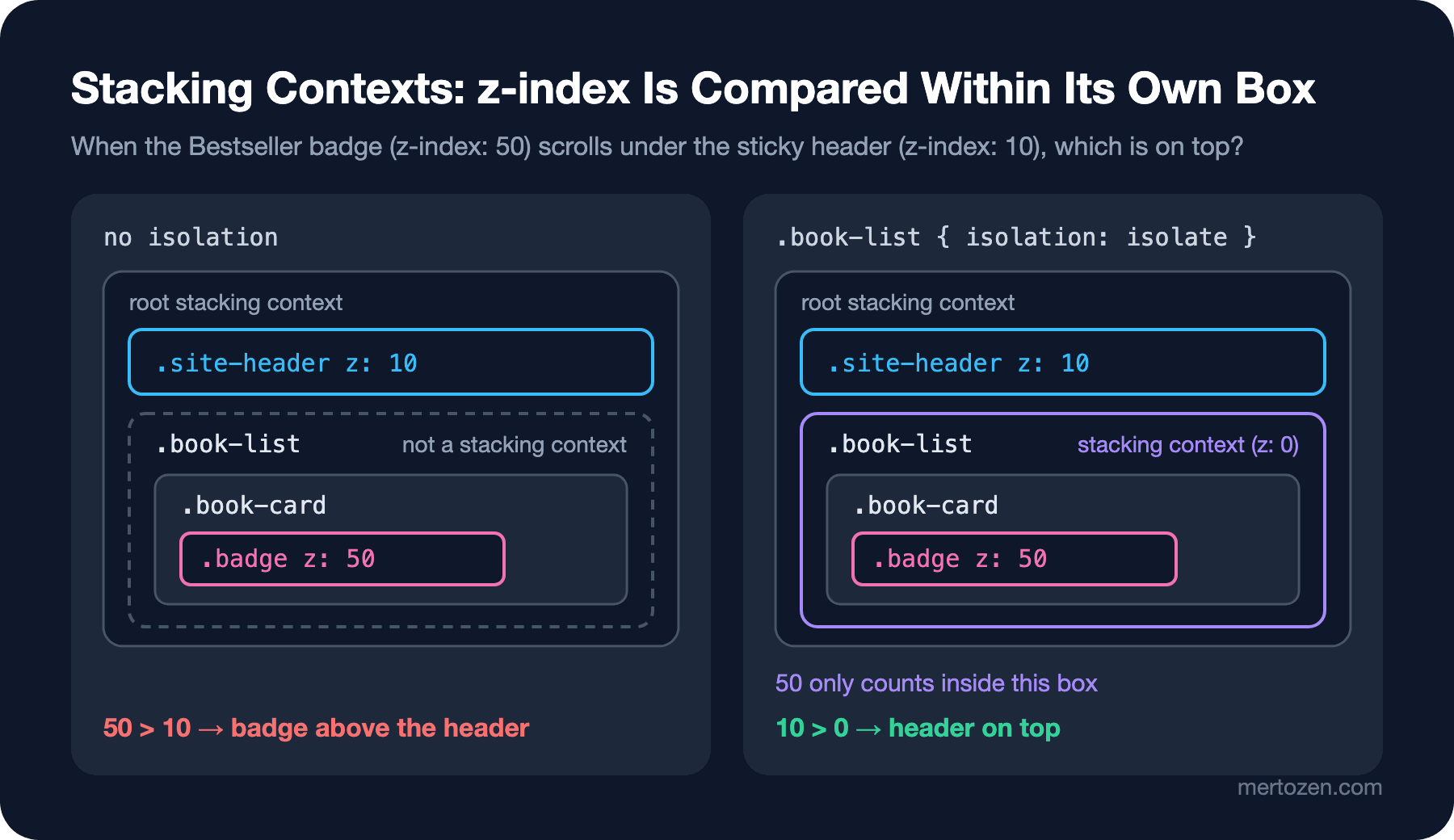
The second block of the output measures this. I scrolled the page until the badge went under the header and used elementFromPoint to ask which element is painted on top at the badge's position. Without any stacking context, the badge and the header are compared in the same root context, and 50 beats 10: the badge is above the header. When isolation: isolate was added to .book-list, the list became a new stacking context; the badge's 50 only counted inside the list, and outside, the list as a whole sits at z-index: auto, level 0, and lost to the header's 10. Raising the header's z-index to 100 would also fix today's bug, but the day someone writes a badge with 150, the same bug comes back. isolation: isolate guarantees that no z-index inside the list competes with the outside. I added it to Bookstore's catalog list:
.book-list {
    list-style: none;
    margin: 0;
    padding: 0;
    /* z-index values inside the list never compete with the sticky header */
    isolation: isolate;
}

.book-card {
    position: relative;
    padding: var(--space);
    border: 1px solid var(--color-border);
    border-radius: var(--radius);
    background-color: var(--color-surface);
}

/* a card without a cover image gets a tinted background instead */
.book-card:not(:has(> img)) {
    background-color: #fef3c7;
}

/* zebra stripes count only the books that are in stock */
.book-card:nth-child(even of .in-stock) {
    border-color: #93c5fd;
}

.book-card[data-stock="0"] .price {
    text-decoration: line-through;
    color: var(--color-muted);
}

.book-card[data-format~="ebook"] .book-title::after {
    content: " · e-book";
    font-size: 0.75em;
    color: var(--color-muted);
}

.badge {
    position: absolute;
    inset-block-start: 0.5rem;
    inset-inline-end: 0.5rem;
    z-index: 1;
    padding-inline: 0.5rem;
    border-radius: var(--radius);
    background-color: var(--color-accent);
    color: #ffffff;
    font-size: 0.75rem;
}
The third and fourth lines of the output show something sneakier: writing transform: translateX(0) or opacity: 0.99 on the card also changed the result. Stacking contexts are not created only by z-index. Every element with an opacity below 1, a transform, filter, backdrop-filter, clip-path, mask or mix-blend-mode, every element whose position is fixed or sticky, positioned elements and flex or grid items whose z-index is not auto, isolation: isolate, contain: paint and containers with a container-type all create a stacking context. In this example that side effect helped us, but the opposite is common too: a transform added to a card for a hover animation traps the z-index: 1000 of a dropdown inside the card, and the dropdown ends up under the next card. When you say "z-index doesn't work", the first question should be: which stacking context is this element in?
The Top Layer: How dialog and popover End the z-index War
In the last line of the output, I raised the header's z-index to the largest possible value, 2147483647, and opened a dialog with showModal(). The dialog is still on top. Modal dialogs, popovers and elements in fullscreen are painted in a separate layer called the top layer. The top layer is above all stacking contexts, and no z-index can reach it. No overflow: hidden or transform on an ancestor can clip it either.
This makes the z-index race unnecessary for everything in Bookstore that must sit "above everything": the quick view window, the cart menu and confirmation dialogs. Instead of writing your own modal component with a div and z-index: 9999, use the native elements; the HTML side of dialog and popover is covered in the HTML5 and Semantic HTML series post on native interactive elements. Positioning a popover relative to a button is the topic of the series' post on anchor positioning.
In Production
Agree on a z-index scale in the project and stop writing random numbers. In Bookstore the rule is simple: page-level layers, the sticky header at 10 and the sticky toolbar at 5, live in the root context; everything inside components lives in its own context with isolation: isolate, where small numbers like 1 and 2 are enough. Everything that must be "above everything" goes into the top layer. We will see how to name this scale with custom properties in the series' post on theming.
Before adding overflow: hidden to a box, think about whether there is a sticky element inside; if you want to hide horizontal overflow, use overflow-x: clip. Likewise, giving properties like transform and filter to broad selectors, such as all cards or all sections, silently creates stacking contexts and containing blocks for fixed elements. If an animation needs them, apply them only for the duration of the animation.
Sticky and stacking problems are visible on screen, but their cause is not visible in the code. The Computed tab in the Elements panel of Chrome DevTools shows an element's real position, overflow and z-index values; the Layers panel shows the page's layers in three dimensions. A small Playwright check with elementFromPoint, like the one in this post, is an easy way to turn "does anything poke through the sticky header?" into a regression test.
Common Pitfalls
First, looking for the reason sticky "doesn't work" in the sticky element. The reason is almost always in an ancestor: one with an overflow other than visible, or a parent that is as tall as the element.
Second, the z-index war. If an element does not come to the top, inspect the stacking contexts instead of making the number bigger. What is being compared may not be the element itself but the context it is in.
Third, giving z-index to an element without position. On a block element in normal flow, z-index has no effect; flex and grid items are the exception.
Fourth, writing modals and dropdowns with z-index: 9999. With dialog and popover using the top layer, there is no need.
A Small Experiment
★☆☆ In lab/04-sticky.html, remove overflow-x from .catalog completely, then remove inset-block-start from the toolbar. Note how the first line of node scripts/04-position.mjs changes at each step.
★★☆ Add filter: blur(0) and will-change: transform to the list of variants in lab/04-stacking.html. Which ones create a stacking context? Compare the result with MDN's list of stacking context triggers.
★★★ Add a "Quick view" dropdown to the catalog card and give the cards transform: translateY(-2px) on hover. Prove with elementFromPoint that the dropdown ends up under the next card, then move the dropdown to the top layer with popover and repeat the test.
In the next post we move on to the first big layout tool: Flexbox. We will calculate with numbers how flex-grow, flex-shrink and flex-basis share free space along the main and cross axes, and lay out the header, the card footer and the input and button in the coupon field with Flexbox.