

CSS Grid 2: Subgrid, Alignment and the "Grid or Flexbox?" Decision
Subgrid lets a card borrow its rows from the list instead of working them out itself, so the title, author and price rows of cards with titles of different lengths line up. We move the Bookstore catalog to subgrid, measure the justify/align and place-* properties, choose between Grid and Flexbox with the content-out versus layout-in rule, and look at where grid-lanes stands for masonry in November 2026.
Version note: This post follows the CSS Grid Layout Level 2 specification and the state of Baseline in November 2026; the examples were run in Chrome 158 and WebKit 27.2 via Playwright 1.65, and Firefox support is taken from web-features 3.46 data.
Guess First
The catalog grid we built for Bookstore, the online bookstore used as the shared example across this site's series, still has one flaw. The cards have equal heights, but their insides do not line up: Dune and Emma have a cover, Middlemarch does not. At 1024px, looking at the titles of the three cards in the same row, Dune's and Emma's sit under the cover at 201px; Middlemarch, without a cover, has its title at the very top of the card, at 17px. Thanks to margin-block-start: auto the prices line up, but the title and author rows do not.
Now we switch the card from Flexbox to Grid, and instead of giving it rows of its own we write: grid-row: span 4; grid-template-rows: subgrid;. Without changing anything else inside the card, at which pixel does Middlemarch's title end up? Why would the title of a card without a cover be positioned by another card's cover?
In this post we move on to the second part of Grid. First subgrid, which ties the rows of different cards to one shared grid; then the alignment properties of Grid and Flexbox; and finally the decision rule for the question every layout task raises: "Grid or Flexbox?" We also look at where masonry layout stands in November 2026.
Subgrid: Borrowing Rows from the List
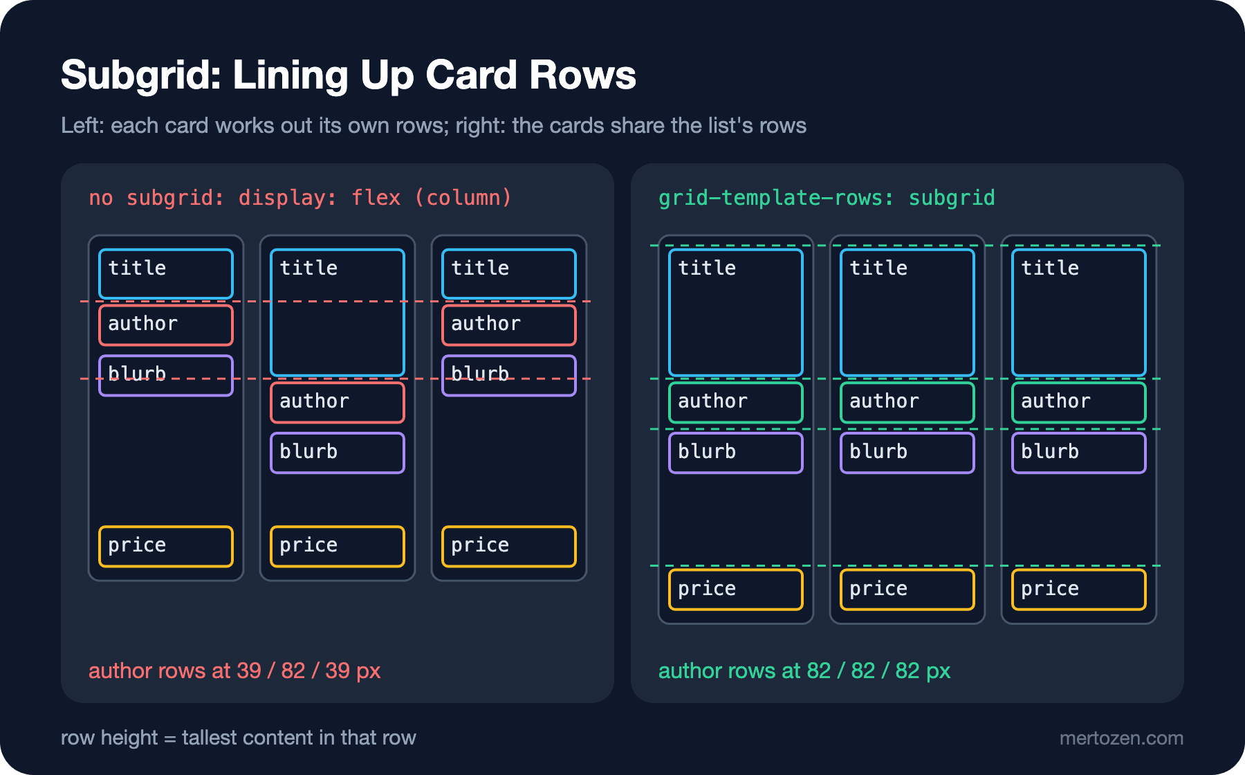
A grid item can itself be a grid; that is called a nested grid. The problem: the rows of the inner grid are completely independent of the outer grid. Each card works out its own rows from its own content and has no idea that the neighbouring card's title takes two lines. The subgrid value changes that: the card does not define tracks of its own, it uses the tracks it occupies in the parent grid. On the lab page I built a shelf of three cards, once with Flexbox and once with subgrid:
/* every card is its own flex column: rows know nothing about the neighbours */
#without .card { display: flex; flex-direction: column; gap: 4px; }
#without .price { margin-block-start: auto; }

/* every card borrows four rows from the shelf */
#with .card {
    display: grid;
    grid-row: span 4;
    grid-template-rows: subgrid;
    row-gap: 4px;
}
grid-row: span 4 tells the card to occupy four rows of the shelf; grid-template-rows: subgrid turns those four rows into the card's own rows. The card's four children (title, author, short blurb, price) go into those rows in order. The height of each shelf row is now set by the tallest content in that row: Middlemarch's two-line title makes the title row taller, and the author rows of the other two cards move down with it. The measuring script prints how far each card's rows are from the top of the shelf:
node scripts/07-grid.mjs--- chromium
#without
Dune author y=39 blurb y=67 price y=162
Middlemarch: A Stu author y=82 blurb y=110 price y=162
The Hobbit author y=39 blurb y=67 price y=162
#with
Dune author y=82 blurb y=110 price y=186
Middlemarch: A Stu author y=82 blurb y=110 price y=186
The Hobbit author y=82 blurb y=110 price y=186
#steps (display: grid)
Cart x=44 y=30 w=31
Address x=240 y=66 w=59
Payment x=508 y=30 w=63
#empty-cart (display: block)
Your cart is empty. x=0 y=88 w=1280
#chips-flex (display: flex)
Science Fiction x=0 y=0 w=136
Classics x=144 y=0 w=86
Children x=238 y=0 w=87
Poetry x=333 y=0 w=73
History of Science x=0 y=34 w=158
#chips-grid (display: grid)
Science Fiction x=0 y=0 w=135
Classics x=143 y=0 w=135
Children x=285 y=0 w=135
Poetry x=0 y=58 w=135
History of Science x=143 y=58 w=135
#covers (display: grid)
Dune x=0 y=0 w=100
Emma x=110 y=0 w=100
Ulysses x=220 y=0 w=100
Middlemarch x=0 y=160 w=100
The Hobbit x=110 y=160 w=100The first two blocks sum up the figure. With Flexbox, the author rows are at 39, 82 and 39px, so only the card with the long title has its author lower. With subgrid, all three are at 82px. The prices line up in both cases, but for different reasons: with Flexbox, margin-block-start: auto pushes the price to the bottom of the card; with subgrid, the price sits in a shared row.
Subgrid can be used on one axis only. In this example the card defines its own columns (in fact there is just one) and takes its rows from the shelf. The opposite works too: with grid-template-columns: subgrid you can tie the labels and inputs of a form row to the columns of the page grid. No implicit tracks are created on a subgridded axis; if you put a fifth child into a card that borrows four rows, the browser does not open a new row, and the extra item is placed in the last row. When you change the structure of the card, you also have to update the span count.
Subgrid in the Bookstore Catalog
I applied the same idea to the catalog card. In a list that mixes cards with and without covers, placing the children in order is not enough: in a card without a cover, the first child is the title, so it would land in the cover row. So I named the rows and placed each child by name:
/* every card borrows four rows from the list, so titles, authors and prices line up across a row */
.book-card {
    display: grid;
    grid-row: span 4;
    grid-template-rows: subgrid;
    grid-template-areas: "cover" "title" "author" "price";
    row-gap: 0.25rem;
    position: relative;
    padding: var(--space);
    border: 1px solid var(--color-border);
    border-radius: var(--radius);
    background-color: var(--color-surface);
}

.book-card > * {
    margin: 0;
}

.book-card > img {
    grid-area: cover;
    justify-self: center;
}

.book-card .book-title {
    grid-area: title;
}

.book-card .book-author {
    grid-area: author;
}

/* the price row is shared, so the price sits at its bottom edge */
.book-card .price {
    grid-area: price;
    align-self: end;
}
Subgridded rows can be named with grid-template-areas too; the areas are drawn over the borrowed rows. Middlemarch's cover area stays empty, and its title moves down into the same row as the other cards' titles. The badge from an earlier post (.badge) is position: absolute, so it is not a grid item; it never enters the rows and stays in the corner of the card. The card's padding and border do not disappear either: a subgrid's padding and border are added to its first and last rows. Running the same measuring script on the tag of the previous post (06) gave this:
--- chromium 1024px
book-list rows: 302.797px 118.797px
Dune        title y=201  author y=234  price y=262  rows: none
Middlemarch title y=17   author y=50   price y=262  rows: none
Emma        title y=201  author y=234  price y=262  rows: none
The Hobbit  title y=336  author y=369  price y=397  rows: none
After subgrid:
node scripts/07-catalog.mjs--- chromium 1024px
book-list rows: 191px 16.7969px 12px 35px 17px 16.7969px 12px 35px
Dune title y=201 author y=234 price y=262 rows: subgrid [] [] [] [] []
Middlemarch title y=201 author y=234 price y=262 rows: subgrid [] [] [] [] []
Emma title y=201 author y=234 price y=262 rows: subgrid [] [] [] [] []
The Hobbit title y=346 author y=379 price y=407 rows: subgrid [] [] [] [] []Middlemarch's title moved from 17px down to 201px; that is the answer to the guess. The title, author and price rows of the three cards line up. WebKit gave the same numbers. The card without a cover now has a 180px empty area at the top; in a catalog that is what I want, because the eye scans the titles along the row. Putting a placeholder image on cards without a cover is a design decision and belongs to the UI/UX Design Principles series.
The first line of the output looks odd at first sight: the list shows eight tracks instead of four, and the title row is only 16.8px, while the title is 28.8px tall. The reason is row-gap. The list leaves 16px between rows, while the card wants 4px inside itself. When you give a subgrid a different gap, the parent's tracks do not change; the difference is split between the two edges of the items. The 12px difference between 16 and 4 is taken off as 6px above and 6px below each item, so every track looks 12px shorter than its content. The result on screen is correct, but in the DevTools grid overlay the row lines do not match the content. Do not take this for a bug and try to fix it.
Alignment: justify, align, -items, -content, -self and place-*
Grid's alignment properties answer two questions: which axis, and what am I aligning? justify-* works on the inline axis (left to right in horizontal writing), align-* on the block axis (top to bottom). -content sets where the tracks sit inside the container, -items where every item sits inside its own cell, and -self where one single item sits. On the lab page I put three 120px columns into a 600px container, which leaves 240px of free space:
/* tracks are smaller than the container: there is free space to distribute */
.steps {
    display: grid;
    grid-template-columns: repeat(3, 120px);
    grid-template-rows: 60px;
    inline-size: 600px;
    block-size: 120px;
    justify-content: space-between;  /* moves the tracks inside the container */
    align-content: center;
    justify-items: center;           /* moves each item inside its own cell */
}
.steps .current { place-self: end start; }

/* align-content on a plain block container: no flex, no grid */
.empty-cart { display: block; block-size: 200px; align-content: center; }| Property | What it moves | Grid | Flexbox |
|---|---|---|---|
justify-content / align-content | The tracks or lines, inside the container's free space | When the tracks add up to less than the container | Items on the main axis; align-content only in a multi-line (wrapping) container |
justify-items / align-items | Every item inside its own cell | Works on both axes | justify-items is ignored; align-items works on the cross axis |
justify-self / align-self | One single item | Works on both axes | justify-self is ignored; use margin: auto on the main axis |
place-content, place-items, place-self | The align value first, then the justify value | Shorthand | Shorthand; the ignored half has no effect |
The #steps block in the output: justify-content: space-between spread the three tracks to 0, 240 and 480px, and justify-items: center put each step in the middle of its own 120px cell. "Cart" is 31px wide and starts at 44px; (120 − 31) / 2 = 44.5. align-content: center moved the 60px row to the middle of the 120px container, to 30px. "Address" sits in the bottom-left corner of its cell thanks to place-self: end start: x=240, y=66 (the row ends at 90, minus its own 24px height). In the place-* shorthands the first value is the block axis (align) and the second the inline axis (justify); mixing up that order is the most common mistake.
One more addition that is not in this table but has been in browsers since 2024: align-content now works on ordinary block containers as well. #empty-cart in the output is a 200px tall display: block box. The text "Your cart is empty." sits at 88px, exactly in the middle; (200 − 24) / 2 = 88. To center the empty cart message vertically, you no longer have to turn the element into a flex or grid container. This became Baseline in April 2024 and has been widely available since October 2026.
Grid or Flexbox?
Both can put a set of elements next to and below each other; the difference is where the size comes from. On the lab page I put the same five category chips into two 420px lists, one Flexbox and one Grid:
.chips { inline-size: 420px; gap: 8px; }
.chips li { padding-inline: 12px; border: 1px solid #e5e7eb; }
.chips.flex { display: flex; flex-wrap: wrap; }
.chips.grid { display: grid; grid-template-columns: repeat(auto-fill, minmax(120px, 1fr)); }
In #chips-flex in the output, every chip is as wide as its content: "Classics" is 86px, "History of Science" 158px; four fit on the first line and the fifth wrapped below. In #chips-grid they are all 135px; "Science Fiction" does not fit that width, so it broke onto two lines and the first row doubled in height (the second row starts at 58px). For category chips the right tool is Flexbox, because each chip's width should come from its content.
The rule I use: if the size flows from the content outwards, Flexbox; if it flows from the layout inwards, Grid. In Flexbox the items come first; the container lines them up on one axis and shares out the remaining space. In Grid the grid comes first; items drop into ready-made cells, and rows and columns know about each other. A navbar, a button group, a list of chips, an input next to a button are of the first kind. A page skeleton, a card grid, a form with aligned labels and cards with aligned rows are of the second.
Real pages use both, and Bookstore's catalog page is a good example. The page skeleton is Grid (grid-template-areas), the header inside it is Flexbox (logo, search, cart), the result list is Grid, every card is a subgrid, and the coupon field at checkout is Flexbox again. The choice is made per container, not per page. "I do everything with Grid" and "I never use Grid" both lead to unnecessary code.
Masonry and grid-lanes: Where Things Stand in November 2026
There is one layout Grid still cannot do on its own: stacking covers of different heights into columns without gaps, putting each new item under the shortest column. For years this masonry layout was done with JavaScript libraries. On the specification side, after a long discussion, a separate display value was accepted: display: grid-lanes. In November 2026 the situation is this: according to web-features 3.46 data only Safari 27.2 supports it, Chrome and Firefox do not, so it is not Baseline. In the Chrome 158 I measured, CSS.supports('display', 'grid-lanes') returned false; in WebKit 27.2 it returned true. That is why on the lab page I added it only inside @supports, on top of an ordinary grid:
/* masonry: only where grid-lanes exists, a normal grid everywhere else */
.covers { display: grid; grid-template-columns: repeat(3, 100px); gap: 10px; inline-size: 320px; }
@supports (display: grid-lanes) {
    .covers { display: grid-lanes; }
}
In Chromium the covers are in an ordinary grid: Middlemarch and The Hobbit are in the second row, at 160px, where Dune, the tallest cover of the first row, ends. WebKit's output is different:
--- webkit
#covers (display: grid-lanes)
  Dune                  x=0   y=0   w=100
  Emma                  x=110 y=0   w=100
  Ulysses               x=220 y=0   w=100
  Middlemarch           x=110 y=100 w=100
  The Hobbit            x=220 y=130 w=100
Middlemarch went into the column under the 90px Emma (y=100), The Hobbit under the 120px Ulysses (y=130); they did not go to Dune's column even though there was room, because that column is the tallest. Visually it is a tight layout, but the reading order now zigzags: while the eye moves left to right and top to bottom on screen, the DOM order jumps between columns. If order matters in a catalog (results sorted by price, for example), masonry is the wrong tool. For content whose order carries no meaning, such as a cover gallery or customer reviews, it can be used as a progressive enhancement with @supports; browsers without support show a neat grid.
In Production
Subgrid became Baseline in September 2023 with Chrome 117 (Firefox had supported it since 2019, Safari since 2022) and has been widely available since March 2026. You do not need a fallback to use it today. If your project has to support older browsers, a browser without support treats grid-template-rows: subgrid as invalid, and the card stays an ordinary single-column grid that works out its own rows; the content is still readable, only the alignment is lost.
The price of subgrid is that the card's structure is tied to the list. span 4 assumes the card has four rows; adding a new row to the card (stock status, say) means changing both the span and the area list. Also keep this in mind: subgrid requires the element to take part in the parent's layout. Anything that puts the card into a layout context of its own (including container-type, which we will meet later) silently turns subgrid off. We will measure that in the container queries post of this series.
For alignment tests, a script that reads positions, like the one in this post, gives more stable results than comparing screenshots: "are the author rows of the three cards at the same y?" is a clearer test than hunting for pixel differences.
Common Pitfalls
First, forgetting grid-row: span N. A subgrid borrows the tracks the card occupies; if the card occupies one row, it borrows one row and all its children pile up in that row.
Second, placing children in order. If some cards lack an element (a cover, a badge, a discount label), placement in order shifts every row; place them by area name.
Third, mixing up the value order in the place-* shorthands: align (block axis) first, then justify (inline axis). Also remember that justify-items and justify-self have no effect in Flexbox; to push a single item along the main axis, use margin-inline-start: auto.
Fourth, relying on support in a single browser for masonry. grid-lanes is not Baseline. A display: grid-lanes written without a display: grid before it and without @supports is dropped by Chrome as an invalid declaration, and the element keeps its default display value, block.
A Small Experiment
★☆☆ Remove row-gap: 4px from #with .card in lab/07-subgrid.html. Guess how many pixels of space the cards will have inside, then check with node scripts/07-grid.mjs.
★★☆ In catalog.html, add a p.book-series ("Dune Chronicles, Book 1") to the Dune card, between the title and the author. Update the span value and the grid-template-areas list accordingly; verify with the script that this row stays empty in the other cards and that the titles are still aligned.
★★★ Turn the form rows in checkout.html into a single Grid: labels on the left in one column of equal width, inputs on the right. Tie every .form-row to the parent's columns with grid-template-columns: subgrid, and write a Playwright script that measures that the longest label sets the column width.
In the next post we step out from the grid to the page: mobile-first writing, the media query range syntax, fluid typography with clamp() that does not break zoom, and the media features that read the preferences the user chose in their operating system (dark theme, reduced motion, high contrast, touch screen).