

Flexbox: One-Dimensional Layout, flex-grow/shrink/basis and Real-World Scenarios
Flexbox hands out free space by flex-grow and takes away missing space weighted by flex-shrink × flex-basis, so the larger item shrinks more. We lay out Bookstore's header, catalog cards and coupon field with Flexbox, and measure in Chromium and WebKit what the flex shorthands expand to, the min-width: auto trap that pushes a long book title out of its line, and the fact that order does not change the Tab sequence.
Version note: This post follows the CSS Flexible Box Layout Level 1 specification and the state of Baseline in November 2026; the examples were run in Chrome 158 and WebKit 27.2 via Playwright 1.65, and Firefox support is taken from web-features data.
Guess First
We are designing the cart line for Bookstore, the online bookstore used as the shared example across this site's series: the cover on the left, the book details in the middle, the buttons on the right. I gave the three parts different flex values:
@layer components {
    .row { display: flex; inline-size: 600px; }
    .row.narrow { inline-size: 300px; }
    .row > * { margin: 0; outline: 1px solid #94a3b8; }
    .cover { flex: 1 1 100px; }
    .details { flex: 2 1 100px; }
    .actions { flex: 1 1 200px; }
}
How many pixels wide is each part when the line is 600px wide? And when the same line shrinks to 300px? For the shrinking case most people's first guess is "all three shrink by the same ratio" or "their flex-shrink values are equal, so each one shrinks by the same amount". Both are wrong.
In the previous post we covered normal flow and positioning. In this post we move on to the first big layout tool: Flexbox, designed for one-dimensional layout. We will calculate with numbers how free space is shared, then lay out Bookstore's header, catalog cards and coupon field with Flexbox.
Main Axis, Cross Axis and gap
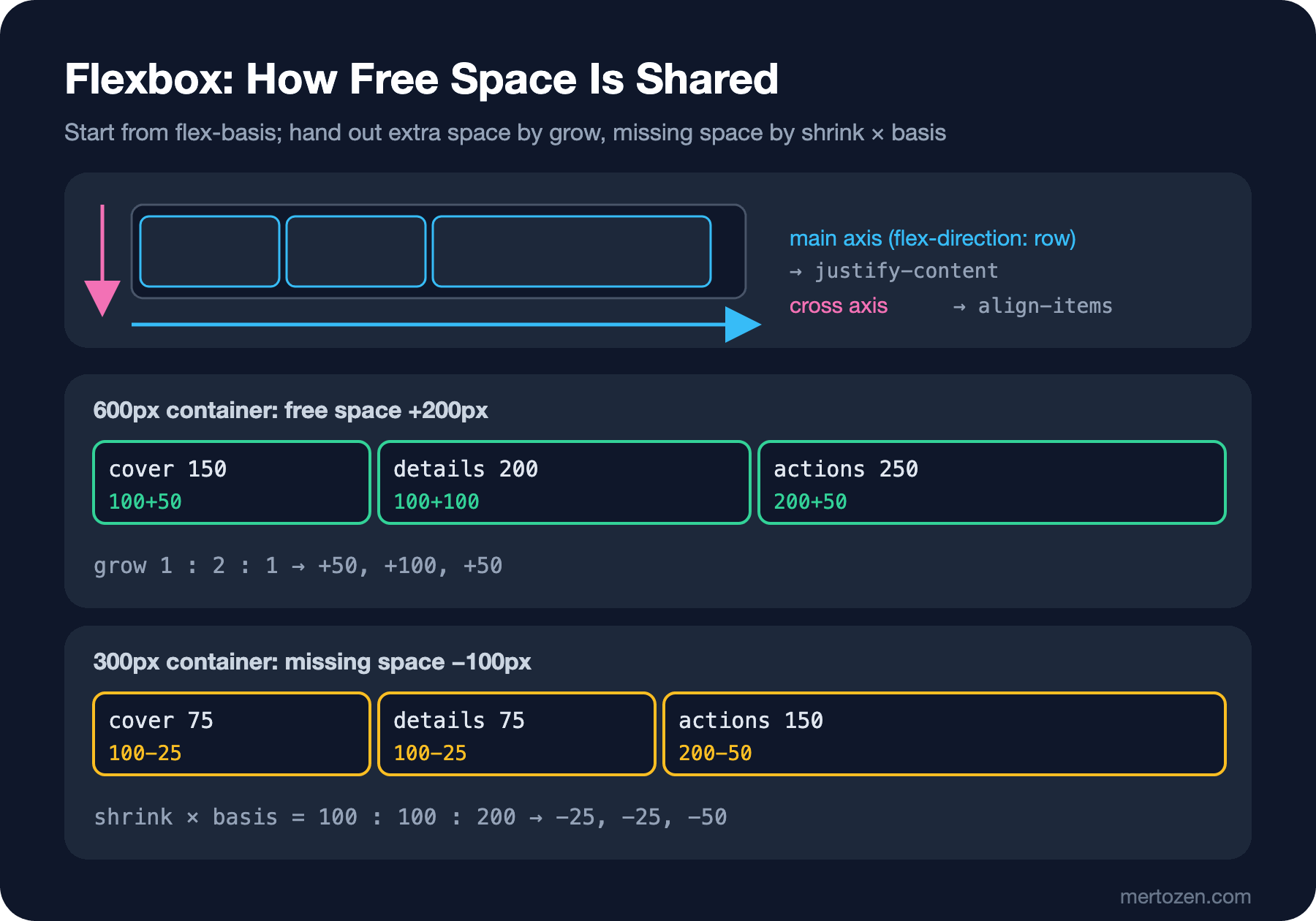
When you give an element display: flex, its direct children become flex items and are arranged along an axis. That axis is the main axis: with flex-direction: row, the default, it is the direction in which a line is written; with column, top to bottom. The axis perpendicular to it is the cross axis. All of Flexbox's alignment properties work along these two axes: justify-content aligns items along the main axis, align-items along the cross axis. When you write flex-direction: column, their meanings swap; this is the source of the "which one was it for centering horizontally?" confusion.
Give the space between items with gap instead of margins. As we saw in the previous post, margins on flex items do not collapse, and giving margins on both sides doubles the space; gap puts a single value only between items, not at the edges. In Flexbox, gap has been Baseline since April 2021. For items to move to the next line when they do not fit, you need flex-wrap: wrap; with the default nowrap, items stay on one line and try to shrink even when they do not fit.
flex-grow, flex-shrink and flex-basis: With Numbers
The size of every flex item is calculated in three steps. First, flex-basis: the item's starting size before anything is shared. Then the free space in the container is found: the container width minus the sum of the bases. If the free space is positive, it is distributed in proportion to flex-grow; if it is negative, items shrink according to flex-shrink. I measured the lab page in two engines:
node scripts/05-flex.mjs
node scripts/05-pages.mjs
--- chromium
wide (600px): cover 150, details 200, actions 250
narrow (300px): cover 75, details 75, actions 150
flex: initial -> grow 0, shrink 1, basis auto
flex: 1 -> grow 1, shrink 1, basis 0%
flex: auto -> grow 1, shrink 1, basis auto
flex: none -> grow 0, shrink 0, basis auto
flex: 12rem -> grow 1, shrink 1, basis 192px
broken details 556.8px, price right edge 656.4px, line right edge 320px
fixed details 220.4px, price right edge 320.0px, line right edge 320px
visual order: Add to cart | Details | Add to wishlist
Tab order: Details | Add to wishlist | Add to cart
--- webkit
wide (600px): cover 150, details 200, actions 250
narrow (300px): cover 75, details 75, actions 150
flex: initial -> grow 0, shrink 1, basis auto
flex: 1 -> grow 1, shrink 1, basis 0%
flex: auto -> grow 1, shrink 1, basis auto
flex: none -> grow 0, shrink 0, basis auto
flex: 12rem -> grow 1, shrink 1, basis 192px
broken details 556.8px, price right edge 656.4px, line right edge 320px
fixed details 220.4px, price right edge 320.0px, line right edge 320px
visual order: Add to cart | Details | Add to wishlistIn the 600px line, the bases add up to 100 + 100 + 200 = 400, leaving 200px of free space. The grow values are 1 : 2 : 1, so the 200px was split into four and handed out as 50, 100 and 50: 150, 200, 250. Intuitive so far.
In the 300px line, 100px is missing. The shrink values are equal, 1, 1 and 1, yet the shrinking was not shared equally: 75, 75, 150. Per the spec, shrinking is weighted not by flex-shrink but by flex-shrink × flex-basis. The weights are 100 : 100 : 200, so a quarter of the missing 100px came off each of the first two and half came off the third. The reasoning: cutting 25px from a large item is a small fraction of its size, but cutting the same amount from a small item could wipe it out. So the large one shrinks more.
In real life you will rarely do this calculation, because the four common values of the flex shorthand cover most needs. The second part of the output shows what they expand to:
flex: initial, the default →0 1 auto: does not grow, shrinks if needed, starts at its content size.flex: 1→1 1 0%: the basis is zero, all space is shared by grow ratio; for equal-width columns.flex: auto→1 1 auto: starts at its content size and shares what is left; the item with more content ends up wider.flex: none→0 0 auto: never grows, never shrinks; for parts that must not be squeezed, such as a price tag.
Writing a single length, as in flex: 12rem, means 1 1 12rem. The difference between flex: 1 and flex: auto is often missed: three tabs with flex: 1 end up equally wide even if their labels differ in length; with flex: auto the tab with the longer label stays wider.
Real-World Scenarios: Header, Card and Input Group
The first scenario is the header. The logo, the search box and the cart link on one line, with the cart at the far end:
<header class="site-header">
    <a class="logo" href="catalog.html">Bookstore</a>
    <form class="site-search" role="search" action="catalog.html">
        <input type="search" name="q" placeholder="Search books" aria-label="Search books">
    </form>
    <a class="cart-link" href="cart.html">Cart <span class="cart-count"></span></a>
</header>
.site-header {
display: flex;
align-items: center;
gap: var(--space);
position: sticky;
inset-block-start: 0;
z-index: 10;
block-size: 3.5rem;
padding-inline: var(--space);
background-color: var(--color-surface);
border-block-end: 1px solid var(--color-border);
}
.site-search {
flex: 1 1 12rem;
max-inline-size: 30rem;
}
.site-search input {
inline-size: 100%;
}
/* auto margin takes all free space and pushes the cart to the end */
.cart-link {
margin-inline-start: auto;
}
.cart-count:empty {
display: none;
}
/* keyboard users get a strong ring, mouse users do not */
:where(a, button, input, summary):focus-visible {
outline: 3px solid #1d4ed8;
outline-offset: 2px;
}align-items: center centers all three vertically. To push the cart to the end I did not use a separate wrapper or justify-content: space-between: margin-inline-start: auto gives all the free space on the main axis to that margin and pushes the cart to the end. This behavior of auto margins in Flexbox is the cleanest solution to "separate one item, keep the rest together".
The second scenario is the catalog cards. Each card is a flex container with flex-direction: column, and the list is a flex container that lays them out in rows and wraps:
.book-list {
    display: flex;
    flex-wrap: wrap;
    gap: var(--space);
    list-style: none;
    margin: 0;
    padding: 0;
    /* z-index values inside the list never compete with the sticky header */
    isolation: isolate;
}

.book-card {
    flex: 1 1 14rem;
    display: flex;
    flex-direction: column;
    gap: 0.25rem;
    position: relative;
    padding: var(--space);
    border: 1px solid var(--color-border);
    border-radius: var(--radius);
    background-color: var(--color-surface);
}

.book-card > * {
    margin: 0;
}

.book-card > img {
    align-self: center;
}

/* the price sits at the bottom, however long the title is */
.book-card .price {
    margin-block-start: auto;
}

/* a card without a cover image gets a tinted background instead */
.book-card:not(:has(> img)) {
    background-color: #fef3c7;
}

/* zebra stripes count only the books that are in stock */
.book-card:nth-child(even of .in-stock) {
    border-color: #93c5fd;
}

.book-card[data-stock="0"] .price {
    text-decoration: line-through;
    color: var(--color-muted);
}

.book-card[data-format~="ebook"] .book-title::after {
    content: " · e-book";
    font-size: 0.75em;
    color: var(--color-muted);
}

.badge {
    position: absolute;
    inset-block-start: 0.5rem;
    inset-inline-end: 0.5rem;
    z-index: 1;
    padding-inline: 0.5rem;
    border-radius: var(--radius);
    background-color: var(--color-accent);
    color: #ffffff;
    font-size: 0.75rem;
}
--- chromium
1024px header: logo x=16, search 105.4-585.4, cart right edge 1008 of 1024
Dune x=16.0 y=177 w=236.0 h=302.8 price bottom gap 17px
Middlemarch x=268.0 y=177 w=236.0 h=302.8 price bottom gap 17px
Emma x=520.0 y=177 w=236.0 h=302.8 price bottom gap 17px
The Hobbit x=772.0 y=177 w=236.0 h=302.8 price bottom gap 17px
768px header: logo x=16, search 105.4-585.4, cart right edge 752 of 768
Dune x=16.0 y=177 w=234.7 h=302.8 price bottom gap 17px
Middlemarch x=266.7 y=177 w=234.7 h=302.8 price bottom gap 17px
Emma x=517.3 y=177 w=234.7 h=302.8 price bottom gap 17px
The Hobbit x=16.0 y=496 w=736.0 h=118.8 price bottom gap 17px
coupon group 320px: input 234.1px, button 77.9px, button right edge 320
--- webkit
1024px header: logo x=16, search 105.4-585.4, cart right edge 1008 of 1024
Dune x=16.0 y=178 w=236.0 h=302.8 price bottom gap 17px
Middlemarch x=268.0 y=178 w=236.0 h=302.8 price bottom gap 17px
Emma x=520.0 y=178 w=236.0 h=302.8 price bottom gap 17px
The Hobbit x=772.0 y=178 w=236.0 h=302.8 price bottom gap 17px
768px header: logo x=16, search 105.4-585.4, cart right edge 752 of 768
Dune x=16.0 y=178 w=234.7 h=302.8 price bottom gap 17px
Middlemarch x=266.7 y=178 w=234.7 h=302.8 price bottom gap 17px
Emma x=517.3 y=178 w=234.7 h=302.8 price bottom gap 17px
The Hobbit x=16.0 y=497 w=736.0 h=118.8 price bottom gap 17px
coupon group 320px: input 234.1px, button 77.9px, button right edge 320At 1024px the four cards sit side by side, each 236px wide and all the same height, 302.8px. I wrote nothing for equal heights: the default of align-items is stretch, and items on the same line stretch to the height of the line. The cards without a cover are as tall as the ones with a cover, even though their content is shorter. The price sitting 17px from the bottom of every card, 16px of padding plus 1px of border, comes from margin-block-start: auto on .price; the same auto margin technique as in the header, this time on a main axis that runs in the column direction. I gave the card's img align-self: center; otherwise stretch would stretch the cover to the width of the card.
The result at 768px shows the limit of Flexbox. The first three cards are 234.7px, but the fourth card, The Hobbit, ended up alone on the next line and stretched to 736px. With flex-wrap, every line is calculated on its own; the single item on the last line takes all the free space. If you want the cards to sit in the same columns on every row, that is a two-dimensional problem, and the right tool is Grid. We will move the catalog list to Grid in the next post.
The third scenario is the coupon field at checkout: the input should stretch, and the button should stay as wide as its content.
.input-group {
    display: flex;
    gap: 0.5rem;
}

/* min-inline-size: 0 lets the input shrink below its default width */
.input-group input {
    flex: 1;
    min-inline-size: 0;
}
In the last line of the output, on a 320px phone the input is 234.1px, the button is 77.9px, and the button's right edge is exactly at 320: nothing overflows. The min-inline-size: 0 here is the subject of the next section.
The min-width: 0 Trap and Long Book Titles
The default min-width of a flex item is not 0 but auto, and for a flex item auto means "do not get narrower than the content's min-content width". Most of the time that is a good thing: it prevents a word from being cut in half. But it becomes a problem when the content's min-content width is very large. In the cart line I wanted to cut the book title on one line with an ellipsis:
@layer components {
    .cart-line { display: flex; gap: 1rem; inline-size: 320px; outline: 1px solid #94a3b8; }
    .cart-line p { margin: 0; }
    .cart-line .details { flex: 1; }
    .cart-line .title { white-space: nowrap; overflow: hidden; text-overflow: ellipsis; }
    .cart-line .price { flex: none; }
    .cart-line.fixed .details { min-inline-size: 0; }
}
<div class="cart-line" id="broken">
<div class="details">
<p class="title">Twenty Thousand Leagues Under the Seas: An Underwater Tour of the World</p>
<p class="author">Jules Verne</p>
</div>
<span class="price">189.00 TRY</span>
</div>Look at the broken line in the output: in the 320px line, .details grew to 556.8px, and the price's right edge is at 656.4px, 336px outside the line. Since .title has white-space: nowrap, the min-content width of .details became the full length of the title, and min-width: auto did not let it shrink below that. The title was not cut with an ellipsis; it pushed the price out of the line. The only difference in the fixed line is min-inline-size: 0 on .details: .details shrank to 220.4px, the title was cut, and the price is inside the line. This is the pitfall I promised at the end of the previous post.
A detail: the automatic minimum size of a flex item whose overflow is not visible is already zero. So if I had written overflow: hidden on the flex item itself, there would have been no problem. The problem appears when an element inside the item does the cutting. For the same reason I gave the input in the coupon field min-inline-size: 0: inputs have a default width set by the browser, and on a narrow screen that is enough to push the button out.
order: Visual Order and DOM Order
The order property changes the visual order of items without changing the DOM. To move the "Add to cart" button to the front of the card actions, I gave it order: -1:
@layer components {
    .card-actions { display: flex; gap: 0.5rem; }
    .card-actions .add-to-cart { order: -1; }
}
<div class="card-actions">
<a href="#details">Details</a>
<a href="#wishlist">Add to wishlist</a>
<button class="btn btn-primary add-to-cart" type="button">Add to cart</button>
</div>The last two lines of the output: the visual order is "Add to cart | Details | Add to wishlist", but when moving with Tab the order is "Details | Add to wishlist | Add to cart". Keyboard users and screen readers follow the DOM order, not the order on screen. When the visual order and the focus order drift apart, the keyboard user's focus seems to jump around the screen. I took this measurement in Chromium only; as mentioned in the earlier posts, WebKit on macOS not moving to buttons with Tab makes the comparison meaningless.
The rule is simple: if the order carries meaning, change the DOM, not order. Use order and flex-direction: row-reverse only where the order is purely visual and carries no meaning. Chrome has a reading-flow property that makes focus order follow the visual order, but as of November 2026 it exists only in Chromium-based browsers and is not Baseline. The accessibility reasoning is in the upcoming Accessibility (a11y) series.
In Production
Use Flexbox for layouts that are thought of from the content outward: the buttons in a row, a header, a form row, the vertical arrangement inside a card. If the items' sizes are set by their content and the container tries to fit them, Flexbox is the right tool. If you want an arrangement that goes from the layout inward, such as cards that sit in the same columns on every row, Grid is a better fit; we will cover that decision in detail in the series' post on subgrid and "Grid or Flexbox?".
Test with real content. The two bugs in this post, the card that stretched on its own at 768px and the title that pushed the price out of the line, never show up with short test data. Bookstore's longest book title, its longest author name and a book with no cover should be essential data for layout tests. Checks that measure sizes at a few widths, like the Playwright scripts in this post, catch these bugs without setting up a visual regression tool.
Common Pitfalls
First, assuming flex-shrink makes items shrink equally. Shrinking is weighted by flex-shrink × flex-basis; the larger item shrinks more. If you want an item never to shrink, give it flex: none or flex-shrink: 0.
Second, a flex item with long content overflowing. The cause is almost always min-width: auto; the fix is to give the item min-inline-size: 0 or overflow: hidden.
Third, building a card grid with flex-wrap. The items on the last line end up a different width from the others. If the columns must line up, use Grid.
Fourth, changing a meaningful order with order. The order on screen and the Tab order drift apart.
A Small Experiment
★☆☆ Set the flex-shrink of .actions in lab/05-flex-math.html to 0, calculate the new widths of the 300px line on paper first, then check them with node scripts/05-flex.mjs.
★★☆ Change flex: 1 1 14rem on the catalog cards to flex: 0 1 14rem. What is the width of the lone card at 768px now? What did you lose this time?
★★★ Write a line for the cart page with Flexbox: cover, title and author, quantity picker, price and a remove button. Verify with a Playwright script that with the longest title and at 320px nothing overflows, and that the price stays aligned on every line. Note the point where Flexbox is not enough for aligning the prices; the answer is in the next post.
In the next post we move on to Grid: tracks, the fr unit, repeat(auto-fill, minmax()), which builds a responsive catalog grid without media queries, and grid-template-areas, which describes the page skeleton by name.