

The Box Model, Sizing and Logical Properties: box-sizing, Margin Collapse, Intrinsic Sizes and Units
With box-sizing: border-box, width measures the whole box; in normal flow stacked vertical margins do not add up, the larger one wins, while in flex and grid they add up. On Bookstore's book card and detail page we measure the box model, when margin collapse happens and when it doesn't, min-content/max-content/fit-content, the cover ratio with aspect-ratio, rem/em/ch and svh/lvh/dvh units, and RTL-ready logical properties in Chromium and WebKit.
Version note: This post follows the CSS Box Model, Box Sizing, Values and Units, and Logical Properties specifications and the state of Baseline in November 2026; the examples were run in Chrome 158 and WebKit 27.2 via Playwright 1.65, and Firefox support is taken from web-features data.
Guess First
While designing book cards for Bookstore, the online bookstore used as the shared example across this site's series, two small questions came up. First: both boxes below got width: 200px. Are both 200 pixels wide on screen?
@layer components {
    .box { width: 200px; padding: 16px; border: 4px solid #1f2937; }
    .content-box { box-sizing: content-box; }

    .stack > p { margin-block: 0; }
    .stack > .first { margin-block-end: 24px; }
    .stack > .second { margin-block-start: 16px; }
    .stack > .pull-up { margin-block-start: -8px; }
    .stack.as-flex { display: flex; flex-direction: column; }

    .promo { background: #fef3c7; }
    .promo > h2 { margin-block-start: 32px; }
    .promo.flow-root { display: flow-root; }

    .shelf { width: 300px; }
    .shelf > p { margin: 0; background: #e0f2fe; }
    .min { width: min-content; }
    .max { width: max-content; }
    .fit { width: fit-content; }
}
Second: there are two paragraphs, one above the other. The upper one has a 24px margin-block-end, the lower one a 16px margin-block-start. How many pixels of space end up between them: 40, 24 or 16? And what if we put the same two paragraphs in a box with display: flex; flex-direction: column?
<div class="box">border-box</div>
<div class="box content-box">content-box</div>

<div class="stack" id="siblings"><p class="first">Dune</p><p class="second">Emma</p></div>
<div class="stack" id="negative"><p class="first">Dune</p><p class="pull-up">Emma</p></div>
<div class="stack as-flex" id="flex"><p class="first">Dune</p><p class="second">Emma</p></div>

<section class="promo" id="escape"><h2>Summer sale</h2></section>
<section class="promo flow-root" id="contained"><h2>Summer sale</h2></section>

<div class="shelf">
    <p class="min">The Count of Monte Cristo</p>
    <p class="max">The Count of Monte Cristo and Twenty Thousand Leagues Under the Seas</p>
    <p class="fit">The Count of Monte Cristo</p>
    <p class="fit">The Count of Monte Cristo and Twenty Thousand Leagues Under the Seas</p>
</div>
Note your answers. In the previous two posts we talked about which rule the browser picks; in this post we look at how the chosen values turn into a box. The box model is the bottom layer of layout in CSS: Flexbox and Grid, too, end up placing these boxes.
The Box Model and box-sizing
Every element on the page produces a box, and that box has four layers: the content, the inner space between the content and the edge called padding, the edge line called border, and the space the box leaves between itself and its neighbors called margin. The background is painted up to the end of the padding; the margin is always transparent.
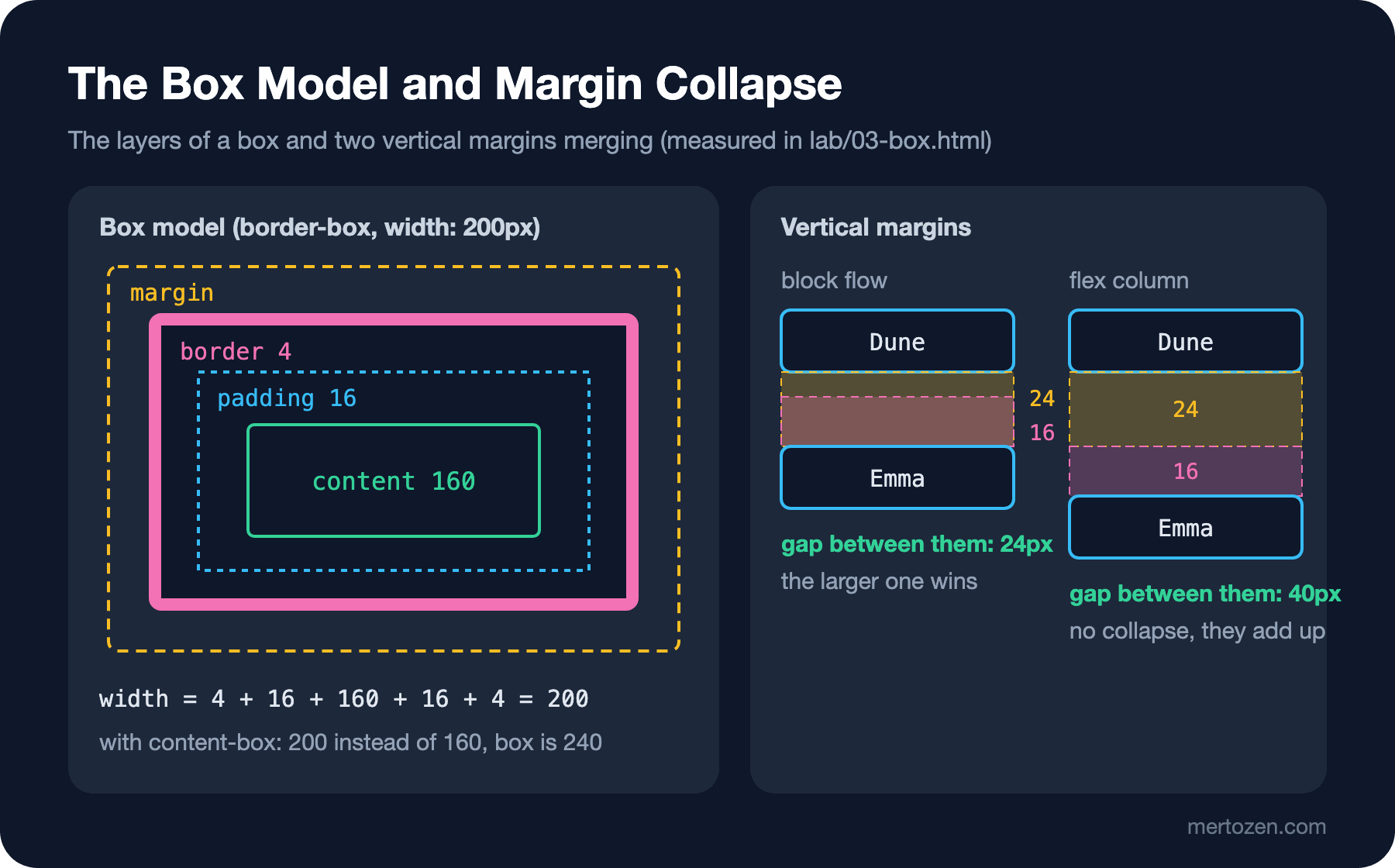
The real question is which of these layers width measures. That is decided by box-sizing. The default is content-box: width is just the width of the content, and padding and border are added on top. With border-box, width is the whole box including the border, and the content gets what is left. I ran the measurement script in two engines:
node scripts/03-box.mjs
node scripts/03-book.mjs
--- chromium
border-box rendered width: 200px
content-box rendered width: 240px
gap (siblings): 24px
gap (negative): 16px
gap (flex): 40px
escape space between section top and h2: 0px
contained space between section top and h2: 32px
min width: 46.0 lines: 5
max width: 537.4 lines: 1
fit width: 192.1 lines: 1
fit width: 300.0 lines: 2
100vh=844px 100svh=844px 100lvh=844px 100dvh=844px
--- webkit
border-box rendered width: 200px
content-box rendered width: 240px
gap (siblings): 24px
gap (negative): 16px
gap (flex): 40px
escape space between section top and h2: 0px
contained space between section top and h2: 32px
min width: 46.0 lines: 5
max width: 537.4 lines: 1
fit width: 192.1 lines: 1
fit width: 300.0 lines: 2
100vh=844px 100svh=844px 100lvh=844px 100dvh=844pxThe first two lines answer the first question. The border-box box is exactly 200px, with 200 − 2×16 − 2×4 = 160px of content. The content-box box is 240px: 200px of content, plus 16px of padding and 4px of border on each side. When a designer says "the card is 200 pixels", they almost always mean the former, not the latter. That is why the reset layer we set up in the first post has box-sizing: border-box for all elements and pseudo-elements. This line is in almost every modern CSS reset, and this measurement is the reason.
Margin Collapse: When It Happens and When It Doesn't
The next three lines answer the second question. In normal block flow, the vertical margins of two elements stacked on top of each other do not add up; they merge, and the larger one wins. With 24 and 16 next to each other, the gap became 24px. If one of the margins is negative, the largest positive and the most negative are added; 24 and −8 gave 16px. But with the same two paragraphs inside a flex container, the gap is 40px: the margins of flex and grid items never collapse.
Margin collapse does not only happen between two siblings. If a parent has no border, padding or inline content at its top and does not establish its own block formatting context, the top margin of its first child escapes outside the parent. In the escape line of the output, the 32px margin of the "Summer sale" heading ended up outside the section, not inside it: there is 0px between the top of the section and the top of the heading, and the section's yellow background starts right above the heading. This is the classic case where you see unexpected space above a banner and go looking for padding. In the contained line I only added display: flow-root to the same section; the section established its own formatting context, the margin stayed inside, and the 32px of space showed up within the background. We will see exactly what flow-root does in the next post; for now it is enough to say it "keeps what is inside the box in the box".
It is also worth knowing when collapse does not happen: horizontal margins never collapse; neither do the margins of flex and grid items, floats, absolutely positioned elements or inline-block elements. Nor do margins collapse when border, padding or content sits between them. As a practical rule, I give vertical space from one direction only: elements get only a margin-block-end, and I don't use margin-block-start. In Flexbox and Grid layouts, using gap instead of margins removes the question entirely; we will see that in the Flexbox post.
Intrinsic Sizes: min-content, max-content and fit-content
Instead of a fixed number, you can also size a box by its content. I measured four paragraphs inside a 300px shelf. min-content is the narrowest width the content can take without overflowing: for text, the longest word. "The Count of Monte Cristo" shrank to 46px and broke into five lines. max-content is the width the content wants without breaking any line; the long title went past the shelf and became 537.4px. fit-content is the smart middle ground: as wide as max-content if the content fits, so the short title is 192.1px on one line, and as wide as the available space if it does not, so the long title is 300px on two lines. For boxes that should take as much room as their content but never overflow, such as a price tag or an "In stock" badge, fit-content is the right choice.
Besides these keywords, the min(), max() and clamp() functions are there to set limits. For the book cover I wrote inline-size: min(100%, 20rem): the cover never grows beyond 20rem, but on a narrow screen it does not overflow its box either. We will talk about fluid font sizes with clamp() in the series' post on responsive design.
A Cover Ratio with aspect-ratio, overflow and text-overflow
I updated the book detail page with this post's topics:
.book-page {
    max-inline-size: 60rem;
    margin-inline: auto;
    padding-inline: var(--space);
}

/* one line, cut with an ellipsis */
.breadcrumb {
    white-space: nowrap;
    overflow: hidden;
    text-overflow: ellipsis;
    color: var(--color-muted);
}

/* the cover keeps a 2:3 ratio at any width */
.book-cover {
    inline-size: min(100%, 20rem);
    block-size: auto;
    aspect-ratio: 2 / 3;
    object-fit: cover;
    border-radius: var(--radius);
}

.book-page .price {
    padding-inline-start: 0.75rem;
    border-inline-start: 4px solid var(--color-accent);
    font-size: 1.25rem;
}

/* at most three lines of summary, readable line length */
.book-summary {
    max-inline-size: 65ch;
    display: -webkit-box;
    -webkit-box-orient: vertical;
    -webkit-line-clamp: 3;
    overflow: hidden;
}
--- chromium 320px
cover: 288 x 432
breadcrumb: client 288px, content 632px
summary: 72px tall (line-height 24px), max 655.078px
price border left/right: 4px / 0px, padding left/right: 12px / 0px
--- chromium 1280px
cover: 320 x 480
breadcrumb: client 928px, content 928px
summary: 72px tall (line-height 24px), max 655.078px
price border left/right: 4px / 0px, padding left/right: 12px / 0px
dir=rtl -> price border left/right: 0px / 4px, padding left/right: 0px / 12px
--- webkit 320px
cover: 288 x 432
breadcrumb: client 288px, content 632px
summary: 72px tall (line-height 24px), max 634.765625px
price border left/right: 4px / 0px, padding left/right: 12px / 0px
--- webkit 1280px
cover: 320 x 480
breadcrumb: client 928px, content 928px
summary: 72px tall (line-height 24px), max 634.765625px
price border left/right: 4px / 0px, padding left/right: 12px / 0px
dir=rtl -> price border left/right: 0px / 4px, padding left/right: 0px / 12pxThe cover is 288 × 432 on a 320px-wide phone and 320 × 480 on desktop: the width changes, but the ratio is always 2:3. aspect-ratio has been Baseline since September 2021. A detail: when you write the width and height attributes on an img, the browser derives the ratio from them and reserves space before the image loads. I still write aspect-ratio explicitly, because keeping the page from shifting while loading depends on the attributes, while making an image with a different ratio fit 2:3 depends on object-fit: cover. What that reserved space means for Core Web Vitals is covered in the upcoming Web Performance series.
The breadcrumb line stays on one line and is cut with an ellipsis. This needs three properties together: white-space: nowrap stops the line from wrapping, overflow: hidden hides the overflowing part, and text-overflow: ellipsis puts the ellipsis where the text is cut. In the output, on the phone the content is 632px but the box is 288px; on desktop the two are equal, so nothing was cut.
The summary paragraph shows at most three lines: 72px in the output with a 24px line height. The standard line-clamp property for multi-line truncation is not Baseline yet; what works today is the trio of display: -webkit-box, -webkit-box-orient: vertical and -webkit-line-clamp. Despite the prefix, the result is the same in Chromium and WebKit, and according to MDN Firefox supports it too.
Among the values of overflow, it helps to know the difference between hidden and clip. Both hide what overflows, but hidden makes the box a scroll container that can still be scrolled by script, and clip does not. This difference will matter in the next post when we look for the reason position: sticky doesn't work.
Units: rem, em, ch and Viewport Units
rem is relative to the font size of the root element, html; the browser default is 16px, so 20rem is 320px. If the user increases the default font size in the browser settings, everything sized in rem grows with it; that is why rem is my first choice for font sizes, spacing and box limits. em is relative to the element's own font size and multiplies when nested; it is good for deliberate cases, such as scaling a button's padding with the button's font.
ch is the width of the "0" character in the font. In the summary paragraph I kept the line length at about 65 characters with max-inline-size: 65ch. Look at the output: 655.078px in Chromium, 634.766px in WebKit. The two engines use different fonts for system-ui, and since ch depends on the font, the result differs too. ch is not a pixel measure; it expresses a readable line length.
Viewport units are where most mistakes happen on mobile. 100vh looks like "the screen height", but in mobile browsers the address bar hides and shows as you scroll, so the height of the screen changes. Per the spec, vh should equal the large viewport, the height with the bars hidden. The result: a full-screen checkout summary built with 100vh slides under the address bar at the bottom when the page first opens. Three newer units, Baseline since December 2022, solve this: svh is based on the small viewport, with the bars visible, lvh on the large viewport, and dvh on the actual current height. In the last line of the measurement all four are 844px; a headless browser has no address bar that hides and shows, so I cannot show the difference here. On a real phone svh is smaller than lvh. My rule: min-block-size: 100svh for an area that should fill the screen; dvh only when it is really needed, since it can cause relayout while scrolling. Units that measure against a container, such as cqi, are in the series' post on container queries.
Logical Properties and RTL-Ready Styles
In this post's code I used names such as inline-size, margin-inline and padding-block instead of width, margin-left and padding-top. These are logical properties, Baseline since September 2021. Physical properties depend on the direction of the screen: left, right, top, bottom. Logical ones depend on the direction of the text. The inline axis is the direction in which a line is written, the block axis is the direction in which lines are stacked. In Turkish and English the inline direction is left to right, but in Arabic and Hebrew it is right to left.
I gave the red line to the left of the price with border-inline-start. In the last line of the output I measured the same page with dir="rtl": the line and the padding moved to the right on their own, without changing a single line of CSS. Bookstore is only in Turkish and English today, but using logical properties in new CSS costs nothing, and it saves you from going through every stylesheet if a right-to-left language is added later. My rule: logical for everything related to text flow, such as margin, padding, border and alignment; physical for things that are really physical, such as the light direction of a shadow.
In Production
Adding box-sizing: border-box to an existing project later changes every width that was calculated for content-box. Do it on day one in a new project; in an old project, put it into the reset layer first and check the pages one by one. If a third-party component relies on content-box, you may need to write box-sizing: content-box specifically for it.
Testing on a real device is a must for viewport units. As in the headless measurement in this post, in an environment without an address bar that hides and shows, all four units give the same value and you cannot see the difference.
Text cut with -webkit-line-clamp stays complete in the DOM and for screen readers; only the visual is shortened. If the cut part matters, give the user a way to see all of it, such as a "Read more" link.
Common Pitfalls
First, the unexplained space above a banner. Most of the time the cause is the first child's margin collapsing outside the parent. Giving the parent padding or writing display: flow-root fixes it.
Second, assuming the space between two elements "adds up" when you give margins on both sides. In normal flow it doesn't; the larger one wins. In flex and grid it adds up. If the spacing changes when you put the same component into two different layouts, this is why.
Third, height: 100vh for full-screen areas. On mobile, while the address bar is visible, the content overflows the bottom of the screen. Use min-block-size: 100svh, and prefer the property starting with min- over height so that the box grows when the content grows.
Fourth, expecting text-overflow: ellipsis to work on its own. Without white-space: nowrap and overflow: hidden the ellipsis does not appear; in flex items you also need min-width: 0. We will measure that last pitfall in the Flexbox post.
A Small Experiment
★☆☆ Set the margin of .second in lab/03-box.html to 40px and run node scripts/03-box.mjs. What did the gap become? Then add display: flow-root to #siblings; did the collapse between the siblings change, and why?
★★☆ Rewrite .price on the book detail page with physical properties, padding-left and border-left, and compare the dir=rtl line from node scripts/03-book.mjs.
★★★ On your phone, build a page that imitates Bookstore's checkout summary: a full-screen box and a fixed "Place order" button at the bottom. Try the box first with 100vh, then with 100svh and 100dvh; note where the button sits while you scroll.
In the next post we move on to how boxes are placed on the page: normal flow, the two-value syntax of display, flow-root, why position: sticky sometimes doesn't work, and the stacking context that explains why z-index sometimes seems to do nothing.