

Flutter Layout: Constraints Go Down, Sizes Go Up — Row, Column, Expanded, Stack and Overflow Errors
In Flutter a parent gives its child a constraint, the child picks its own size within it, and the parent sets the position; a Text in a Row overflows because it gets an unbounded width. We print constraints in a test and show with real output tight versus loose constraints, Expanded and Flexible, the three classic layout errors, and a book details screen with phone and tablet layouts built on LayoutBuilder.
Version note: The examples in this post were run with Flutter 3.47.8 (Dart 3.13.7) and material_ui 1.11.0. The output comes from flutter test runs and from opening the web build in Playwright's headless Chromium; running on an emulator or a device was not done for this post.
Guess First
We are writing the book details screen in the mobile app of Bookstore, the online bookstore used as the shared example across this site's series. The title line is simple: a book icon on the left and the book's full title next to it. The book is The Hobbit, full title "The Hobbit: or There and Back Again". The screen is a small phone, 320 dp wide.
Row(
  children: [
    const Icon(Icons.menu_book),
    Text(hobbit.displayTitle, style: const TextStyle(fontSize: 20)),
  ],
)
What happens: does the text wrap to a second line by itself, does it get cut off with "...", or do you see a yellow and black striped band on the screen and an error in the console? If you have worked with CSS Flexbox on the web, the first answer looks reasonable. In Flutter the right answer is the third one, and the reason is the layout rule this post is about.
The Layout Rule: Constraints Go Down, Sizes Go Up
Flutter does layout in a single pass over the tree, and the "Understanding constraints" page in the official docs sums it up in three short sentences: constraints go down, sizes go up, and the parent sets the position. The parent gives its child a constraint (a minimum and maximum width and height); the child picks its own size within those limits and reports it upward; and the parent decides where the child is drawn. A widget does not know its own position and cannot pick any size it wants, only one from the range it was given.
To see this instead of guessing, we wrote a small helper that prints every constraint it receives. LayoutBuilder hands its builder the constraint that comes from the parent:
final log = <String>[];

/// Prints the constraints it receives from its parent, then picks a size.
Widget probe(String label, {Widget? child}) => LayoutBuilder(
  builder: (context, constraints) {
    log.add('$label: $constraints');
    return child ?? const SizedBox(width: 100, height: 40);
  },
);
In a test we set the screen to a 390 x 844 dp phone and put a probe in the Scaffold body, in a Column inside a 16 dp Padding, and in the column's different children:
Scaffold body: BoxConstraints(0.0<=w<=390.0, 0.0<=h<=844.0)
Column child: BoxConstraints(0.0<=w<=358.0, 0.0<=h<=Infinity)
SizedBox(200x100) child: BoxConstraints(w=200.0, h=100.0)
Center child: BoxConstraints(0.0<=w<=358.0, 0.0<=h<=Infinity)
Row child: BoxConstraints(unconstrained)
Expanded in Row: BoxConstraints(w=258.0, 0.0<=h<=Infinity)
Let's read it line by line. Scaffold gives its body as much room as the screen but lets it be smaller. Padding takes 16 off each side, so the width limit drops to 358. Column puts no vertical limit on its children (Infinity), because it stacks them and wants each to choose its own height. SizedBox forces a single size on its child. A Row inside a Column gives its non-flex children no limit on either axis; keep that line in mind, because it is where overflow errors come from.
For the second and third parts of the rule, we read the size each child chose and the position its parent gave it on the same screen:
title: size Size(57.0, 20.0), offset in parent Offset(71.5, 0.0)
box: size Size(200.0, 100.0), offset in parent Offset(0.0, 20.0)
column: size Size(200.0, 812.0), offset in parent Offset(16.0, 16.0)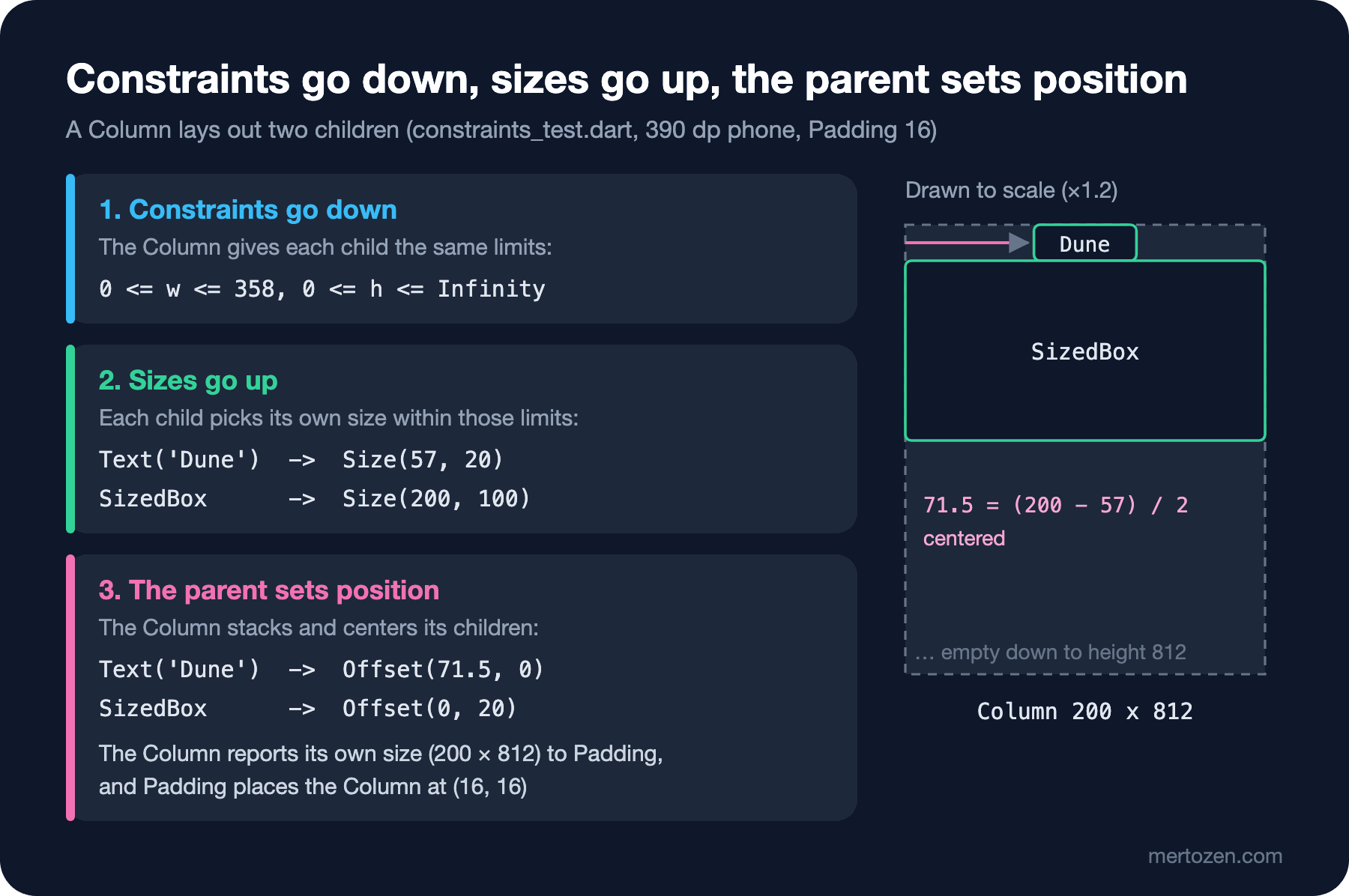
The Column is as wide as its widest child (200) and as tall as the largest value it was allowed (812), because mainAxisSize defaults to max. It is also the Column that centers the text "Dune" horizontally: 71.5 is (200 - 57) / 2. The text itself does not know it is centered. One note: instead of a real font, the test environment uses a test font that draws every character as a square, so text widths differ from a real device; the constraints and the positioning logic are the same.
Tight and Loose Constraints
The two formats in the output match two kinds of constraints. w=200.0, h=100.0 is a tight constraint: the minimum and maximum are the same, and the child has no choice. 0.0<=w<=358.0 is a loose constraint: the minimum is zero, and the child picks anything between 0 and 358. Widgets such as Center, Align and the Scaffold body loosen the constraint they receive before passing it on; SizedBox, SizedBox.expand and Expanded pass a tight one.
This difference explains the problem everyone new to Flutter hits once: "I gave the Container width: 100, but it fills the screen." A widget placed directly in the home of MaterialApp gets a tight constraint the size of the screen; asking for a width of 100 changes nothing, because its parent allows no value other than 390. Put a Center in between and the constraint becomes loose, so the width of 100 is applied. In CSS a width is a request; in Flutter a width is a preference that is applied if the parent allows it.
Row, Column, Expanded and Flexible
Row and Column are Flutter's counterpart of CSS Flexbox; both are the horizontal and vertical forms of the Flex widget. For readers coming from the web, here is how the concepts map:
| Flutter | CSS Flexbox | Difference |
|---|---|---|
Row / Column | flex-direction: row / column | No wrapping; content that does not fit is an error |
mainAxisAlignment | justify-content | Same values: start, center, spaceBetween... |
crossAxisAlignment | align-items | Default is center in Column, stretch in CSS |
Expanded | flex: 1 | Must fill the remaining space (tight) |
Flexible | close to flex: 0 1 auto | Can grow up to the remaining space or stay smaller (loose) |
Wrap | flex-wrap: wrap | A separate widget |
Stack + Positioned | position: relative + absolute | Positioned can only be a direct child of a Stack |
A flex lays out in this order: first the non-flex children (the ones not wrapped) are measured with an unbounded constraint on the main axis, then the remaining space is shared among the Expanded and Flexible children according to their flex values. The Row child: unconstrained and Expanded in Row: w=258.0 lines in the probe output are exactly this: the first child took 100 of the 358 width, and the remaining 258 was given to Expanded as a tight constraint.
The answer to "Guess First" follows from this. Text is a non-flex child, so it got an unbounded width, wrote its full title on one line and did not fit in the Row. Wrap the text in Expanded and its width is limited to the remaining space, so maxLines and overflow take effect:
Row(
  children: [
    const Icon(Icons.menu_book),
    Expanded(
      child: Text(
        hobbit.displayTitle,
        style: const TextStyle(fontSize: 20),
        maxLines: 1,
        overflow: TextOverflow.ellipsis,
      ),
    ),
  ],
)
Three Classic Errors
In a debug build, layout errors show up as yellow and black stripes on the screen and a long explanation in the console. In a release build the stripes do not appear, but the content is still cut off. We produced three classic errors in a test and collected their first lines; the helper in the test temporarily replaces FlutterError.onError and counts the reported errors:
without Expanded: A RenderFlex overflowed by 413 pixels on the right. (1 error(s))
with Expanded: no error
ListView in Column: Vertical viewport was given unbounded height. (15 error(s))
wrapped in Expanded: no error
Expanded in Padding: Incorrect use of ParentDataWidget. (1 error(s))
The first one is the line from "Guess First": RenderFlex is the render object of Row and Column. The 413 pixels are how far the text overflows with the test font.
The second one is a ListView placed inside a Column. The Column gives its child infinite vertical space; the ListView is a scrollable area, so it wants to fill all the height it has. It cannot fill infinity, so it throws. One pump reported 15 errors: the first is the real cause, and most of the rest say "RenderBox was not laid out" and list, one by one, the ancestor render objects whose layout was left unfinished. In a pile like that, always read the first error. The fix is to give the ListView a bounded height: the remaining space with Expanded, or a fixed height with SizedBox. The often-suggested shrinkWrap: true removes the error but breaks the list's lazy behavior; we will see why in the next post.
The third one is using Expanded outside a Row, Column or Flex. Expanded does not draw anything itself; it carries information to its parent (parent data) that says "lay me out as a flex child". When the parent is a Padding, that information has nowhere to go. Using Positioned outside a Stack gives the same error.
To find these errors on a real screen, the layout view of the Flutter Inspector in Flutter DevTools (the Layout Explorer) shows the constraints of the Row or Column you select and the flex values of its children, and lets you change the values there and see the result. DevTools was not run for this post; we read the same information with the probe and the tests above.
Stack, Positioned and Wrap: the Cover and the Chips
The cover on the book details screen is made of two layers on top of each other: the cover area and, for e-books, a label in the top-left corner. Layering is the job of Stack:
class BookCover extends StatelessWidget {
  const BookCover({super.key, required this.book});

  final Book book;

  @override
  Widget build(BuildContext context) {
    final colors = Theme.of(context).colorScheme;
    return AspectRatio(
      aspectRatio: 2 / 3,
      child: Stack(
        fit: StackFit.expand,
        children: [
          DecoratedBox(
            decoration: BoxDecoration(
              color: colors.primaryContainer,
              borderRadius: BorderRadius.circular(8),
            ),
            child: Icon(
              Icons.menu_book,
              size: 64,
              color: colors.onPrimaryContainer,
            ),
          ),
          if (book.format == .ebook)
            Positioned(
              top: 8,
              left: 8,
              child: Chip(
                label: const Text('E-book'),
                visualDensity: VisualDensity.compact,
              ),
            ),
        ],
      ),
    );
  }
}
AspectRatio computes a 2:3 height from the width it gets; the cover's width will be set by its parent. StackFit.expand makes the non-positioned children (DecoratedBox) cover the whole Stack. Positioned places its child relative to the edges. We will add the real cover image to this layer with Image.network in the lists post.
The book information has two Wrap widgets. One lays out the format, year and ISBN chips side by side as far as they fit and moves the rest to the next line. The story of the other one is in the "In Production" section below.
Responsive: LayoutBuilder, MediaQuery.sizeOf and SafeArea
The details screen should have the cover on top and the text below on a phone, and the cover on the left and the text on the right on a tablet. The decision is based on the width that comes from LayoutBuilder:
class BookDetailsScreen extends StatelessWidget {
  const BookDetailsScreen({super.key, required this.book, this.onAddToCart});

  /// Below this width the cover sits above the text; from it up, on the left.
  static const twoColumnMinWidth = 600.0;

  final Book book;
  final VoidCallback? onAddToCart;

  @override
  Widget build(BuildContext context) {
    return Scaffold(
      appBar: AppBar(title: Text(book.title)),
      body: SafeArea(
        child: LayoutBuilder(
          builder: (context, constraints) {
            final info = BookInfo(book: book, onAddToCart: onAddToCart);
            if (constraints.maxWidth >= twoColumnMinWidth) {
              return Row(
                crossAxisAlignment: CrossAxisAlignment.start,
                children: [
                  Padding(
                    padding: const EdgeInsets.all(24),
                    child: SizedBox(width: 240, child: BookCover(book: book)),
                  ),
                  Expanded(
                    child: SingleChildScrollView(
                      padding: const EdgeInsets.fromLTRB(0, 24, 24, 24),
                      child: info,
                    ),
                  ),
                ],
              );
            }
            return SingleChildScrollView(
              padding: const EdgeInsets.all(16),
              child: Column(
                children: [
                  SizedBox(width: 180, child: BookCover(book: book)),
                  const SizedBox(height: 16),
                  info,
                ],
              ),
            );
          },
        ),
      ),
    );
  }
}
The 600 dp threshold comes from Material's window size guidance; Flutter's adaptive design docs also use below 600 as the phone layout and above it as the wide layout in their example. Why LayoutBuilder rather than MediaQuery: MediaQuery.sizeOf(context) gives the size of the app window, while LayoutBuilder gives the space allotted to this widget. If the details screen later opens next to a list on a tablet, taking half the screen, LayoutBuilder gives the right answer. Where you do need to decide by window size (a bottom bar or a side rail, for example), use MediaQuery.sizeOf(context) instead of MediaQuery.of(context).size; the former rebuilds only when the size changes, the latter whenever any value in MediaQuery changes (such as the keyboard opening). The Flutter docs also advise against choosing a layout by device type ("is it a tablet?") or orientation (portrait/landscape): with split screens and foldables, window size and device type do not line up.
SafeArea reads the areas covered by the notch, the status bar and the system bar at the bottom from the padding values in MediaQuery and keeps the content away from them. Here AppBar already handles the top, so its real work is in landscape and at the bottom edge.
We opened both layouts in a test at phone and tablet sizes and measured the positions of the cover and the title:
phone 390: cover (105, 72) 180x270, title (16, 358) 358x96
tablet 1024: cover (24, 80) 240x360, title (288, 80) 712x64
We compiled the same build for the web, opened it in Playwright's headless Chromium at widths of 390 and 1024, tapped The Hobbit in the list and read where the title was drawn:
phone 390: title at (16, 358), console errors: 0
tablet 1024: title at (288, 80), console errors: 0
The positions match the test. The Navigator.push that opens the details screen when a card is tapped is a temporary one-liner in HomeScreen for now; we will move it to go_router in the navigation post.
In Production
Test the screen at the smallest width and with large text. The price line on the details screen was a Row at first: the price inside an Expanded on the left and the "Add to cart" button on the right. At 390 dp it looked fine. Remembering that users can enlarge text in their accessibility settings, we ran the test at 320 dp with text twice the size and got this:
Expected: null
  Actual: FlutterError:<A RenderFlex overflowed by 63 pixels on the right.>
With larger text the button no longer fit in the Row, and Expanded could only shrink the price. The fix was to turn the line into a Wrap that moves the button to the next line when there is no room:
// A Row overflowed here (320 dp, 2x text); Wrap moves the button down
Wrap(
  alignment: WrapAlignment.spaceBetween,
  crossAxisAlignment: WrapCrossAlignment.center,
  spacing: 16,
  runSpacing: 8,
  children: [
    Text(book.price.format(), style: textTheme.titleLarge),
    FilledButton.icon(
      onPressed: onAddToCart,
      icon: const Icon(Icons.add_shopping_cart),
      label: const Text('Add to cart'),
    ),
  ],
),
320 dp, text x2: no overflowWrite this test for every screen. It fixes the text scale with MediaQuery.withClampedTextScaling and changes the screen size with tester.view.physicalSize; it needs no emulator and runs in under a second.
Do not give fixed heights. Giving a box that contains text SizedBox(height: 48) means an overflow when the text grows or a translation comes out longer. Let the content decide the height, and put screens that may be long inside a SingleChildScrollView.
An overflow is silent in a release build: no stripes, no error in the console, the user just sees a clipped button. That is why you have to catch overflows in debug and in tests.
Common Pitfalls
The first pitfall is silencing overflows by putting Expanded everywhere. Expanded can only be a direct child of a Row/Column, and it forces its child to fill the remaining space. If the child needs to stay smaller, Flexible is the right tool; if you need wrapping, Wrap.
The second pitfall is fixing a ListView inside a Column with shrinkWrap: true. With short lists you see no difference; with a long list every row goes through layout at once.
The third pitfall is creating unbounded space on the same axis in nested widgets: a Column inside a SingleChildScrollView, with an Expanded inside it. A scrollable area gives its child infinite vertical space; Expanded cannot share out infinity and throws.
The fourth pitfall is making responsive decisions based on Platform.isIOS, the device model or the orientation. The decision is made on the space allotted to the widget (LayoutBuilder) or the window size (MediaQuery.sizeOf).
A Small Experiment
★☆☆ Add crossAxisAlignment: CrossAxisAlignment.stretch to the Column in constraints_test.dart. How did the constraint on the "Column child" line change, and where did the text "Dune" end up?
★★☆ Turn the Wrap in BookInfo back into a Row and wrap the price in Flexible instead of Expanded. Does the 320 dp, 2x text test pass? If not, which child overflows?
★★★ Add a third layout to the details screen for screens wider than 900 dp: the cover, the information and, on the right, a 280 dp column for "Other books by this author". Write a test for 1280 x 800 and print the positions of the three columns.
In the next post we move on to the catalog screen: lazy rendering with ListView.builder, GridView, slivers and CustomScrollView, cover images with Image.network, pull-to-refresh, paged loading, and empty, loading and error states.