

Accessible Components in Angular: Angular Aria, CDK a11y, Material and Not Writing Your Own Combobox
For complex widgets like a combobox or tabs, the order is: native element, then Angular Material, then headless Angular Aria (stable since 22.0.0), and CDK primitives last. We add search suggestions and book tabs to Bookstore with Angular Aria, measure the three decisions and the hidden-panel CSS the library leaves to us, and show that Signal Forms does not write aria-invalid before wiring up the error connection.
Version note: The examples in this post were run with WCAG 2.2, Angular 22.2 (TypeScript 6.0), Angular Aria 22.2, Angular CDK 22.2, Node.js 24, Playwright 1.65 (Chromium 158) and axe-core 4.14.
Guess First
We want to add a list of suggestions to the search box of Bookstore, the online bookstore used as the shared example across this site's series: typing "the" should show titles like "The Hobbit" and "The Great Gatsby" below it. According to the combobox pattern of the ARIA Authoring Practices Guide (APG), how many ARIA attributes and how many key behaviors would you have to write for that? Second question: Angular Aria arrived with Angular 21; is it still in developer preview in Angular 22? Third: does the [formField] directive of Signal Forms write aria-invalid on an invalid field?
The Decision: Native, Material, Angular Aria, CDK
In the earlier posts of the series we solved every interaction in Bookstore with native elements or a few ARIA attributes: category selection is radio buttons, the filter panel is a disclosure, the remove confirmation is a native dialog. When you need a combobox, tabs or a tree, the job changes. The APG descriptions of these patterns run for pages; they include roles, states, id references, focus management and dozens of key combinations, and each of them has to be tested with screen readers. Instead of writing that from scratch in every project, we use this order to pick a ready-made solution:
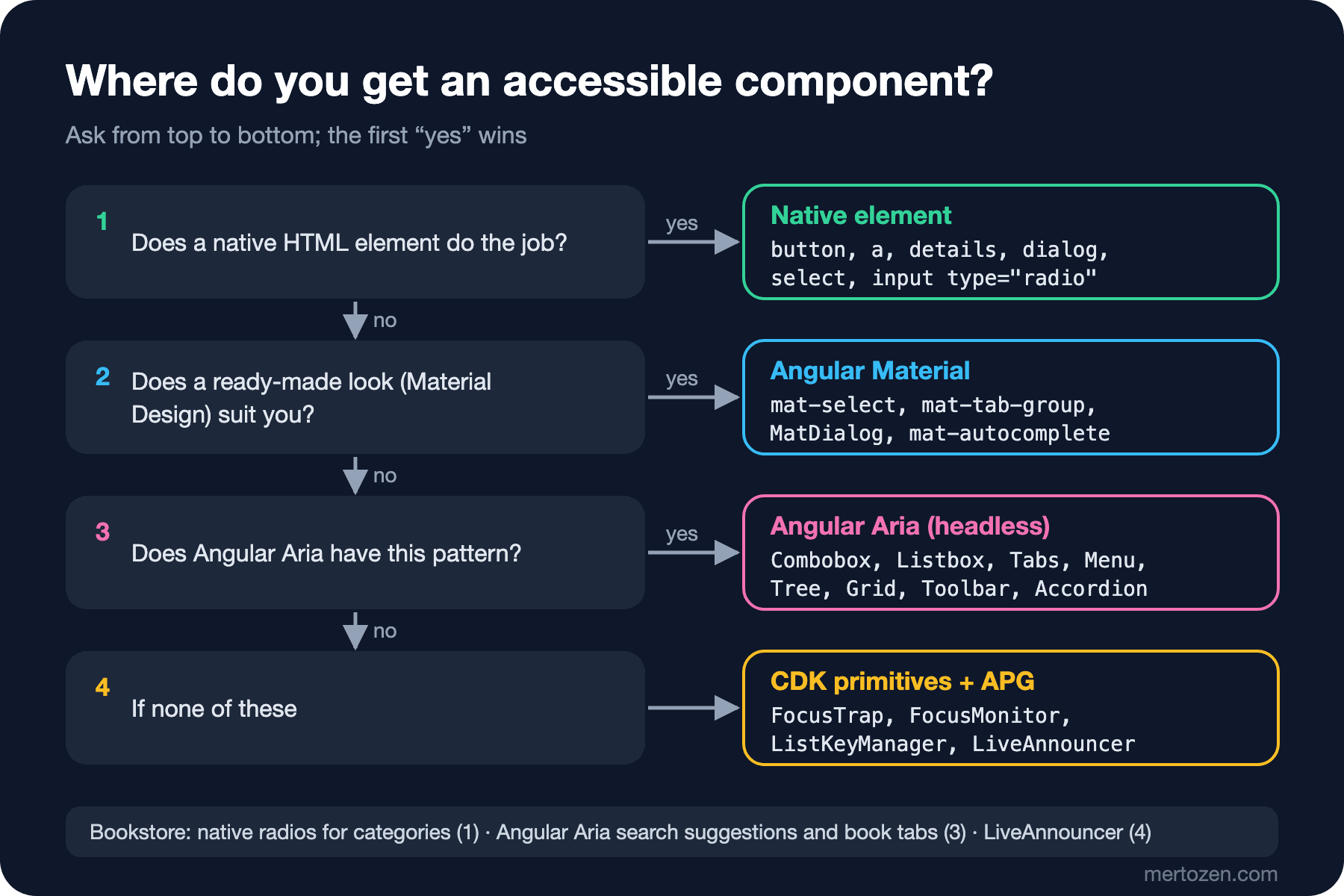
Angular Material gives you ready-made components with the Material Design look; if that look suits you, it is the shortest path. Angular Aria is headless: it manages behavior, the keyboard, ARIA attributes and focus, and leaves the look entirely to you. Since Bookstore has its own CSS, that is our path. CDK primitives are the bottom layer: Angular Aria itself depends on @angular/cdk (the package's peer dependency is @angular/cdk 22.2.7), and Material is built on the CDK too.
The answer to the second guess question: no. Angular Aria arrived in Angular 21 as a developer preview; according to the CHANGELOG of the angular/components repository, the developer preview tag was removed in 22.0.0, released on 3 June 2026. The same release brought a breaking change: the old combobox and autocomplete were removed, and the version developed under the name "simple combobox" became stable as Combobox. The type definitions of 22.2.7 have no @developerPreview tag either. If you are coming from 21, be ready to rewrite your combobox code.
npm install @angular/aria@22.2.7Search Suggestions with Angular Aria
We turned the search box into a combobox: ngCombobox on the input, ngComboboxPopup on the popup, and ngListbox with ngComboboxWidget on the list inside it. While the popup is open, focus stays in the input and the active option is pointed to with aria-activedescendant:
  <search>
    <form (submit)="applySearch($event)">
      <div class="search-field">
        <!-- Angular Aria: role="combobox", aria-expanded, aria-controls and aria-activedescendant come from ngCombobox -->
        <input ngCombobox #combobox="ngCombobox" type="search" placeholder="Search by title, author or ISBN"
               aria-label="Search books" [(value)]="query" />
        <ng-template ngComboboxPopup [combobox]="combobox">
          <!-- Focus stays in the input; the active option is pointed to with aria-activedescendant -->
          <div ngListbox ngComboboxWidget #listbox="ngListbox" class="suggestions" aria-label="Suggestions"
               focusMode="activedescendant" selectionMode="explicit" [tabindex]="-1"
               [activeDescendant]="listbox.activeDescendant()"
               [(value)]="picked" (click)="pickSuggestion()" (keydown.enter)="pickSuggestion()">
            <!-- The first option is the typed text itself, so Enter right after typing still searches for it -->
            <div ngOption [value]="query().trim()" [label]="'Search for ' + query().trim()">Search for "{{ query().trim() }}"</div>
            @for (title of suggestions(); track title) {
              <div ngOption [value]="title" [label]="title">{{ title }}</div>
            }
          </div>
        </ng-template>
      </div>
      <button type="submit">Search</button>
    </form>
  </search>
// Every title once, for the suggestions under the search box
private readonly titles = httpResource<PagedResult<BookSummary>>(() => ({ url: '/api/books', params: { pageSize: 50 } }));
protected readonly hasQuery = computed(() => this.query().trim().length >= 2);
protected readonly suggestions = computed(() => {
const text = this.query().trim();
return (this.titles.value()?.items ?? []).map(book => book.title)
.filter(title => title !== text && title.toLowerCase().includes(text.toLowerCase())).slice(0, 8);
}); constructor() {
// ngCombobox opens the popup on every keystroke; keep it closed until there are two characters to work with
effect(() => {
if (this.combobox().expanded() && !this.hasQuery()) {
this.combobox().expanded.set(false);
}
});
}
protected applySearch(event: Event): void {
event.preventDefault();
this.combobox().expanded.set(false);
this.search.set(this.query().trim());
}
// Enter or a click on an option: its value is the text to search for (the typed text or a title)
protected pickSuggestion(): void {
const text = this.picked()[0];
if (text) {
this.query.set(text);
this.search.set(text);
}
this.picked.set([]);
this.combobox().expanded.set(false);
// After a click the popup and its options are gone; give focus back to the input
this.combobox().element.focus();
}To measure the behavior, we wrote a script that uses it with the keyboard and prints what the tree says after each key (node widgets.mjs combobox):
type "t"   combobox "Search books" value="t" expanded=false
type "he"  combobox "Search books" value="the" expanded=true active="Search for "the""
ArrowDown  combobox "Search books" value="the" expanded=true active="The Count of Monte Cristo"
ArrowDown  combobox "Search books" value="the" expanded=true active="The Great Gatsby"
Escape     combobox "Search books" value="the" expanded=false
ArrowDown  combobox "Search books" value="the" expanded=true active="Search for "the""
ArrowUp    combobox "Search books" value="the" expanded=true active="Wuthering Heights"
Enter      combobox "Search books" value="Wuthering Heights" expanded=false
result: 1 book for "Wuthering Heights"
click "The Hobbit": 1 book for "The Hobbit", focus combobox "Search books"
- combobox "Search books" [expanded]: the
- listbox "Suggestions":
  - option "Search for \"the\""
  - option "The Count of Monte Cristo"
  - option "The Great Gatsby"
  - option "The Hobbit"
  - option "The Left Hand of Darkness"
  - option "Wuthering Heights"
axe (popup open): no violations, passed rules=17
The input is in the tree with the combobox role and its expanded state; the list that opens is a listbox and its items are options. Arrow keys move between options (Up Arrow on the first option goes to the end of the list), Escape closes, Enter selects. Focus never leaves the input; a screen reader reads the option aria-activedescendant points to. axe found no violations with the popup open either. We did not write a single line of ARIA or keydown code for any of this.
Three decisions were left to us, and all three were wrong on the first try. First: Angular Aria's listbox makes the first option active as soon as it opens; a user who typed "the" and pressed Enter searched for the first suggestion ("The Count of Monte Cristo"), not for what they typed. We put the typed text itself at the top of the list as an option ("Search for "the""); Enter now searches for what was typed, and the arrow keys lead to the suggestions. Second: ngCombobox opens the popup on every keystroke; to avoid announcing an empty listbox as "expanded" after one letter, we close it below two characters. We first tried this with [(expanded)] bound to our own signal and an effect(); the effect set the signal to false, but since the binding's last value was already false, Angular did not send a new value to the directive and the popup stayed open. Closing the combobox's own expanded model directly fixed it. The third was selection with the mouse; the first measurement was this:
click "The Hobbit": 1 book for "The Hobbit", focus (nothing focused)When the clicked option left the DOM together with the popup, focus fell back to <body>. The example in the Angular documentation also gives focus back to the input after a selection; the last line of pickSuggestion() does that.
If You Wrote Your Own Combobox
Let's answer the first guess question as far as we measured it. What Angular Aria did for us for this small suggestion list:
- On the input,
role="combobox",aria-autocomplete="list",aria-haspopup="listbox",aria-expanded,aria-controlsandaria-activedescendant; on the list and the options, roles, ids andaria-selected. - Unique ids generated on every render and the references between them (when the listbox id changes,
aria-controlschanges too). - Down and Up Arrow, wrapping at both ends, passing Home, End, PageUp and PageDown to the list, Escape, Enter, selection with the mouse.
- Closing the popup when focus leaves the input, without a click inside the popup triggering it.
- Giving an option a label separate from its visible text, and choosing with
selectionModewhether selection follows the arrow keys or happens only on Enter.
That means a few dozen lines of keydown logic and id management per input; more importantly, each of them is a detail that can go wrong in a screen reader. When you write your own combobox you have to test this whole list; when you use Angular Aria you only test your own decisions (like the three above).
The Book Page: Angular Aria Tabs
The ★★★ exercise in the series' ARIA post was to write "Description" and "Details" tabs on the book page by hand, following the APG. With Angular Aria the same job is a few directives in the template:
    <!-- Angular Aria tabs: roles, aria-selected, aria-controls, roving tabindex, arrows, Home and End -->
    <div ngTabs class="book-tabs">
      <div ngTabList selectedTab="description" aria-label="About this book">
        <div ngTab value="description">Description</div>
        <div ngTab value="details">Details</div>
      </div>
      <div ngTabPanel value="description">
        <ng-template ngTabContent><p>{{ b.description }}</p></ng-template>
      </div>
      <div ngTabPanel value="details">
        <ng-template ngTabContent>
          <p>ISBN {{ b.isbn }}</p>
          <p>Published in {{ b.publishedYear }} · {{ b.category }}</p>
        </ng-template>
      </div>
    </div>
- tablist "About this book":
- tab "Description" [selected]
- tab "Details"
- tabpanel "Description":
- paragraph: A desert planet, a noble family and the most valuable substance in the universe.
- tabpanel "Details"
Tab tab "Description" panel: A desert planet, a noble family and the most val
ArrowRight tab "Details" panel: ISBN 9780441172719 Published in 1965 · Science F
ArrowRight tab "Description" panel: A desert planet, a noble family and the most val
End tab "Details" panel: ISBN 9780441172719 Published in 1965 · Science F
Home tab "Description" panel: A desert planet, a noble family and the most val
Tab tabpanel "Description" panel: A desert planet, a noble family and the most val
Shift+Tab tab "Description" panel: A desert planet, a noble family and the most valTab enters the tab list with a single stop (roving tabindex), arrow keys move between tabs and select them at the same time (the default of selectionMode is "follow"), Home and End go to the ends; the next Tab goes to the panel, because the panel has tabindex="0". All of these behaviors are in the APG's tabs description. The tree has one extra thing, though: the unselected "Details" panel shows up as an empty tabpanel. Angular Aria makes the unselected panel inert and removes its content from the DOM, but does not hide it; in a headless library, hiding is the stylesheet's job:
/* Angular Aria marks the inactive panel inert; hiding it is the stylesheet's job */
[ngTabPanel][inert] { display: none; }
- tablist "About this book":
- tab "Description" [selected]
- tab "Details"
- tabpanel "Description":
- paragraph: A desert planet, a noble family and the most valuable substance in the universe.The panel is no longer in the tree. That is the price of "headless": the behavior is ready, but the look of the selected tab, hiding the hidden panel and marking the active option (through the data-active attribute) are in your CSS. If you skip that CSS, the keyboard works but the tree is wrong or the screen is misleading.
CDK a11y Primitives
For an interaction that has no counterpart in Angular Aria you go down to @angular/cdk/a11y. The important parts of the package in 22.2.7 are: cdkTrapFocus and FocusTrap (keeping focus inside an overlay where you cannot use a native dialog), FocusMonitor (tells whether focus came from the keyboard, the mouse or a program), ListKeyManager and the FocusKeyManager and ActiveDescendantKeyManager derived from it (arrow keys, Home, End and typeahead logic in a list), LiveAnnouncer (we used it in the previous post as the fallback for ariaNotify()) and InteractivityChecker (tells whether an element can receive focus). These are building blocks, not patterns: you still set up the roles, the id references and the meaning of the keys. That is why, when you go down to the CDK, you need to open the matching pattern in the APG and apply its attribute and key lists step by step.
Angular-Specific Pitfalls
The first is the host element. The host of a component like <app-book-card> is a meaningless element to the browser; if it sits inside a <ul> instead of an <li>, list semantics break. The fix is attribute selectors (li[appBookCard]) or giving a role through a host binding; this was measured in the "Accessible Markup Basics" post of the HTML5 and Semantic HTML series, so we do not repeat it here.
The second is a div with (click). Adding (click) to a div in a template is easy and produces a button that is invisible to keyboard users; it is the div role="button" problem we measured in the series' ARIA post. The template accessibility rules of angular-eslint catch it; wiring them into CI is the topic of the last post in the series.
The third is ARIA bindings. As far as we measured in Angular 22.2, [aria-label] and [attr.aria-label] both write the same attribute, and both remove it when the value is null; the examples in the Angular documentation use the attr. prefix. The real pitfall is the value itself: pointing aria-describedby at the id of a message that is not rendered (which is why Bookstore passes null when there is no message), or sending undefined to [attr.aria-expanded] and never writing the attribute.
The fourth is Signal Forms. We moved the order form to Signal Forms: the model is a signal, the rules and their messages are in the schema, and the field is bound in the template with [formField]. On the first try we removed the ARIA bindings, kept only [formField] and submitted the form empty:
before submit: <input id="customer-name" autocomplete="name" name="ng.form0.name" required="">
after submit:  <input id="customer-name" autocomplete="name" name="ng.form0.name" required="">
focus:         textbox "Full name"
The answer to the third guess question: no. [formField] writes the value, required and a name, but it does not write aria-invalid or an aria-describedby pointing at the message while the field is invalid; the focused field looks error-free in the tree. We connected the error state and the message ourselves, as in the earlier posts:
  // Signal Forms: the model is a signal, the rules and their messages live in the schema
  protected readonly customer = signal({ name: '', email: '' });
  protected readonly checkoutForm = form(this.customer, path => {
    required(path.name, { message: 'Enter your full name.' });
    required(path.email, { message: 'Enter your e-mail address.' });
    email(path.email, { message: 'Enter an e-mail address like name@example.com.' });
  });
  // Messages appear after the first submit, not while the user is still typing
  private readonly submitted = signal(false);
  protected readonly nameError = computed(() => this.submitted() ? this.firstError(this.checkoutForm.name().errors()) : '');
  protected readonly emailError = computed(() => this.submitted() ? this.firstError(this.checkoutForm.email().errors()) : '');
<!-- [formField] sets value, required and name; the error state and its message we connect ourselves -->
<input id="customer-name" autocomplete="name" [formField]="checkoutForm.name"
[attr.aria-invalid]="nameError() ? 'true' : null"
[attr.aria-describedby]="nameError() ? 'customer-name-error' : null" />
@if (nameError()) {
<p id="customer-name-error" class="error field-error">{{ nameError() }}</p>
}before submit: <input id="customer-name" autocomplete="name" name="ng.form0.name" required="">
after submit: <input id="customer-name" autocomplete="name" name="ng.form0.name" required="" aria-invalid="true" aria-describedby="customer-name-error">
focus: textbox "Full name" description="Enter your full name." invalid=trueWe show the messages after the first submit; seeing a red error under every field before the user has started typing is both annoying and means an error read out on every field in a screen reader. The error summary, focus and server errors work as in the previous post; announce.mjs checkout gives the same result.
The Razor and MVC Side
If Bookstore's server side is an MVC or Razor Pages interface, the same questions apply to Tag Helpers: does asp-for connect the label and the input, is the validation message connected to the field with aria-describedby, is aria-invalid written when there is an error? In the "Accessible Markup Basics" post of the HTML5 and Semantic HTML series, the e-mail field of Bookstore's checkout was written with Razor Pages and the Tag Helper output was checked piece by piece; the short answer is that the label connection comes ready, the error connections do not. The measurement scripts in this post work the same on server-rendered pages, because they look at the tree, not at the framework.
In Production
Test an update of a headless library like a UI change. The 22.0.0 breaking change in Angular Aria changed the combobox API; when you upgrade, run keyboard scripts like widgets.mjs again.
Keep behavior in one place in your design system. Wrap the combobox once as Bookstore's own component (something like app-search-box) and let only that component use Angular Aria; three different combobox decisions on three pages (first option, opening threshold, focus return) confuse users.
Use Angular Aria's test harnesses. 22.0.0 brought harnesses for accordion, combobox, tabs, listbox, menu, tree, grid and toolbar; working with them instead of DOM queries in component tests keeps your tests intact when the library's internals change. The basics of component tests are in the Frontend Testing series.
If a pattern is not in Angular Aria, question the design first. For Bookstore's category selection, a radio group instead of a combobox means less code, fewer tests and better screen reader support.
Common Pitfalls
First, thinking a headless library also manages the states that concern the look. Hiding the hidden panel and marking the active option are in the CSS.
Second, missing that the first option becomes active automatically in a combobox. In a box where the user wants to search for what they typed, always measure what Enter does.
Third, forgetting focus after a selection. If focus is lost when the popup closes, a keyboard user starts again from the top of the page.
Fourth, trying to fix a two-way binding with an effect. If the binding's last value did not change, the directive does not receive the new value; use the directive's own model.
Fifth, assuming that a form library also takes care of accessibility. Signal Forms manages the value and validation; you connect the error state and the message to the tree.
A Small Experiment
★☆☆ Remove selectionMode="explicit" from the listbox and run node widgets.mjs combobox again. Does the text in the input change as you move with the arrow keys, and how does that affect the list of suggestions?
★★☆ Give the book tabs selectionMode="explicit". Do the arrow keys now only move focus? Add Enter and Space steps to widgets.mjs tabs and measure; which behavior suits Bookstore's two tabs better?
★★★ Turn the category radios into a single-selection list with Angular Aria's Listbox, then compare the two versions with elements.mjs catalog and sr-script.mjs. Which is less code, which is clearer for a screen reader? Justify the result with the decision flow in this post.
Up to this post we measured every fix with a script, but we ran the scripts by hand. In the last post of the series we automate these checks: angular-eslint, axe in Playwright tests, Lighthouse, a CI gate that baselines existing debt, and what automation cannot catch.