

Using WAI-ARIA Correctly: Roles, States, Properties, Accessible Names and "No ARIA Is Better than Bad ARIA"
ARIA changes an element's name, role and state in the accessibility tree but adds no behavior; if a native element exists, it comes first. We measure accessible name sources from Chromium, give same-named buttons context that respects 2.5.3, apply aria-hidden, aria-expanded, aria-current, aria-invalid and aria-describedby in Bookstore, and catch a CSS bug that made the state and the screen disagree.
Version note: The examples in this post were run with WAI-ARIA 1.2, Accessible Name and Description Computation 1.2, WCAG 2.2, Angular 22.2 (TypeScript 6.0), Node.js 24, Playwright 1.65 (Chromium 158) and axe-core 4.14.
Guess First
The catalog of Bookstore, the online bookstore used as the shared example across this site's series, has twenty "Add to cart" buttons, and in a screen reader's list of buttons they all look the same. To fix that, a developer writes this:
<button aria-label="Add Dune to cart">Add to cart</button>What does a screen reader announce now? What happens when someone using voice control sees "Add to cart" on screen and says "Click Add to cart"? Second question: <div role="button" tabindex="0">Add to cart</div> receives focus with Tab and a screen reader announces it as a "button"; does it get clicked when you press Enter or Space? Does axe count it as a violation?
What ARIA Does and Doesn't Do
WAI-ARIA, whose current version is the 1.2 Recommendation from June 2023, does one thing: it changes how an element appears in the accessibility tree. A role says what the element is (button, tab, dialog). A state is a condition that changes with user interaction (aria-expanded, aria-checked, aria-invalid). A property is a more permanent characteristic of the element (aria-labelledby, aria-controls, aria-describedby). None of them add behavior: keyboard support, focus, clicks and appearance are still your code's job.
W3C's "Using ARIA" note summarized this in four rules for years (it was closed as "discontinued" in February 2026 and now sends readers to the ARIA Authoring Practices Guide, APG for short): if a native element has the meaning and behavior you need, use it; do not change native semantics unless you have to; every interactive control you define with ARIA must be usable with the keyboard; do not hide a focusable element with aria-hidden or role="presentation". The APG makes the same warning at the start of its guidance: bad ARIA is worse than no ARIA, because it lies to the screen reader. The lines that measure the second part of the guess:
div-button        button "Add to cart" <- contents
div-button: Enter + Space -> clicks=0
axe: button-name (#icon-only); label-content-name-mismatch (#all, #aria-label); target-size (#div-button)
In the tree the div is a perfect button "Add to cart"; but after Enter and Space the click count is zero. A native button produces a click event for these two keys, a div does not; you would have to write it yourself with keydown. axe's list has no violation about this either: the role and the name are there, what the tool cannot see is behavior. The only finding is target-size, because the unstyled div is small and too close to the elements next to it.
How Is the Accessible Name Computed?
The name a screen reader reads for an element is computed by an algorithm in W3C's Accessible Name and Description Computation (accname) specification. In practice what you need to know is the order of the sources and that the first one with content wins:
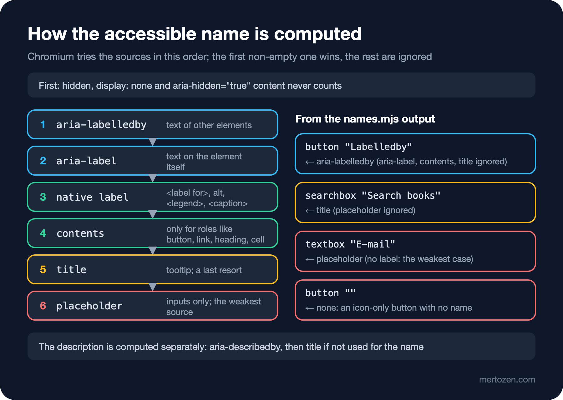
Instead of memorizing this you can ask Chromium. The Chrome DevTools Protocol's Accessibility.getFullAXTree command also gives, for every node, the source the name came from and the sources that were ignored. The DevTools Accessibility tab shows the same information under "Computed Properties"; the Elements panel is covered in the "Getting Started with Chrome DevTools and the Elements Panel" post of the Browser DevTools series. A script that puts eleven cases on one page and measures them:
    <button id="all" aria-labelledby="all-label" aria-label="Label" title="Tip">Content</button>
    <span id="all-label">Labelledby</span>

    <button id="aria-label" aria-label="Add Dune to cart">Add to cart</button>
    <button id="hidden-text">Add to cart<span class="visually-hidden">: Dune</span></button>
    <button id="described" aria-describedby="dune-title">Add to cart</button>
    <span id="dune-title">Dune</span>

    <input id="title-only" type="search" title="Search books" placeholder="Title or author">
    <input id="placeholder-only" type="email" placeholder="E-mail">

    <button id="icon-only"><svg aria-hidden="true" width="16" height="16"><path d="M2 2 L14 14 M14 2 L2 14" stroke="currentColor"/></svg></button>
    <button id="icon-labelled" aria-label="Remove Dune"><svg aria-hidden="true" width="16" height="16"><path d="M2 2 L14 14 M14 2 L2 14" stroke="currentColor"/></svg></button>

    <a id="arrow" href="/en/">← Back to catalog</a>
    <a id="arrow-hidden" href="/en/"><span aria-hidden="true">←</span> Back to catalog</a>

    <div id="div-button" role="button" tabindex="0" onclick="this.dataset.clicks = Number(this.dataset.clicks ?? 0) + 1">Add to cart</div>
// Shows how Chromium computes the accessible name of each element in demos/names.html, and where it came from.
// Usage: node names.mjs
import { readFileSync } from 'node:fs';
import { chromium } from 'playwright';
import { AxeBuilder } from '@axe-core/playwright';
const browser = await chromium.launch();
const page = await (await browser.newContext()).newPage();
await page.setContent(readFileSync(new URL('./demos/names.html', import.meta.url), 'utf8'));
const cdp = await page.context().newCDPSession(page);
const { nodes } = await cdp.send('Accessibility.getFullAXTree');
const label = s => s.attribute ?? s.nativeSource ?? s.type;
for (const id of ['all', 'aria-label', 'hidden-text', 'described', 'title-only', 'placeholder-only',
'icon-only', 'icon-labelled', 'arrow', 'arrow-hidden', 'div-button']) {
const { node } = await cdp.send('DOM.describeNode', { objectId: (await cdp.send('Runtime.evaluate',
{ expression: `document.getElementById('${id}')` })).result.objectId });
const ax = nodes.find(n => n.backendDOMNodeId === node.backendNodeId);
const sources = ax.name?.sources ?? [];
const used = sources.find(s => s.value?.value && !s.superseded);
const ignored = sources.filter(s => s.value?.value && s.superseded).map(label);
const description = ax.description?.value ? ` description="${ax.description.value}"` : '';
console.log(`${id.padEnd(17)} ${ax.role.value} "${ax.name?.value ?? ''}" <- ${used ? label(used) : '(none)'}` +
(ignored.length ? ` (ignored: ${ignored.join(', ')})` : '') + description);
}
// role="button" changes what the element is called, not what it does
await page.focus('#div-button');
await page.keyboard.press('Enter');
await page.keyboard.press('Space');
console.log(`div-button: Enter + Space -> clicks=${await page.locator('#div-button').getAttribute('data-clicks') ?? 0}`);
const axe = await new AxeBuilder({ page }).withTags(['wcag2a', 'wcag2aa', 'wcag21a', 'wcag21aa', 'wcag22aa', 'experimental']).analyze();
console.log('axe:', axe.violations.map(v => `${v.id} (${v.nodes.map(n => n.target.join(' ')).join(', ')})`).join('; ') || 'no violations');
await browser.close();all button "Labelledby" <- aria-labelledby (ignored: aria-label, contents, title) description="Tip"
aria-label button "Add Dune to cart" <- aria-label (ignored: contents)
hidden-text button "Add to cart : Dune" <- contents
described button "Add to cart" <- contents description="Dune"
title-only searchbox "Search books" <- title (ignored: placeholder, title)
placeholder-only textbox "E-mail" <- placeholder
icon-only button "" <- (none)
icon-labelled button "Remove Dune" <- aria-label
arrow link "← Back to catalog" <- contents
arrow-hidden link " Back to catalog" <- contents
div-button button "Add to cart" <- contents
div-button: Enter + Space -> clicks=0
axe: button-name (#icon-only); label-content-name-mismatch (#all, #aria-label); target-size (#div-button)The answer to the first part of the guess is on the second line: aria-label won, the name is "Add Dune to cart" and the "Add to cart" inside the button was ignored. axe's experimental label-content-name-mismatch rule caught exactly this. It is a matter for 2.5.3 (Label in Name): the name of a control with visible text must contain that text. "Add to cart" is on screen, but "Add Dune to cart" does not contain it as one piece; the command of a voice control user saying what they see may not match. The first line has the same problem: the visible text is "Content", the name "Labelledby".
The other lines are lessons too. Visually hidden text counts toward the name, but Chromium put a space before the span with position: absolute: "Add to cart : Dune". aria-describedby does not change the name; it is added as a description, which a screen reader reads after the name and role, sometimes after a short pause, and users can turn description reading off. title beats the placeholder; the placeholder only becomes the name when nothing else is left. The icon-only button stayed nameless and axe flagged it with button-name; with aria-label it became "Remove Dune". Finally the arrow character: "← Back to catalog" is part of the name, and depending on its settings a screen reader may read it out as a symbol name; the arrow in a span with aria-hidden="true" left the name.
Buttons in Bookstore That Share a Name
The twenty "Add to cart" buttons in the catalog and the "Remove" buttons in the cart may not count as a WCAG violation technically, because each button sits in its own book's card or row and the context can be determined programmatically. But twenty identical names in a screen reader's element list or in voice control make the user's job harder. We measured three options; for Bookstore we chose an aria-label that starts with the visible text and completes the name:
        <a [routerLink]="['/books', book.isbn]">{{ book.title }}</a>
        <span class="muted">{{ book.author }} · {{ book.publishedYear }}</span>
        <span class="muted">{{ book.category }}</span>
        <strong>{{ book.price | currency: 'TRY' : 'symbol-narrow' }}</strong>
        <!-- The name starts with the visible text, so "Click Add to cart" still works with voice control (WCAG 2.5.3) -->
        <button type="button" [attr.aria-label]="'Add to cart: ' + book.title" (click)="cartStore.add(book.isbn)">Add to cart</button>
<td><button type="button" [attr.aria-label]="'Remove ' + line.title" (click)="askToRemove(line)">Remove</button></td>node tree.mjs catalog .book-card
node tree.mjs cart "tbody tr"- listitem:
- link "1984":
- /url: /books/9780451524935
- text: George Orwell · 1949 Dystopian
- strong: ₺279.00
- 'button "Add to cart: 1984"': Add to cart
- row "1984 ₺279.00 Quantity of 1984 ₺279.00 Remove 1984":
- cell "1984":
- link "1984":
- /url: /books/9780451524935
- cell "₺279.00"
- cell "Quantity of 1984":
- text: Quantity of 1984
- spinbutton "Quantity of 1984": "1"
- cell "₺279.00"
- cell "Remove 1984":
- button "Remove 1984": RemoveThe name is "Add to cart: 1984"; because the visible text is at the start of the name, the command of a user saying "Click Add to cart" still matches. I also ran the experimental rules with node scan.mjs experimental; across four pages there were no violations, label-content-name-mismatch included. We chose aria-label over hidden text for two reasons: the spacing problem we measured, and the name living in one readable place. There is a counter-argument: automatic page translation tools may not translate attributes as reliably as visible text. Bookstore's interface is single-language, so this does not affect us; on a multilingual site hidden text may be safer.
Using aria-hidden in the Right Place
The arrow character in the book page's back link is only a visual cue. We removed it from the tree with aria-hidden:
<a routerLink="/"><span aria-hidden="true">←</span> Back to catalog</a>- link "← Back to catalog":
- /url: /
- link "Back to catalog":
- /url: /This is the right use of aria-hidden: non-interactive content that repeats meaning visually (icons, decorative characters, the icon next to a button that has text). The wrong use is hiding a section that contains something focusable; focus goes to an element that cannot be seen in the tree and the user cannot hear what it is. That trap and how it differs from inert were measured in the "Accessible Markup Basics" post of the HTML5 and Semantic HTML series.
aria-expanded and aria-controls: the Filters Disclosure
The category chips take up space on narrow screens; we added a "Filters" button to the catalog and made the panel collapsible. This is the APG's disclosure pattern: a button tells with aria-expanded whether the content it controls is open, and aria-controls points to that content's id. The pattern's description includes the keys too: Enter and Space activate the button; a native button already does that.
  <button type="button" class="filters-toggle" aria-controls="category-filters"
          [attr.aria-expanded]="filtersOpen()" (click)="filtersOpen.set(!filtersOpen())">
    Filters
  </button>
  <fieldset id="category-filters" class="chips" [hidden]="!filtersOpen()">
if (mode === 'filters') {
// The Filters button is a disclosure: aria-expanded tells whether the panel it controls is open
await open(page, 'catalog');
await tabUntil('button "Filters"');
console.log(`focus: ${await focused()}`);
const toggle = page.getByRole('button', { name: 'Filters' });
await page.keyboard.press('Enter');
// Angular renders the signal change asynchronously: wait for the attribute before reading the tree
await toggle.and(page.locator('[aria-expanded="false"]')).waitFor();
console.log(`Enter: ${await focused()}, radio group visible=${await page.getByRole('group', { name: 'Category' }).isVisible()}`);
await page.keyboard.press('Space');
await toggle.and(page.locator('[aria-expanded="true"]')).waitFor();
console.log(`Space: ${await focused()}, radio group visible=${await page.getByRole('group', { name: 'Category' }).isVisible()}`);
}The first measurement was a surprise:
focus: button "Filters" [expanded]
Enter: button "Filters", radio group visible=true
Space: button "Filters" [expanded], radio group visible=true
After Enter the button says "collapsed" ([expanded] disappeared), but the panel is still visible. The reason: the .chips class sets display: flex, and that rule beats the display: none the browser applies for the hidden attribute. A screen reader user hears "collapsed", a sighted user sees the panel open: the state and the screen disagree. The fix is a global rule:
/* display: flex would beat the hidden attribute; keep hidden elements hidden */
[hidden] { display: none !important; }
focus: button "Filters" [expanded]
Enter: button "Filters", radio group visible=false
Space: button "Filters" [expanded], radio group visible=trueThere was also a way to build this disclosure without ARIA: details and summary. The browser manages the open/closed state and writes it to the tree itself; this was covered in the "Native Interactive Elements 1" post of the HTML5 and Semantic HTML series. You need a button with aria-expanded when you want to put the button somewhere other than the panel or fully control the styling. Next in the APG are the tabs and combobox patterns: arrow keys and aria-selected for tabs, aria-activedescendant, aria-autocomplete and popup management for a combobox. Writing these from scratch is error-prone; using them ready-made with Angular Aria and the CDK is the subject of the series' Angular post. The same logic applies to sorting tables: in a sortable table only the th of the column currently sorted carries aria-sort="ascending" or "descending", and the sort control is a button inside the header.
Navigation with aria-current
Which of the header's "Catalog" and "Cart" links was the current page was only shown visually, in bold. aria-current="page" tells the screen reader as well; Angular's RouterLinkActive manages it itself through the ariaCurrentWhenActive input:
<header class="site-header">
  <a routerLink="/" class="brand">Bookstore</a>
  <nav>
    <a routerLink="/" routerLinkActive="active" ariaCurrentWhenActive="page"
       [routerLinkActiveOptions]="{ exact: true }">Catalog</a>
    <a routerLink="/cart" routerLinkActive="active" ariaCurrentWhenActive="page" data-testid="cart-link">
      Cart ({{ cartStore.itemCount() }})
    </a>
  </nav>
</header>
node tree.mjs catalog nav html<nav><a routerlink="/" routerlinkactive="active" ariacurrentwhenactive="page" href="/en/" class="active" aria-current="page">Catalog</a><a routerlink="/cart" routerlinkactive="active" ariacurrentwhenactive="page" data-testid="cart-link" href="/cart"> Cart (0) </a></nav>On the catalog, the "Catalog" link carries aria-current="page"; a screen reader announces it as "current page". "Catalog" needs exact: true, otherwise the link would be active on every page because / is a prefix of every route. Playwright's aria snapshot does not show this attribute, so here we looked at the rendered HTML; knowing what the tool you measure with shows and what it doesn't is part of the job.
Form Errors: aria-invalid and aria-describedby
Back to the 3.3.1 row of the audit table. The order form was left to the browser's native validation. What a keyboard user who leaves the name empty, types "ada" as the e-mail and presses Enter gets from the focused field:
// Submits the order form with mistakes and prints what a screen reader gets on the focused field.
// Usage: node form.mjs
import { chromium } from 'playwright';
import { focusedAx, open } from './lib.mjs';

const browser = await chromium.launch();
const page = await (await browser.newContext()).newPage();
await open(page, 'cart');

// Name left empty, e-mail without a domain; submit with Enter like a keyboard user
await page.getByLabel('E-mail').fill('ada');
await page.getByLabel('E-mail').press('Enter');
await page.waitForTimeout(300);
console.log(`after submit: ${await focusedAx(page)}`);
await page.keyboard.press('Tab');
console.log(`next Tab:     ${await focusedAx(page)}`);

// Fix both fields and submit again
await page.getByLabel('Full name').fill('Ada Lovelace');
await page.getByLabel('E-mail').fill('ada@example.com');
await page.getByLabel('E-mail').press('Enter');
console.log(`result: ${await page.getByTestId('order-confirmation').textContent({ timeout: 3000 }).then(t => t.trim().replace(/\s+/g, ' '))}`);
await browser.close();
after submit: textbox "Full name"
next Tab: textbox "E-mail" invalid=true
result: Order #2 placed (Placed). Total: ₺279.00The browser moved focus to the first invalid field and showed a bubble, but there is no error text in the accessibility tree: the "Full name" field is not even invalid, and the e-mail field does not say what the error is. How the bubble reaches a screen reader depends on the browser and screen reader pair. We gave the form novalidate and did the validation ourselves; we wrote the message under the field, tied it to the field with aria-describedby and marked the field with aria-invalid:
  <form class="checkout" novalidate (submit)="checkout($event, nameBox, emailBox)">
    <div class="field">
      <label for="customer-name">Full name</label>
      <input #nameBox id="customer-name" name="name" autocomplete="name" required
             [attr.aria-invalid]="nameError() ? 'true' : null"
             [attr.aria-describedby]="nameError() ? 'customer-name-error' : null" />
      @if (nameError()) {
        <p id="customer-name-error" class="error field-error">{{ nameError() }}</p>
      }
    </div>
    <div class="field">
      <label for="customer-email">E-mail</label>
      <input #emailBox id="customer-email" name="email" type="email" autocomplete="email" required
             [attr.aria-invalid]="emailError() ? 'true' : null"
             [attr.aria-describedby]="emailError() ? 'customer-email-error' : null" />
      @if (emailError()) {
        <p id="customer-email-error" class="error field-error">{{ emailError() }}</p>
      }
    </div>
    <button type="submit">Place order</button>
  </form>
protected async checkout(event: Event, nameBox: HTMLInputElement, emailBox: HTMLInputElement): Promise<void> {
event.preventDefault();
this.errorMessage.set('');
// The form has novalidate: we check the fields ourselves and show the messages next to them (WCAG 3.3.1)
this.nameError.set(nameBox.validity.valueMissing ? 'Enter your full name.' : '');
this.emailError.set(emailBox.validity.valueMissing ? 'Enter your e-mail address.'
: emailBox.validity.typeMismatch ? 'Enter an e-mail address like name@example.com.' : '');
const firstInvalid = this.nameError() ? nameBox : this.emailError() ? emailBox : null;
if (firstInvalid) {
// Focus after the next render, when aria-invalid and aria-describedby are already on the field
afterNextRender(() => firstInvalid.focus(), { injector: this.injector });
return;
}after submit: textbox "Full name" description="Enter your full name." invalid=true
next Tab: textbox "E-mail" description="Enter an e-mail address like name@example.com." invalid=true
result: Order #3 placed (Placed). Total: ₺279.00The focused field now carries three pieces of information together: its name, that it is invalid and what the error is. A screen reader reads these three from the field; no real screen reader session was run for this post, what we measured is the information the tree provides. The message says what is wrong and how to fix it (3.3.3 Error Suggestion). We give focus with afterNextRender: if we gave it immediately, aria-invalid and aria-describedby would not be rendered yet and the screen reader would read the field as error-free. Errors returned by the server, such as missing stock, still appear silently under the form; a summary of several errors and announcing them is the subject of the next post. We updated the statement page's entry accordingly.
In Production
Look for a native element before adding ARIA. In most of this post's work ARIA completed a single missing piece of a native element: context for a button, "current" for a link, error text for a field. We rarely needed to change a role.
ARIA states must be fed from the same source as what is on screen. In Bookstore aria-expanded and the panel's hidden come from the same signal; even so, a CSS rule separated them. When you test a state, check visibility as well as the attribute.
Automate name tests. Playwright locators such as getByRole('button', { name: 'Add to cart: Dune' }) work on the accessible name; if your tests use the name the user hears, the test breaks when the name breaks. This approach is in the "Testing Like a User with Angular Testing Library" post of the Frontend Testing series.
Be careful with aria-label on text that goes through translation and content management. If the visible text is translated and the aria-label is not, a 2.5.3 violation appears in one language only.
Common Pitfalls
First, giving a div role="button" and forgetting Enter and Space. axe does not catch it; a keyboard test does.
Second, an aria-label that does not contain the visible text. When a button showing "Add to cart" is named "Add Dune to cart", a voice control user may not be able to select it by name.
Third, putting aria-label everywhere. An aria-label added to a link or button that already has a good name overrides the content, and often gives a worse name.
Fourth, updating aria-expanded and managing the visual state somewhere else, or the other way round. The screen reader says one thing, the screen another.
Fifth, writing an error message without tying it to the field. Without aria-describedby the message is, for a screen reader user, just a paragraph somewhere on the page.
Sixth, moving focus before the attributes are rendered. In Angular, if you give focus after a state change, use afterNextRender.
A Small Experiment
★☆☆ Add <input id="both" aria-label="Quantity" placeholder="1"> to demos/names.html, put the id in the list in names.mjs and run it. Why is the placeholder in the "ignored" list?
★★☆ Give the "Add to cart" button on the book details page context too, like in the catalog. Is it needed when there is only one book on the page? Compare the two versions with tree.mjs book and justify your decision.
★★★ Add two tabs named "Description" and "Details" to the book details page; read the APG's tabs pattern first. Write role="tablist", tab and tabpanel, aria-selected, aria-controls, roving tabindex and the arrow keys; add a mode to keyboard.mjs and measure it. We will compare how many lines the same thing takes with Angular Aria in the series' Angular post.
When you add a book to the cart the screen shows "Added.", in the catalog the book count updates when the filter changes, and when the server returns an error a message appears under the form. None of these move focus and a screen reader announces none of them. In the next post we look at ways to announce dynamic content: live regions, role="status" and alert, the new ariaNotify(), error summaries and loading states.