

Style Architecture in Large Projects: the 7-1 Pattern, BEM, ITCSS and Layered CSS with Cascade Layers

Split a large style code base into CSS-free abstracts and folders that produce CSS, keep names flat with BEM, and move ITCSS's general-to-specific order into the browser with @layer; in Sass, layers are built with meta.load-css(), not @use. We turn Bookstore's style tree into 7-1, put vendor CSS into a layer, and measure how Angular component styles, being unlayered, beat even the longest layered selector.
Version note: The examples in this post were run with Dart Sass 1.108.2, Angular 22.2 (TypeScript 6.0; the Sass 1.104.1 bundled with the Angular CLI), Angular Material 22.2.7, modern-normalize 3.0.1 and the Chromium build of Playwright 1.65.
Guess First
While adding delivery date selection to Bookstore, the online bookstore used as the shared example across this site's series, a third-party datepicker's CSS came into the project. To show the selected day in Bookstore's brand color, someone wrote a single-class rule following BEM:
// third-party datepicker CSS: long selectors, high specificity
.datepicker table td.is-selected {
    background-color: #2563eb;
    color: #ffffff;
}

// Bookstore's delivery-date picker: one class, BEM
.calendar-day--selected {
    background-color: #b45309;
    color: #ffffff;
}
Is the selected day blue or brown? Our rule comes later, but its specificity is (0,1,0) while the datepicker's is (0,2,2). And what if we put the same two files into two layers with @layer vendors, components;?
node scripts/06-layers.mjs06/main-unlayered.scss selected day background=rgb(37, 99, 235)
06/main-layered.scss selected day background=rgb(180, 83, 9)Without layers the datepicker wins: specificity comes before order of appearance. With layers our rule wins: layer order comes before specificity. This post is about the difference between those two lines: how we split style code into folders, names and layers in a large project, and Sass's role in setting that up. The order of the cascade itself was covered in the first post of the CSS3 series.
The 7-1 Folder Structure
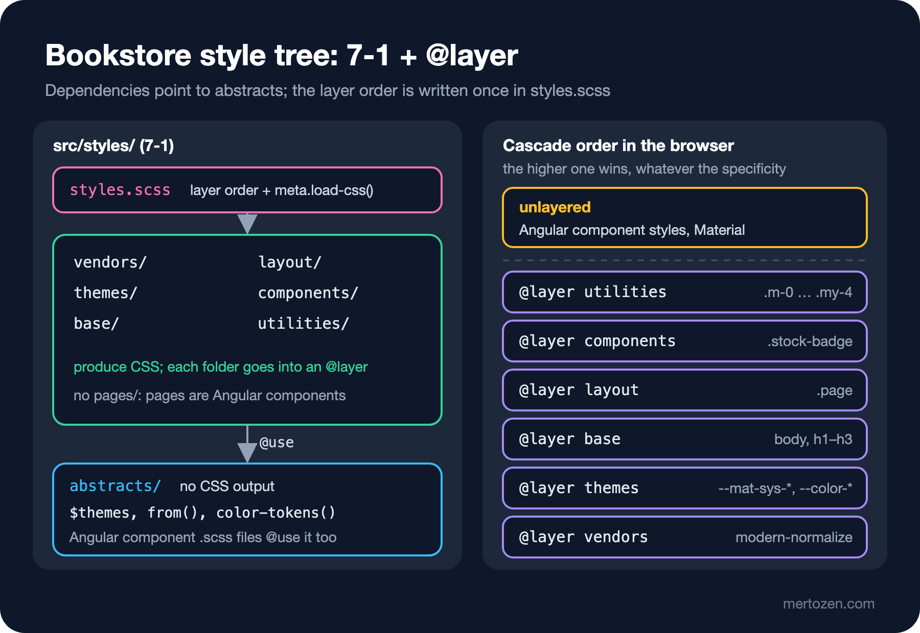
The 7-1 pattern is a folder layout Kitty Giraudel proposed in Sass Guidelines: seven folders and a single entry file that brings them together. The folders are abstracts, vendors, base, layout, components, pages and themes. The guide was written in the @import era; one rule is enough to carry the idea over to the module system: folders that produce CSS @use abstracts, and abstracts uses nothing.
I set this structure up in Bookstore's Angular client, bookstore-web, with some changes. There is no pages, because in Angular every page is already a component with its own stylesheet. Instead there is a utilities folder taken from ITCSS:
src/
  styles.scss                 // layer order + meta.load-css()
  styles/
    abstracts/                // no CSS output
      _index.scss             // @forward "tokens", "breakpoints", "theme"
      _tokens.scss            // $themes, $radius, $space
      _breakpoints.scss       // $breakpoints, from()
      _theme.scss             // color-tokens()
    vendors/_index.scss       // modern-normalize
    themes/
      _index.scss             // mat.theme(), color-tokens(), color-scheme
      _theme-colors.scss      // palette generated with ng generate
    base/_typography.scss     // body, h1–h3
    layout/_page.scss         // .page
    components/_stock-badge.scss
    utilities/_spacing.scss   // .m-0 … .my-4
  app/
    book-card/book-card.scss  // component style (Angular)
Every folder that produces CSS has an _index.scss that loads its files with @use; the index in abstracts uses @forward instead, because its job is not to produce CSS but to expose variables and mixins. The difference matters: the CSS of a file you @use goes into the output; the members of a file you @forward are exposed.
The figure below summarizes the structure: on the left, the folders and the direction of dependencies; on the right, the order in which the browser evaluates them.
BEM: Keeping Specificity Flat
BEM is not a folder structure but a naming convention. Every independent piece of UI is a block (.book-card), its parts are elements (.book-card__title), and its states and variants are modifiers (.book-card--featured). The result is that every selector is a single class and specificity stays at (0,1,0) everywhere. The deep nesting problem from the second post does not arise with BEM, and Sass's &__title and &--featured make BEM easier to write.
In Bookstore we apply two more rules. Blocks can nest, but they do not style each other's elements: instead of changing the color of the .stock-badge inside .book-card with .book-card .stock-badge, we add a modifier to the badge. Second, elements do not have elements: .book-card__currency instead of .book-card__price__currency. These rules keep styles from breaking when the DOM changes.
In Angular part of BEM can look unnecessary: emulated encapsulation already limits a component's selectors to its own template. We still use BEM inside components, because a generic class name such as .title can clash with a global rule using the same name, and in DevTools it does not tell you which component it belongs to.
ITCSS's Idea of Layers and @layer
ITCSS is Harry Roberts's proposal to order stylesheets from wide reach to narrow and from low specificity to high: settings, tools, generic, elements, objects, components, utilities. The first two produce no CSS (the Sass equivalent is abstracts); each later one affects fewer elements, but more strongly.
For years ITCSS had one problem: the order was only a convention. A long selector in a vendor file could beat a later component rule through specificity; the datepicker example at the start of this post is exactly that. Cascade layers moved the convention into the browser. Because layer order is evaluated before specificity, a single-class rule in a later layer always beats a long selector in an earlier layer. In Bookstore I mapped the ITCSS layers like this:
| ITCSS | Bookstore folder | @layer |
|---|---|---|
| Settings, Tools | abstracts/ | none (no CSS output) |
| Generic | vendors/ | vendors |
| (theme variables) | themes/ | themes |
| Elements | base/ | base |
| Objects | layout/ | layout |
| Components | components/ and Angular components | components / unlayered |
| Utilities (Trumps) | utilities/ | utilities |
Building the Layers with Sass: meta.load-css()
The first idea is to write @use inside an @layer block. Sass does not allow it:
@layer vendors {
    @use "vendors/datepicker";
}
Error: This at-rule is not allowed here.
╷
2 │ @use "vendors/datepicker";
│ ^^^^^^^^^^^^^^^^^^^^^^^^^
╵
06/use-in-layer.scss 2:5 root stylesheet@use can only be written at the top level of a file. The way to place a module's CSS anywhere you like is the load-css() mixin from the sass:meta module. Bookstore's entry file now consists of only this:
@use "sass:meta";

// layer order is decided once, here: a later layer beats an earlier one, whatever the specificity
@layer vendors, themes, base, layout, components, utilities;

@layer vendors {
    @include meta.load-css("vendors");
}

@layer themes {
    @include meta.load-css("themes");
}

@layer base {
    @include meta.load-css("base");
}

@layer layout {
    @include meta.load-css("layout");
}

@layer components {
    @include meta.load-css("components");
}

@layer utilities {
    @include meta.load-css("utilities");
}
The @layer list on the first line matters: layer order is determined by the order in which the browser first sees them. Putting the list at the very top keeps the order stable even if a file moves. The vendor folder loads the CSS of an npm package; Sass can load plain .css files as modules too:
// third-party CSS, loaded as a Sass module so it can be put into a layer
@use "modern-normalize/modern-normalize";
To see how the layers come out in the global stylesheet after the build, I ran a small script that prints the first characters of each layer in the compressed CSS:
node scripts/06-layer-dump.mjs@layer vendors,themes,base,layout,components,utilities;
vendors -> *,:before,:after{box-sizing:border-box}html{font-family:system-ui,Segoe UI,Roboto,Helvetic
themes -> html{color-scheme:light dark;--mat-sys-background: light-dark(#fff8f6, #1b110c);--mat-sys-
base -> body{margin:0;font-family:system-ui,sans-serif;line-height:1.5;background-color:var(--colo
layout -> .page{max-width:80rem;margin-inline:auto}@media(width>=64rem){.page{padding-inline:16px}}}
components -> .stock-badge{display:inline-block;padding:2px 8px;border-radius:999px;font-size:.75rem}.st
utilities -> .m-0{margin:0}.m-1{margin:4px}.m-2{margin:8px}.m-3{margin:16px}.m-4{margin:24px}.mt-0{margSix layers, in the expected order. After this reorganization I ran the previous post's theme measurement (05-theme.mjs) and the badge measurements again; every value came out the same.
Global, Component and Utility Boundaries in Bookstore
In an Angular project style code lives in three places, and which goes where is the most debated topic. Bookstore's rule:
- Component styles: everything used only in one Angular component's template goes into that component's
.scssfile.BookCard's border, title and price. - Global components: small UI pieces used in the templates of more than one Angular component and without behavior of their own go into
styles/components/. The stock badge appears on the catalog card, the book page and the cart; I moved the badge classes we generated insideBookCardin the third post here. - Utilities: classes that change a single property and can be used anywhere go into
styles/utilities/, in the strongest layer.
Angular component styles are in no layer at all. Angular adds them to the page with component-specific selectors (.book-card__title[_ngcontent-…]), and unlayered styles are stronger than every layered style. I measured this in the built app: first I added a rule with (0,3,1) specificity to the strongest layer, then an unlayered rule with (0,2,1) specificity, and read the book title's color:
node scripts/06-web-layers.mjslayer order: vendors < themes < base < layout < components < utilities
layered (0,3,1) global rule → title color rgb(180, 83, 9)
unlayered (0,2,1) global rule → title color rgb(220, 38, 38)Even the long selector in the utilities layer could not change the component style; the unlayered rule won only because its specificity was higher than the component's (0,2,0). This is the behavior we want: global styles can never accidentally override a component's own style. Angular Material's component styles are unlayered too, so a button rule written in base does not break Material buttons. I tried it: after adding button { border-radius: 0; background-color: … } to the base layer, the "Add to cart" button kept its 8px corners and its rgb(155, 69, 0) background. The price is that utility classes cannot override component styles either; if you use class="m-0" on an element whose margin the component defines itself, the component wins. In Bookstore we use utilities only for properties the component style does not touch.
Compared with Utility-first
The approach in this post is "semantic classes plus a few utilities". A utility-first framework such as Tailwind does the opposite: nearly all styling is written in the template with utility classes, and the CSS file stays almost empty. Tailwind v4 itself uses cascade layers named theme, base, components and utilities; the layer idea is the same there. The difference is where the decision is made: with us, the class name carries meaning (.stock-badge--low) and the look lives in CSS; with utility-first, the look lives in the template. Comparing the two approaches and when to pick which is the subject of the Tailwind CSS series. The reasons from the first post for not using both in one project still apply.
In Production
Keep the layer order in one place. The @layer list should appear only at the very top of the entry file. If a new layer name is first used in another file, the browser appends it to the order at that point, and which layer wins starts to depend on the order in which files load; exactly what we wanted to avoid.
Remember that !important works in reverse across layers. For normal declarations the later layer wins; for !important declarations the earlier layer wins. I tried it: with !important on the same property in the vendors and utilities layers, the value in vendors won. If the vendor CSS contains !important, putting it in a layer makes it even stronger.
Track the size of the global CSS per layer. In Bookstore the global stylesheet is 10.65 kB, most of it Material tokens in the themes layer. Knowing which layer grows shortens the next "why did our CSS grow?" discussion.
Common Pitfalls
Forcing 7-1 on a small project. Seven folders, each with an _index.scss and a single file, for two hundred lines of styles makes searching and reading harder. Even Bookstore today is borderline; some folders have only one file. I open up the structure as the style code grows: first abstracts and a single global file, then folders for the parts that really diverge.
The pages folder turning into a dumping ground. In classic 7-1, files like pages/_checkout.scss gradually become the home of "everything I didn't know where to put", and one page's styles leak into others. In Angular this folder is unnecessary; page-specific styles belong in the page component.
Leaving global CSS unlayered. If you forget to put a file into a layer during the move, every rule in it beats all the layers, and does so silently. Bookstore's rule: the entry file contains no @use or CSS rule other than sass:meta and the layer blocks; in code review of a change touching the entry file, that is the first thing to check.
Treating layers as the only answer to specificity problems. Layers resolve conflicts between layers; within a single layer, specificity and order of appearance still apply. A rule written with deep nesting in the components layer still overrides a BEM rule in the same layer.
A Small Experiment
★☆☆ Remove the @layer vendors, components; line from 06/main-layered.scss and swap the two layer blocks. How does the output of node scripts/06-layers.mjs change, and why?
★★☆ Add a styles/components/_price.scss to bookstore-web (.price--sale for discounted prices) and use it in BookCard. Pick a property where the rule clashes with the component's own &__price style, and show with web-probe.mjs which rule wins and why.
★★★ Put @angular/cdk's overlay-prebuilt.css into the vendors layer and add a small page that opens a Material dialog. Verify with Playwright that the dialog's positioning still works after layering; if it does not, explain why in terms of layer order.
The next post is about preparing for Dart Sass 2.0. Which deprecations will become errors, getting those errors today with --fatal-deprecations, cleaning up slash division with sass-migrator, and how to pass these settings with Angular's own Sass version.