

Transforms: translate, rotate, scale, Individual Transform Properties, transform-origin and 3D
Transform functions apply from left to right and each one changes the coordinate system of the next, so their order changes the result; the individual translate, rotate and scale properties always apply in that fixed order, whatever order you write them in, and combine with transform. The post covers transform-origin, transform-box in SVG, why transforms do not affect layout, and a cover hover, a 3D cover flip and a cart icon in Bookstore, with measurements.
Version note: This post follows the CSS Transforms Level 1 and Level 2 specifications and the November 2026 state of Baseline (web-features 3.46.0); the examples were run in Chromium 158 and WebKit 27.2 (Playwright 1.65), and Firefox support comes from web-features and MDN browser-compat-data 8.1.9.
Guess First
We are done with text and with how the box looks; this post moves on to visual effects. For Bookstore, the online bookstore used as the shared example across this site's series, we will add cover images to the catalog cards, a card on the book page that turns over to show the back cover, and a small cart icon in the header. First, a two-line experiment. Two boxes get the same two functions, only in a different order:
.box { position: absolute; inset-block-start: 80px; inset-inline-start: 0; inline-size: 80px; block-size: 40px; background: #1d4ed8; }
#translate-rotate { transform: translate(100px, 0) rotate(45deg); }
#rotate-translate { transform: rotate(45deg) translate(100px, 0); }
Both boxes will turn 45 degrees and move 100px. Do they land in the same place? If not, which one goes right and which one goes down? Write your answer down; the first measurement is about it.
transform Functions and Why Their Order Changes the Result
The transform property takes a space-separated list of functions: translate(), rotate(), scale(), skew(), their per-axis forms (translateX(), scaleY()…) and matrix(), which expresses all of them at once. In the lab I measured where the center of each box ends up:
node scripts/06-transforms.mjstranslate-rotate center moved (100, 0) bbox 84.85x84.85
rotate-translate center moved (70.71, 70.71) bbox 84.85x84.85Both boxes turned the same way (bounding boxes of 84.85×84.85, an 80×40 rectangle at 45 degrees), but their centers are in different places. The first center moved exactly 100px to the right; the second moved 70.71px right and 70.71px down. The functions are read from left to right, and each one changes the coordinate system of the next. translate(100px, 0) rotate(45deg) first moves the box to the right, then turns it where it is. rotate(45deg) translate(100px, 0) first turns the axes by 45 degrees; the 100px move that follows runs along that slanted x axis. The 45-degree components of 100px are 70.71px each.
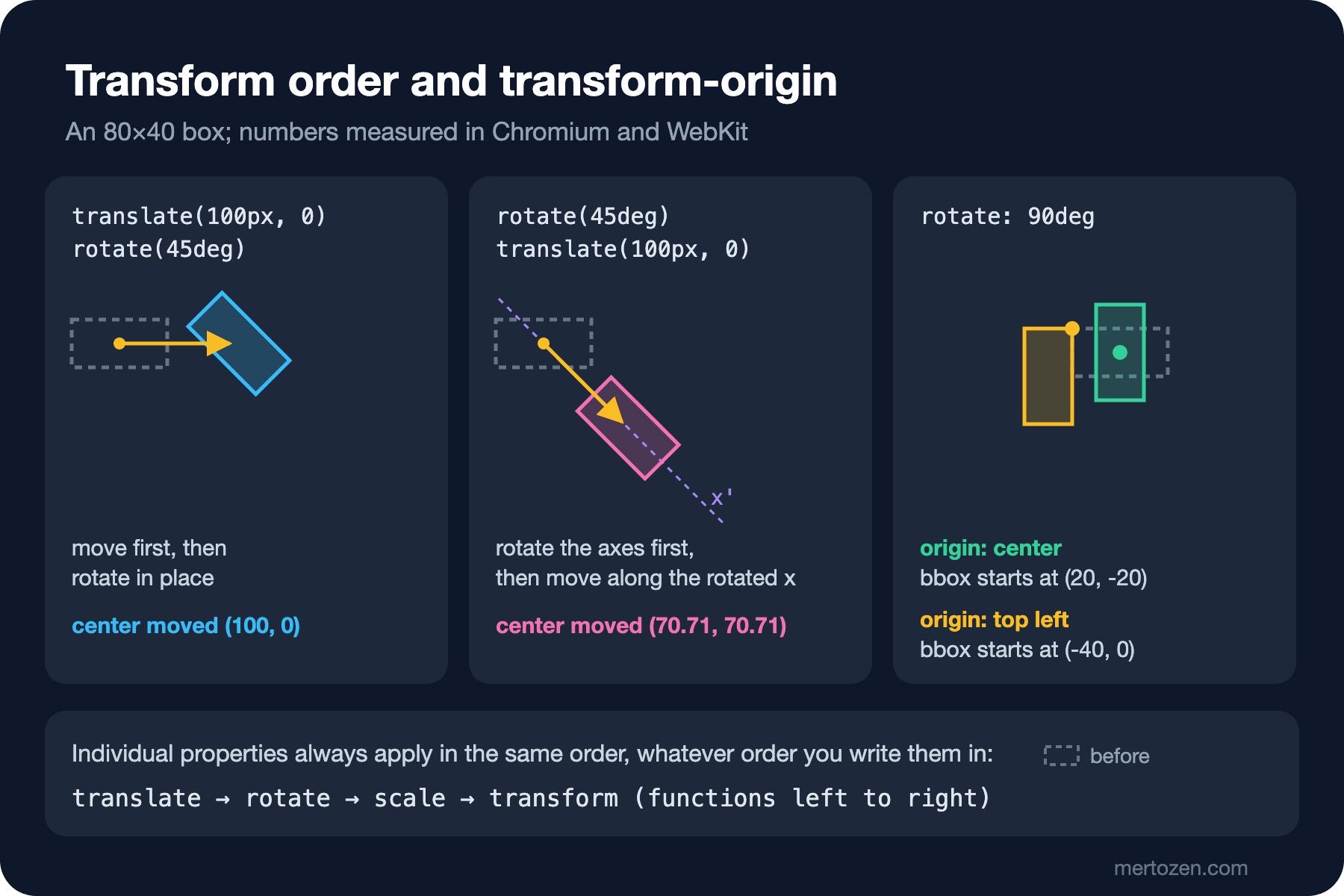
A practical rule: to rotate and scale an element "in place", put the move first. To swing it around a point on an orbit (like the numbers on a clock face), rotate first, then move. The computed value of transform is always a single matrix(); you cannot read the function list back, so the rule you wrote is the reference, not the matrix you see in DevTools.
The Individual translate, rotate and scale Properties
Since 2022, translate, rotate and scale can also be written as separate properties. Here is how they handle the ordering problem:
/* 2) individual properties: always translate, then rotate, then scale, then transform */
#individual { rotate: 45deg; translate: 100px 0; }
#rotate-only { rotate: 45deg; }
#combined { transform: rotate(20deg); rotate: 25deg; }
individual center moved (100, 0) bbox 84.85x84.85
rotate-only center moved (0, 0) bbox 84.85x84.85
combined center moved (0, 0) bbox 84.85x84.85
#individual computed: translate: 100px; rotate: 45deg; transform: none
#combined computed: rotate: 25deg; transform: matrix(0.939693, 0.34202, -0.34202, 0.939693, 0, 0)In #individual we wrote rotate first and translate second; the result is still the same as translate(100px, 0) rotate(45deg): the center moved by (100, 0). Individual properties ignore the order you write them in and apply in a fixed order set by the specification: translate first, then rotate, then scale, and finally the transform list. That means "turn and grow in place", which is exactly what most interface effects want.
#combined shows the second important rule: rotate: 25deg does not override transform: rotate(20deg); the two add up. The bounding box is identical to #rotate-only, which turned 45 degrees. The computed values keep them apart too: rotate is 25deg, and transform is the 20-degree matrix (cos 20° = 0.9397, sin 20° = 0.342). If you do not want rotations from two sources to combine on the same element, you have to reset one of them on purpose.
The real benefit of individual properties shows up in animation. Because transform is a single property, an animation that changes it replaces the whole static value:
@keyframes tilt-transform { from { transform: rotate(0deg); } to { transform: rotate(10deg); } }
@keyframes tilt-rotate { from { rotate: 0deg; } to { rotate: 10deg; } }
#anim-transform { transform: scale(1.5); animation: tilt-transform 1s linear paused; }
#anim-rotate { scale: 1.5; animation: tilt-rotate 1s linear paused; }
anim-transform transform: matrix(0.996195, 0.0871557, -0.0871557, 0.996195, 0, 0); scale: none; rotate: none; bbox 83.18
anim-rotate transform: none; scale: 1.5; rotate: 5deg; bbox 124.77I paused each animation exactly half way. In #anim-transform the computed transform is only a 5-degree rotation; scale(1.5) is gone and the box turns at 80×40 (bounding width 83.18). In #anim-rotate the animation changes only rotate, scale: 1.5 stays, and the bounding width is 124.77. This matters when an element that grows on hover also needs a rotation animation; that is exactly what we will do with Bookstore's cart icon below. Animation itself (@keyframes, easing, reduced motion) was covered in post 13 of the CSS3 series.
transform-origin, and transform-box in SVG
Rotation and scaling have a center: transform-origin. Its initial value is 50% 50%, the middle of the box. I measured the same 90-degree rotation around two different centers:
#origin-center { rotate: 90deg; }
#origin-corner { rotate: 90deg; transform-origin: top left; }
origin-center transform-origin 40px 20px bbox from (20, -20) size 40x80
origin-corner transform-origin 0px 0px bbox from (-40, 0) size 40x80The computed value is in pixels: the middle of the 80×40 box is 40px 20px. The box turned around its middle starts at (20, -20), so it stood up in place. The box turned around its top left corner moved to the left of that corner: it starts at (-40, 0) and reaches downwards, like a door opening on its hinge. transform-origin decides which point stays still; a menu that grows out of the button that opened it, or an icon that swings from its bottom edge, is built with this property.
Shapes inside an SVG hold a surprise for transform-origin. On HTML elements percentages refer to the element's own box; on a rect or path inside an SVG the reference box is the SVG's viewBox by default. transform-box changes that:
<svg viewBox="0 0 24 24"><rect id="wheel-view" x="2" y="2" width="6" height="6" fill="#b91c1c"/></svg>
<svg viewBox="0 0 24 24"><rect id="wheel-fill" x="2" y="2" width="6" height="6" fill="#b91c1c"/></svg>
/* 7) transform-origin inside SVG: view-box (default) vs fill-box */
#wheel-view, #wheel-fill { rotate: 45deg; transform-origin: center; }
#wheel-fill { transform-box: fill-box; }--- chromium
wheel-view transform-box view-box center after rotate (120, 21)
wheel-fill transform-box fill-box center after rotate (50, 50)
--- webkit
wheel-view transform-box view-box center after rotate (120, 21)
wheel-fill transform-box fill-box center after rotate (50, 50)The SVGs are 240px wide with a 24-unit viewBox, so one unit is 10 pixels and the square sits at (50, 50) before it turns. With the default view-box, transform-origin: center rotates around the middle of the viewBox, (120, 120), and the square escapes to (120, 21). With transform-box: fill-box the reference becomes the square's own bounds and it turns in place. When you animate a part of an SVG icon (a gear, the clapper of a bell), fill-box is almost always what you want.
Transforms Do Not Change Layout
A transform does not change an element's place in the layout; it only changes where it is painted. I scaled the middle box of a row by 1.5:
.row div { inline-size: 80px; block-size: 40px; background: #1d4ed8; }
#grown { scale: 1.5; }
#grown: offsetWidth 80, rendered width 120; #after starts at x=180offsetWidth is still 80; the painted width is 120. The box on the right did not move either: 80 + 10 + 80 + 10 = 180. A growing box overlaps its neighbours instead of pushing them. For hover effects this is exactly the behavior you want: growing shifts nothing on the page and triggers no layout. For the same reason transform is one of the few properties that can be animated on the compositor, as measured in post 13 of the CSS3 series.
There are two side effects, and both were measured in post 04 of the CSS3 series: any transform other than none (individual properties included) makes the element a new stacking context, and position: fixed elements inside it are positioned relative to that element instead of the viewport. If a card that grows on hover contains a fixed notification, the notification moves with the card.
Let us put this together for the catalog cover: the image grows slightly on hover, but must not spill out of the card:
.book-card .cover {
    margin-block-end: 0.75rem;
    border-radius: 0.25rem;
    /* the scaled image stays inside the frame */
    overflow: hidden;
}
.book-card .cover img {
    display: block;
    inline-size: 100%;
    block-size: auto;
    transition: scale 200ms ease-out;
}
.book-card:hover .cover img { scale: 1.05; }
@media (prefers-reduced-motion: reduce) {
    .book-card .cover img { transition: none; }
}
The overflow: hidden that cuts the overflow is on the frame (.cover), not on the image. The image starts at the size of the frame; when it grows, the excess is clipped. Giving the img display: block removes the small gap under the image; the details of the img reset are in this series' post on images. The measurement on the page:
node scripts/06-pages.mjs--- chromium
cover img scale: 1.05
img 193.2x289.8 -> 202.86x304.29, frame 193.2x289.8, card moved: false
cart count: 1
cart icon at 25% + hover: rotate -12deg, scale 1.1, transform-origin 12px 24px
flip: aria-pressed=true, rotate y 180deg, cover box 240x360
cover pixel: front rgb(21, 95, 61), after flip rgb(30, 41, 60)
--- webkit
cover img scale: 1.05
img 193.2x289.8 -> 202.86x304.29, frame 193.2x289.8, card moved: false
cart count: 1
cart icon at 25% + hover: rotate -12deg, scale 1.1, transform-origin 12px 24px
flip: aria-pressed=true, rotate y 180deg, cover box 240x360The first two lines are about the cover: the image grows from 193.2×289.8 to 202.86×304.29, the frame keeps its size and the card does not move at all. These lines are the same in both engines.
3D: perspective, preserve-3d and backface-visibility
On the book page, clicking should reveal the back cover. A 3D flip needs three pieces: perspective on the parent (the viewing distance; a smaller value gives a more exaggerated depth), transform-style: preserve-3d on the turning element (so its children stay in the same 3D scene) and backface-visibility: hidden on each face (so a face turned away is not painted). I measured three variants in the lab:
/* 6) 3D flip: perspective on the parent, preserve-3d on the rotating element */
.flip { position: relative; inline-size: 120px; block-size: 180px; margin: 20px 0 20px 100px; perspective: 800px; }
.flip-inner { display: grid; block-size: 100%; transform-style: preserve-3d; }
.flip.is-flipped .flip-inner { rotate: y 180deg; }
.face { grid-area: 1 / 1; backface-visibility: hidden; }
.front { background: #15803d; }
.back { background: #1e293b; rotate: y 180deg; }
#flip-visible .face { backface-visibility: visible; }
/* overflow: hidden flattens the 3D scene */
#flip-clipped .flip-inner { overflow: hidden; border-radius: 8px; }
flip-ok front side shows front (green) flipped shows back (navy)
flip-visible front side shows back (navy) flipped shows back (navy)
flip-clipped front side shows front (green) flipped shows front (green)The correctly built card (flip-ok) shows the green front first and the navy back after the flip. On the card where backface-visibility stays visible, the back face shows even before the flip: both faces are in the same plane, and the back face, which comes later in the DOM, is painted in front even though it faces away. The third card is the sneaky one: we gave .flip-inner overflow: hidden to round the corners, and after the flip it still shows the front (mirrored). According to the specification, overflow (other than visible and clip), opacity below 1, filter, clip-path, mask, isolation: isolate and mix-blend-mode flatten the scene, and the used value of preserve-3d becomes flat. The computed value still reads preserve-3d; DevTools shows nothing wrong. Corner rounding and clipping go on the faces, not on the turning element.
I checked the pixels of this measurement only in Chromium: Playwright's WebKit build ignored backface-visibility in screenshots and painted the back face in every case. The computed values are the same in WebKit; according to browser-compat-data Safari has supported the property without a prefix since 15.4, and needed -webkit-backface-visibility before that. I could not check it visually in real Safari.
The Bookstore card is the same as the correct lab setup. Grid stacks both images in the same cell, and the back cover starts turned by 180 degrees:
<div class="cover-flip">
    <div class="cover-flip-inner">
        <img class="cover-face" src="img/cover-middlemarch.webp" alt="Front cover of Middlemarch" width="240" height="360">
        <img class="cover-face cover-back" src="img/cover-middlemarch-back.webp" alt="Back cover of Middlemarch" width="240" height="360">
    </div>
</div>
<button type="button" class="flip-button" aria-pressed="false">Show back cover</button>
/* front and back cover: perspective on the parent, preserve-3d on the turning element */
.cover-flip { inline-size: 240px; perspective: 800px; }
.cover-flip-inner {
display: grid;
transform-style: preserve-3d;
transition: rotate 400ms ease-in-out;
}
.cover-flip.is-flipped .cover-flip-inner { rotate: y 180deg; }
.cover-face {
grid-area: 1 / 1;
display: block;
inline-size: 100%;
block-size: auto;
border-radius: 0.25rem;
backface-visibility: hidden;
}
.cover-back { rotate: y 180deg; }
@media (prefers-reduced-motion: reduce) {
.cover-flip-inner { transition: none; }
}// Turns the cover over; aria-pressed tells screen readers which side is up.
const flip = document.querySelector('.cover-flip');
const flipButton = document.querySelector('.flip-button');
flipButton?.addEventListener('click', () => {
const flipped = flip.classList.toggle('is-flipped');
flipButton.setAttribute('aria-pressed', String(flipped));
});A button triggers the flip and reports its state with aria-pressed; a click listener on the image would leave keyboard and screen reader users out. The last lines of the measurement: the button switches to aria-pressed=true, the computed rotate of the turning element is y 180deg, and in Chromium the pixel in the middle of the cover changes from the green of the front cover to the navy of the back cover. The box stays 240×360; a 3D turn does not affect layout either.
The Cart Icon: rotate and scale Together
The last piece is the cart icon in the header. It grows a little when the pointer is over it, and when "Add to cart" is pressed it does a short swing on its wheels:
.cart-link {
    display: inline-flex;
    align-items: center;
    gap: 0.375rem;
    margin-inline-start: auto;
    color: inherit;
    text-decoration: none;
}
.cart-icon {
    inline-size: 1.5rem;
    block-size: 1.5rem;
    fill: none;
    stroke: currentColor;
    stroke-width: 2;
    /* swing from the wheels, not from the middle */
    transform-origin: 50% 100%;
}
.cart-link:hover .cart-icon { scale: 1.1; }
/* rotate and scale are separate properties: the bump keeps the hover scale */
.cart-icon.bump { animation: cart-bump 400ms ease-in-out; }
@keyframes cart-bump {
    25% { rotate: -12deg; }
    75% { rotate: 12deg; }
}
@media (prefers-reduced-motion: reduce) {
    .cart-icon.bump { animation: none; }
}
The swing pivots on the bottom edge of the icon: transform-origin: 50% 100% computes to 12px 24px on the 24×24 icon. The measurement pauses the animation at 25% and moves the pointer over the link: the computed rotate is -12deg and scale is 1.1. The hover's scaling and the animation's rotation apply together without overriding each other. Written as two transform rules, the hover scaling would disappear for the length of the animation, as we saw with #anim-transform in the lab.
In Production
Scaling an element leaves the browser two options: paint the content again at the new size, or enlarge the existing painting. Since version 53 Chrome repaints content when its scale changes; but if the element has will-change: transform, it keeps the existing raster so the animation stays smooth, and enlarges it. That can make scaled text and images look blurry (Chrome for Developers blog, "Re-rastering composited layers on scale change"). A headless screenshot repaints the layer, so I could not measure this difference here. The rule: give will-change only to elements that really animate continuously, and if possible only while they animate; a cover that grows 5% on hover does not need it.
Keep the scale factor small too. 5% is noticeable on a cover image; scaling a card that contains text pushes its lines onto subpixel positions and softens the edges. Changing the card's shadow instead of scaling it (previous post), or scaling only the image, gives a cleaner result. Fractional pixel values in translate (translate: 0.5px) can blur text as well.
Large rotations and flips can be a problem for users who are sensitive to motion. Every transition in Bookstore is switched off under prefers-reduced-motion: reduce; the cover still turns over, just without animation.
Common Pitfalls
First, assuming the order of functions does not matter. rotate(45deg) translate(100px) and translate(100px) rotate(45deg) land in different places. If you are not sure about the order, use the individual properties; their order is fixed.
Second, assuming the individual rotate overrides transform: rotate(). They combine; a transform coming from a component adds up with your rotate.
Third, using position: fixed inside a transformed ancestor. The fixed element is then positioned relative to that ancestor, not the viewport; details in post 04 of the CSS3 series.
Fourth, giving the turning element of a 3D card overflow: hidden, opacity or filter. The scene flattens and the back face never shows; the computed value does not reveal it.
Fifth, rotating a shape inside an SVG with transform-origin: center and forgetting transform-box: fill-box. The shape turns around the middle of the viewBox and runs away.
Baseline Status
node scripts/baseline.mjs transforms2d individual-transforms transforms3d transform-box will-changetransforms2d widely 2018-03-30 Chrome 36, Firefox 16, Safari 9, iOS 9
individual-transforms widely 2025-02-05 Chrome 104, Firefox 72, Safari 14.1, iOS 14.5
transforms3d widely 2024-09-14 Chrome 36, Firefox 16, Safari 15.4, iOS 15.4
transform-box widely 2026-10-16 Chrome 118, Firefox 125, Safari 13.1, iOS 13.4
will-change widely 2022-07-15 Chrome 36, Firefox 36, Safari 9.1, iOS 9.3| Feature | Status | Note |
|---|---|---|
transform (2D), transform-origin | Widely available | Functions apply from left to right |
translate, rotate, scale | Widely available | Newly in 2022-08, widely in 2025-02 |
3D transforms, perspective, backface-visibility | Widely available | backface-visibility was prefixed in Safari until 15.4 |
transform-box | Widely available | fill-box is old; widely in 2026-10 because of content-box/stroke-box |
will-change | Widely available | Stops repainting on scale change in Chrome |
No feature in this post is in the "not Baseline" category. Do not let the widely date of transform-box mislead you: according to browser-compat-data the fill-box value that SVG icons need has existed since Chrome 64, Firefox 55 and Safari 11; the 2026-10 date comes from the content-box and stroke-box values, which reached Firefox in version 125.
A Small Experiment
★☆☆ Change #rotate-translate in the lab into a rule that moves its center to (100, 0); first by reordering the functions, then with the individual properties only. 06-transforms.mjs should print the same line in both cases.
★★☆ Make the catalog cover grow from its bottom left corner on hover (transform-origin), and add a line to 06-pages.mjs that measures that the image's bottom left corner stays at the same point before and after the hover.
★★★ Give the cover card on the book page a frame with border-radius and a light shadow, without flattening the 3D scene. Verify in Chromium that in the flipped state the pixel in the middle of the cover is still the color of the back cover; note which element got what.
In the next post we process images and backdrops with CSS: the filter functions, the difference between drop-shadow() and box-shadow, backdrop-filter on a sticky filter bar, and a duotone effect on the campaign banner with blend modes.