

Backgrounds and Gradients: background-image, size, position, Multiple Layers, linear/radial/conic-gradient and image-set()
To keep text readable on an image, write a semi-transparent gradient layer before the image in background-image, pick the image with image-set() as 1x/2x and AVIF, and use the background shorthand with care because it also resets background-color. On Bookstore's campaign banner we measure the contrast ratio by reading pixels, fix the gray midpoint of sRGB with in oklch, and build a rating ring with conic-gradient and a skeleton that respects reduced motion.
Version note: This post follows the CSS Backgrounds and Borders Level 3, CSS Images Level 3/4 and CSS Color Level 4 specifications and the November 2026 state of Baseline (web-features 3.46.0); the examples were run in Chromium 158 and WebKit 27.2 (Playwright 1.65), and Firefox support comes from web-features and MDN browser-compat-data 8.1.9.
Guess First
For three posts we worked on text; now we move to the box itself. We are adding a campaign banner to the home page of Bookstore, the online bookstore used as the shared example across this site's series. First, two small experiments:
.box { inline-size: 400px; block-size: 200px; }
.banner { background-color: #1e3a8a; }
.banner.sale { background: url("../img/square.png") center / cover no-repeat; }

.mix { block-size: 40px; background: linear-gradient(to right, #0000ff, #ffff00); }
First: .banner sets a navy background color, and .banner.sale adds an image on top with the background shorthand. What is the background-color of the .sale box? Second: which color is the pixel exactly in the middle of a gradient from blue to yellow? Is the middle of blue and yellow green, or something else?
The background Longhands and What the Shorthand Resets
background is the shorthand for eight longhands: background-color, background-image, background-position, background-size, background-repeat, background-attachment, background-origin and background-clip. The measurement in the lab:
node scripts/04-background.mjs--- chromium
.banner.sale background-color: rgba(0, 0, 0, 0)
--- webkit
.banner.sale background-color: rgba(0, 0, 0, 0)The navy is gone: rgba(0, 0, 0, 0), which is transparent. We did not write background-color in the shorthand, but a shorthand resets every longhand you leave out to its initial value, and the initial value of background-color is transparent. Since the image covers the whole box, you do not notice it on screen; when the image fails to load or arrives slowly, white text sits on a white background. In this series' font post we saw the font shorthand reset line-height; background behaves the same way.
The order inside the shorthand is flexible, but there are two rules. background-size can only be written after background-position, separated by / (center / cover). If a value has two box keywords (padding-box border-box), the first is background-origin and the second background-clip; a single box keyword applies to both. You can write several layers separated by commas, but background-color may appear only in the last layer. My rule: in a component, write longhands in rules that change the color or the image; use the shorthand only when defining a box's background from scratch.
background-size, background-position and background-repeat
cover scales the image, keeping its ratio, until it covers the box completely and crops what overflows; contain scales it down until the whole image fits and leaves empty space. I put a 300×300 test image (red background, a blue square in the middle) into a 400×200 box and read the pixel at the left edge and in the center:
/* 2) cover vs contain: a 300x300 image in a 400x200 box */
.fill { background: #1e3a8a url("../img/square.png") center / cover no-repeat; }
.fill.contain { background-size: contain; }
cover left edge rgb(220, 38, 38) center rgb(37, 99, 235)
contain left edge rgb(30, 58, 138) center rgb(37, 99, 235)With cover the left edge is the image's red: the image grew to 400×400 and covered the full width of the box, with 100 pixels cut off at the top and the bottom. With contain the left edge is navy, the background-color: the image shrank to 200×200 and 100 pixels of empty space remain on each side. This difference was measured with a small helper that reads pixels: the script takes a screenshot, draws it onto a canvas in the page and reads the color with getImageData. We will measure gradients, and later shadows, with the same helper. The two engines give exactly the same results here.
background-position takes keywords, lengths or percentages, and the four-value syntax gives an offset from an edge: right 1rem bottom 1rem places the image 1rem in from the bottom right corner. Percentages align the same relative point of the image and the box: 25% 75% puts the image's 25%/75% point on the box's 25%/75% point. Besides repeat and no-repeat, background-repeat has two less known values: space repeats the image without cropping it and distributes the gaps evenly, round scales the image slightly so that a whole number of copies fit.
background-origin decides which box positioning is relative to (padding-box by default), and background-clip where painting is cut off (border-box by default). Both will be useful in the next post when we build a gradient border. background-attachment: fixed fixes the image to the viewport for a parallax-like effect; but it does not work in iOS Safari, which is why the feature is not Baseline. Do not build a mobile design that depends on this effect.
Gradients: Geometry, Color Stops and Color Hints
In CSS, gradients are images: they are written in background-image, and background-size and background-repeat apply to them too. The diagram below shows how the three kinds place their colors along a different geometry:
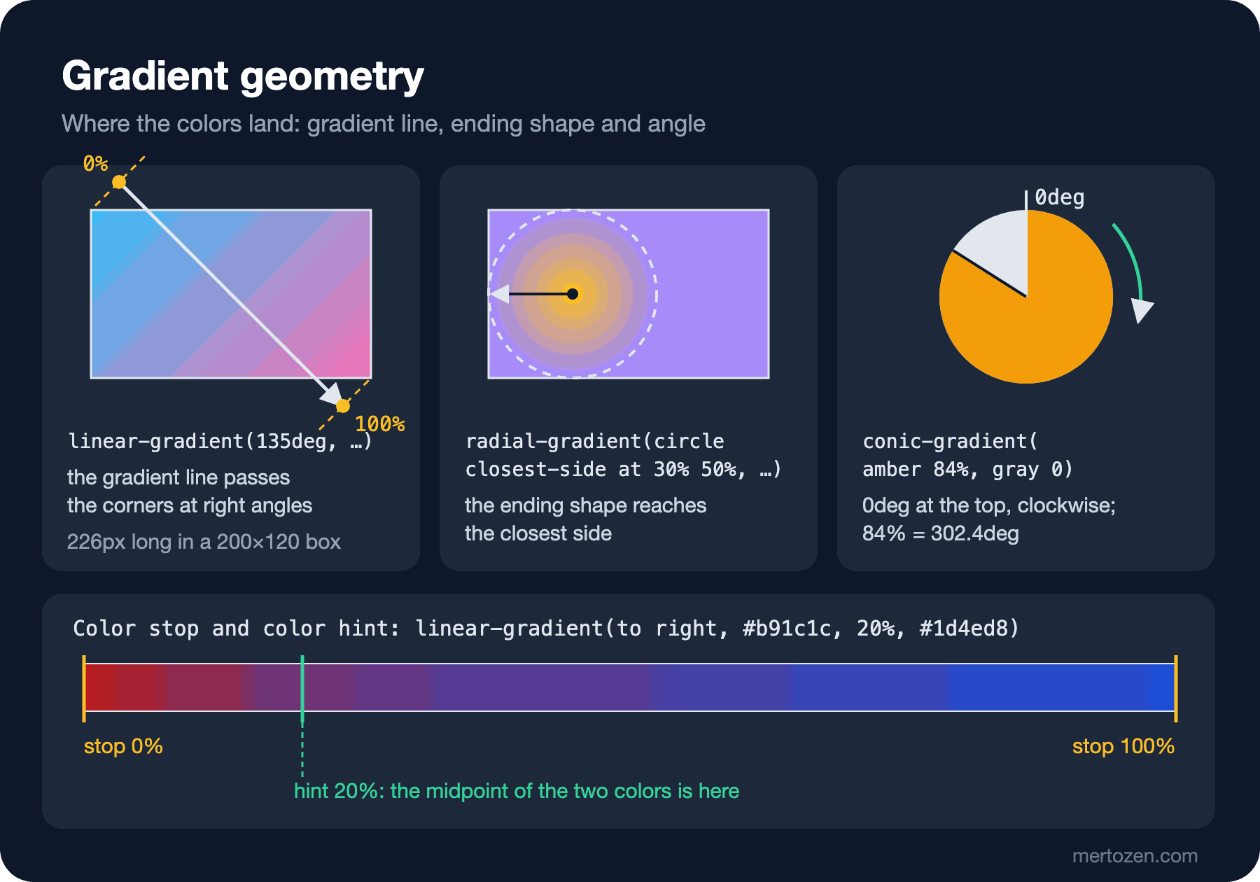
In a linear-gradient the colors are laid out along a "gradient line". The angle is measured clockwise from the top (0deg up, 90deg right), and the line's length is chosen so that the lines through the 0% and 100% points, at right angles to it, touch the corners of the box. That is why in a 135deg gradient the corners get exactly the first and the last color. Forms such as to right and to bottom right point to a corner, and the angle is calculated from the box's aspect ratio.
A radial-gradient has a center (at 30% 50%) and an ending shape (circle or ellipse); the size of the ending shape is given with keywords such as closest-side and farthest-corner (the default) or with a length. A conic-gradient lays the colors out along an angle around the center: 0deg is at the top, the direction is clockwise, and percentages are fractions of a full turn.
Color stops are positions on that line or angle. A single percentage placed between two stops is a color hint and says where the exact middle of the two colors should be:
/* 4) a color hint moves the midpoint, equal stops make a hard edge */
.hint { block-size: 40px; background: linear-gradient(to right, #b91c1c, 20%, #1d4ed8); }
.hard { block-size: 40px; background: linear-gradient(to right, #b91c1c 50%, #1d4ed8 50%); }
hint at 20%: rgb(106, 53, 122) at 50%: rgb(69, 65, 167)
hard at 49%: rgb(185, 28, 28) at 51%: rgb(29, 78, 216)In the gradient with the hint, the color at 20% is rgb(106, 53, 122), the exact average of red and blue: half of the transition is done within the first 20%. On the second line, two stops at the same position draw a hard edge; 49% is pure red, 51% pure blue. This "hard stop" technique is the basis of patterns such as stripes, flags and progress bars. Giving one color two positions, as in #b91c1c 0 8px (double position), writes the same thing more briefly. repeating-linear-gradient and the other repeating-* functions repeat the pattern after the last stop.
Gradient Interpolation: Graying in sRGB and in oklch
The second half of the opening question: the middle of the gradient between blue (#0000ff) and yellow (#ffff00). I drew the same gradient in three color spaces:
.mix { block-size: 40px; background: linear-gradient(to right, #0000ff, #ffff00); }
.mix.oklab { background: linear-gradient(to right in oklab, #0000ff, #ffff00); }
.mix.oklch { background: linear-gradient(to right in oklch, #0000ff, #ffff00); }
--- chromium
srgb middle of the gradient: rgb(127, 127, 127)
oklab middle of the gradient: rgb(108, 171, 198)
oklch middle of the gradient: rgb(0, 207, 188)
--- webkit
srgb middle of the gradient: rgb(128, 128, 128)
oklab middle of the gradient: rgb(109, 172, 199)
oklch middle of the gradient: rgb(0, 208, 189)The default interpolation happens in sRGB and each channel is averaged separately: (0+255)/2, (0+255)/2, (255+0)/2. The result is rgb(127, 127, 127): gray. This dull band in the middle of a colorful gradient always appears in sRGB between two complementary colors. in oklab averages in a perceptually uniform space and gives a light blue-gray; in oklch also averages the hue angle and produces a bright cyan in the middle (rgb(0, 207, 188)). Which one is right depends on the design: oklch if you want to keep saturation between the two colors, oklab for a soft transition that does not shift the hue. In WebKit the values differ by 1; this comes from pixel rounding. The color spaces themselves and oklch() were covered in post 11 of the CSS3 series. Choosing a color space for a gradient has been Baseline newly available since June 2024.
Multiple Layers and image-set(): The Campaign Banner
The banner image is a bookshelf, with a white heading and a short text on top. The light areas of the shelf image make the white text unreadable, so we put a semi-transparent dark gradient layer over the image:
.promo-banner {
    display: grid;
    align-content: end;
    min-block-size: 16rem;
    padding: 2rem;
    border-radius: 0.75rem;
    color: #ffffff;
    /* shown until the image arrives, and if it never does */
    background-color: #1e293b;
    /* first layer is on top: the overlay keeps the text readable */
    background-image:
        linear-gradient(to top, rgb(15 23 42 / 0.9), rgb(15 23 42 / 0.3) 70%),
        image-set(
            url("../../img/banner-1x.avif") 1x type("image/avif"),
            url("../../img/banner-2x.avif") 2x type("image/avif"),
            url("../../img/banner-1x.webp") 1x type("image/webp"),
            url("../../img/banner-2x.webp") 2x type("image/webp")
        );
    background-size: cover;
    background-position: center;
}
With comma-separated layers, the first one is painted on top. The bottom of the gradient is darker (90% opacity) and the top lighter (30%); the text is aligned to the bottom, so it falls on the darkest area. The image is given with image-set(): from the types it supports (type()), the browser picks the one that best matches the screen's pixel density (1x, 2x). image-set() has been Baseline widely available since March 2026. The measurement shows which file is requested and the contrast ratio against the brightest pixel behind the text:
node scripts/04-pages.mjs--- chromium
dpr 1: requested /img/banner-1x.avif
banner layers: linear-gradient + image-set
worst contrast with overlay: h2 4.28:1, p 7.21:1
worst contrast without overlay: h2 1.03:1, p 1.09:1
dpr 2: requested /img/banner-2x.avif
skeleton animation (no-preference): shimmer
skeleton animation (reduce): none
--- webkit
dpr 1: requested /img/banner-1x.avif
banner layers: linear-gradient + image-set
worst contrast with overlay: h2 4.35:1, p 7.13:1
worst contrast without overlay: h2 1.03:1, p 1.09:1
dpr 2: requested /img/banner-2x.avif
skeleton animation (no-preference): shimmer
skeleton animation (reduce): noneOn a normal screen (device pixel ratio 1) banner-1x.avif is requested, on a 2x screen banner-2x.avif, and no request goes to the WebP files; both engines support AVIF. With the overlay the worst contrast in Chromium is 4.28:1 for the heading and 7.21:1 for the paragraph (4.35:1 and 7.13:1 in WebKit). WCAG level AA asks for 4.5:1 for normal text and 3:1 for large text of 24px and above; the 32px heading passes 3:1 and the paragraph passes 4.5:1. When I removed the overlay (the script does this by deleting the layer), the ratios dropped to 1.03:1 and 1.09:1: the text is almost invisible over the white labels on the shelf. The details of contrast thresholds are in the Color and Contrast post of the UI/UX Design Principles series.
This is where the difference between a gradient overlay and text-shadow becomes clear: the overlay darkens the background itself and gives a measurable contrast. We also wrote a separate background-color: if the image does not arrive, or the user turned images off, the text still sits on a dark background.
A Striped Strip, a Rating Ring and a Skeleton
The category strip on the home page draws thin 45-degree stripes over the category color. The pattern is a single repeating-linear-gradient with double-position stops; the color comes from the --cat-color custom property set in HTML:
.category-strip {
    display: flex;
    gap: 1rem;
    padding: 0.75rem 1rem;
    margin-block: 1.5rem;
    border-radius: 0.5rem;
    color: #ffffff;
    /* 45-degree stripes over the category color */
    background:
        repeating-linear-gradient(45deg, rgb(255 255 255 / 0.12) 0 8px, transparent 8px 16px),
        var(--cat-color, #1d4ed8);
}
The rating ring on the book detail page has two layers: at the bottom a conic-gradient that fills according to the rating, on top a radial-gradient with a white center. The small gap between 78% and 80% in the radial-gradient softens the inner edge of the ring; with both stops at the same position the edge would look jagged:
.rating-ring {
    display: grid;
    place-items: center;
    inline-size: 4rem;
    block-size: 4rem;
    border-radius: 50%;
    font-weight: 700;
    /* a white disc on top of the conic ring */
    background:
        radial-gradient(closest-side, #ffffff 78%, transparent 80%),
        conic-gradient(#f59e0b calc(var(--rating) / 5 * 100%), #e5e7eb 0);
}
<div class="rating-ring" style="--rating: 4.2" role="img" aria-label="Rated 4.2 out of 5">4.2</div>In the single-layer ring in the lab, a rating of 4.2 means 84% of the turn, which is 302.4 degrees. I read the pixels at 90, 300 and 310 degrees:
/* 5) a rating ring: 4.2 out of 5 */
.rating {
    --rating: 4.2;
    inline-size: 120px;
    block-size: 120px;
    border-radius: 50%;
    background: conic-gradient(#f59e0b calc(var(--rating) / 5 * 100%), #e5e7eb 0);
}
rating 90deg: rgb(245, 158, 11)
rating 300deg: rgb(245, 158, 11)
rating 310deg: rgb(229, 231, 235)300 degrees is still orange, 310 degrees gray: the edge is where we expect it. Remember that the ring is a visual element; we give the rating to screen readers with role="img" and aria-label, and as text with the "4.2" in the middle.
Finally, the skeleton cards shown while the catalog loads. The gradient is painted as an image twice as wide as the box, and background-position is moved with an animation:
.skeleton {
    block-size: 8rem;
    border-radius: 0.5rem;
    background: linear-gradient(90deg, #e5e7eb 25%, #f3f4f6 50%, #e5e7eb 75%) 0 0 / 200% 100%;
    animation: shimmer 1.5s linear infinite;
}
@keyframes shimmer {
    to { background-position: -200% 0; }
}
@media (prefers-reduced-motion: reduce) {
    .skeleton { animation: none; }
}
In the measurement, on a page opened with reducedMotion: 'reduce', animation-name becomes none; a user who prefers reduced motion sees static gray cards. prefers-reduced-motion itself was covered in post 08 of the CSS3 series.
In Production
A background image in CSS is discovered only after the browser has downloaded and parsed the stylesheet and worked out that the rule matches an element. An img in HTML is seen by the parser immediately. The largest image on the page, such as the banner, is an LCP candidate and starts late when it is given in CSS. If the banner image is part of the content, use img or picture; if it stays in CSS, consider preloading it with <link rel="preload" as="image" imagesrcset="…">. The details are in the image and font optimization post of the Web Performance series.
Check contrast by measuring, not by eye. The banner image changes from campaign to campaign, and with the next image a white area may land right behind the text. Putting a check like this post's worstContrast function into a test that runs before a new banner goes live reduces that risk.
A background-position animation needs a repaint on every frame. For three skeleton cards this is negligible; in a list of hundreds of rows, moving the shimmer with transform on a pseudo-element is cheaper. Which properties the compositor animates cheaply is in post 13 of the CSS3 series.
Common Pitfalls
First, giving a content image with background-image. A background image has no alternative text, screen readers never announce it, users cannot right-click and save it, and the browser discovers it late. Product covers, author photos and a meaningful image in a banner belong in HTML; the markup side is in the Image and Media post of the HTML5 and Semantic HTML series.
Second, mistaking the gray middle of a gradient between two colors for a design error. As we measured, it is the result of sRGB interpolation; fix it by adding in oklab or in oklch.
Third, wiping out a background-color from an earlier rule with the background shorthand. In hover or modifier classes, write only the longhand that changes.
Fourth, forgetting the fallback color when making gradient text with background-clip: text. This value is not Baseline in web-features: Firefox has partial support and it does not work with multiple layers. Give the text a plain color first and add the gradient inside @supports (background-clip: text).
Baseline Status
node scripts/baseline.mjs background background-size background-position background-clip background-attachment gradients conic-gradients gradient-interpolation image-set background-clip-textbackground widely 2018-01-29 Chrome 1, Firefox 3.6, Safari 1.3, iOS 1
background-size widely 2018-01-29 Chrome 21, Firefox 9, Safari 5.1, iOS 4.2
background-position widely 2018-01-29 Chrome 25, Firefox 13, Safari 7, iOS 7
background-clip widely 2018-01-29 Chrome 21, Firefox 22, Safari 5.1, iOS 5
background-attachment not Baseline Chrome 1, Firefox 25, Safari 15.4, iOS -
gradients widely 2018-01-29 Chrome 26, Firefox 3.6, Safari 7, iOS 7
conic-gradients widely 2023-05-17 Chrome 69, Firefox 83, Safari 12.1, iOS 12.2
gradient-interpolation newly 2024-06-11 Chrome 111, Firefox 127, Safari 16.2, iOS 16.2
image-set widely 2026-03-18 Chrome 113, Firefox 89, Safari 17, iOS 17
background-clip-text not Baseline Chrome 120, Firefox -, Safari 14, iOS 14| Feature | Status | Note |
|---|---|---|
background and its longhands (except attachment) | Widely available | The shorthand resets background-color too |
background-attachment | Not Baseline | fixed is missing in iOS Safari |
| Linear, radial and repeating gradients, color hints, double position | Widely available | |
conic-gradient | Widely available | Since 2023-05 |
Color space in gradients (in oklch) | Newly available | Since 2024-06 |
image-set() and type() | Widely available | Since 2026-03 |
background-clip: text | Not Baseline | Firefox partial; use @supports |
A Small Experiment
★☆☆ Change the top stop of the banner overlay to rgb(15 23 42 / 0.1) and measure with 04-pages.mjs whether the heading's contrast ratio drops below 3:1.
★★☆ Turn the pattern of the category strip into a two-color gradient with in oklch and use the lab's pixel reader to compare the color in the middle of the strip with the sRGB version.
★★★ Update the rating ring with a round() calculation that rounds the rating to half stars (steps of 0.5), and verify with a pixel measurement that for a rating of 3.8 the ring rounds to 4.0 and its edge is at 288 degrees (80%).
In the next post we move to the edges of the box: border and the per-side longhands, elliptical and pill uses of border-radius, a gradient border with background-clip, a focus ring with outline, and an elevation scale with box-shadow.