

Themes and Design Tokens: @theme Namespaces, Custom Colors/Fonts/Breakpoints and Dark Mode

Every variable in a @theme block produces both a utility and a CSS variable on :root; the variable's namespace decides which utility appears. In Bookstore.Web we define brand tokens, compare extending the default theme with resetting it via --color-*: initial, measure why @theme inline is needed for per-institution colors and what @theme static does, build flash-free dark mode with semantic variables and a head script, and generate @theme from DTCG tokens with Style Dictionary.
Version note: The examples in this post were run with Tailwind CSS 4.3.5, Style Dictionary 5.8, Node.js 24, .NET 10 and Playwright 1.65 (Chromium 158).
Guess First
Bookstore, the online bookstore used as the shared example across this site's series, gives each institution its own accent color on the Institutional Orders side. The school portal is green, the default theme indigo. We built this with a CSS variable and registered it with Tailwind as a color:
:root {
    --tenant-accent: var(--color-indigo-600);
}
.tenant-school {
    --tenant-accent: var(--color-emerald-600);
}

@theme {
    --color-accent: var(--tenant-accent);
}
The "Order for the school" button in the school portal carries class="bg-accent" and sits inside the .tenant-school element. Is the button green or indigo?
In this post we open up Tailwind's theme system: how a @theme block produces both utilities and CSS variables, namespaces, the difference between extending and resetting the default theme, @theme inline and @theme static, dark mode with two strategies, and turning design tokens from a JSON file into a @theme block with Style Dictionary. We covered the token concept itself and the DTCG format, the token file format defined by the Design Tokens Community Group at the W3C, in the design system post of the UI/UX Design Principles series; here we look at the Tailwind side.
What @theme Produces
Let's define Bookstore.Web's brand with three colors, a font and a radius:
@theme {
    --color-brand-50: oklch(0.97 0.014 264);
    --color-brand-600: oklch(0.54 0.178 264);
    --color-brand-700: oklch(0.47 0.16 264);
    --color-ink-900: oklch(0.21 0.03 264);
    --radius-card: 0.875rem;
    --font-display: Georgia, Cambria, serif;
}
Every variable inside @theme produces two things. The first is a utility: the moment --color-brand-600 is defined, bg-brand-600, text-brand-600, border-brand-600 and every other utility that takes a color become available. The second is a real CSS variable on :root. With bg-brand-600 and rounded-card used in the card partial, the build output looks like this:
@layer theme {
  :root, :host {
    --color-brand-600: oklch(0.54 0.178 264);
    --color-brand-700: oklch(0.47 0.16 264);
    --color-ink-900: oklch(0.21 0.03 264);
    --radius-card: 0.875rem;
    --font-display: Georgia, Cambria, serif;
    /* ... */
  }
}
@layer utilities {
  .rounded-card {
    border-radius: var(--radius-card);
  }
  .bg-brand-600 {
    background-color: var(--color-brand-600);
  }
}
Two details matter. The utility doesn't copy the value, it binds to the variable; change the variable in a subtree and the utility changes with it. We build dark mode on top of that. Second, :root contains only the variables in use: --color-brand-50 is not used anywhere, so it didn't make it into the CSS. --color-ink-900, on the other hand, is there even though no class uses it directly, because --color-fg, which we define below, refers to it and Tailwind tracks that dependency.
The variables on :root can be used from outside, too: background: var(--color-brand-600) in component CSS written without @apply, style="border-color: var(--color-line)" in Razor, or getComputedStyle(document.documentElement).getPropertyValue("--color-brand-600") in JavaScript. Tailwind's own default theme is written with the same mechanism; the package's index.css defines the palette inside a @theme default block, and a variable with the same name in your @theme block overrides it.
Namespaces: Which Utility Does a Variable's Name Produce?
The prefix of a variable's name, its namespace, decides which utility it produces. We defined one example from each namespace and read the CSS they produce with a script:
@theme {
    --color-brand-600: oklch(0.54 0.178 264);
    --font-display: Georgia, Cambria, serif;
    --text-hero: 2.75rem;
    --text-hero--line-height: 1.1;
    --font-weight-heavy: 850;
    --tracking-tightest: -0.04em;
    --leading-cozy: 1.4;
    --breakpoint-3xl: 120rem;
    --container-shelf: 72rem;
    --spacing-gutter: 1.25rem;
    --radius-card: 0.875rem;
    --shadow-card: 0 1px 2px oklch(0 0 0 / 0.06), 0 4px 12px oklch(0 0 0 / 0.08);
    --ease-snappy: cubic-bezier(0.2, 0, 0, 1);
    --animate-pulse-once: pulse 1s ease-in-out 1;
}
node scripts/03-namespaces.mjsbg-brand-600 → background-color: var(--color-brand-600);
font-display → font-family: var(--font-display);
text-hero → font-size: var(--text-hero); line-height: var(--tw-leading, var(--text-hero--line-height));
font-heavy → --tw-font-weight: var(--font-weight-heavy); font-weight: var(--font-weight-heavy);
tracking-tightest → --tw-tracking: var(--tracking-tightest); letter-spacing: var(--tracking-tightest);
leading-cozy → --tw-leading: var(--leading-cozy); line-height: var(--leading-cozy);
3xl:hidden → @media (width >= 120rem) display: none;
max-w-shelf → max-width: var(--container-shelf);
p-gutter → padding: var(--spacing-gutter);
rounded-card → border-radius: var(--radius-card);
shadow-card → --tw-shadow: 0 1px 2px var(--tw-shadow-color, oklch(0 0 0 / 0.06)), 0 4px 12px var(--tw-shadow-color, oklch(0 0 0 / 0.08)); box-shadow: var(--tw-inset-shadow), var(--tw-inset-ring-shadow), var(--tw-ring-offset-shadow), var(--tw-ring-shadow), var(--tw-shadow);
ease-snappy → --tw-ease: var(--ease-snappy); transition-timing-function: var(--ease-snappy);
animate-pulse-once → animation: var(--animate-pulse-once);A few rules can be read from the output. A double-dash suffix like --text-hero--line-height defines the line height that comes with the font size, and leading-* can override it (var(--tw-leading, …)). --breakpoint-* produces a variant rather than a utility: 3xl: is now a media query that applies at 120rem and up. --container-* feeds both the max-w-* sizes and the container query variants. A named spacing value like --spacing-gutter can be used in every utility that takes spacing: p-gutter, gap-gutter, w-gutter. --shadow-card doesn't copy the value as is; it wraps the color part in --tw-shadow-color so that a color utility like shadow-brand-600/20 can change the shadow's color.
Extend or Reset the Default Theme?
So far we have been extending: Tailwind's palette is still there and we added brand on top. To change a single value, redefining it with the same name is enough; write --breakpoint-sm: 30rem and sm: starts at 480px.
If all the colors of a design system are fixed, you may want to stop the team from reaching for an off-system color like bg-red-500. For that you reset the namespace with initial:
@theme {
    /* only Bookstore's own colors: the default palette is dropped entirely */
    --color-*: initial;
    --color-white: oklch(1 0 0);
    --color-brand-600: oklch(0.54 0.178 264);
}
With the classes bg-brand-600 bg-red-500 bg-black bg-transparent bg-current text-white border-gray-200 in the same HTML, these are the utilities that get generated:
npx tailwindcss -i 03/reset.css | grep -E '^ \.' .bg-brand-600 {
.bg-current {
.bg-transparent {
.text-white {bg-red-500, bg-black and border-gray-200 were not generated at all, and Tailwind gave no warning about it either; the classes stayed in the HTML and did nothing. white and black are in the --color-* namespace as well, so the reset removed them; we added white back by hand. transparent and current belong to the utility itself rather than the palette and were not affected. To remove the whole default theme there is --*: initial; then you also have to define spacing, fonts and breakpoints from scratch.
Which one to pick? If you are moving an existing product design to Tailwind, resetting is more natural; if you are building your design tokens on top of Tailwind's palette, extending is. Resetting has a cost: a third-party Tailwind component, or an example copied from the docs, uses color classes that no longer exist and silently stays colorless.
@theme inline: The Answer to the Guess
We measured the button from the guess next to a second color defined with @theme inline:
@theme inline {
    --color-accent-inline: var(--tenant-accent);
}
node scripts/03-inline.mjsplain oklch(0.511 0.262 276.966)
inline oklch(0.596 0.145 163.225)bg-accent stayed indigo (the value of indigo-600), and bg-accent-inline turned green (emerald-600). The reason is in the generated CSS:
  .bg-accent {
    background-color: var(--color-accent);
  }
  .bg-accent-inline {
    background-color: var(--tenant-accent);
  }
With a plain @theme, the definition --color-accent: var(--tenant-accent) is written to :root, and var(--tenant-accent) is resolved there, on :root, where --tenant-accent is indigo. The resolved value is inherited downward. Even though --tenant-accent turns green inside .tenant-school, --color-accent has already been computed as indigo. @theme inline writes the variable's value into the utility instead of its name: var(--tenant-accent) is resolved directly on the button, and the nearest definition is the school's green. We measured in detail on which element custom properties are computed in the custom properties and theming post of the CSS3 series.
The rule is short: if a variable inside @theme refers to another variable, and that variable can have different values in different parts of the page, use inline. The same applies when you refer to variables that a font loader or a component library puts on the page.
@theme static: Bring the Unused Variables Too
Sometimes no class touches a variable, yet it is still needed. The sales chart in Bookstore's admin panel reads the series colors from CSS with getComputedStyle; since the chart library doesn't use Tailwind classes, the scanner never sees these colors. We defined the same three colors in a plain block and in a static block and built them with only text-white in the HTML:
@theme static {
    --color-brand-50: oklch(0.97 0.014 264);
    --color-brand-600: oklch(0.54 0.178 264);
    --color-brand-700: oklch(0.47 0.16 264);
}
npx tailwindcss -i 03/static-off.css | grep -- --color- --color-white: #fff;
color: var(--color-white);npx tailwindcss -i 03/static-on.css | grep -- --color- --color-white: #fff;
--color-brand-50: oklch(0.97 0.014 264);
--color-brand-600: oklch(0.54 0.178 264);
--color-brand-700: oklch(0.47 0.16 264);
color: var(--color-white);In the plain block the brand colors never made it into the CSS; in the static block all three are on :root. static only affects the variables in its own block; it doesn't force Tailwind's whole palette into the output. Collecting the tokens JavaScript reads in a separate @theme static block solves the problem without inflating the CSS.
Dark Mode: Media Query and Class Strategy
The default dark: variant looks at the operating system's preference:
<body class="bg-white text-slate-900 dark:bg-slate-900 dark:text-slate-100"> @media (prefers-color-scheme: dark) {
.dark\:bg-slate-900 {
background-color: var(--color-slate-900);
}node scripts/03-dark.mjslight rgb(255, 255, 255)
dark oklch(0.208 0.042 265.755)That is enough if you won't offer the user a theme button. In Bookstore.Web, though, users should be able to change the choice and have it remembered. For that we tie the dark variant to a class on <html>:
/* dark mode follows the .dark class on <html>, not only the OS setting */
@custom-variant dark (&:where(.dark, .dark *));
Now dark:shadow-none produces this selector; since :where() adds no specificity, dark rules keep the same weight as normal utilities:
  .dark\:shadow-none:where(.dark, .dark *) {
    --tw-shadow: 0 0 #0000;
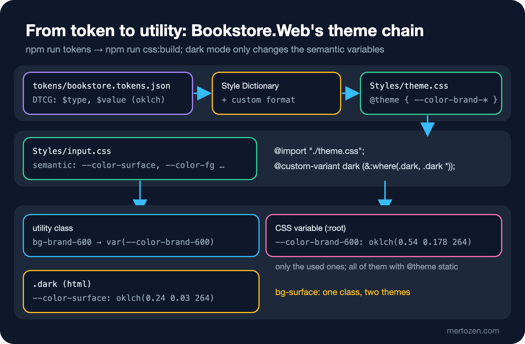
The second decision is whether to write dark: on every element or change the colors in one place. In Bookstore.Web components use the name of a meaning, not of a palette color: bg-surface, text-fg, border-line. We define these semantic variables in @theme with their light theme values and override them under .dark:
/* semantic colors: components use these names, not the palette */
@theme {
    --color-canvas: oklch(0.985 0.003 264);
    --color-surface: oklch(1 0 0);
    --color-fg: var(--color-ink-900);
    --color-fg-muted: oklch(0.45 0.03 264);
    --color-line: oklch(0.92 0.01 264);
}

@layer base {
    .dark {
        color-scheme: dark;
        --color-canvas: oklch(0.18 0.025 264);
        --color-surface: oklch(0.24 0.03 264);
        --color-fg: oklch(0.96 0.01 264);
        --color-fg-muted: oklch(0.75 0.02 264);
        --color-line: oklch(0.34 0.03 264);
    }
}
The card now carries rounded-card border border-line bg-surface, and one class list is enough for both themes. The .dark rule is in the base layer; since that layer comes after theme, it overrides the light values on :root. The dark: variant is still there, but for exceptions: turning the shadow off (dark:shadow-none) or changing the palette colors on the stock badge (dark:bg-emerald-950 dark:text-emerald-300). The color-scheme: dark line also switches the parts the browser draws, such as scrollbars and form controls, to the dark theme.
The last piece is FOUC, the flash of unstyled content where a page briefly shows the wrong styles. If the theme choice is applied by a script at the end of the page, the browser paints the light theme first and then switches to dark. To prevent that, we apply the choice with a small inline script in <head> that runs before the stylesheet:
<script>
    // runs before the first paint: the page never flashes in the wrong theme
    (function () {
        var stored = null;
        try { stored = localStorage.getItem("theme"); } catch (e) { }
        var dark = stored ? stored === "dark" : matchMedia("(prefers-color-scheme: dark)").matches;
        document.documentElement.classList.toggle("dark", dark);
    })();
</script>
<link rel="stylesheet" href="~/css/site.css" asp-append-version="true">
// theme toggle: flips the .dark class and remembers the choice
document.querySelector("[data-theme-toggle]")?.addEventListener("click", () => {
const dark = document.documentElement.classList.toggle("dark");
try { localStorage.setItem("theme", dark ? "dark" : "light"); } catch { }
});Because an inline script blocks the parser, the .dark class is in place before <body> is painted. localStorage can throw in a private window or with site data disabled, so the calls are inside try. We measured four cases on the published app:
node scripts/03-theme.mjsOS light, nothing stored dark=false body oklch(0.985 0.003 264) card oklch(1 0 0) stored=null
OS dark, nothing stored dark=true body oklch(0.18 0.025 264) card oklch(0.24 0.03 264) stored=null
OS dark, stored light dark=false body oklch(0.985 0.003 264) card oklch(1 0 0) stored=light
OS light, toggle clicked dark=true body oklch(0.18 0.025 264) card oklch(0.24 0.03 264) stored=darkWith nothing stored the operating system wins; with a stored choice, the user's choice wins. The button flips the class and writes the choice. This site works the same way: @custom-variant dark and an inline script in the head that holds rendering.
Generating @theme from DTCG Tokens
Bookstore's colors come from the design team's tools as a DTCG JSON file. Instead of copying that file into @theme by hand, we generate it with Style Dictionary:
{
  "color": {
    "$type": "color",
    "brand": {
      "600": { "$value": { "colorSpace": "oklch", "components": [0.54, 0.178, 264], "hex": "#3766d4" } }
    }
  },
  "radius": {
    "$type": "dimension",
    "card": { "$value": { "value": 0.875, "unit": "rem" } }
  },
  "font": {
    "$type": "fontFamily",
    "display": { "$value": ["Georgia", "Cambria", "serif"] }
  }
}
In DTCG 2025.10 a color is an object: a color space, components and an optional hex fallback. Style Dictionary 5 reads the $value and $type fields; the two pieces we wrote are a value transform and a format:
// DTCG tokens → a Tailwind @theme block (Styles/theme.css)
import StyleDictionary from "style-dictionary";

StyleDictionary.registerTransform({
    name: "value/dtcg-css",
    type: "value",
    transitive: true,
    transform: (token) => {
        const v = token.$value;
        if (token.$type === "color") return `oklch(${v.components[0]} ${v.components[1]} ${v.components[2]})`;
        if (token.$type === "dimension") return `${v.value}${v.unit}`;
        if (token.$type === "fontFamily") return v.map((f) => (f.includes(" ") ? `"${f}"` : f)).join(", ");
        return v;
    },
});

StyleDictionary.registerFormat({
    name: "css/tailwind-theme",
    format: ({ dictionary }) =>
        "/* generated from tokens/bookstore.tokens.json, do not edit */\n@theme {\n" +
        dictionary.allTokens.map((t) => `    --${t.name}: ${t.$value};`).join("\n") +
        "\n}\n",
});

export default {
    source: ["tokens/bookstore.tokens.json"],
    platforms: {
        tailwind: {
            transforms: ["name/kebab", "value/dtcg-css"],
            buildPath: "Styles/",
            files: [{ destination: "theme.css", format: "css/tailwind-theme" }],
        },
    },
};
npm run tokenstailwind
✔︎ Styles/theme.css/* generated from tokens/bookstore.tokens.json, do not edit */
@theme {
--color-brand-50: oklch(0.97 0.014 264);
--color-brand-100: oklch(0.93 0.033 264);
--color-brand-500: oklch(0.62 0.17 264);
--color-brand-600: oklch(0.54 0.178 264);
--color-brand-700: oklch(0.47 0.16 264);
--color-ink-900: oklch(0.21 0.03 264);
--radius-card: 0.875rem;
--font-display: Georgia, Cambria, serif;
}The name/kebab transform turns the token path (color.brand.600) into the variable name (color-brand-600). Since Tailwind's namespaces start with color-, radius- and font-, naming the top-level groups in the JSON after the namespaces is enough; no separate mapping table is needed. input.css pulls this file in with @import "./theme.css";. We committed the generated file to the repo, so the CSS build doesn't depend on Style Dictionary and a token change shows up in code review as a theme.css diff.
In Production
The inline script in the head runs into script-src in an app that uses a Content Security Policy. Either add the script's SHA-256 hash to the policy or give it a nonce generated per request; if you move the script into an external file, you can't add defer or async, because it still has to load synchronously in the head to hold rendering. Setting up the policy is not the topic of this series but of the Web Security (OWASP Top 10) series.
Overriding semantic variables under .dark means one recalculation for the whole page; dark: classes on every element grow the CSS. In Bookstore.Web, dark: appears in just three places. When a second theme is needed, such as a high-contrast theme for the institutional portal, you write just one more variable block.
If you read tokens from JavaScript, make sure the variable is in the CSS. Forget @theme static and the variable comes back as an empty string; the series in the chart fall back to a default color and you see no error message.
Common Pitfalls
The first is the pitfall from the guess: writing a theme variable that refers to another variable without inline. The value freezes on :root and overrides in a subtree never reach the utility.
The second is naming tokens after their value. --color-blue-600 is right as a palette color, but if components use it, dark mode starts producing contradictions like "in the dark theme blue-600 is actually blue-400". Separate the palette from the semantic layer; let components use the semantic names.
The third is looking for theme.extend in tailwind.config.js out of v3 habit. In v4 that file is not read by default; you can load an old config with @config, but new tokens belong in @theme. We do the migration with npx @tailwindcss/upgrade in the maintenance post of this series.
The fourth is resetting with --color-*: initial and forgetting to add basic colors such as white and black back. Wherever text-white is written, the text silently falls back to the body color.
A Small Experiment
★☆☆ Add a new token named color.accent.500 to tokens/bookstore.tokens.json, run npm run tokens and npm run css:build, and verify that bg-accent-500 can be used on the card.
★★☆ In 03/inline.css, delete the @theme inline block, keep --color-accent in @theme, and add a --color-accent: var(--tenant-accent); line to the .tenant-school rule. Does the button's color change? What does this solution cost compared to @theme inline?
★★★ Add a second theme to Bookstore.Web: with <html class="contrast">, --color-fg is black and --color-line dark gray. Define @custom-variant contrast and extend the 03-theme.mjs script to measure this theme as well.
In the next post we move on to variants: group-* and peer-*, has-* and not-*, styling headless components with aria-* and data-*, built-in container queries, enter animations with starting:, and @utility and @variant for writing your own utilities.