

Everyday Utility Families 1: Layout, Flex, Grid, Spacing, Sizing and Position Utilities

Tailwind's layout utilities map one to one onto CSS, and numeric values derive from a single --spacing variable; the hard part is knowing which CSS to pick. We build Bookstore's catalog grid, book card and two-column cart page both with utilities and with plain CSS, compare the boxes of both pages at three widths in Playwright (0px difference), and measure space-x breaking on wrapping rows, a missing min-w-0 and the difference between auto-fill and auto-fit.
Version note: The examples in this post were run with Tailwind CSS 4.3.5, Node.js 24 and Playwright 1.65 (Chromium 158).
Guess First
Bookstore, the online bookstore used as the shared example across this site's series, shows genre chips above the catalog. The chips sit in a 320px box, the ones that don't fit wrap to the next line, and the lines are centered. The first class that comes to mind for spacing them out is space-x-4:
<div id="chips-space" class="flex w-80 flex-wrap justify-center space-x-4">
    <span class="rounded-full bg-white px-3 py-1">Fantasy</span>
    <span class="rounded-full bg-white px-3 py-1">Science fiction</span>
    <span class="rounded-full bg-white px-3 py-1">Classics</span>
    <span class="rounded-full bg-white px-3 py-1">Poetry</span>
</div>
The four chips break into two lines. Is there any space between the two lines? Is the first line really centered?
The earlier posts set up Tailwind's configuration, tokens, variants and integration. This post and the next one are about the utility families you write every day. This one covers layout: display, flex, grid, spacing, sizing, position and responsive prefixes. The examples are Bookstore's catalog grid, book card and cart page; we also write the plain CSS version of each screen and compare the boxes of both pages pixel by pixel in Playwright. The CSS mechanisms underneath are in the Box Model, Flexbox, CSS Grid and Responsive Design posts of the CSS3 series.
Reading a Utility Through Its CSS
The quickest way to learn a utility family is to look at the CSS line each class turns into. 04-selectors.mjs, which we used in the variants post, compiles each class on its own and prints only the utility rule:
node scripts/04-selectors.mjs 'p-4' 'p-13' 'mx-auto' 'size-10' 'w-1/2' 'max-w-7xl'p-4
.p-4 {
padding: calc(var(--spacing) * 4);
}
p-13
.p-13 {
padding: calc(var(--spacing) * 13);
}
mx-auto
.mx-auto {
margin-inline: auto;
}
size-10
.size-10 {
width: calc(var(--spacing) * 10);
height: calc(var(--spacing) * 10);
}
w-1/2
.w-1\/2 {
width: calc(1 / 2 * 100%);
}
max-w-7xl
.max-w-7xl {
max-width: var(--container-7xl);
}Three things stand out. First, the spacing scale derives from a single variable: --spacing is 0.25rem in the default theme and every numeric utility is a multiple of it. v3 had no p-13 because the scale came from a table; in v4 any whole number, or a half step like 2.5, works. As the theme post showed, @theme { --spacing: ... } changes the whole scale in one line. Second, mx-auto and px-4 now produce margin-inline and padding-inline; the horizontal axis is written with logical properties that follow the text direction. Third, not every size comes from the same scale: max-w-7xl reads from the --container-* namespace rather than spacing, and w-1/2 computes a percentage.
Display and Flex: The Book Card Skeleton
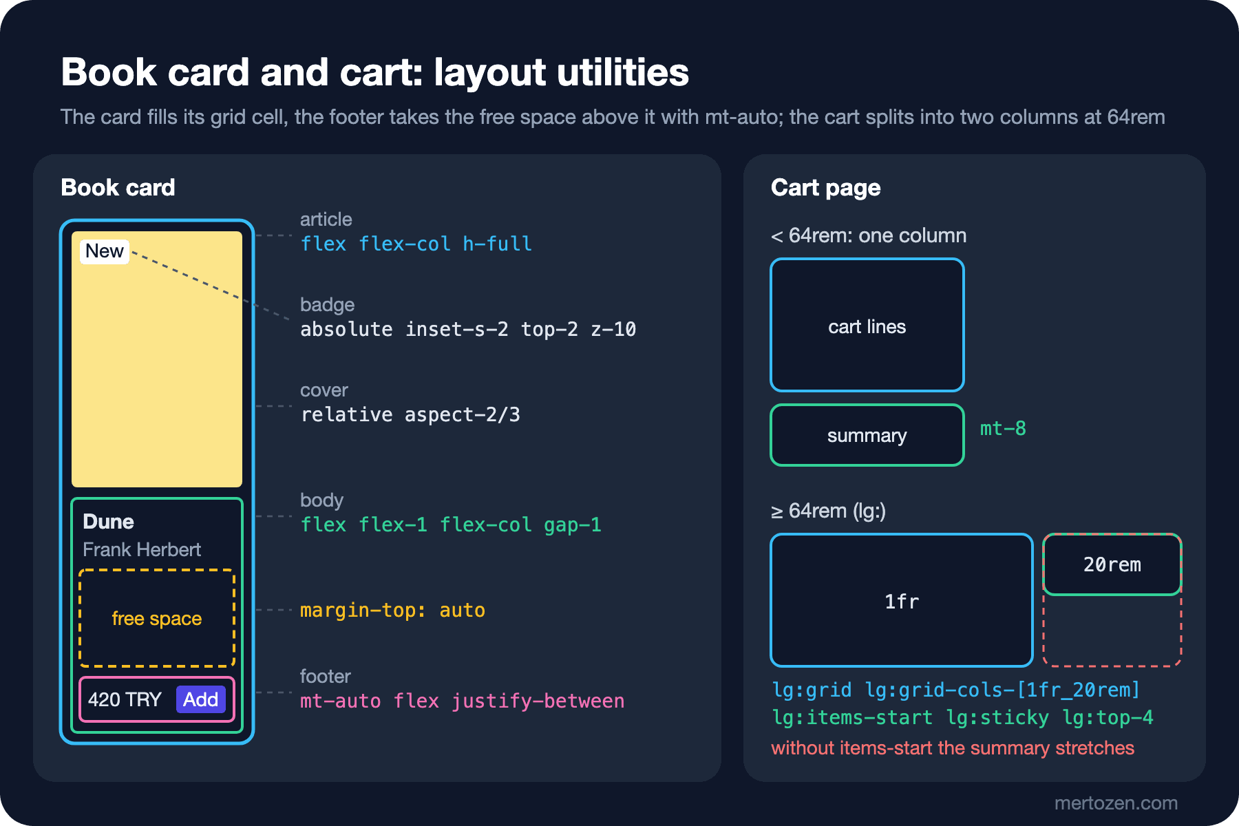
Every book in the catalog is a card: the cover on top, the title and author below it, the price and an "Add" button at the bottom. Titles have different lengths, yet the footers of cards in the same row should line up:
<article class="flex h-full flex-col overflow-hidden rounded-lg border border-slate-200 bg-white">
    <div class="relative aspect-2/3 bg-amber-200">
        <span id="badge" class="absolute inset-s-2 top-2 z-10 rounded bg-white px-2 py-0.5 text-xs">New</span>
    </div>
    <div class="flex flex-1 flex-col gap-1 p-4">
        <h2 class="line-clamp-2 font-semibold">Dune</h2>
        <p class="text-sm text-slate-600">Frank Herbert</p>
        <div class="mt-auto flex items-center justify-between pt-3">
            <span class="font-semibold">420.00 TRY</span>
            <button type="button" class="rounded bg-indigo-600 px-3 py-1 text-sm text-white">Add</button>
        </div>
    </div>
</article>
Three classes carry the skeleton. The card takes the full height of its grid cell with flex flex-col h-full; the body fills what the cover leaves with flex-1; the footer is pushed to the bottom of the body with mt-auto. Inside a flex container mt-auto gathers the free space on that side, so the prices stay on the same line whether the title takes one line or two. items-center and justify-between are just align-items and justify-content; Tailwind teaches nothing new here, it only shortens the writing.
Three utilities set the size of a flex item, and they map directly onto CSS:
node scripts/04-selectors.mjs 'flex-1' 'grow' 'shrink-0' 'basis-64'flex-1
.flex-1 {
flex: 1;
}
grow
.grow {
flex-grow: 1;
}
shrink-0
.shrink-0 {
flex-shrink: 0;
}
basis-64
.basis-64 {
flex-basis: calc(var(--spacing) * 64);
}flex-1 means flex: 1, that is flex: 1 1 0%: the item grows, shrinks and its starting size is computed from zero. grow only turns on growing, and the starting size comes from the content. We measured why that difference matters with flex-basis in the Flexbox post of the CSS3 series. line-clamp-2, which cuts the title after two lines, is a typography utility; we come back to it in the next post. The -webkit-line-clamp and text-overflow mechanics underneath are in the Line Breaking and Overflow post of the CSS Properties: A Hands-On Guide series.
Grid: The Catalog Grid
The list that lays out the cards is responsive with a single class:
<ul id="catalog-grid" class="mt-6 grid grid-cols-[repeat(auto-fill,minmax(12rem,1fr))] gap-6">grid-cols-[repeat(auto-fill,minmax(12rem,1fr))]
.grid-cols-\[repeat\(auto-fill\,minmax\(12rem\,1fr\)\)\] {
grid-template-columns: repeat(auto-fill,minmax(12rem,1fr));
}Tailwind's built-in grid-cols-3 produces repeat(3, minmax(0, 1fr)); the column count is fixed. There is no built-in utility for "as many 12rem columns as fit", so we write an arbitrary value. Inside the square brackets you use commas instead of spaces; if you need a space, write _ (grid-cols-[1fr_20rem]). If the expression appears once on the page, an arbitrary value is acceptable; if it repeats in several places, naming it with @utility is better.
We opened the page in Playwright at three widths:
npm run build:07
node scripts/07-layout.mjs
375px grid columns 1 toolbar column count none cart block summary static boxes 20, max diff vs plain CSS 0px
800px grid columns 3 toolbar row count block cart block summary static boxes 20, max diff vs plain CSS 0px
1280px grid columns 5 toolbar row count block cart grid summary sticky boxes 20, max diff vs plain CSS 0pxOne column on a phone, three on a tablet, five on a desktop; we wrote no breakpoint at all. Five columns for four books at 1280px is a detail worth noticing: auto-fill keeps the empty column in place. We swapped the value for auto-fit and measured again:
4 books at 1280px: auto-fill card 230px, auto-fit card 294pxauto-fit collapses the empty columns, and the four cards grow to fill the row. We chose auto-fill because we don't want huge cards when a filter leaves only two books in the catalog. The details of auto-fill versus auto-fit are in the CSS Grid 1 post of the CSS3 series.
The rest of grid is a straight mapping too: col-span-2 → grid-column: span 2 / span 2, col-start-2 → grid-column-start: 2, row-span-2, grid-flow-dense, place-items-center. col-span-2 is enough to give the "Book of the week" card two columns.
Spacing and Sizing: gap, space-* and min-w-0
There are three ways to add space. p-* and m-* write to the element's own box. gap-* writes between the items of a flex or grid container. space-x-* and space-y-* give margins to the children, and their selector changed in v4:
space-x-4
  :where(.space-x-4 > :not(:last-child)) {
    --tw-space-x-reverse: 0;
    margin-inline-start: calc(calc(var(--spacing) * 4) * var(--tw-space-x-reverse));
    margin-inline-end: calc(calc(var(--spacing) * 4) * calc(1 - var(--tw-space-x-reverse)));
  }
The margin goes on the end side of every child except the last one. In v3 it went on the start side of each child through a sibling combinator; the upgrade guide explains the change with performance problems on large pages and suggests moving to gap if it causes trouble. The answer to the guess is here as well.
The common sizing utilities: size-* sets width and height together (for icons and avatars), w-screen produces 100vw and h-dvh produces 100dvh; for the height that changes with a mobile browser's address bar, h-dvh is more accurate than h-screen. max-w-prose is 65ch. The long title in a cart line shows the most forgotten sizing class:
<li class="flex items-center gap-4 py-4">
    <div class="h-24 w-16 shrink-0 rounded bg-emerald-200"></div>
    <div class="min-w-0 flex-1">
        <h3 id="line-title" class="truncate font-medium">Middlemarch: A Study of Provincial Life (Penguin Classics, annotated edition)</h3>
        <p class="text-sm text-slate-600">Qty 1</p>
    </div>
    <span id="line-price" class="shrink-0 font-semibold">385.00 TRY</span>
</li>
cart line title box 536px, text 571pxThe title's box is 536px and its text 571px; truncate cuts the rest with an ellipsis. min-w-0 is what makes this possible: a flex item's default minimum width is auto, the width of its content. Without min-w-0 there is no limit at which the text could be cut. The shrink-0 on the cover and the price keeps the cover from being squeezed below 64px and the price from wrapping.
Position, inset and z-index
The "New" badge in the corner of the cover is positioned relative to the cover:
node scripts/04-selectors.mjs 'inset-s-2' 'inset-x-0' 'z-10' 'aspect-2/3'inset-s-2
.inset-s-2 {
inset-inline-start: calc(var(--spacing) * 2);
}
inset-x-0
.inset-x-0 {
inset-inline: 0px;
}
z-10
.z-10 {
z-index: 10;
}
aspect-2/3
.aspect-2\/3 {
aspect-ratio: 2/3;
}A relative cover and an absolute inset-s-2 top-2 badge are enough. We wrote inset-s-2 instead of left-2; in the maintenance post we saw that the start-* utilities are deprecated and inset-s-* replaces them. We measured what the logical form buys in a right-to-left block:
badge ltr    left 8px, right 179px
badge rtl    left 143px, right 8px
In the block with dir="rtl" the same class moved the badge to the right corner. ps-*, pe-*, ms-* and me-* work the same way. aspect-2/3 derives the cover's height from its width; since space is reserved before the image loads, no CLS occurs. z-10 only means something within the same stacking context; if you write z-50 and a modal still ends up underneath, the problem is the stacking context, not the number. We measured that in detail in the Normal Flow, display and Positioning post of the CSS3 series.
The cart summary has lg:sticky lg:top-4: on a wide screen the "Checkout" button stays visible while the user scrolls through the lines. In the output above the summary is sticky at 1280px and static at the narrower widths.
Responsive Prefixes: The Cart's Two Columns
Breakpoint prefixes are mobile-first: an unprefixed class applies at every width, md: at 48rem and up. The cart page is a single column on a phone and two columns from 64rem:
<section id="cart" class="mx-auto max-w-5xl px-4 py-8 lg:grid lg:grid-cols-[1fr_20rem] lg:items-start lg:gap-8">
    <ul id="cart-lines" class="divide-y divide-slate-200 rounded-lg bg-white px-4">...</ul>
    <aside id="summary" class="mt-8 rounded-lg bg-white p-6 lg:sticky lg:top-4 lg:mt-0">...</aside>
</section>
We saw what lg:items-start does by removing the class and measuring:
cart lines / summary height: with lg:items-start 257px / 160px
cart lines / summary height: without          257px / 257px
Grid items stretch to the row height by default (align-items: stretch); without the class the summary box grew as tall as the cart lines. sticky is useless on such a box, because it already fills the whole row and has no room to move. The mt-8 above the summary on a phone is removed with lg:mt-0 in the two-column layout.
In v4 every breakpoint also has a max-* counterpart, and combining the two gives a range:
max-md:hidden
  @media (width < 48rem) {
    .max-md\:hidden {
      display: none;
    }
  }

md:max-lg:grid-cols-2
  @media (width >= 48rem) {
    @media (width < 64rem) {
      .md\:max-lg\:grid-cols-2 {
        grid-template-columns: repeat(2, minmax(0, 1fr));
      }
    }
  }
The "4 books" counter in the catalog is hidden on phones with max-md:hidden (count none in the 375px line). We could also have written hidden md:block; the difference is that with max-md: you don't have to restate the element's normal display value. md:max-lg: puts a rule on the tablet range only. If you need your own breakpoint, add it to the --breakpoint-* namespace; the docs warn you to define all breakpoints in the same unit (rem), otherwise the order of the generated rules can get mixed up.
When a component should decide by the width of the slot it is placed in rather than the page, a viewport breakpoint is the wrong tool; we measured @container and container variants such as @md: in the variants post. If the book card will also go into a narrow side column on the home page, leave its inner layout to a container query and the page skeleton to viewport breakpoints.
The Same Screen in Plain CSS
To see that utilities really are "just CSS", we built the same catalog and cart page with semantic classes and a hand-written stylesheet. The plain CSS version of the card and the cart:
.book-card { display: flex; flex-direction: column; height: 100%; overflow: hidden; border: 1px solid #e2e8f0; border-radius: 0.5rem; background: #fff; }
.book-card__cover { position: relative; aspect-ratio: 2 / 3; }
.book-card__body { display: flex; flex: 1; flex-direction: column; gap: 0.25rem; padding: 1rem; }
.book-card__footer { margin-top: auto; display: flex; align-items: center; justify-content: space-between; padding-top: 0.75rem; }

.cart { max-width: 64rem; margin-inline: auto; padding: 2rem 1rem; }
.cart-summary { margin-top: 2rem; border-radius: 0.5rem; background: #fff; padding: 1.5rem; }
@media (width >= 64rem) {
    .cart { display: grid; grid-template-columns: 1fr 20rem; align-items: start; gap: 2rem; }
    .cart-summary { position: sticky; top: 1rem; margin-top: 0; }
}
07-layout.mjs compares the position and size of 20 boxes on both pages (toolbar, cards, covers, buttons, cart columns, title and price); the last column of the output above shows a maximum difference of 0px at all three widths. Both styles produce the same layout. What differs is where the decision lives. In plain CSS the fact that "the cart becomes two columns at 64rem" sits in the stylesheet, and the HTML only has the name cart. In Tailwind the fact sits in the template and you see it as you read; the price is a longer class list. The first post measured that trade-off; the only thing to add here is that because layout utilities map one to one, everything you know about plain CSS still applies. Someone who doesn't know flex-basis or auto-fill can't pick the right class in Tailwind either.
In Production
Layout utilities mostly produce fixed values, so they are not what grows your CSS; variant combinations are. 07/index.out.css is 11.8 kB unminified for this page and 9.7 kB with --minify; less than half of it (5.6 kB) is utilities, the rest is Preflight and the theme variables in use.
Don't test a layout that changes with screen width at a single width. A small Playwright test like 07-layout.mjs that opens the page at three widths and reads the column count, display and position catches it right away when someone deletes lg:items-start as "unnecessary".
The rule from the setup post applies to dynamic classes here as well: concatenated names like 'grid-cols-' + count are not scanned and not generated. If the column count comes from data, keep the full class names in a map ({ 2: "grid-cols-2", 3: "grid-cols-3" }), or pass the value with style="--cols: 3" and read it with grid-cols-[repeat(var(--cols),minmax(0,1fr))]. The short form grid-cols-(--cols) doesn't help here: it produces grid-template-columns: var(--cols), so the variable would have to hold a full track list rather than 3.
Common Pitfalls
The first is the one from the guess. We measured the chip box:
#chips-space rows 2, vertical gap 0px, row 1 space left 39px / right 55px
#chips-gap   rows 2, vertical gap 16px, row 1 space left 47px / right 47px
With space-x-4 the two lines touch, because it only adds horizontal margin. The first line isn't centered either: the last chip on that line isn't the last child of the list, so it carries its end margin and the line shifts 16px to the left. In the same box gap-4 puts 16px between the lines and centers the line. Use gap-* wherever things wrap; space-* is only safe for single-line lists whose order doesn't change.
The second is forgetting min-w-0 on a long title. We built the same line without min-w-0:
#row-no-min container 320px, price right edge 677pxIn the 320px line the price was pushed out to 677px; truncate cut nothing, because the title's box grew with the text. If text inside flex or grid doesn't get cut, the first place to look is min-w-0 (minmax(0, 1fr) in grid).
The third is writing every value as an arbitrary value and leaving the scale. We tried the canonicalize command on layout values: gap-[1.5rem] → gap-6, h-[18rem] → h-72, max-w-[80rem] → max-w-7xl, p-[3.25rem] → p-13, aspect-[2/3] → aspect-2/3. gap-[24px] and w-[288px] didn't change (pixel values aren't converted to rem). The interesting one is w-[18rem]: h-[18rem] became h-72, but this one stayed as it was. 18rem equals both w-72 and w-2xs from the container scale; the tool seems not to choose between two candidates. The rule is still the same: if the value is on the scale, write it from the scale; if it isn't, decide whether it's a token or a one-off adjustment.
The fourth is turning z-* values into a numbers race. Wherever you see z-[9999], list the layers (header, dropdown, modal, toast) and tie them to a few fixed values.
A Small Experiment
★☆☆ Change #chips-space in 07/index.html to gap-x-4 gap-y-2, run npm run build:07 and node scripts/07-layout.mjs, and check that the vertical gap is 8px.
★★☆ Add a "Book of the week" card with col-span-2 to the catalog grid. Measure what happens in the single-column grid at 375px, then fix it with sm:col-span-2, write the same rule in plain CSS in 07/plain.html, and see that the script keeps the 0px difference.
★★★ Rewrite the cart page's two-column layout with @container: make #cart a container and tie the column switch to a container variant such as @3xl:. Show in Playwright that the two solutions behave differently when you place the page in a 600px side panel at 1280px.
In the next post we move to the last part of the series, the utility families on the visual side: typography, color and the opacity modifier, borders and shadows, effects and transforms, form utilities, and finally @tailwindcss/typography for the blog body that comes from the CMS and @tailwindcss/forms for forms.